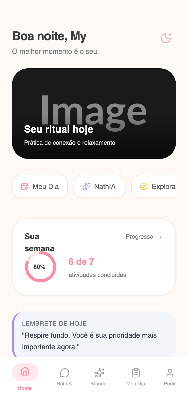
Premium Wellness Home
A premium, influencer-scale wellness app design featuring a warm 'peachy cream' palette, editorial-grade serif typography, and sophisticated glassmorphism elements. Optimized for high-end meditation, health coaching, and luxury lifestyle verticals. Characterized by soft #FFF9F5 backgrounds, #FF8DA1 rose accents, and high-contrast Playfair Display headings. Includes bento-style cards, circular progress metrics, and a refined mood selector with grayscale-to-color hover states.
Summary
A luxurious mobile-first wellness dashboard that balances soft, caring warmth with high-end editorial aesthetics through the use of serif fonts, layered shadows, and a sophisticated peachy-pink color palette.
Style
The style uses a pairing of 'Playfair Display' (serif) for headlines and 'Plus Jakarta Sans' (sans-serif) for body text. The primary background is #FFF9F5, accented with #FF8DA1 (Rose) and #F5E6E0 (Border). UI elements feature heavy rounding (up to 40px), soft wide shadows, and glassmorphic overlays.
Layout & Structure
A vertical-scrolling mobile layout (max-width 375px) with a persistent bottom navigation bar and a generous 28px padding (px-7) for content. Sections are clearly separated by large 40px margins.
Header Section
Premium Hero Card
Category Filter Pills
Activity Metrics Card
Mood Selector
Bottom Navigation
Components
Circular Progress Indicator
A refined SVG-based progress ring for tracking wellness goals.
Grayscale Mood Buttons
Interactive mood selection buttons that transition from muted to vibrant.
Special Notes
MUST: Maintain the 'Playfair Display' for all semantic headers to preserve the editorial feel. MUST: Use #FFF9F5 as the primary background; pure white (#FFFFFF) should only be used for elevated cards and pills. NOT: Do not use sharp corners; minimum radius for cards is 32px. NOT: Do not use black (#000000) for text; use #3D3D3D for high contrast and #8D8D8D for secondary text.