Progressive Sign-Up
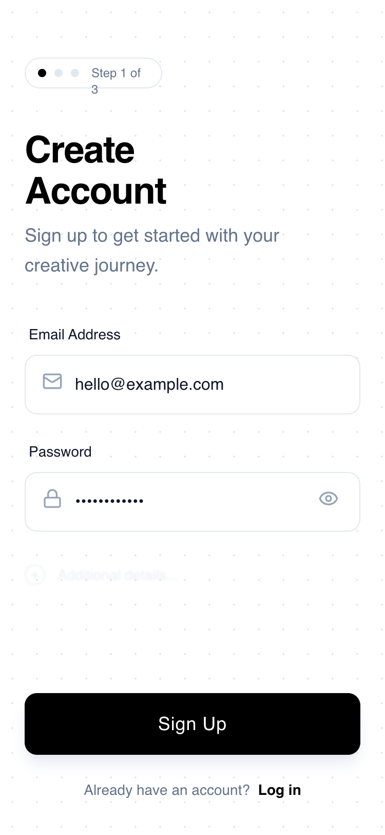
A minimal, high-contrast mobile sign-up interface inspired by architectural wireframes. Characterized by a monochrome palette, geometric typography, and a progressive disclosure pattern. This design uses generous whitespace, a subtle dotted grid background, and tactile interaction states. Ideal for design-centric apps, creative tools, SaaS onboarding, or minimalist fintech products where clarity and reduced cognitive load are paramount.
Summary
A clean, wireframe-style mobile sign-up screen featuring a progressive step indicator, geometric headlines, and minimalist input fields on a subtle grid background.
Style
The style is defined by a 'digital blueprint' aesthetic. It pairs 'Space Grotesk' for display elements with 'Switzer' for high-readability body text. The color scheme is strictly monochrome: Pure White (#FFFFFF), Deep Black (#000000), and a spectrum of Slate Grays (#0F172A to #E5E7EB). Animations are subtle, focusing on scale-down active states and smooth transitions for focus indicators. A 24px radial-dot grid pattern provides texture without clutter.
Layout & Structure
A vertical mobile portrait layout consisting of a header with progress tracking, a central form area, and a bottom-pinned primary action and footer.
Header Section
Form Area
Progressive Disclosure Hint
Footer and CTA
Components
Progressive Step Indicator
A pill-shaped status bar that tracks onboarding progress.
Tactile Primary Button
A high-contrast button with depth and interaction feedback.
Special Notes
Maintain strict 24px horizontal padding throughout. Do not use vibrant colors; stick to the black/white/slate theme. Ensure all icons have consistent stroke weights. The 'blurred hint' section must be non-interactive but visible enough to suggest the journey continues.