SaaS Landing Page for Developer Tool
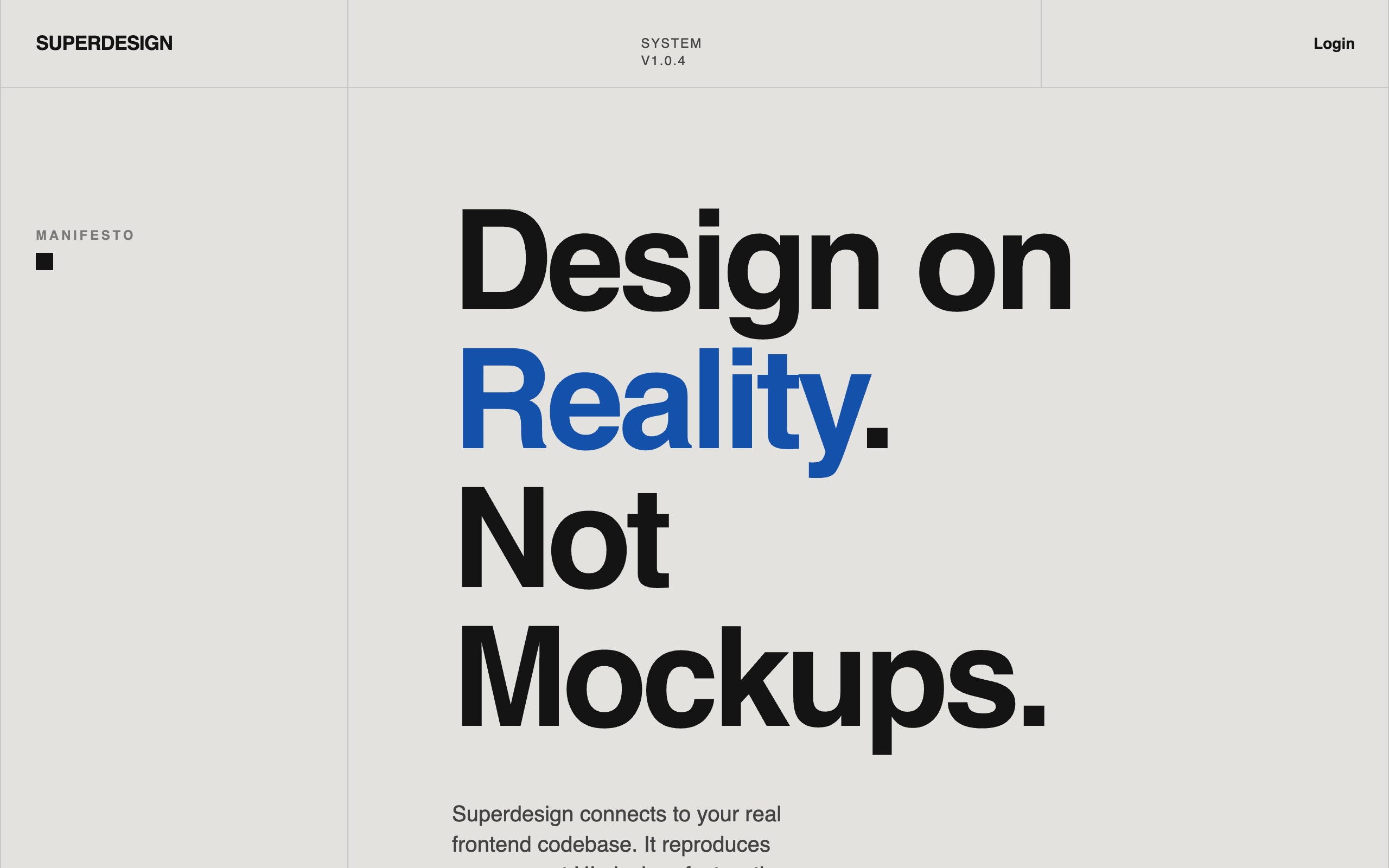
A bold modernist design system inspired by exhibition poster aesthetics and technical documentation. Characterized by a high-contrast 'cream and cobalt' color palette, oversized aggressive typography, and a rigid 12-column grid layout with 1px border dividers. This style is ideal for technical SaaS, developer tools, high-end design agencies, or architectural portfolios. Key elements include tight line-heights (0.85), no rounded corners, and a unique vertical labeling system in a dedicated left-hand grid column.
Summary
A sophisticated, 'Reality-First' design system that rejects typical SaaS fluff in favor of a structured, modernist, and technical aesthetic. It uses a strict grid, monochromatic base with a single vibrant blue accent, and heavy typographic contrast to establish authority and clarity.
Style
The style is defined by a 'Poster Modernist' approach: high-impact sans-serif typography with negative letter-spacing and compressed leading, a flat color palette without gradients or shadows, and a functional grid system. Typography uses 'Aileron' or 'General Sans' in heavy weights for headings and mono/sans for labels. The color palette centers on a soft cream (#E3E2DE) background, deep black text (#141414), and a high-performance primary blue (#1351AA).
Layout & Structure
A grid-locked vertical flow where each section is explicitly demarcated by horizontal dividers. The layout utilizes a 'Label Sidebar' pattern where the leftmost 3 columns of a 12-column grid are used for metadata, labels, or navigation hints.
Navigation
Hero Section
Feature/System Grid
Comparison List
Pricing/Access Section
Components
Poster Button
A high-contrast, zero-radius rectangular button.
Typographic List Item
Large interactive list items with a sidebar index.
Grid Sidebar Label
Sticky section labels used to navigate the grid.