Sectioned Index Page
Features a mixed-media layout including horizontal snap-scrolling cards, vertical activity feeds, and a bento-style recommendation grid. Ideal for content aggregators, interior design apps, portfolio indexes, or minimalist fintech dashboards.
Summary
A clean, whitespace-driven mobile index page that organizes content through a modular vertical stack. It uses a hierarchy established by spacing and font weights rather than color, featuring a persistent bottom navigation bar, a date-stamped header, and three distinct content display patterns: horizontal carousels, vertical list items, and a 2-column grid.
Style
The style is 'Minimalist Editorial' using a strict monochrome color palette (#FFFFFF to #111827). Typography centers on 'General Sans' with variable weights to denote importance. Animations are subtle: image scaling (1.05x) on hover and a slight compression (0.99x) on active tap states to simulate physical feedback. Rounded corners are generous (16px to 24px) to soften the layout.
Layout & Structure
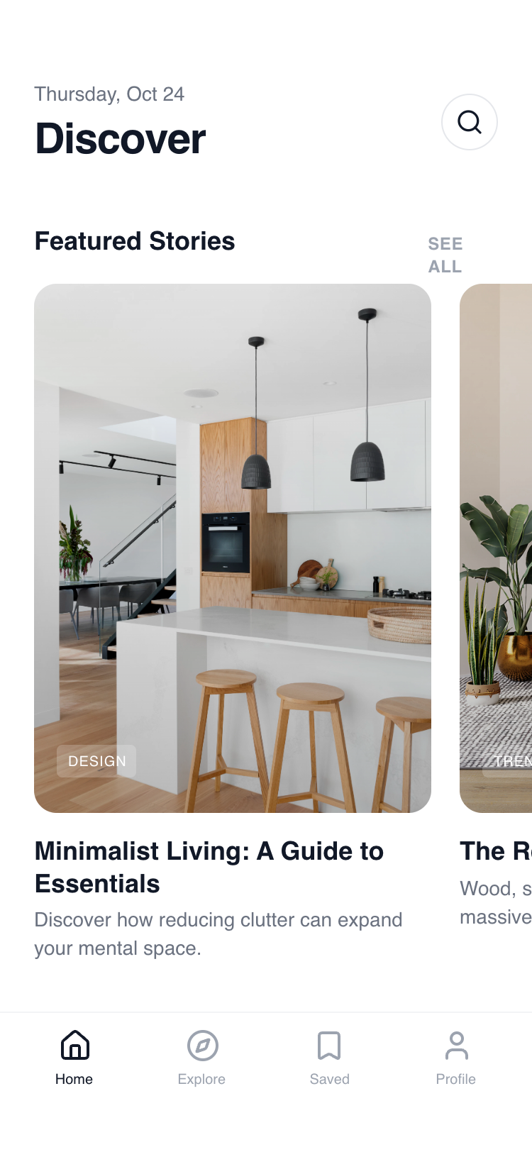
A vertically scrollable stack of content modules. Each section begins with a header row (Heading + 'See All' button) followed by specialized content blocks: Gallery (Horizontal), Activity (Vertical), and Recommendations (Grid).
Sticky Header
Section: Featured Gallery
Section: Recent Activity
Section: Recommendation Grid
Tab Bar Navigation
Components
Interactive List Card
A list item designed for tactile mobile interaction.
Micro-Tag (Glassmorphism)
Overlay tag used on top of imagery.