Security Verification Screen
Mobile-first security verification screen with a clean, serious aesthetic designed for high-trust environments like fintech, banking, and SaaS authentication. Features a minimalist palette centered around Slate-900 and White with a warm orange security accent. Layout emphasizes clarity and readability through General Sans typography, generous whitespace (32px horizontal margins), and a sticky action footer with a subtle white gradient mask. Ideal for account protection, identity verification, or alert notification flows.
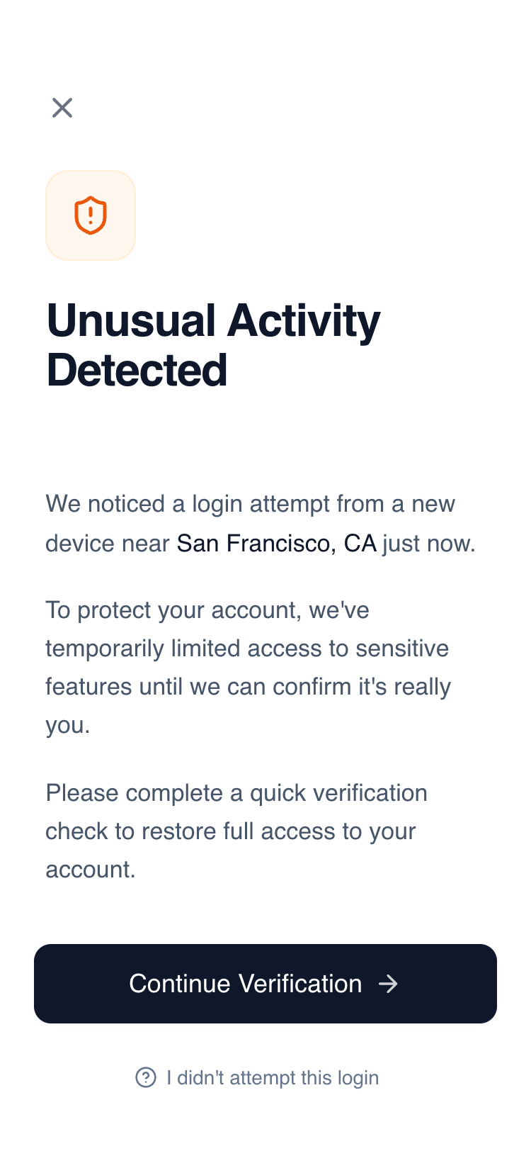
Summary
A minimalist, high-trust security alert screen for mobile, using a focused vertical layout, sophisticated typography, and a single accent color to communicate urgency without panic.
Style
The style is defined by its clean, professional, and serious tone. It uses 'General Sans' for typography with high-contrast font weights (Medium 500 to Semibold 600). The color palette is dominated by Slate-900 (#0F172A) and White (#FFFFFF), with a soft Orange accent (#EA580C) for warnings. UI elements feature large border radii (12px-16px) and subtle interactions like scale-down on click.
Layout & Structure
A vertical flex layout optimized for mobile screens (375px+). It consists of a utility header, a scrollable central content area, and a fixed/sticky footer with a background gradient blend.
Header
Visual Identity Section
Content Body
Footer Actions
Components
Security Icon Badge
A layered icon container for status indicators.
Gradient Mask Footer
A sticky footer that blends into the page content.
Special Notes
MUST use 'General Sans' or a similar geometric sans-serif for the trust-based look. MUST ensure the primary button has a subtle shadow-sm. DO NOT use aggressive red colors; stick to the calculated orange tones to maintain a serious but calm tone. MUST maintain exactly 32px (px-8) side padding for the content text while the footer can use slightly tighter 24px (px-6) padding.