Serious Strategic Framework
A professional 1920x1080 fixed-canvas strategic framework designed for high-stakes business presentations and corporate roadmaps. Featuring high-contrast utilitarianism, the style utilizes 'Inter Tight' typography with hierarchy established through font weight rather than size. A minimalist white background is structured by a 2px black grid, using a single high-chroma red (#F40009) for semantic signals and strategic accents. Optimized for executive visibility, it avoids all shadows, gradients, or rounded corners, favoring sharp-edged precision and generous whitespace to convey confidence. Suitable for fintech dashboards, strategic marketing plans, and operational execution frameworks.
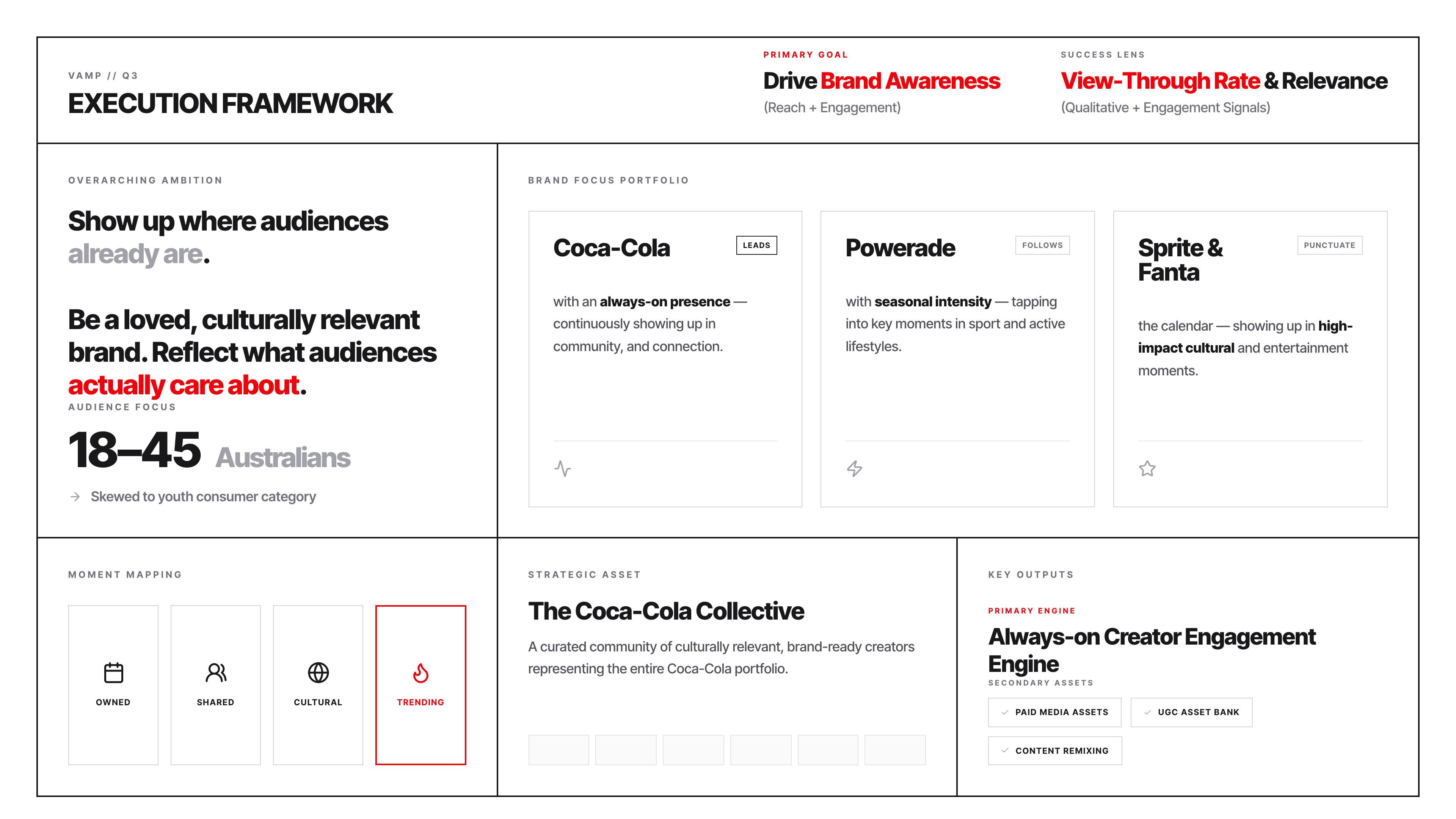
Summary
A rigid, high-precision strategic execution framework on a fixed 1920x1080 canvas, characterized by a utilitarian 2px black grid, Inter Tight typography, and selective use of semantic red (#F40009) to highlight primary goals and trending data.
Style
The design centers on 'Utilitarian Precision'. It uses a pure white (#FFFFFF) background with dark zinc (#18181B) borders and text. All corners are 90-degree sharp (0px radius). Typography relies on Inter Tight, ranging from 400 (regular) to 900 (black) weights. A strategic red (#F40009) is used sparingly to denote 'Critical Path' or 'High Importance' items. No shadows, gradients, or soft styling are permitted.
Layout & Structure
The framework is divided into three primary horizontal tiers: a thesis header, a core strategy grid with split columns, and an execution trinity for tactical outputs.
Global Container
Header Tier
Core Strategy Section
Execution Trinity
Components
Strategic Status Tag
Small, high-precision status indicators found in card headers.
Moment Grid Cell
Equal-sized interactive or static cells for mapping activities.
Output Badges
Horizontal badges for listing deliverables.
Special Notes
Must strictly adhere to 0px border-radius. Every border must be #18181B or #D4D4D8. Red (#F40009) must never be used for backgrounds, only for text highlights and primary status borders. Ensure all uppercase labels have a tracking of 0.25em for readability.