Split Bill — Enhanced Dashboard
A playful and friendly fintech dashboard style with a cartoony aesthetic. Features a soft sky blue theme, high-radius components (28px-32px), and a modular grid layout. Ideal for personal finance, bill splitting, social budgeting, and casual lifestyle apps. It utilizes a soft-glassmorphism approach for activity feeds and a high-contrast dark mode for data insights. Keywords: playful, friendly, sky blue, fintech, bill splitting, dashboard, rounded corners, glassmorphism, horizontal scroll, bento-inspired.
Summary
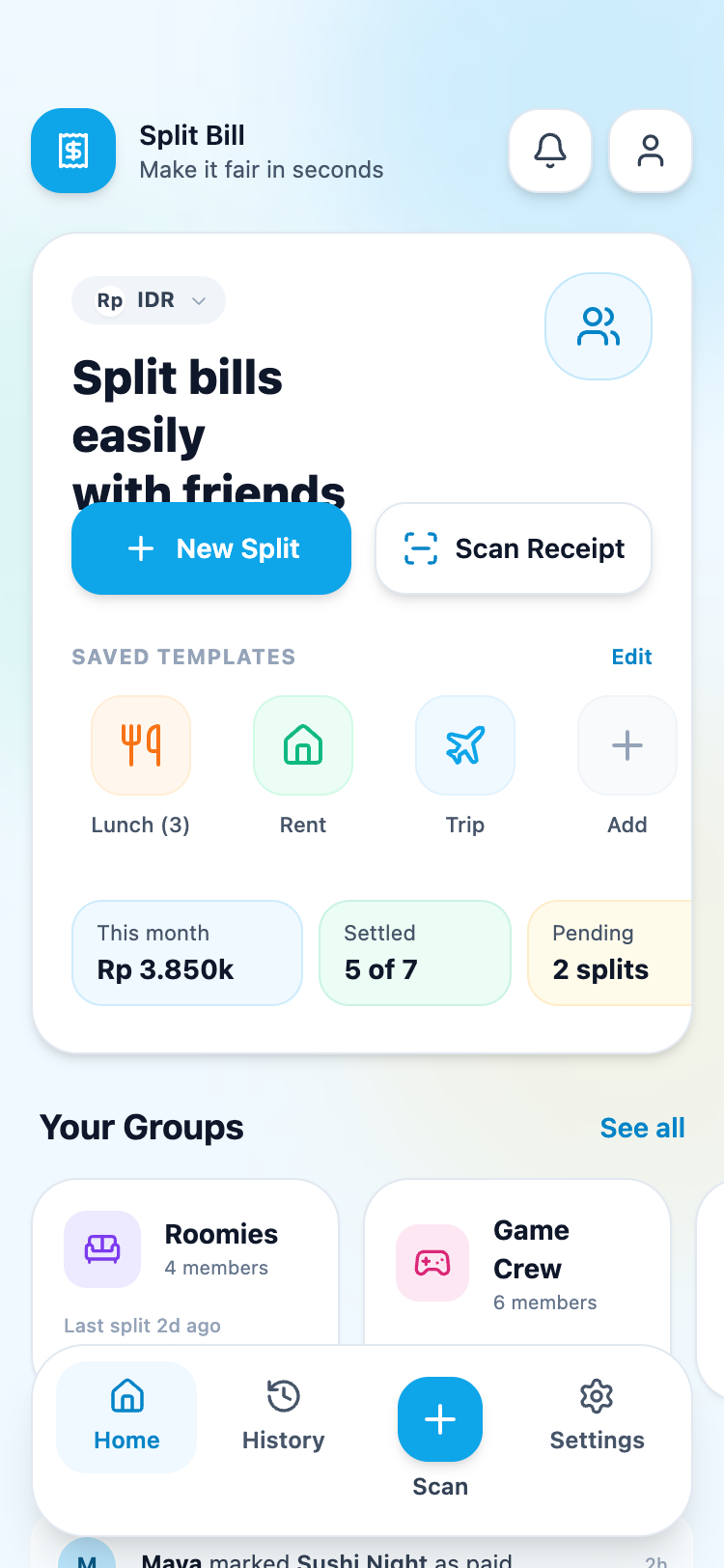
A friendly, cartoony financial dashboard featuring a light sky-blue color palette (#0ea5e9), ultra-rounded components, and distinct sections for quick actions, templates, group management, and spending insights. The UI uses soft drop shadows (shadow-md) and background blur effects for a modern, accessible feel.
Style
The style is characterized by its soft, vibrant palette and high corner radii. Typography uses a sans-serif stack (Slate) with weights ranging from font-medium to font-extrabold to create a clear hierarchy. Colors are used semantically: #0ea5e9 for primary actions, #10b981 (emerald) for success/paid states, and #f59e0b (amber) for pending/warning states. Components use thick borders (border-slate-200) and soft background blurs (backdrop-blur-sm) to differentiate layers.
Layout & Structure
A vertical-scroll mobile dashboard featuring a persistent floating bottom navigation and a fixed header. Content is organized into semantic sections: Hero/Action card, horizontal groups list, vertical activity feed, and a dark-mode insights card.
Header
Hero Action Card
Group Management Section
Activity Feed
Spending Insights Card
Floating Bottom Navigation
Components
Currency Selector Pill
Small toggle pill for switching application currency.
Status Badge
Contextual labels for payment or activity status.
Avatar Stack
Visual representation of group members or participants.
Special Notes
MUST: Use specific font weights (800 for main titles, 400 for subtext). MUST: Maintain high border-radius consistency across all components. MUST: Use subtle background blur (backdrop-blur-sm) on white/60 surfaces for depth. DO NOT: Use sharp corners or harsh black shadows. DO NOT: Use high-contrast borders; keep them subtle (#e2e8f0).