Split Detail Page
Designed for news platforms, editorial blogs, and content-heavy SaaS applications, it utilizes a wireframe-inspired aesthetic with high-contrast typography, generous whitespace, and collapsible modular sections. Key features include glassmorphism headers, sticky bottom action bars, and structured meta-data grids.
Summary
A high-end editorial mobile design system for long-form content, prioritizing readability through serif typography and modular organization via collapsible sections and clean dividers.
Style
The style is 'Minimalist Editorial.' It uses a monochrome foundation with subtle blue accents for utility tags. Typography pairs 'Lora' (Serif) for narrative elements and 'Satoshi' (Sans) for functional UI. Visual hierarchy is established through font weight and size rather than color. Components use #F3F4F6 for dividers and #F9FAFB for subtle background fills.
Layout & Structure
A vertical, single-column scrollable layout (375px width) featuring a fixed top navigation, a content-driven hero, modular body sections, and a fixed utility footer.
Fixed Navigation Header
Hero & Meta Section
Editorial Body Section
Collapsible Modular Sections
Fixed Utility Footer
Components
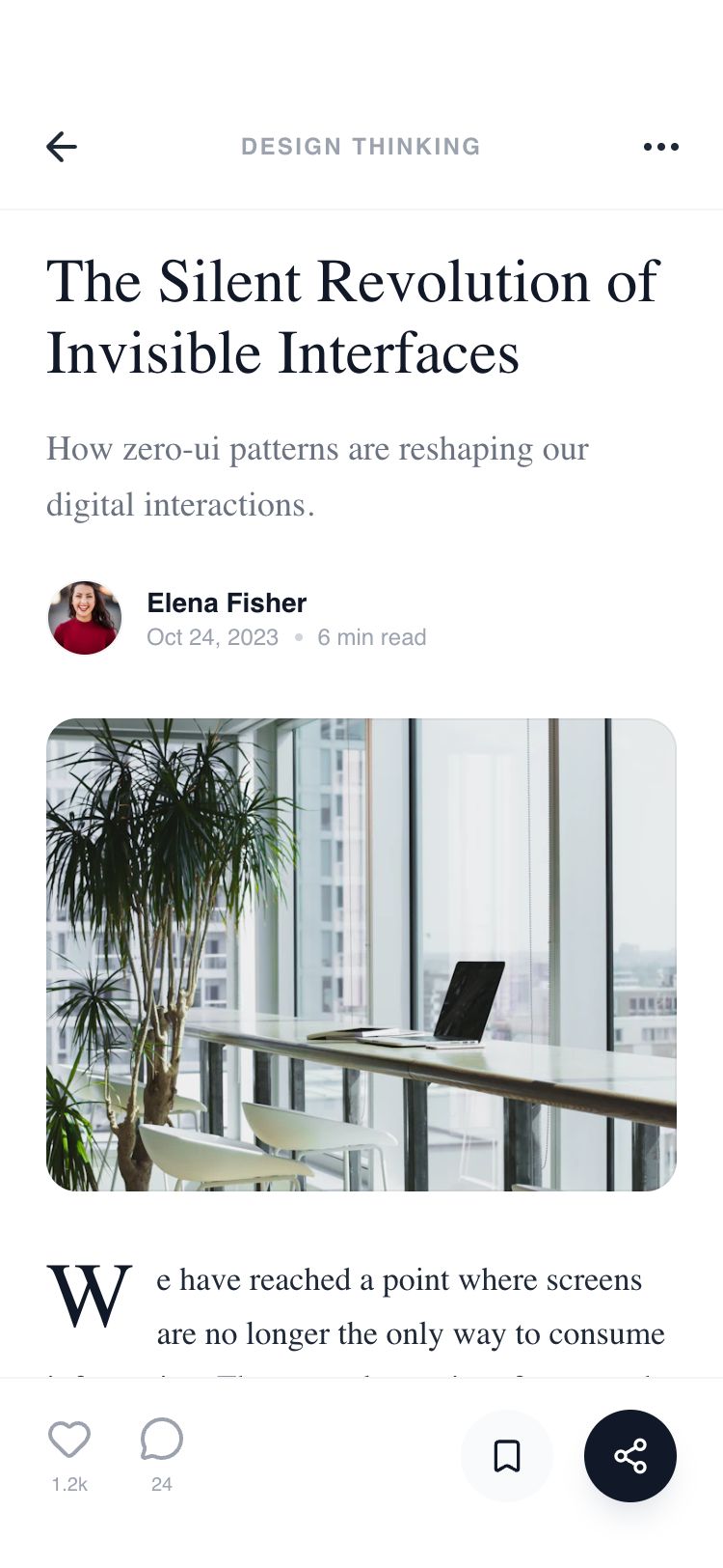
Drop Cap Narrative Start
A stylized opening character for editorial sections.
Metric Insight Cards
A 3-column grid for article engagement stats.