Summary-to-Detail Dashboard
A top-down hierarchy starting with a single primary summary, followed by compact secondary metrics and a detailed breakdown section. Best Suitable For Fintech, health tracking, analytics, enterprise SaaS, data-heavy apps.
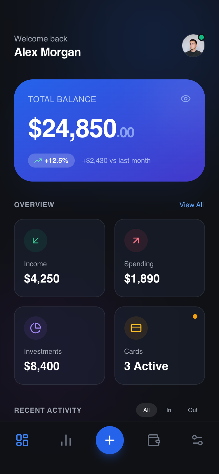
Summary
Create a sophisticated dark-themed mobile dashboard using a modular component system. The design features a high-impact primary summary card with a blue-indigo gradient, a responsive 2-column grid of glassmorphic metric cards, and a scrollable detail list for activity tracking. The interface relies on subtle depth, 12px backdrop blurs, and sharp typography to convey financial security and modern elegance.
Style
The style is defined by a 'Glass-Dark' aesthetic. Primary font: General Sans (Semi-bold for headers, Medium for labels). Palette: Deep Charcoal (#0F1115) background, Primary Blue (#2563EB), and functional accents (Emerald #10B981, Rose #F43F5E, Amber #F59E0B). UI elements use 1px white/8% borders and 12px backdrop-filter blurs to create glass panels.
Layout & Structure
A vertically stacked mobile layout consisting of a fixed header, a scrollable main content area with three distinct modular sections (Primary Hero, Secondary Grid, Detail List), and a fixed bottom navigation bar with a floating action button.
Header
Primary Summary Section
Metric Grid
Activity List
Bottom Navigation
Components
Glass Panel Metric Card
A reusable interactive card for secondary data visualization.
Micro-Interaction Activity Row
A dense list item optimized for scannability and touch interaction.
Special Notes
MUST: Maintain a strict 24px (1.5rem) horizontal padding across all sections for consistent alignment. DO NOT use solid black (#000) for the background; use #0F1115 for depth. MUST: Use semantic icons (like Lucide) consistent in line weight (2px). MUST: Ensure 'modular' structure—each section must be wrapped in its own container to allow removal without impacting the layout of other modules.