Superdesign Editorial Waitlist
Editorial waiting list landing page with a cinematic, high-fashion aesthetic. Features a deep matte #181818 background, warm beige #EBDCC4 typography, and a brutalist yet refined grid. Key elements include oversized edge-to-edge display type, subtle noise textures, and a layered text depth effect. Ideal for luxury tech, creative agency portfolios, high-end SaaS tools, architecture firms, and invite-only exclusivity campaigns. Layout utilizes strong typographic hierarchy and generous negative space with accent tones in coral, rust, and sage.
Summary
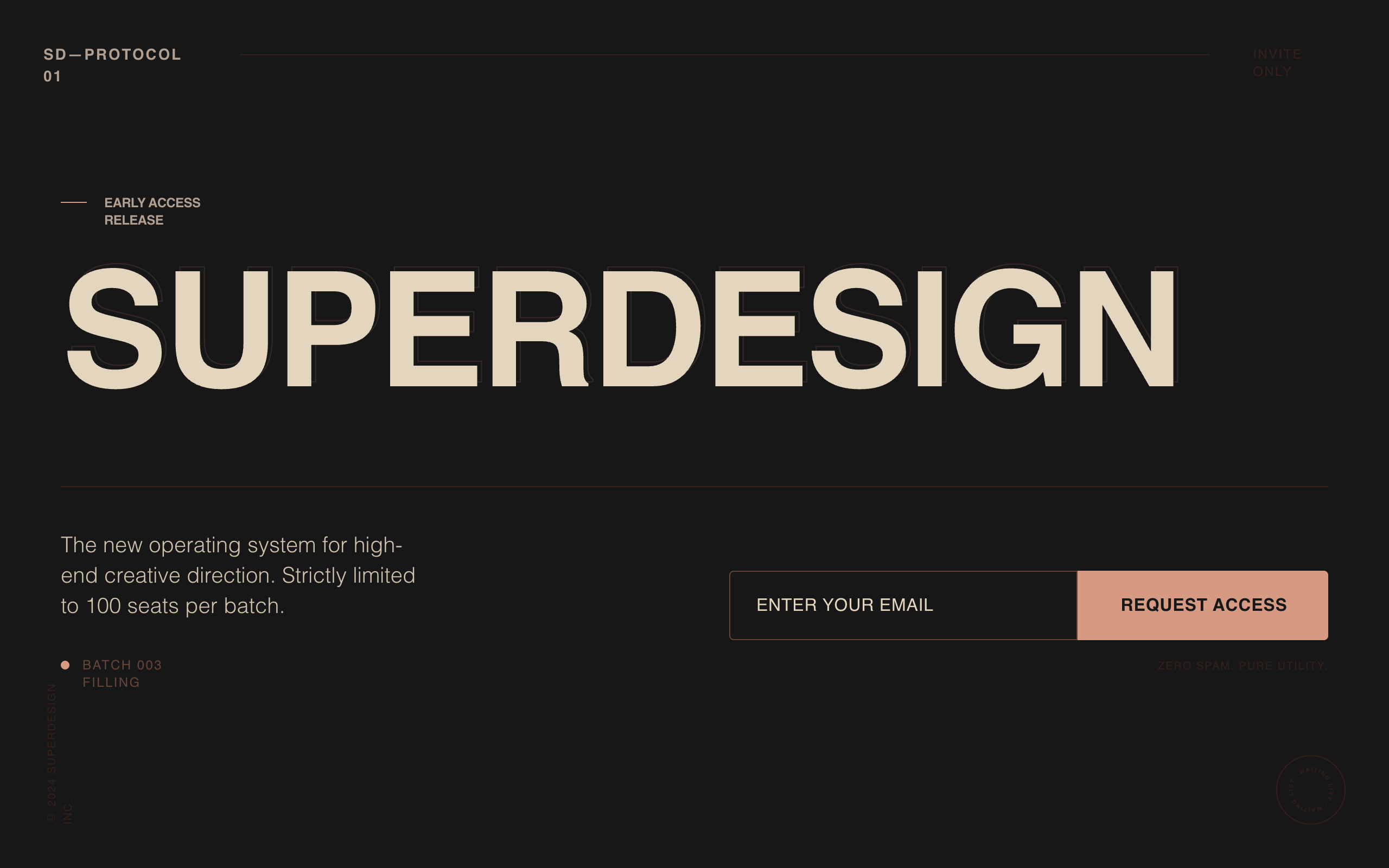
A minimalist, editorial-inspired landing page designed to convey 'quiet confidence' and exclusivity. It uses a dark matte palette with warm earth-toned accents, oversized uppercase typography, and a distinct lack of traditional SaaS elements like icons or soft shadows. The focus is on typographic impact and a structured grid alignment.
Style
The style is defined by a 'Cinematic Editorial' aesthetic. It uses 'Clash Grotesk' for bold, oversized headlines and 'General Sans' for legible, high-end body copy. Colors are earthy and dark: matte charcoal (#181818), warm beige (#EBDCC4), and coral-rust accents (#DC9F85). A subtle 3% opacity fractal noise overlay provides texture. No pill shapes or gradients; strictly 4px rounded corners and 1px solid borders.
Layout & Structure
A vertically structured page with a fixed minimal navigation, an oversized hero section, and a grid-based bottom container for the statement of exclusivity and the email capture form.
Minimal Navigation
Hero Headline Section
Bottom Content Grid
Email Capture & Footer
Components
Rotating Waitlist Badge
An animated circular badge indicating current status.
Cinematic Text Layering
A depth-effect headline style using outlines.
Special Notes
MUST DO: Ensure the background noise overlay is fixed and covers the entire viewport. MAINTAIN strictly tight line-height (0.85) for headlines. MUST NOT: Use gradients, box shadows, or rounded 'pill' buttons. Keep the color palette limited to the specified earthy tones to avoid a generic 'tech' look.