TERRA | Organic Luxury Living
TERRA is a minimal luxury editorial design system characterized by a warm earthtone palette (terracotta, sage, cream) and sophisticated typography. It blends high-end editorial aesthetics with organic, nature-inspired minimalism. Suitable for premium lifestyle brands, sustainable furniture, artisanal ceramics, high-end skincare, and architectural studios. Features include bento-style galleries, editorial hero sections with italicized serif accents, and extreme letter-spacing for utility text.
Summary
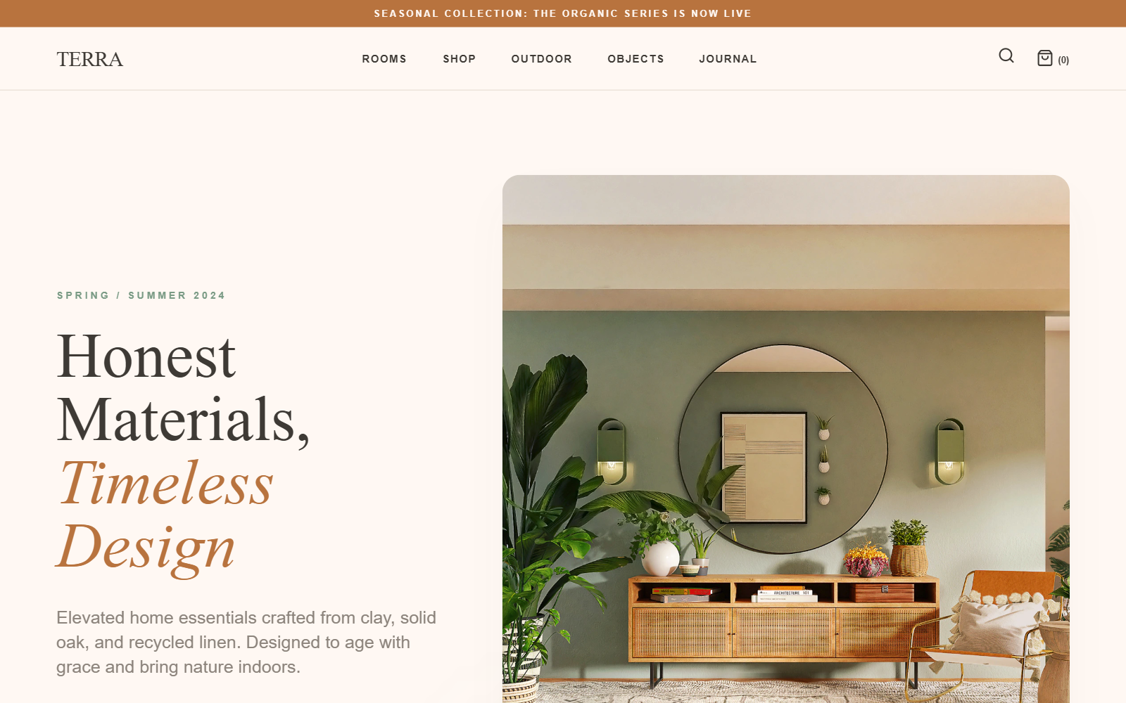
A luxury lifestyle landing page with a warm, organic aesthetic. It uses a cream-colored backdrop, deep charcoal text, and terracotta/sage accents. The layout follows an editorial structure with high-contrast serif typography and generous whitespace to create a sense of 'quiet luxury'.
Style
The style is built on 'Organic Minimalism'. It pairs the modern utility of Inter (Sans) with the timeless elegance of Playfair Display (Serif). Colors are grounded in nature: #FFF8F3 (Cream), #3E3A35 (Earth Text), #B8733E (Terracotta), and #7A9B85 (Sage). Visuals use soft 20px rounded corners, subtle shadows, and slow, cinematic hover transitions (duration 1000ms+).
Layout & Structure
Modular editorial layout starting with a thin notification bar, followed by a sticky minimal header. Content sections alternate between high-density grids (6-column) and immersive, high-impact cards or full-width imagery.
Announcement Bar
Sticky Header
Editorial Hero Section
Category Selection Grid
Featured Collection Cards
Captured Calm Gallery
Immersive Footer
Components
The 'Arch' Primary Button
A high-contrast pill-shaped CTA.
Editorial Featured Card
Immersive image cards with typography overlays.