The Typographic Duel
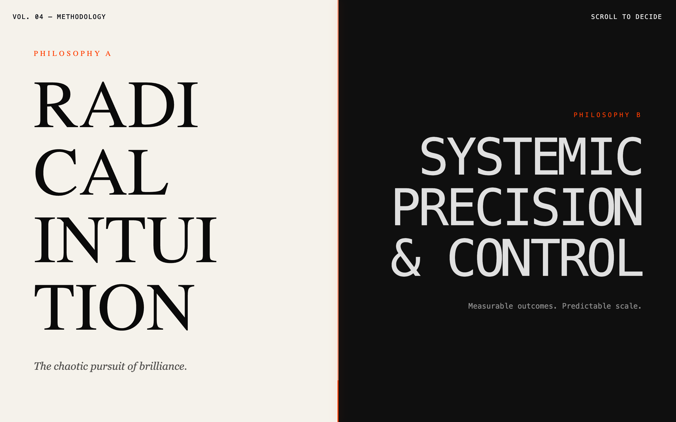
The Typographic Duel is a high-contrast, philosophical comparison layout designed for SaaS, agencies, or products that stand in direct opposition to status-quo methodologies. This design system utilizes a permanent split-screen structure to frame competition as a head-to-head narrative battle rather than a checklist. It features a dual-typography approach pairing expressive, serif-heavy styles with rigid, utilitarian monospace fonts. Key aesthetics include an editorial 'manifesto' layout, a centered tension line, scroll-triggered side-slide animations, and a restricted color palette of off-white (#F5F2EB), charcoal (#0F0F0F), and a vibrant orange-red (#FF3D00) accent. Ideal for high-intent marketing where brand identity and 'way of thinking' are the primary differentiators.
Summary
A split-screen design system that pits two opposing philosophies against each other through extreme typographic contrast, staggered vertical rhythms, and a fixed center divider that acts as a visual tension line.
Style
The style is built on the concept of 'Narrative Friction.' It contrasts an organic, artist-led aesthetic (warm paper tones, expressive serif) with a cold, engineer-led aesthetic (charcoal tones, monospace). The interface avoids gradients and shadows, opting for raw, graphic-driven hierarchy. Motion is directional: elements slide from their respective sides toward the center upon intersection.
Layout & Structure
A vertical-scrolling, permanent split-screen layout where the center axis remains fixed. Content is often staggered vertically to create an intentional imbalance, forcing the eye to zigzag across the tension line.
Navigation
Hero Standoff
Staggered Workflow
Outcome Statements
The Choice Moment
Final Alignment CTAs
Components
Animated Tension Line
A fixed 2px vertical divider that acts as the focal point of the page.
Psychographic Cards
Minimalist sections focusing on the 'Who' rather than the 'How'.
Special Notes
MUST: Maintain the 50/50 split at all times on desktop. MUST: Use the center accent line as a constant anchor. MUST: Invert text colors strictly between the two sides. DO NOT: Use gradients, drop shadows, or rounded corners. DO NOT: Use traditional comparison tables; the 'duel' must be narrative. DO NOT: Mix the typography (Cinzel stays on the left, Space Mono on the right).