Updated Contact Information for HILIOX Energy
A high-contrast, professional renewable energy and tech-forward design system. Features a 'Forest Green' primary palette (#228B22) paired with 'Industrial Blue' (#0D47A1) and 'Sunset Orange' (#FF6B35) accents. Characterized by 'Sora' and 'Poppins' typography, generous 3rem rounded corners, and asymmetric image grids. Optimized for sustainability sectors, solar energy, cleantech, and professional engineering services. Incorporates micro-interactions like floating status pulses and 'hover-lift' transitions.
Summary
A clean, modern corporate style for renewable energy providers, featuring a crisp white background, bold sans-serif typography, vibrant green accents, and large-radius rounded containers. The layout uses bento-grid inspiration and asymmetric image layouts to create a high-trust, technical, yet approachable aesthetic.
Style
The style uses 'Sora' for high-impact headings (ExtraBold) and 'Poppins' for readable body text. Color palette: Forest Green (#228B22) for growth/energy, Industrial Blue (#0D47A1) for trust, and Sunset Orange (#FF6B35) for warmth. Key visual elements include 24px-48px (3rem) border-radii, light gray backgrounds (#F5F5F5) for section separation, and subtle 0.1 opacity shadows. Animations prioritize entrance 'fade-and-slide' and continuous 'pulse' effects for status indicators.
Layout & Structure
A structured, vertical flow with clearly defined sections. It utilizes a sticky navigation header, split hero section with an asymmetric photo collage, and grid-based feature/service areas. Includes high-contrast 'Dark Mode' modules for trust-building content.
Header
Hero Section
Features Grid
Testimonials
Trust/Information Banner
Contact Section
Components
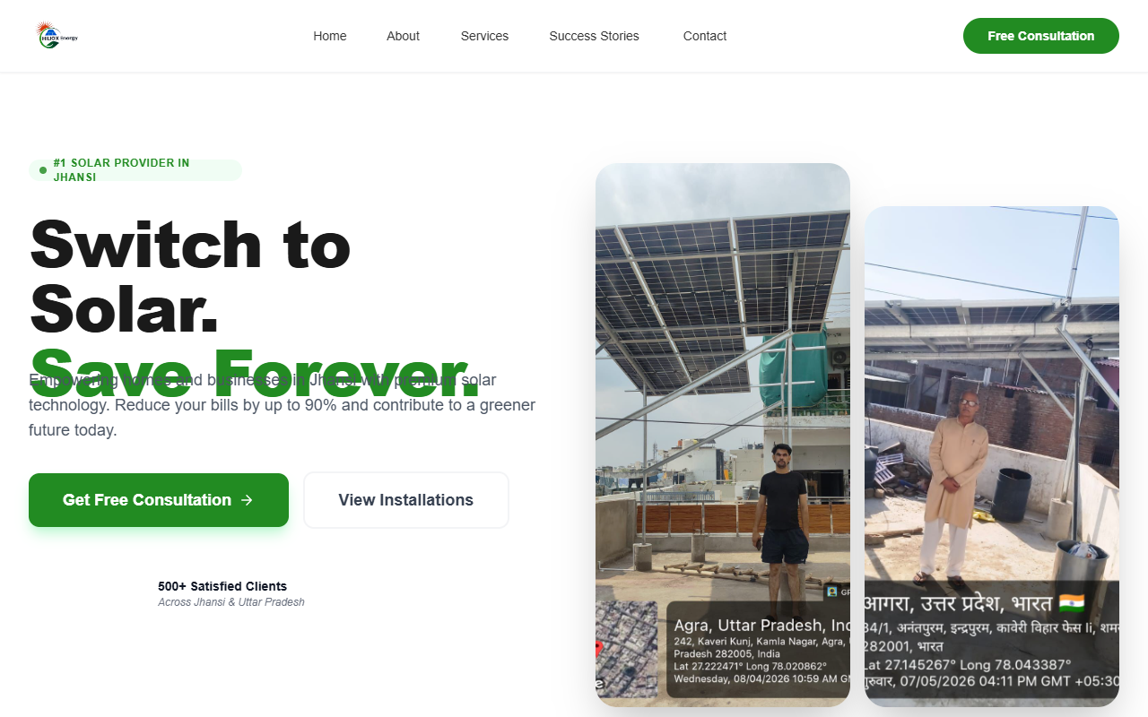
Asymmetric Image Collage
A 2-column image layout with staggered heights.
Glassmorphism Map Tag
Floating location indicator on images.
Special Notes
MUST: Use Sora for all numbers and technical headings to maintain a modern engineering feel. MUST: Maintain a consistent 3rem border radius on large sections to soften the corporate look. MUST: Use specific icon sets like Lucide or similar minimalist stroke icons. DO NOT: Use standard 90-degree corners. DO NOT: Use pure black (#000) for text; use #1A1A1A for optimal readability.