Vrindavan Chandrodaya Temple - Asset Manager
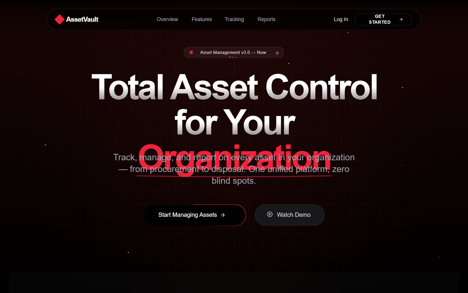
A ceremonial and organized asset management design system with a 'Red Noir' dark aesthetic, infused with warm spiritual accents like saffron and gold. Ideal for religious institutions, NGOs, and traditional organizations requiring robust resource tracking. Features include a bento grid for capabilities, a star-parallax background, glassmorphism dashboard elements, and high-contrast status labeling. Layout elements include a hero section with a badge, a stats horizontal strip, and a detailed asset tracking table with 'Active/Returned/Pending' statuses.
Summary
A sophisticated dark-mode management interface that blends spiritual ceremony with technical precision. It uses a high-contrast palette of deep blacks, vibrant reds (#ef233c), and warm golds (#d4a843) to convey both authority and devotion. The design centers around the lifecycle of assets (Issuance, Tracking, Return) using modern UI patterns like bento grids and animated border gradients.
Style
The style is 'Spiritual Industrial' - combining the clean, data-heavy look of SaaS dashboards with ceremonial colors. Typography pairs Manrope (for bold, spiritual headings) and Inter (for clean, legible data). The palette relies on #000000 background with accents of #ef233c (Red), #f59e0b (Saffron), and #d4a843 (Gold). Micro-interactions include glowing pulse effects, conic-gradient spinning borders on primary buttons, and a subtle floating animation for floating cards.
Layout & Structure
A vertical-scrolling landing page structure transitioning into a comprehensive data management dashboard view.
Navbar
Hero Section
Stats Horizontal Strip
Features Bento Grid
Asset Tracking Dashboard View
Testimonial Banner
Footer
Components
Shiny CTA Button
A button with a continuous spinning colorful border.
Status Pill Labels
High-contrast small labels for item states.
Starfield Background
Animated parallax star background.
Special Notes
Must maintain the 'Sacred' tone in copywriting (using terms like Seva, Devotion, Sacred Items). Must use the specific accent red #ef233c against black for high-urgency items like 'Overdue' status. Do not use generic bright colors outside of the saffron/red/gold/emerald status palette. Ensure all dashboard mockups include a 'pencil/edit' icon for every record to emphasize management capability.