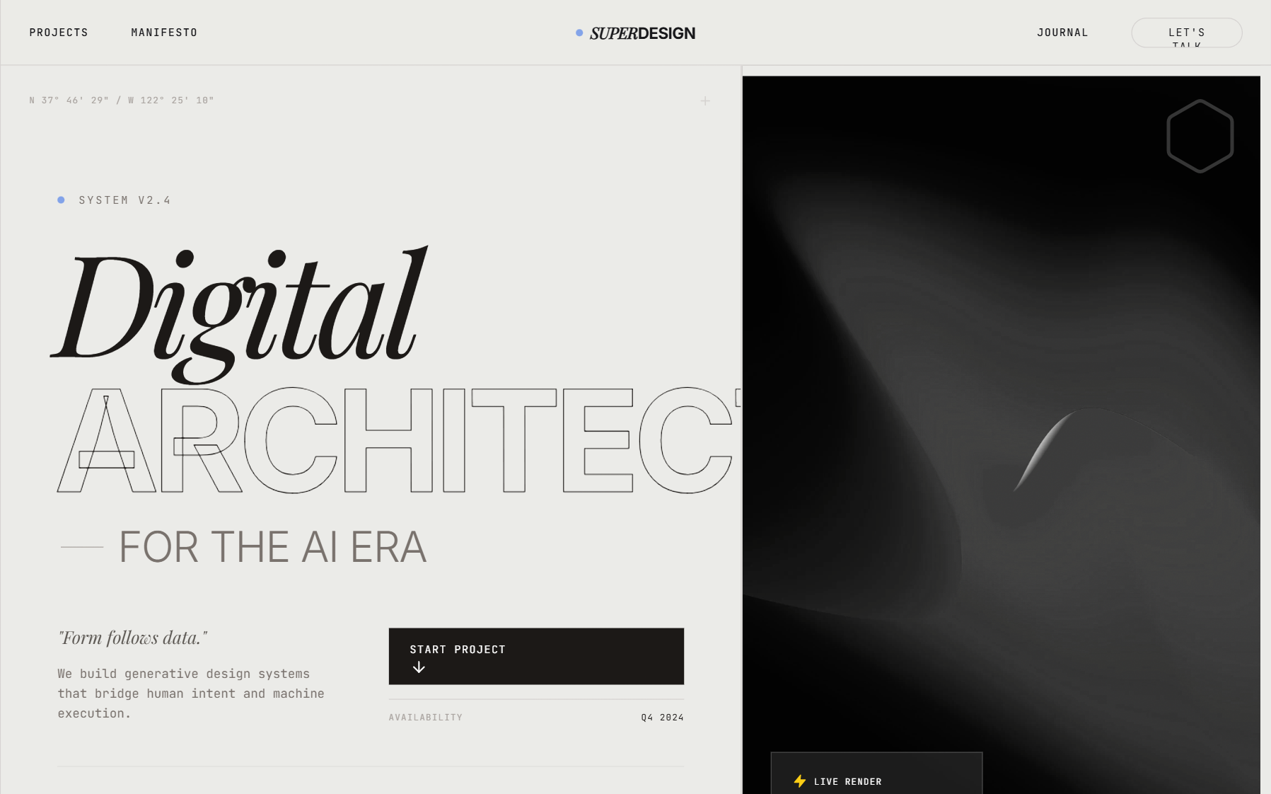
Warm Industrial Gray Style
A sophisticated warm industrial aesthetic that blends brutalist grid structures with editorial typography. Featuring a primary palette of warm concrete gray and rich charcoal accented by electric blue, this style is ideal for AI startups, creative technology studios, fintech platforms, and architecture portfolios. It utilizes a high-contrast pairing of heavy grotesque sans-serifs and elegant serif italics, layered over a subtle film grain noise texture. Key features include scroll-triggered reveals, magnetic hover states, and structural grid-line overlays that emphasize a 'form follows function' technical philosophy.
Summary
An industrial-chic design system centered on structural grids, warm gray tones, and high-impact editorial typography with technical 'readout' accents.
Style
The style is defined by its 'Warm Industrial' palette (#EBEBE8 background) and technical precision. It uses 'Inter' for structural UI and 'Playfair Display' for editorial flair. Animation is characterized by smooth, high-inertia transitions (cubic-bezier(0.16, 1, 0.3, 1)) and clip-path reveals. A constant 4% opacity fractal noise overlay provides a tactile, analog feel to the digital interface.
Layout & Structure
The layout is built on a rigid 12-column grid system, where sections are divided by explicit 1px horizontal and vertical lines. It follows a vertical stack of high-impact sections: Navigation -> Split Hero -> Marquee -> Interactive Project List -> Philosophical Parallax -> Technical Journal -> Massive Footer.
Structural Grid
Sticky Header
Hero Section
Marquee Ticker
Project List
Footer
Components
Stroke Text Effect
High-impact display text that uses thin outlines instead of solid fills.
Clip-Path Project Reveal
An image reveal interaction for list items.
Status Pulse
A technical 'live' indicator.
Special Notes
MUST: Maintain the #EBEBE8 background color throughout to preserve the 'warm industrial' feel. MUST: Use strict grid alignment—text and boxes should align perfectly with the 12-column background lines. DO NOT: Use rounded corners on anything except the main CTA buttons and small status badges; keep the layout sharp and rectangular. MUST: Keep the noise texture visible but subtle to avoid making the UI look 'dirty'.