Welcome screen
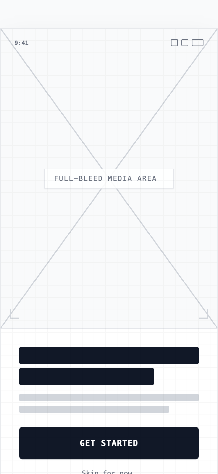
A refined, mobile-first onboarding wireframe style characterized by high-fidelity structural elements. It features a minimalist aesthetic using a neutral grayscale palette (#FFFFFF, #171717, #E5E7EB), clean sans-serif typography (Satoshi), and a device-centric layout. Designed for SaaS, fintech, or lifestyle mobile applications, it emphasizes a vertical three-tier structure: a full-bleed visual area (60% height), an informative text section, and a sticky action footer with high-contrast primary buttons. Suitable for high-intent user journeys where clarity and focus are paramount.
Summary
A minimalist, mobile-first onboarding interface designed for modern app experiences. It utilizes a high-fidelity wireframe approach with a clean neutral color palette, bold Satoshi typography, and a structured layout that prioritizes high-impact visuals and clear call-to-action buttons within the mobile safe zone.
Style
The style is 'Minimalist Hi-Fi Wireframe'. Typography uses 'Satoshi' for a modern, geometric feel; headings are bold and sized around 32px, while body text uses 14-16px with tight line-height. The color scheme is monochrome: pure white (#FFFFFF) backgrounds, deep neutral-900 (#171717) for primary text and buttons, and light neutral-200 (#E5E7EB) for secondary accents and borders. Subtle depth is added via backdrop-blur (12px) and soft shadows (rgba(0,0,0,0.1)).
Layout & Structure
A vertical stack optimized for mobile viewports, divided into three distinct zones: Top (Visual), Middle (Content), Bottom (Action).
Device Mockup Frame
Status Bar & Header
Visual Hero Section
Content Area
Sticky Footer
Components
Wireframe Visual Placeholder
A sophisticated geometric placeholder for hero images.
Interactive Action Button
The primary high-contrast CTA.
Special Notes
MUST maintain the 60px height for primary buttons to ensure high tap-accuracy on mobile. MUST use env(safe-area-inset-bottom) for footer positioning to prevent overlap with OS-level navigation. DO NOT use vibrant colors; stick to the grayscale palette to maintain the wireframe integrity. MUST ensure all text placeholders have rounded corners to match the UI softness.