Zero-State First Home
A deliberately minimal layout built around explanation, placeholder content, and a single primary action. Designed to feel intentional when empty. Best Suitable For Early-stage products, onboarding-heavy apps, tools with user-generated content.
Summary
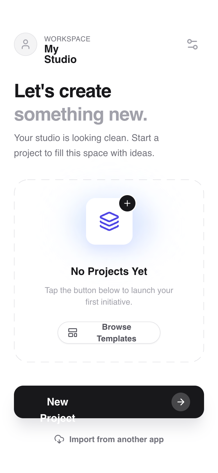
A modern mobile app layout specifically designed for empty or first-use states, featuring a refined vertical hierarchy, editorial typography, and an animated placeholder slot that maintains visual interest without content.
Style
The 'Orbit' style uses the Satoshi sans-serif typeface family with weights ranging from 400 (Regular) to 900 (Black). The color palette is built on the Zinc scale (#18181B for text, #71717A for secondary, #F4F4F5 for backgrounds) with Indigo (#4F46E5) for interactive accents. Visual flair is added through subtle mesh gradients (blur-xl), dashed borders (12px dash, 12px gap), and smooth spring-like micro-interactions. Shadows are soft and layered (indigo-100/zinc-200) to create a sense of depth and elevation.
Layout & Structure
A vertically stacked mobile layout consisting of a fixed-top header, a fluid scrollable main content area with editorial copy and a central placeholder 'slot', and a fixed bottom footer for primary actions.
Header Bar
Welcome Section
Empty State Slot
Footer Action Bar
Components
Animated Icon Anchor
A layered, animated visual centerpiece for the empty state.
Primary Action Arrow Button
A high-visibility button with a nested icon badge.
Special Notes
MUST: Use -webkit-font-smoothing: antialiased for the Satoshi font to maintain premium feel. MUST: Ensure the primary action button has a high-contrast shadow (shadow-zinc-200). DO NOT: Use standard 1px solid borders; use the custom 12px dash pattern for empty states to signify 'available space'. DO NOT: Overcrowd the 'Welcome' section; the white space is critical for the 'clean' aesthetic.