Design prompts for FAQ sections
A good FAQ section does one job: it answers the question a visitor is stuck on before they give up and leave. The ones that work lead with real questions in the user's own words, hide each answer behind a clean accordion so the list stays scannable, mark every row as clickable with a clear toggle, and close with a way to reach a human if the answer is not there. The prompts below are the most-copied FAQ and help-center designs in the Superdesign library, from minimal graphite and Swiss-numbered to glass, editorial serif, and searchable help centers. Open any one to see the exact prompt behind it, then tweak the copy and generate your own editable version in seconds.
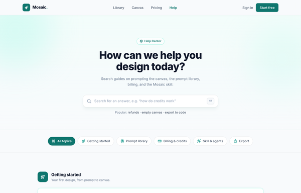
Help Center - Searchable FAQ (Mosaic)
A warm, searchable help-center / FAQ landing page: teal-on-paper palette, sticky blurred nav, gradient hero with a big search field, category filter pills, icon-headed accordion FAQ groups, and a teal gradient support CTA.
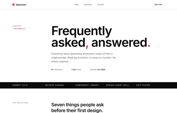
Index / FAQ - Numbered Swiss (International Typographic)
Numbered, Swiss / International-Typographic FAQ rendered as a near-monochrome type specimen: an oversized Inter headline ('Frequently asked, answered.') with red comma + period, a tiny 'Support / Reference' eyebrow column, a full-bleed inverted ink feature rule, and a numbered accordion list under a heavy ink top rule where a Swiss plus glyph (two crossing hairlines) collapses to a single red rule on the one pre-opened row, closed by a black 'Still curious' CTA band, all built from 1px hairlines on a 12-column grid with no cards or shadows.
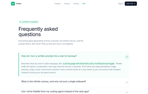
Palette - FAQ (Classic Accordion, Emerald)
A clean, classic single-column FAQ accordion on a light SaaS page: a sticky frosted-white nav, an emerald eyebrow pill with a pulsing live dot, a big tight-tracked Frequently asked questions heading, then full-width question rows split by hairline borders, each with a circular plus-to-x toggle. Opening a row smoothly expands it via a grid-template-rows height animation, washes it faint emerald, paints a 3px emerald accent rail down the left edge and turns the question emerald (single-open, first open by default), and it closes with a friendly Talk to us CTA strip. Emerald #10b981 accent on a cool-slate ink ramp, Inter font, Iconify Phosphor icons.
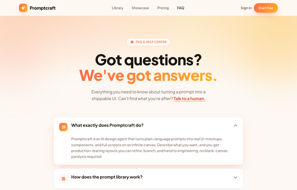
Promptcraft · Answers, sorted (gradient-CTA FAQ)
A warm, friendly FAQ / help-center page on a cream base built around one sunset gradient (coral->amber): a sticky blurred nav, a centered hero with a gradient-clipped 'We've got answers.' headline + a 'FAQ & HELP CENTER' pill over a warm radial wash with blurred blobs, a stack of soft white rounded accordion cards (one pre-opened, lifting on a coral glow with its icon tile swapping to the gradient via a grid-template-rows CSS reveal), a bold full-bleed sunset-gradient CTA card with a frosted-dark reassurance pill, and a minimal cream footer.

Promptly - FAQ (card-grid-pastel)
A friendly, light-mode card-grid FAQ section on a warm cream marketing page: a sticky frosted-cream nav, then a centered header (a 'Help center' eyebrow pill, a big two-line 'Questions, answered the friendly way.' heading with a coral period, and a soft lead) over three pale blurred color blobs, then a responsive 1 / 2 / 3-column grid of rounded-4xl white FAQ cards. Each card is a native <details> disclosure with a circular toggle (sky-blue plus that flips to a coral minus when open) and a smooth grid-template-rows height reveal; open cards lift on a sky-tinted shadow and glow border. Closes with a dark-navy gradient CTA strip ('Can't find your answer?' + a white 'Chat with us' button and a ghost 'Browse the docs' button, over soft coral/sky glows) and a light social footer. Poppins font, cream #fdf9f3 ground, sky #38bdf8 + coral #fb7185 accents, ink #1f2433 text, Iconify Solar icons.
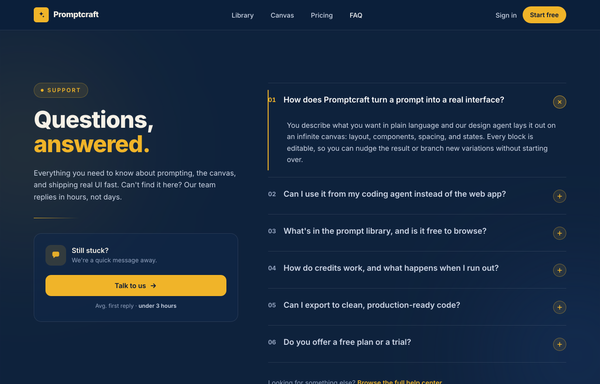
Questions, Answered - Corporate Split FAQ
A two-column split FAQ section on a full-bleed dark-navy marketing page: a sticky frosted navy nav, then a 12-column grid with a sticky left identity column (an amber 'Support' eyebrow pill, a big tight-tracked two-line 'Questions, answered.' heading with the second word in amber, a muted lead, an amber accent rule, and a 'Still stuck?' contact CTA card with a 'Talk to us' button) beside a right-hand numbered accordion (01, 02, ...) of full-width question rows split by hairline white borders, each with a circular amber plus toggle. Opening a row smoothly expands it via a grid-template-rows height animation, paints a 2px amber accent rail down the left edge, turns the question white and the number amber, and rotates the plus 45deg into an x (single-open, first open by default). Subtle dotted grain and two soft ambient glows sit behind it; closes with a dark social footer. Amber #f0b429 accent on a deep navy ramp, Inter font, inline SVG icons.
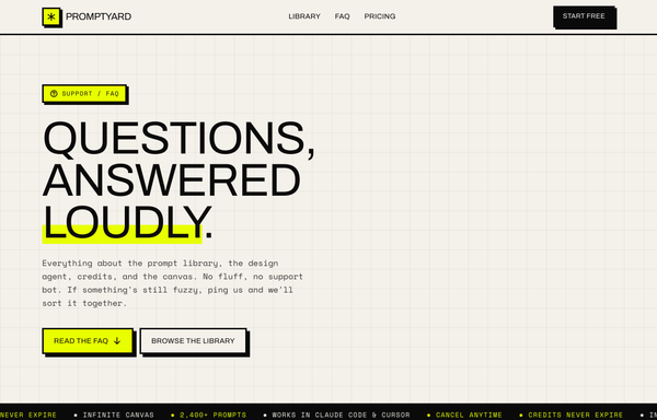
Questions, Answered Loudly - A Brutalist FAQ
Loud neo-brutalist FAQ landing page on warm paper with one acid-yellow accent: a sticky 3px-bordered nav, a graph-paper hero ('Questions, answered loudly.' with an acid underline highlight), a scrolling ink marquee, and a stack of hard-offset-shadow accordion cards (one pre-opened with an acid bar + a plus-to-minus toggle), closed by a black 'Still stuck?' CTA card and an acid pricing band.
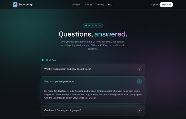
Questions, answered. - Aurora Glass FAQ
Dark glassmorphic FAQ / help-center page: aurora-lit ink canvas, frosted-glass accordion rows grouped by category with one pre-expanded aqua-glow row, sticky blurred nav and a gradient contact CTA.
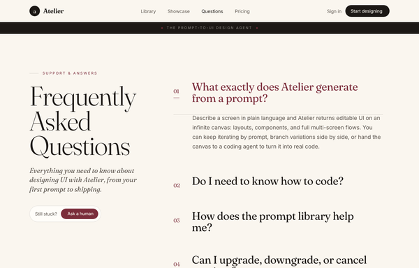
Questions, Set in Serif - An Editorial FAQ
Editorial magazine-style FAQ page on a warm cream canvas: an oversized sticky Fraunces serif 'Frequently Asked Questions' title beside a hairline-ruled column of serif Q/A rows (numbered, rotating plus-to-x, one pre-opened in wine), an ink context band and footer, with a 'Question not here?' contact card.
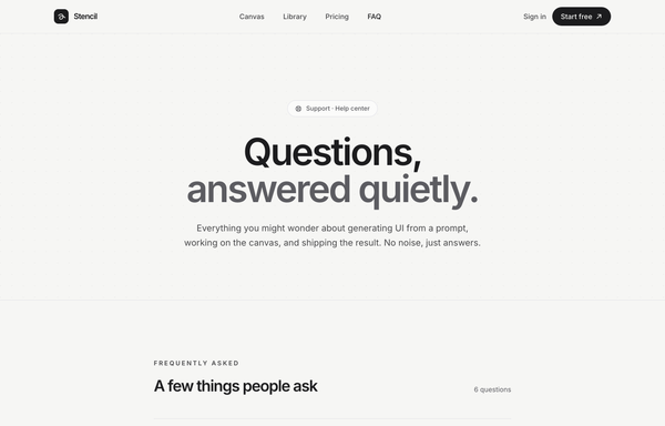
Quiet Answers - Graphite Minimal FAQ
A calm, minimal, monochrome graphite-on-paper FAQ / help-center page set in Inter: a sticky blurred paper nav, a full-bleed dot-grain hero with a huge two-line 'Questions, answered quietly.' headline (line two muted in steel grey), a hairline divider-list accordion of native <details> rows (a circular plus toggle that rotates to an x, answers indented and revealed via a grid-template-rows CSS animation, first item pre-opened, single-open behaviour), and a soft 'Didn't find your answer?' CTA card, all greyscale with one solid-black accent and zero colour.
How to prompt an FAQ section that looks designed, not generated
An AI design agent has a strong default for every part of an FAQ, and most of those defaults read as generic: vague marketing headings, every answer dumped open, no toggle, the Inter typeface on a dark purple gradient, and no way to reach a human. A good prompt is really a list of constraints that override those defaults. Here is each default you need to override, the words that do it, and a template that bakes them all in.
Design an FAQ section for [product], a [what it is] for [who it is for].
Questions: write [6 to 10] in the user's own words, the ones support actually gets. Cover billing, refunds, cancellation, data, and the one objection that blocks a signup. No vague "What makes us different".
Answers: one to three plain sentences each, answer-first, hidden behind an accordion. Open the first row by default so it reads as expandable.
Disclosure: a single-open accordion (opening one closes the last), each answer revealed with a short height animation.
Affordance: a chevron or a plus at the end of each row that rotates to an x when open, and make the whole row clickable.
Findability: past about seven questions, add a search field and a row of category pills (Billing, Account, Privacy).
Contact: close with a "still stuck?" card that links to support, with a reassuring line like "avg first reply under 3 hours".
Layout: a centered single column, or a two-column split with a sticky heading and contact card on the left and the accordion on the right.
Style: a neutral base with one [accent] color reserved for the open state and the CTA. Heading typeface [name], body [name], not the default Inter.
Progressive disclosure
Default: It dumps every answer open at once, so you scroll past nine answers to find the one you came for.
Constrain it: Ask for a collapsed accordion with the first row open by default, so the list stays scannable and you expand only what you need.
Real questions
Default: It writes vague, on-message headings like "What makes us different" that read like marketing, not questions anyone types.
Constrain it: Name the real questions in the user's words: billing, refunds, cancellation, data, the objection that blocks a signup. The ones support actually gets.
The toggle affordance
Default: It leaves the rows with no icon and no open state, so you cannot tell they are even clickable.
Constrain it: Ask for a chevron or a plus at the row end that rotates to an x when open, and make the whole row clickable.
Findability at scale
Default: For a long list it gives you one flat run of questions with nothing to help you jump to your answer.
Constrain it: Past about seven questions, add a search field and a row of category pills like Billing, Account and Privacy.
The way out to a human
Default: The list just stops, so a visitor whose question is not on it hits a dead end with nowhere to go.
Constrain it: Close with a "still stuck?" contact card that links to support, with a reassuring line like "avg first reply under 3 hours".
Color and type
Default: Left alone it defaults to Inter, a dark theme with a purple gradient, and a rainbow palette used as decoration.
Constrain it: Name a heading and body typeface and one accent color on a neutral base, and reserve that accent for the open state and the contact CTA.
Frequently asked questions
What makes a good FAQ section?
Real questions in the visitor's own words, each answer hidden behind a clean accordion so the list stays scannable, a clear toggle on every row, and a way out to a human if the answer is not there. Lead with the questions support actually gets, keep the answers short and answer-first, and reserve one accent color for the open state.
Should an FAQ use an accordion?
Usually yes. Nielsen Norman Group calls FAQ pages a prime accordion candidate, because each question sits in the heading and the answer hides in a collapsed panel, so people scan the questions and expand only what they need. Skip the accordion when visitors need to read most of the answers anyway, or when there are only two or three questions. Keep crucial information outside the panels so it is never hidden.
How many questions should an FAQ have?
Enough to cover the real objections and support tickets, usually six to ten on a marketing page. Past about seven, add a search field and category pills so the list stays findable, which is the help-center pattern. If you are writing more than a dozen, group them by topic instead of one long run.
Why does my AI-generated FAQ look generic?
Because a vague prompt gets the model defaults: vague marketing headings like "What makes us different", every answer dumped open as a wall of text, no toggle, and the Inter typeface on a dark purple gradient. Name the real questions, ask for a collapsed accordion with a clear toggle, add a contact card, set one accent color and a non-default typeface, and it stops reaching for the average.
How do you write a prompt to generate an FAQ section UI?
Describe the brief, not the vibe: the product and who it is for, the real questions in the user's words, short answer-first answers in a single-open accordion, the toggle affordance, a search and category pills for longer lists, a "still stuck?" contact card, the layout, one accent color, and a named typeface. The template above walks through each part, and you can open any example here to see a full prompt that works. Stuck on something? Ping us and we will sort it out together.