Design Prompt Library
A curated, open library of design prompts for building beautiful interfaces — UI design prompts, animation, landing page and visual-style prompts. Pick one of our free AI design prompts and turn it into a real design in seconds.
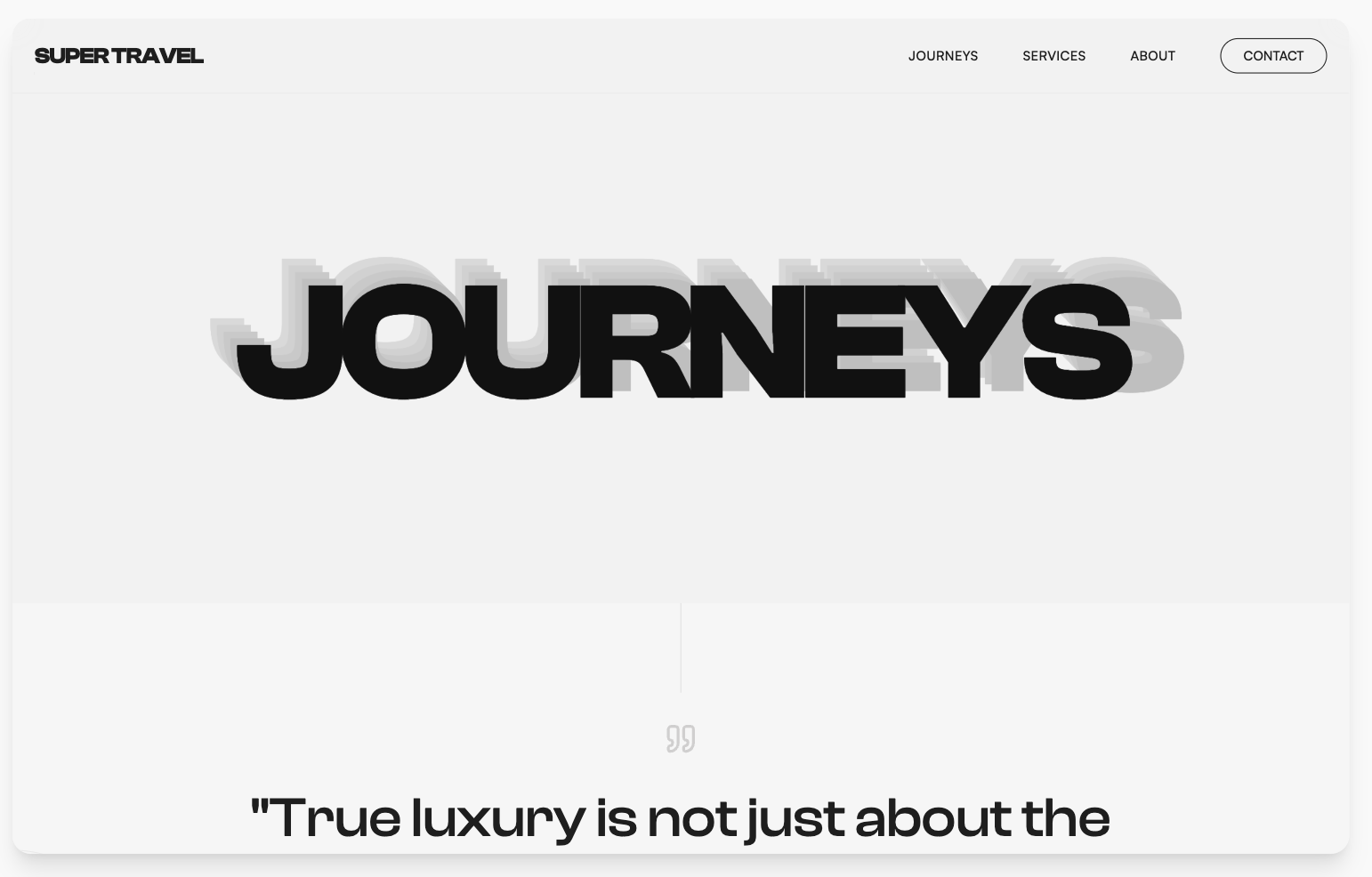
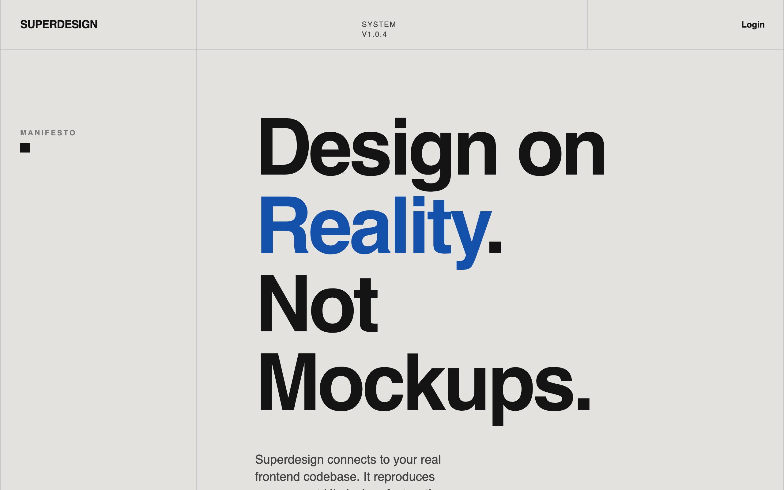
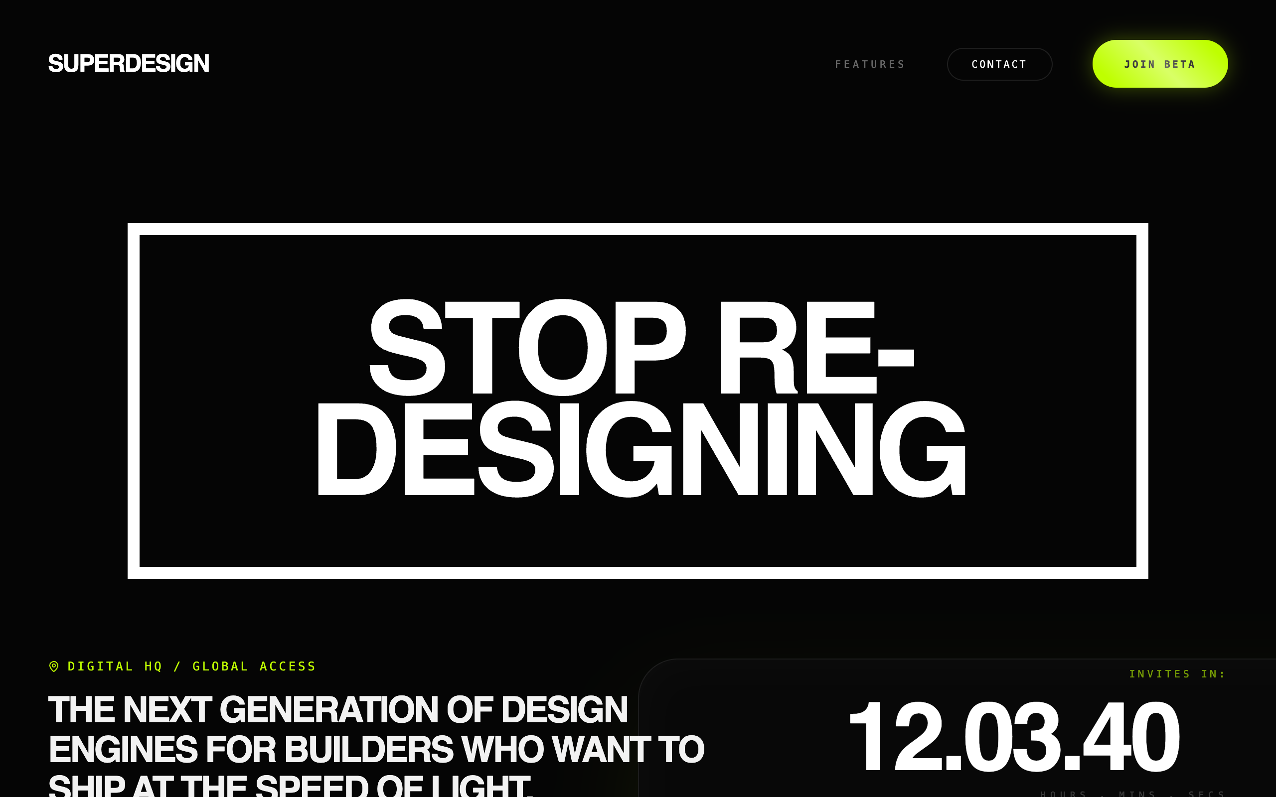
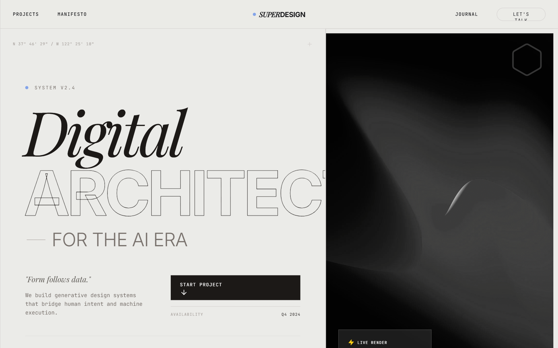
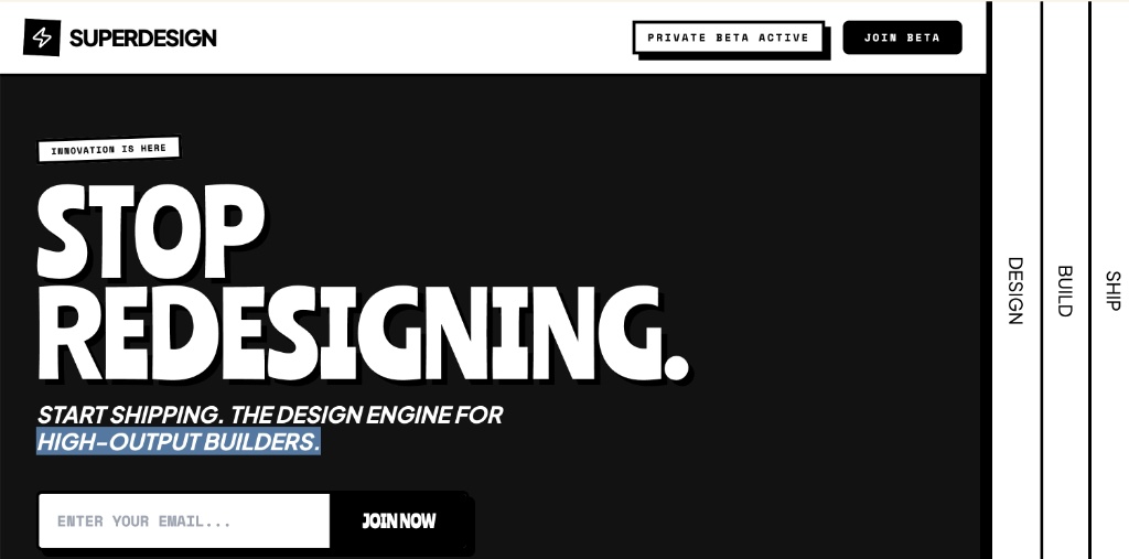
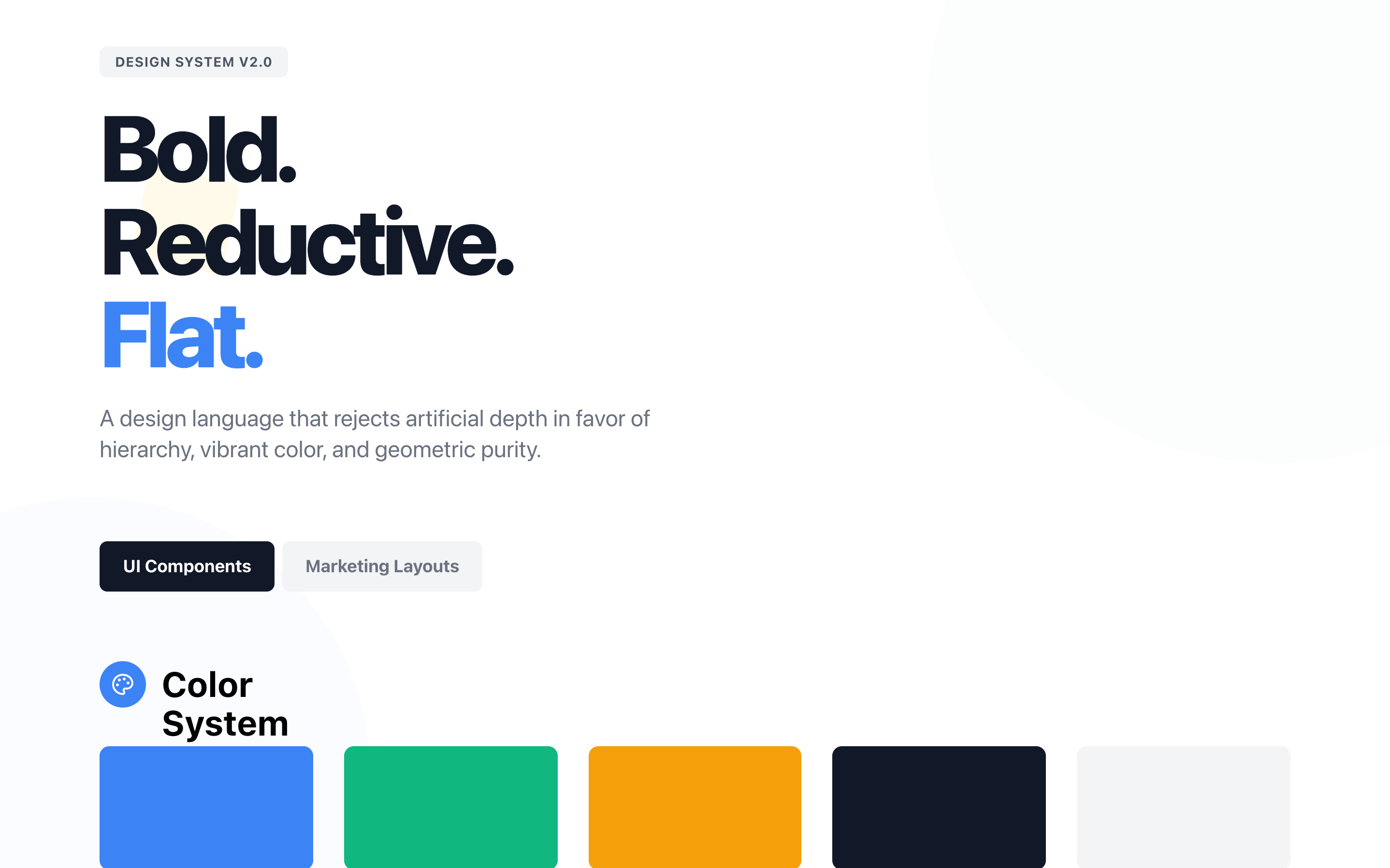
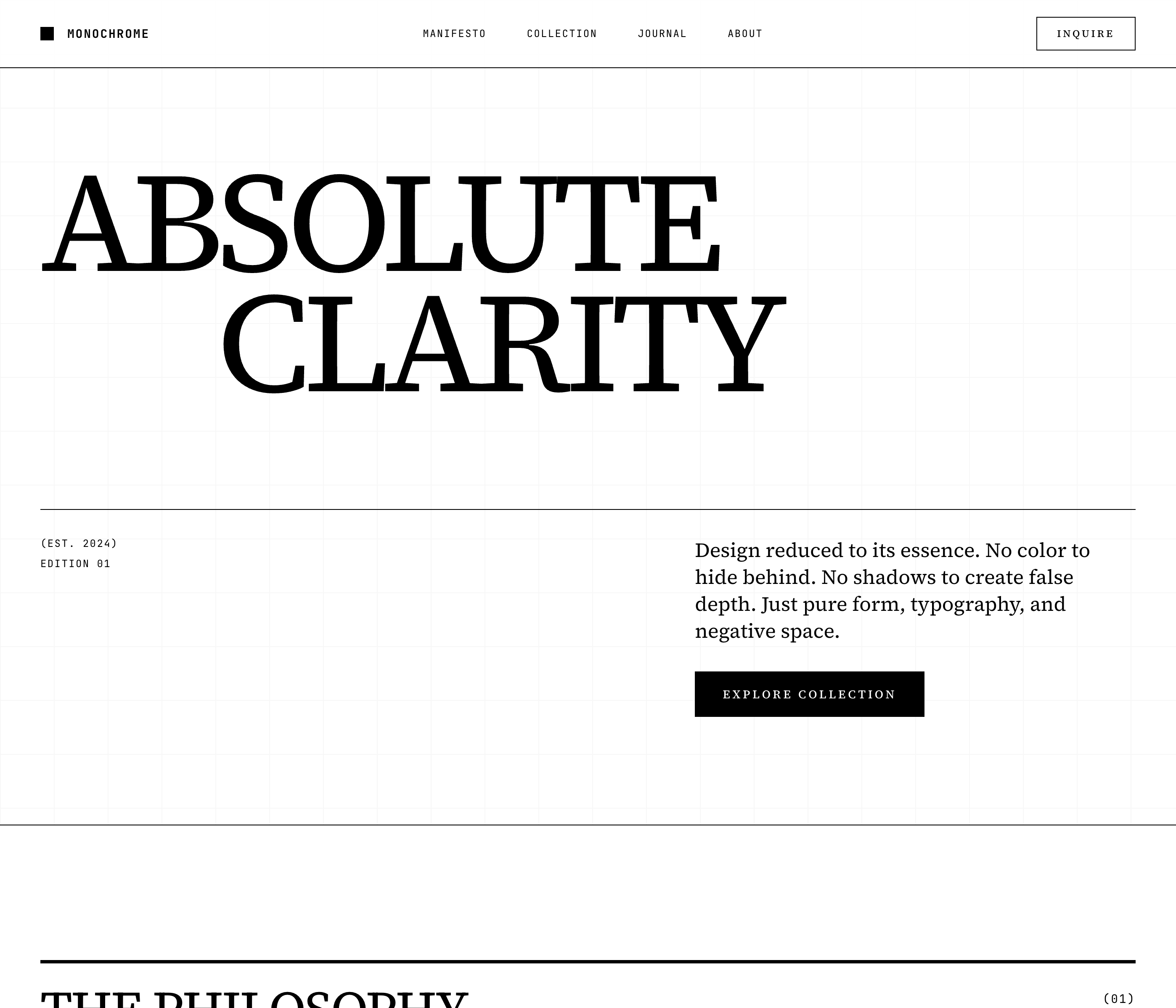
High Contrast Landing Page
A high-contrast Swiss-style minimalist design system utilizing brutalist typography and editorial layouts. Characterized by a neutral palette of off-whites, deep blacks, and monochromatic grays, this style emphasizes rhythmic patterns through stacked text 'echo' effects and asymmetrical grids. Ideal for luxury travel, architecture portfolios, high-end fashion, and premium editorial content where typography acts as the primary visual driver.
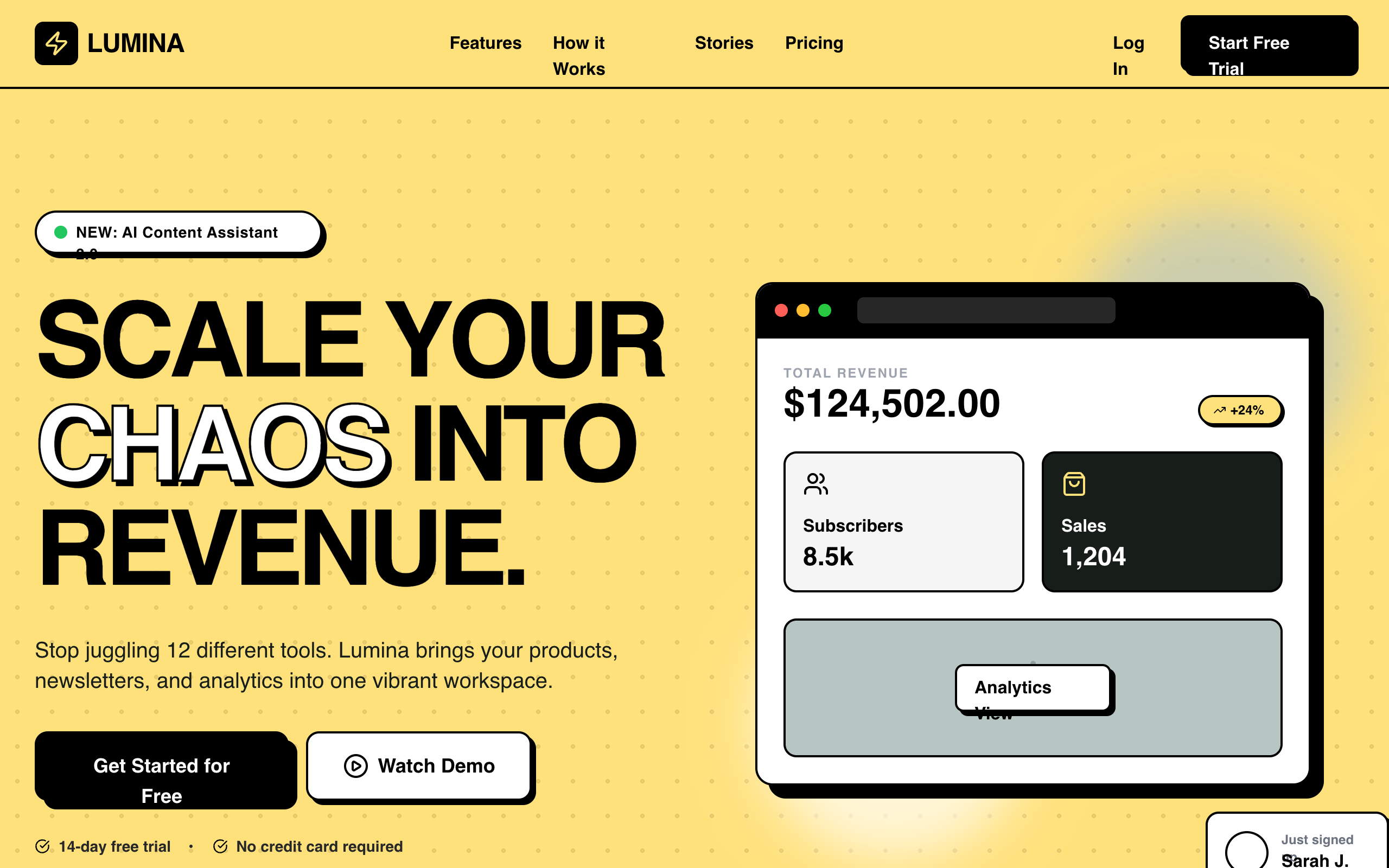
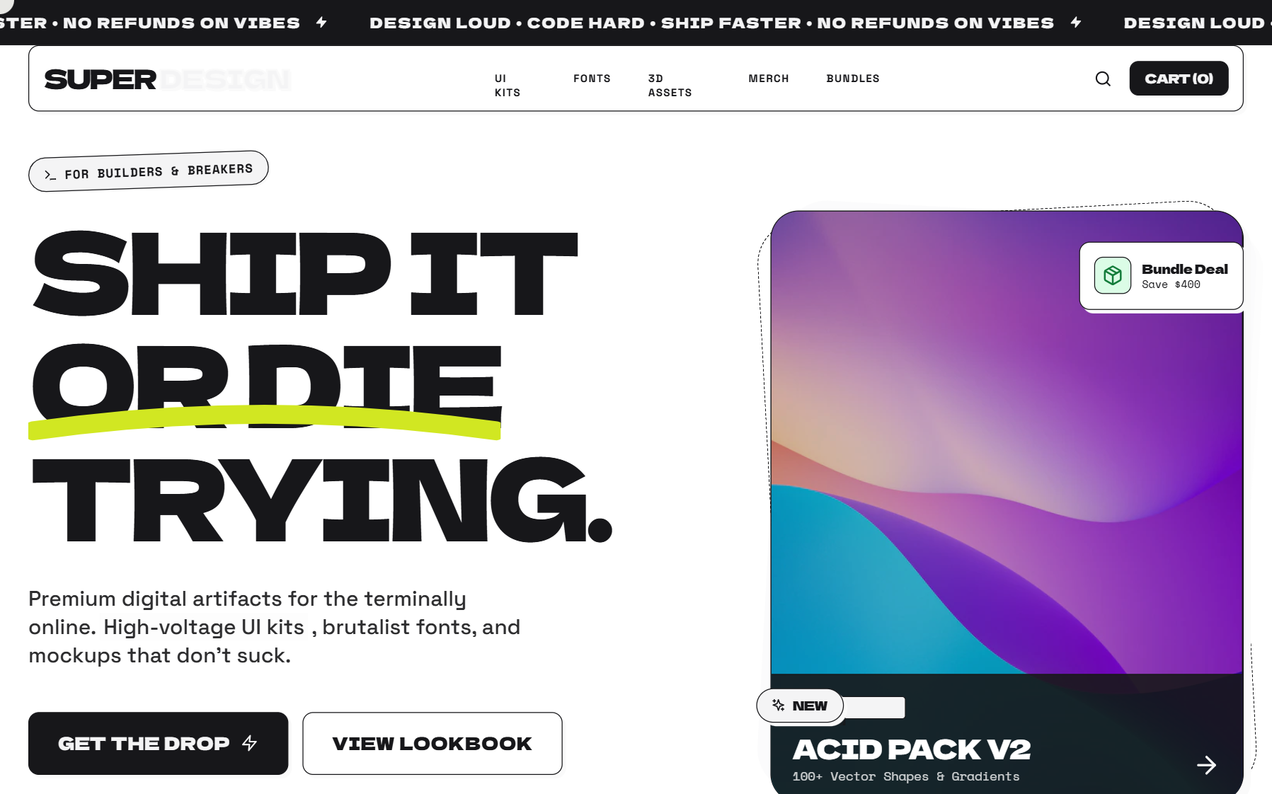
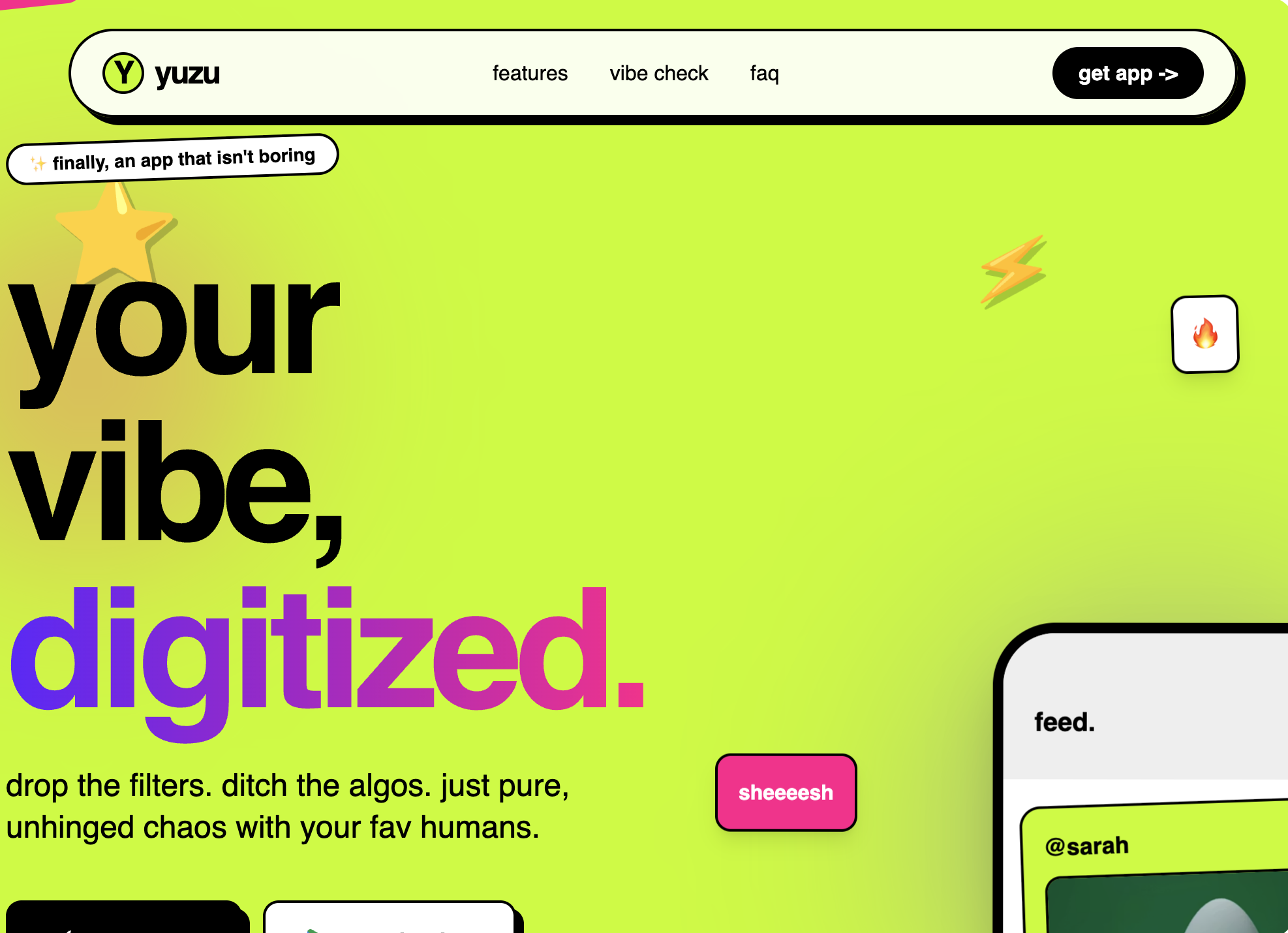
Lumina SaaS Landing Page
Lumina is a high-energy, Neo-Brutalist B2C SaaS design characterized by its bold #ffe17c yellow primary color, heavy 2px black borders, and zero-blur hard shadows. It utilizes a striking combination of 'Cabinet Grotesk' for display-heavy typography and 'Satoshi' for body copy. This style is ideal for the creator economy, modern fintech, edtech, or any startup looking to break the 'clean corporate blue' mold with a confident, high-contrast interface. The layout features bento-style grids, marquee animations, and playful asymmetric card shapes.
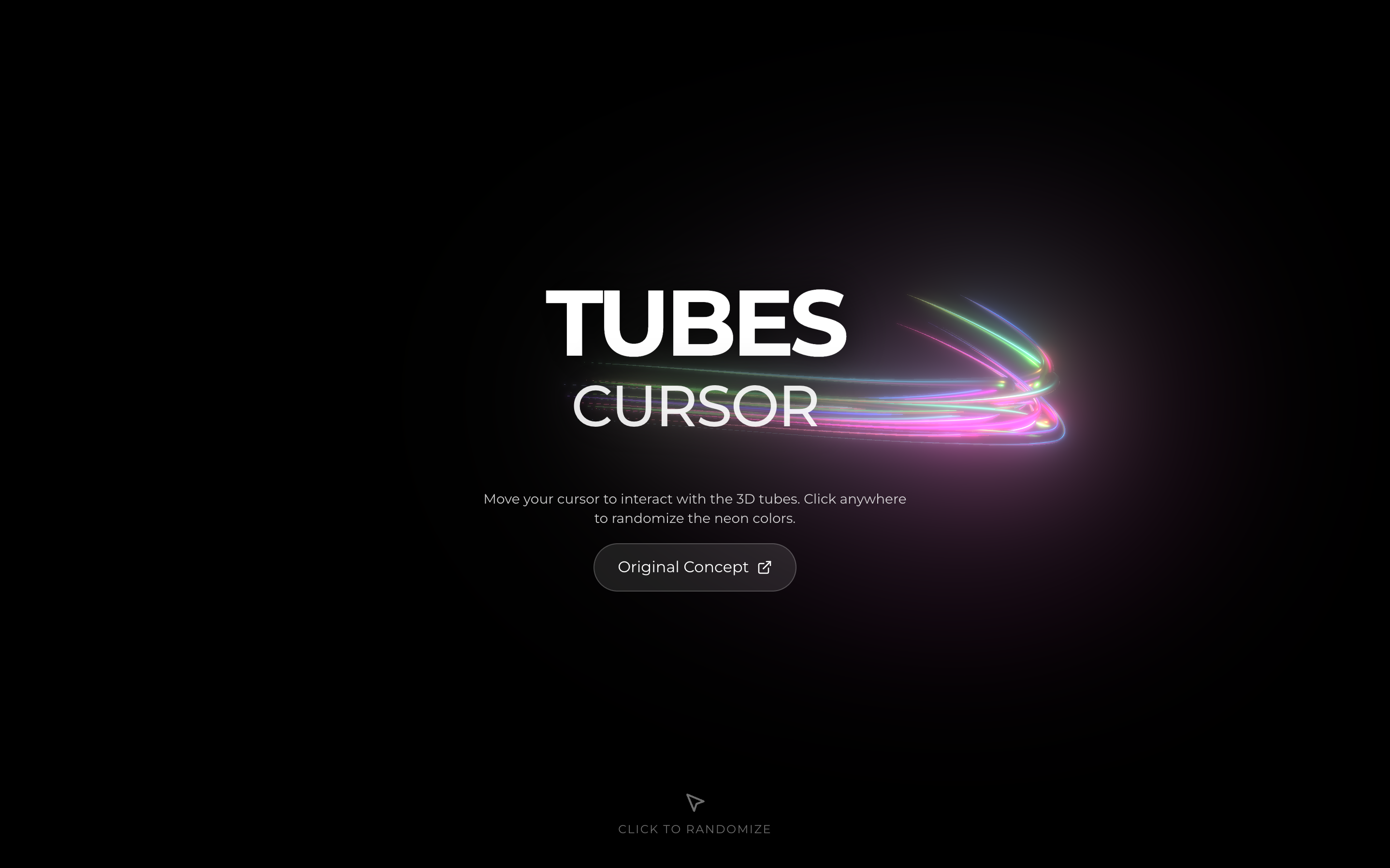
Tubes Interactive Background
A high-performance interactive 3D background featuring neon tubes that follow the cursor. Based on threejs-components, it includes a click interaction to randomize colors and a hero section overlay. Source: https://codepen.io/soju22/pen/qEbdVjK
Deep Red Style
A deep red/orange atmospheric gradients, elegant serif typography, and complex scroll-triggered animations, with floating parallax cards and a dot-grid background.
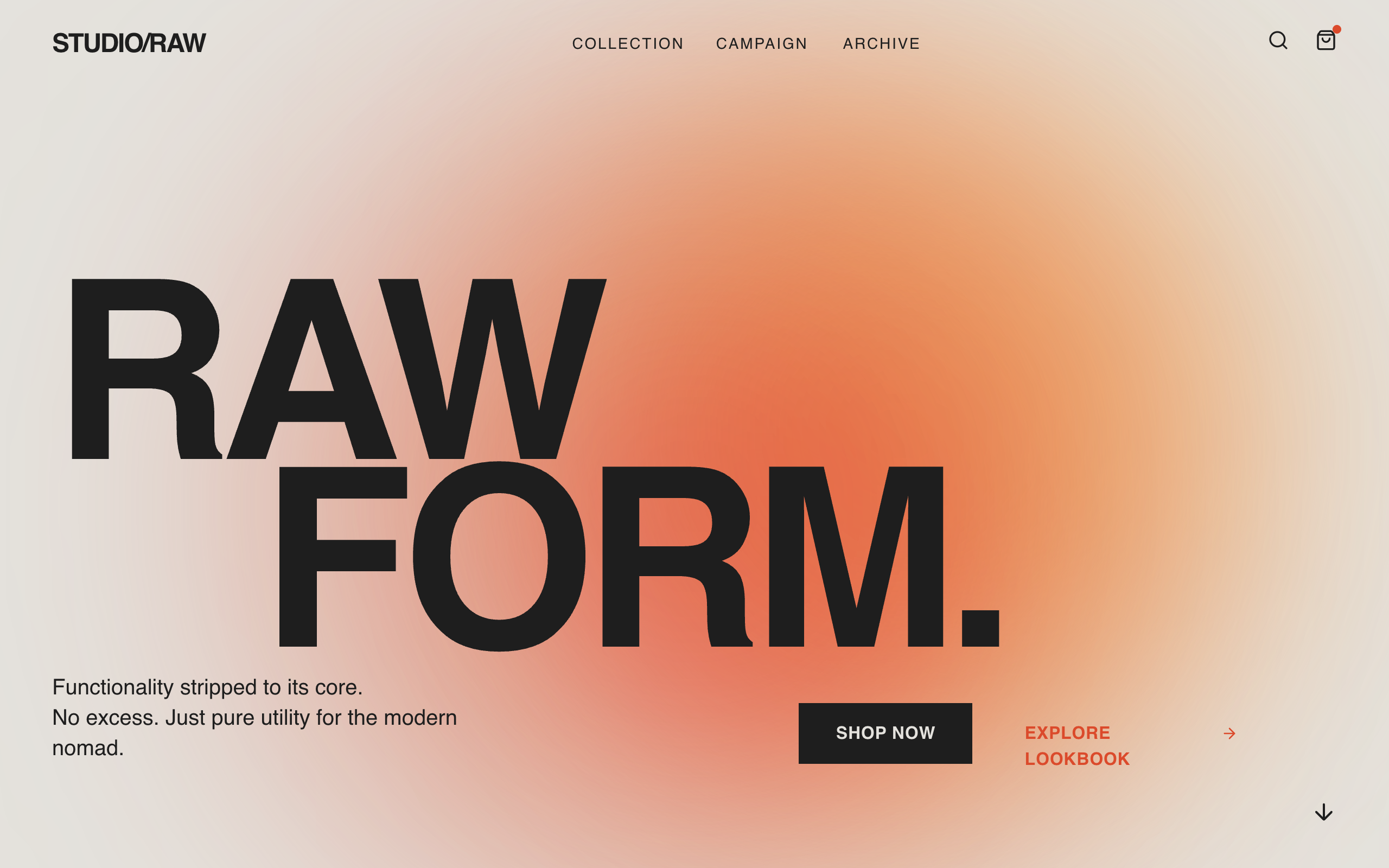
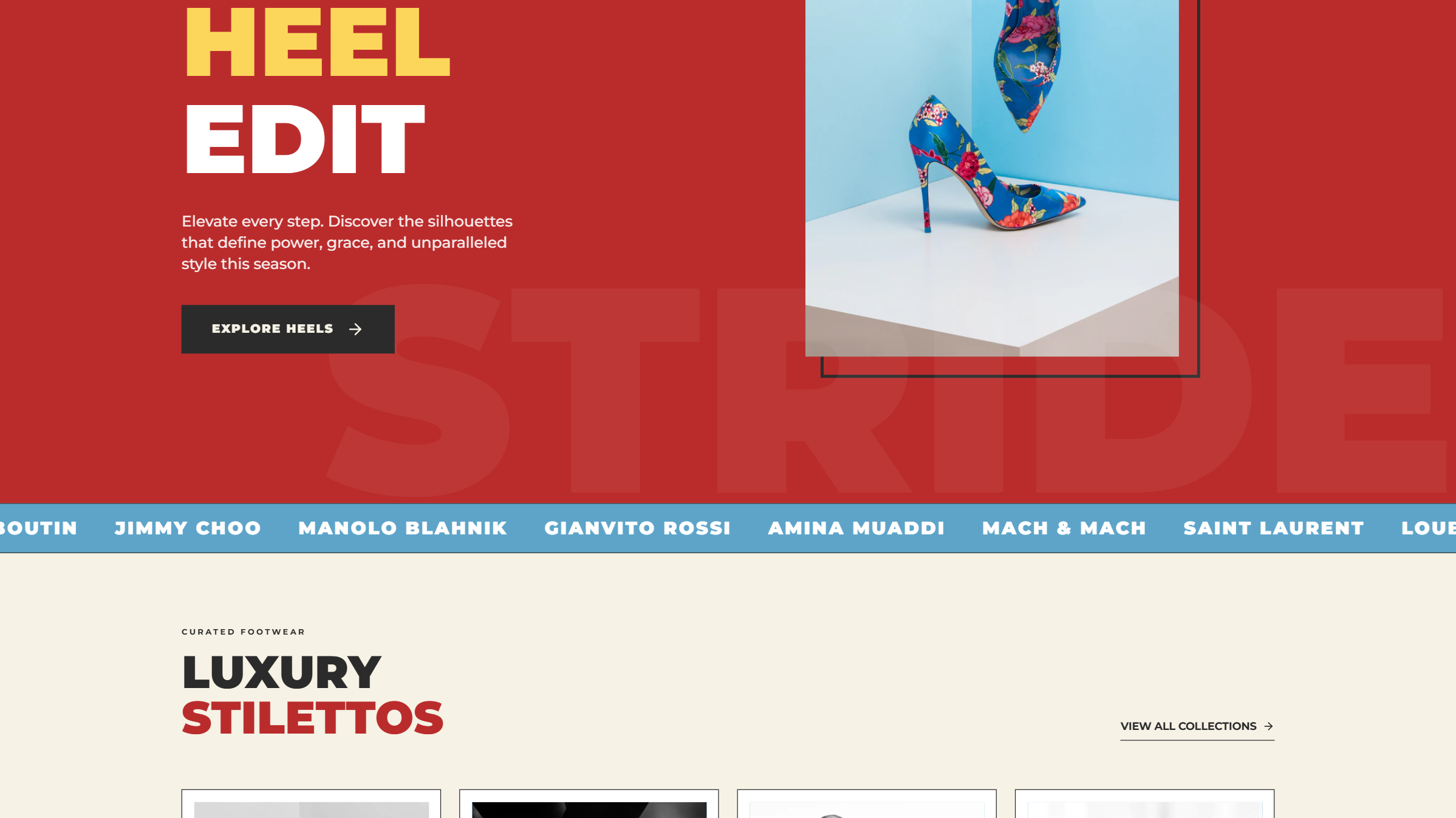
Brutalist E-commerce Page
A brutalist editorial e-commerce style guide inspired by poster-campaign aesthetics. Characterized by massive grotesque typography (Clash Display), soft-blurred gradient forms in red-orange tones (#DB4A2B, #F8A348), and a warm cream background (#E4E2DD). This aesthetic is optimized for high-end fashion, architecture, or lifestyle brands that want a 'poster-first' digital presence. Features include scroll-triggered entrance animations, mix-blend-mode interactions, and a clean, borderless grid structure.
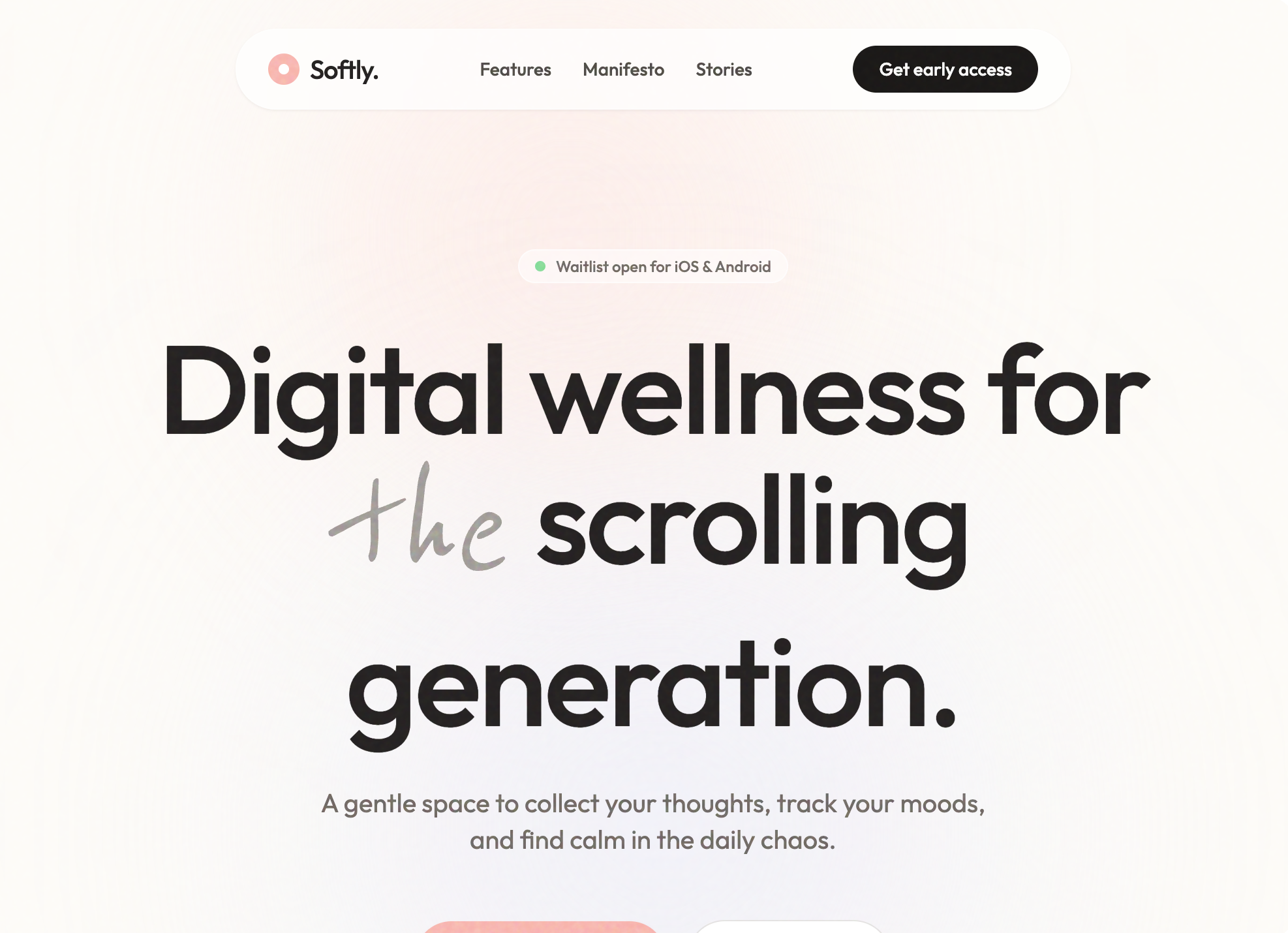
Softly - Digital Wellness App
A soft-aesthetic, Gen-Z oriented design system optimized for wellness, meditation, journaling, and lifestyle brands. Features a warm off-white foundation (#FDFCF8) layered with soft pastel accents (Coral #FFB7B2, Sage #E8EFE8, Lavender #EFEDF4), grain-textured overlays, and a mix of modern geometric sans-serif ('Outfit') and organic handwriting ('Reenie Beanie') typography. The layout emphasizes breathing room, gentle scroll-triggered reveals, and 'floating' organic shapes to reduce cognitive load and evoke a sense of calm.
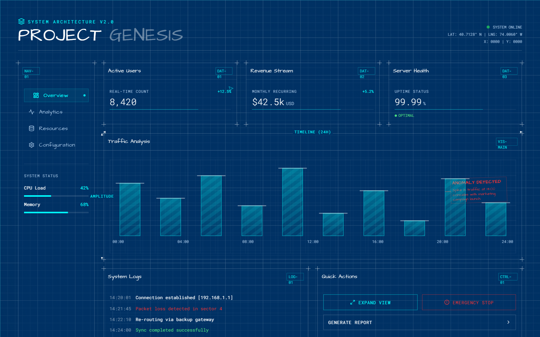
Mosaic Grid Architecture Style
An architectural, technical-blueprint style design system featuring a minimalist mosaic grid, forest green (#1A3C2B) and light-gray paper-textured (#F7F7F5) palette. Optimized for B2B SaaS, developer tools, and high-end agency portfolios. Key features include editorial typography with Space Grotesk, JetBrains Mono labels, bento grid layouts, and 2D flat wireframe aesthetics with zero shadows.
Red Noir Style
A bold, dark-themed landing page featuring high-contrast red accents, glassmorphism, and smooth scroll animations. Designed for AI and tech products with a futuristic aesthetic.
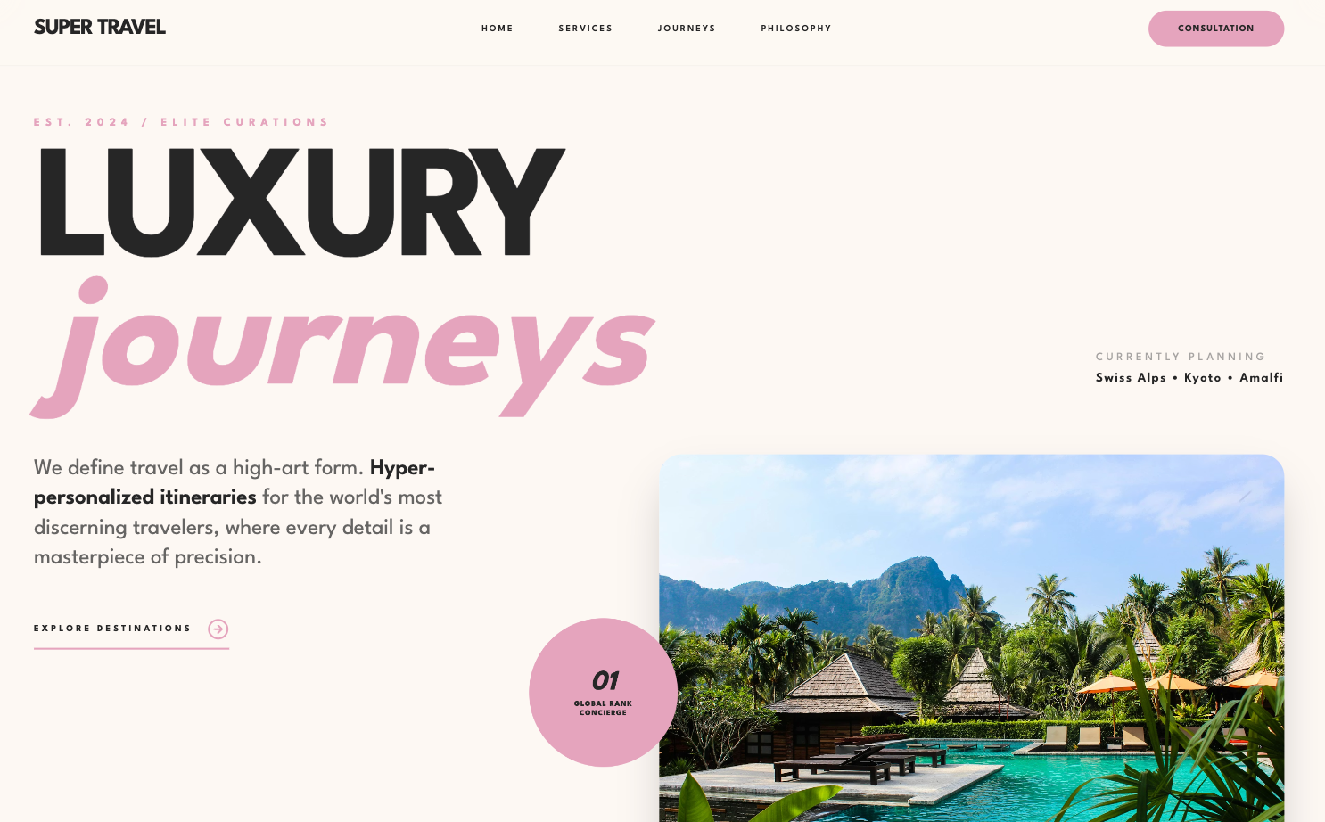
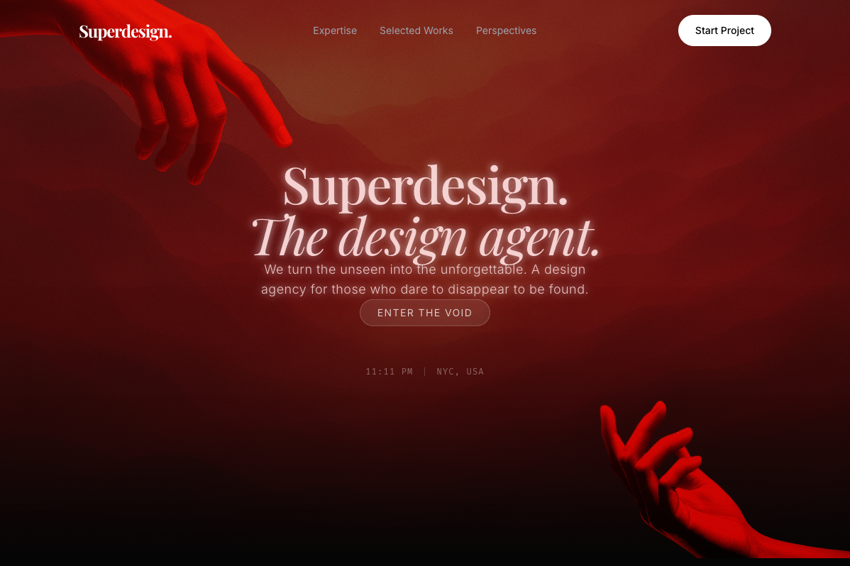
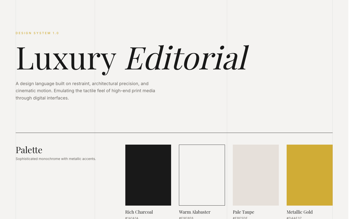
Luxury-focused Design System
A refined, editorial-style design system characterized by heavy geometric sans-serif typography, a sophisticated dusty rose and charcoal palette, and staggered grid layouts. This aesthetic is optimized for high-end luxury services, boutique hospitality, premium fashion brands, or architectural portfolios. It features scroll-triggered reveal animations, grayscale-to-color image transitions, and a 'glassmorphism' navigation bar. The layout focuses on massive, bold headlines paired with hyper-minimalist utility text, creating a contrast that feels modern yet timeless.
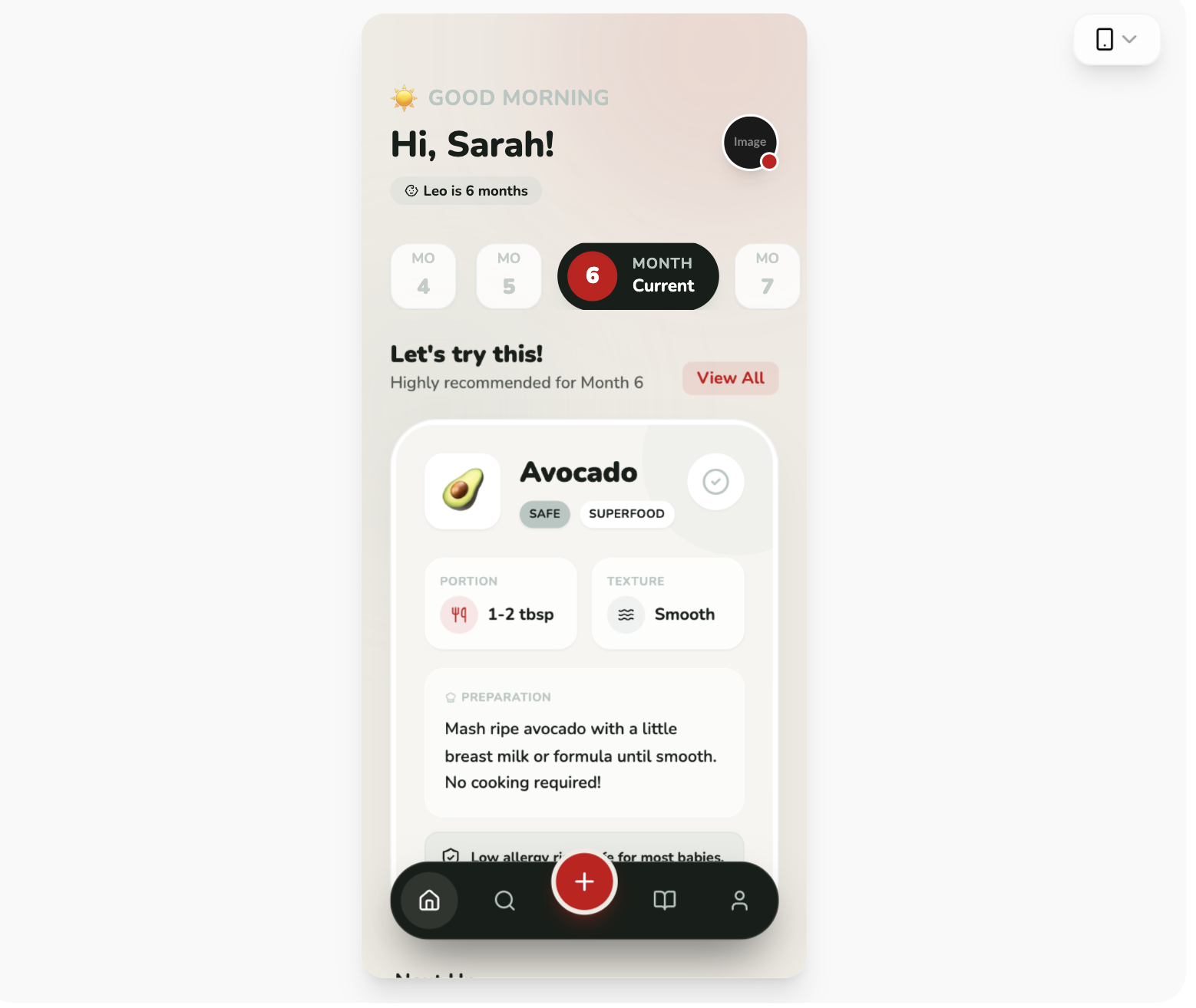
BabyBites - Sophisticated Palette
BabyBites style guide featuring a sophisticated high-contrast palette of dark charcoal, vibrant red, and sage-green. Characterized by playful but professional editorial typography, oversized rounded corners (up to 40px), and a clean, card-based layout. Ideal for parenting, nutrition, healthcare, and educational SaaS platforms. Includes scroll-triggered animations and custom view transitions for fluid mobile-first navigation.
Glassmorphism Style
A high-tech glassmorphism design system featuring neon lime accents, deep obsidian surfaces, and a sophisticated blend of architectural grid patterns and organic glowing gradients. Optimized for high-end SaaS, AI product studios, and fintech platforms, this style uses JetBrains Mono for a developer-centric feel and Space Grotesk for bold, editorial headings. Key elements include backdrop-blur effects (glassmorphism), grain/noise overlays, and a 'floating shell' layout that gives the web interface a premium, app-like quality.
Kinetic Orange Style
A high-energy brutalist design system characterized by a high-contrast 'Kinetic Orange' (#FF4D00) and black palette. It features bold, oversized editorial typography, technical monospace accents, and rhythmic motion through marquees and rotating elements. Ideal for creative agencies, fintech, modern portfolios, or AI-driven startups looking for a 'loud' and confident brand presence.
SaaS Landing Page for Developer Tool
A bold modernist design system inspired by exhibition poster aesthetics and technical documentation. Characterized by a high-contrast 'cream and cobalt' color palette, oversized aggressive typography, and a rigid 12-column grid layout with 1px border dividers. This style is ideal for technical SaaS, developer tools, high-end design agencies, or architectural portfolios. Key elements include tight line-heights (0.85), no rounded corners, and a unique vertical labeling system in a dedicated left-hand grid column.
Brutalist Style Ecommerce Page
A brutalist editorial design system for high-fashion, streetwear, or luxury brands. Featuring a raw, industrial aesthetic with massive typography, high-contrast photography, and utilitarian components. Key elements include a noise-grain texture overlay, a monochromatic palette with burnt orange and neon green accents, and asymmetrical layout grids. The style uses 'Clash Grotesk' for aggressive impact and 'General Sans' for technical clarity. Ideal for product launches, lookbooks, and fashion portfolios looking for a 'Raw Campaign' or 'Modern Brutalist' feel with scroll-triggered visual impact.
Cinematic Style
A high-end 'Cinematic' design system characterized by deep-space dark backgrounds, sophisticated 3D CSS transforms, and bold editorial typography. Optimized for premium portfolios, creative agencies, fintech, and high-tech SaaS. It features a signature 3D rolodex/cube hero section, glassmorphism elements, and smooth GSAP-driven scroll parallax. Key aesthetics include 'mix-blend-difference' navigation, vibrant neon gradients (cyan to pink), and a monochromatic 'Aspekta' font foundation with heavy weights and tight tracking.
Neural Noir Interface Style
The Neural Noir Interface Style is a high-end, futuristic aesthetic characterized by a 'tech-noir' atmosphere. It blends deep dark backgrounds (#0a0a0a) with sophisticated gold and bronze accents (#a78b71, #e8d5b7) and editorial typography. Key features include glassmorphism, neural network-inspired SVG connection lines, and a bento-grid layout. This style is optimized for premium AI platforms, creative design engines, high-end SaaS, and editorial-driven tech portfolios. It utilizes a combination of sleek sans-serif (Inter) for functional elements and elegant serif italics (Playfair Display) for headlines, creating a contrast between high-tech performance and classic sophistication.
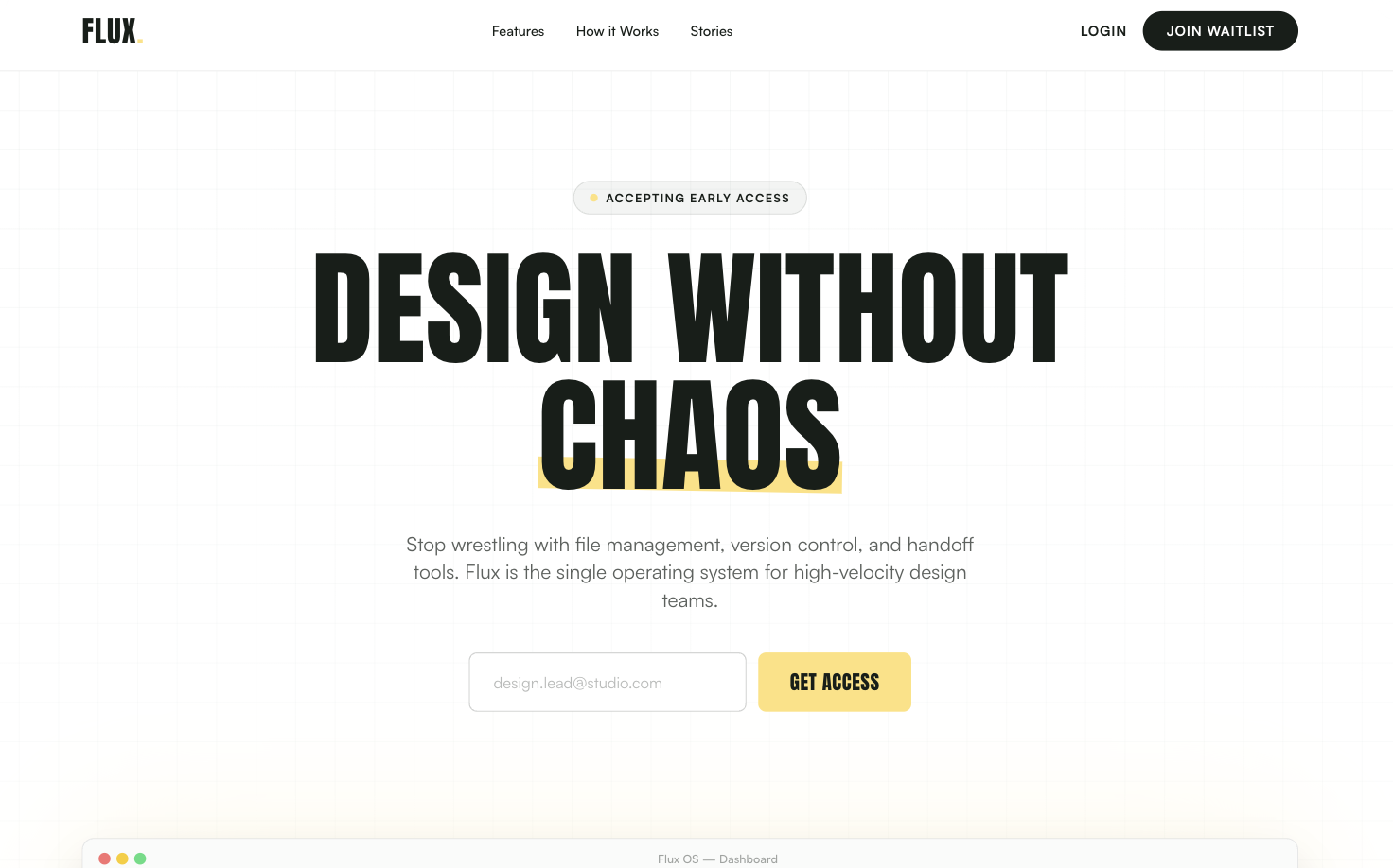
Bold Editorial Style
A high-contrast, editorial-style SaaS landing page design optimized for designers and creative tools. It features bold Anton display typography, a sophisticated palette of golden yellow (#ffe17c) and deep charcoal (#171e19), and a structured layout combining grid patterns and bento-box feature blocks. This style is characterized by aggressive visual hierarchy, oversized headlines, and a minimalist yet punchy aesthetic suitable for high-velocity startups, fintech, or creative agency portfolios.
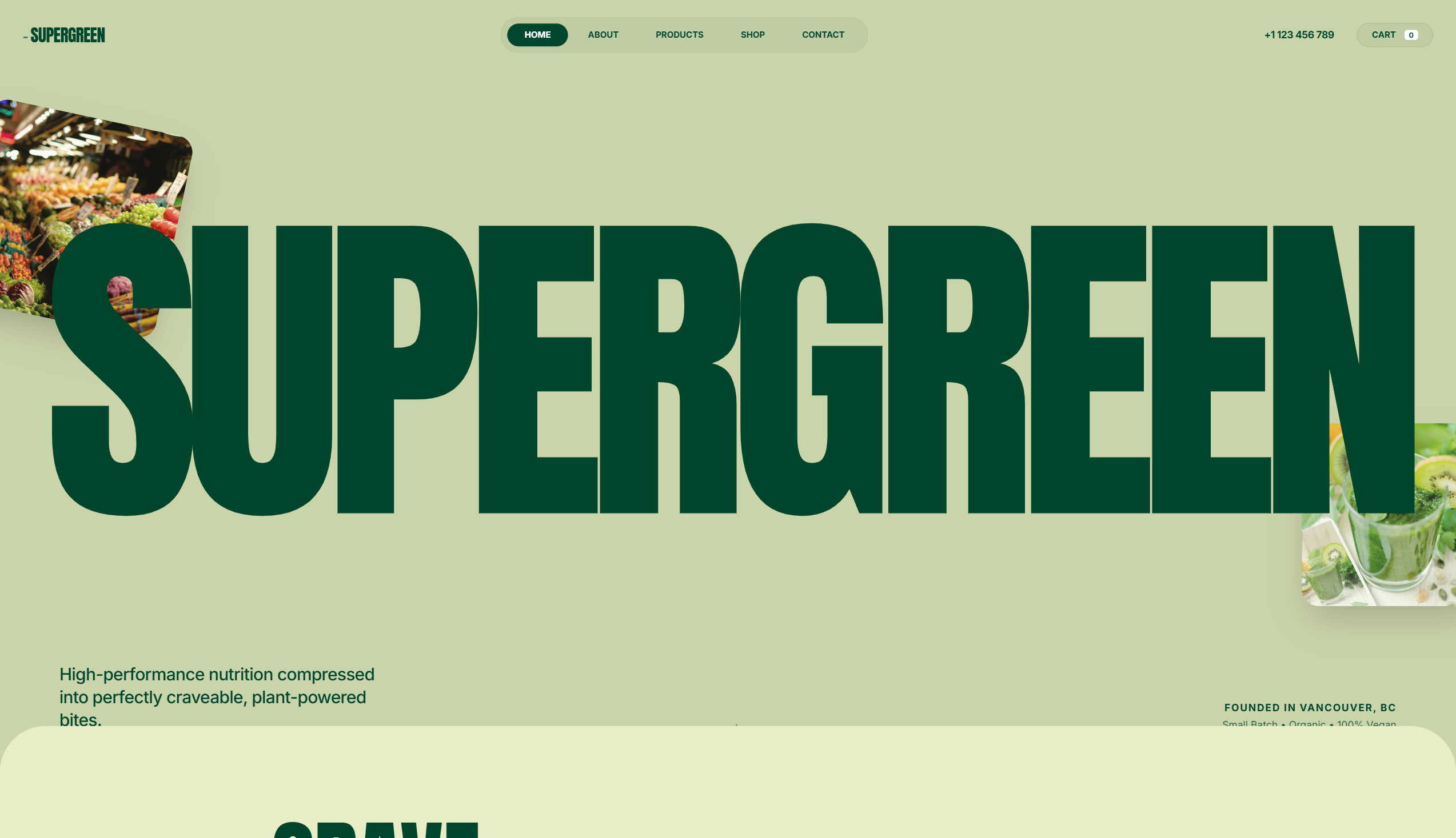
Nature Inspired Style
A nature-inspired 'Organic Brutalist' design system perfect for wellness, sustainable CPG, eco-friendly lifestyle brands, or high-end nutrition. Characterized by a palette of deep forest greens and earthy sages, the style utilizes massive editorial typography (Anton) paired with functional sans-serifs (Inter). The layout features 'bento-adjacent' rounded grids, floating organic elements with parallax effects, and a subtle film grain noise overlay that gives the digital experience a tactile, premium paper-like feel. Key elements include oversized headings, ultra-rounded corners (up to 5rem), and fluid reveal animations.
Bold Editorial Studio Style
Bold Editorial Studio Style is a high-impact, minimalist design system characterized by massive typography, a strict monochromatic palette, and sophisticated micro-interactions. It features a signature 'editorial' look using ultra-large display fonts (up to 12vw), custom cursor logic, and fluid marquee animations. Ideal for creative agencies, high-end portfolios, fashion brands, and premium fintech products, the system leverages white space and motion to create a premium, curated feel. Key elements include mix-blend-mode navigation, staggered text reveals, and asymmetrical image containers with varied border radii.
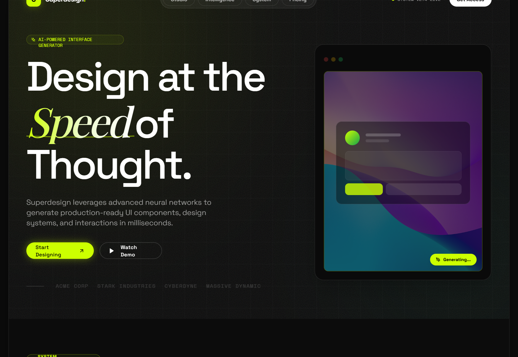
Glassmorphism card
A premium, high-tech glassmorphism design system characterized by deep translucent layers, dark-to-light transitions, and editorial typography. Featuring a 'Superdesign' aesthetic, it utilizes heavy background blurs, grain textures, and emerald accents. This style is ideal for SaaS, AI platforms, fintech, and high-end design agencies requiring a sophisticated, futuristic feel with bento-grid layouts and fluid animations.
Futuristic SasS Landing Page
A modern, atmospheric SaaS design system featuring a high-contrast blend of dark mode hero sections and light mode content areas. Characterized by glassmorphism, sophisticated serif-sans typography pairing, and ethereal glows, it is ideal for AI startups, design tools, creative portfolios, and premium digital platforms. The style emphasizes depth through backdrop blurs, subtle borders (1px), and smooth micro-interactions like scroll-triggered navigation and hover-based transforms.
Hyper-Interactive 3D Developer Portfolio with Three.js
Hyper-interactive dark mode portfolio with Three.js 3D background, neon cyan-purple-pink color palette, and high-end editorial typography. Featuring glassmorphism, 3D tilt interactions, and scroll-triggered reveal animations. Optimized for developer portfolios, SaaS dashboards, and creative agencies wanting a futuristic, high-performance aesthetic.
Synapse
A high-performance 'neural' dark mode design system characterized by deep black backgrounds (#030303), vibrant neon accents in violet (#8B5CF6) and cyan (#06B6D4), and a sophisticated blend of editorial serif typography (Instrument Serif) with functional sans-serif (Inter). The style utilizes glassmorphism, animated mesh gradients, and 'shimmer' text effects to evoke a sense of advanced intelligence, encryption, and institutional-grade technology. Ideal for Fintech, AI, Cybersecurity, and Web3 verticals where speed, security, and technical sophistication are core values.
Bold Editorial Design Style
A premium, bold editorial design system characterized by high-contrast brutalist typography and a sophisticated dark navy and sage color palette. Optimized for creative agencies, design portfolios, luxury architecture, and high-end digital studios. Features include 'Anton' display headers, a custom crosshair cursor, floating ambient gradients, asymmetric masonry layouts, and smooth scroll-triggered reveal animations. The aesthetic balances minimalist white space with massive, impactful type and subtle micro-interactions like mix-blend-mode navigation and grayscale-to-color image transitions.
Midnight Editorial Style
A premium, ultra-modern dark aesthetic featuring deep black backgrounds (#050505), massive 'Satoshi' typography for impact, and striking coral (#FF6B50) accents. Designed for high-end agencies and portfolios that prioritize storytelling and visual drama.
Hyper-Saturated Fluid
A landing page featuring a Hyper-Saturated Fluid design style. It uses a 'Cyber Yellow' primary color with organic 'liquid' sectioning, contrasting against a 'Deep Onyx' dark void. Includes glassmorphic data cards, massive typography, and pill-shaped interactive elements.
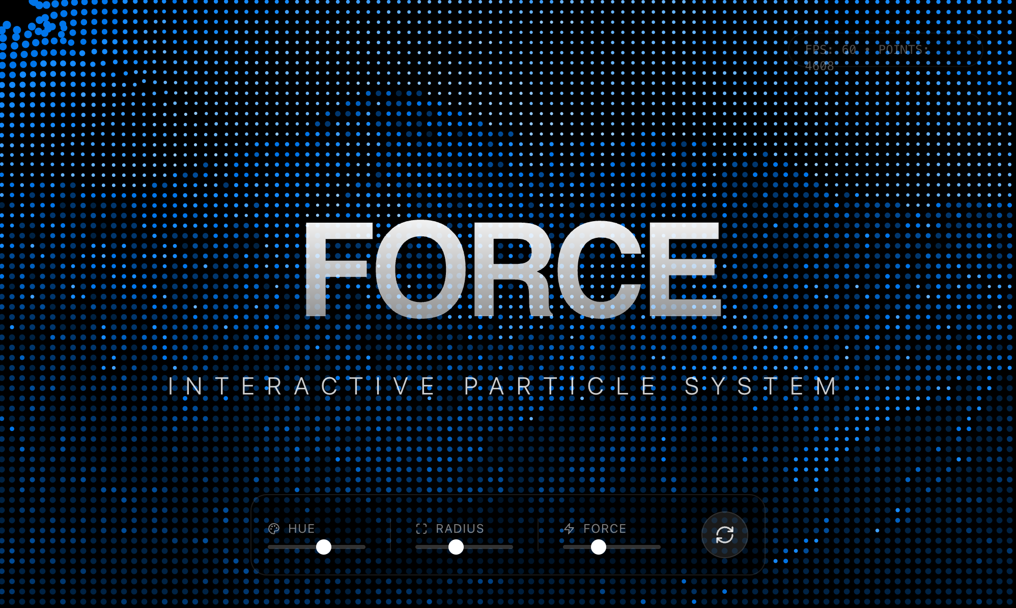
Force Field Background
An interactive, particle-based force field background effect that reacts to mouse movement. Uses p5.js to render particles based on image brightness maps, creating a fluid, magnetic visual experience. Source: https://codepen.io/vainsan/pen/ByoXMoB
Minimalist Beta Capture
A high-end 'Editorial Brutalist' style guide optimized for SaaS waitlists, fintech, or premium developer tools. It features a dark-mode palette (#080808), high-contrast monochromatic typography (DM Serif Display + Geist Mono), and sophisticated glassmorphism. The layout utilizes a bento-grid structure and fluid width (92vw) with oversized hero typography. Key features include scroll-triggered slide-up animations, a silver-metallic gradient system, and a persistent floating mobile navigation bar.
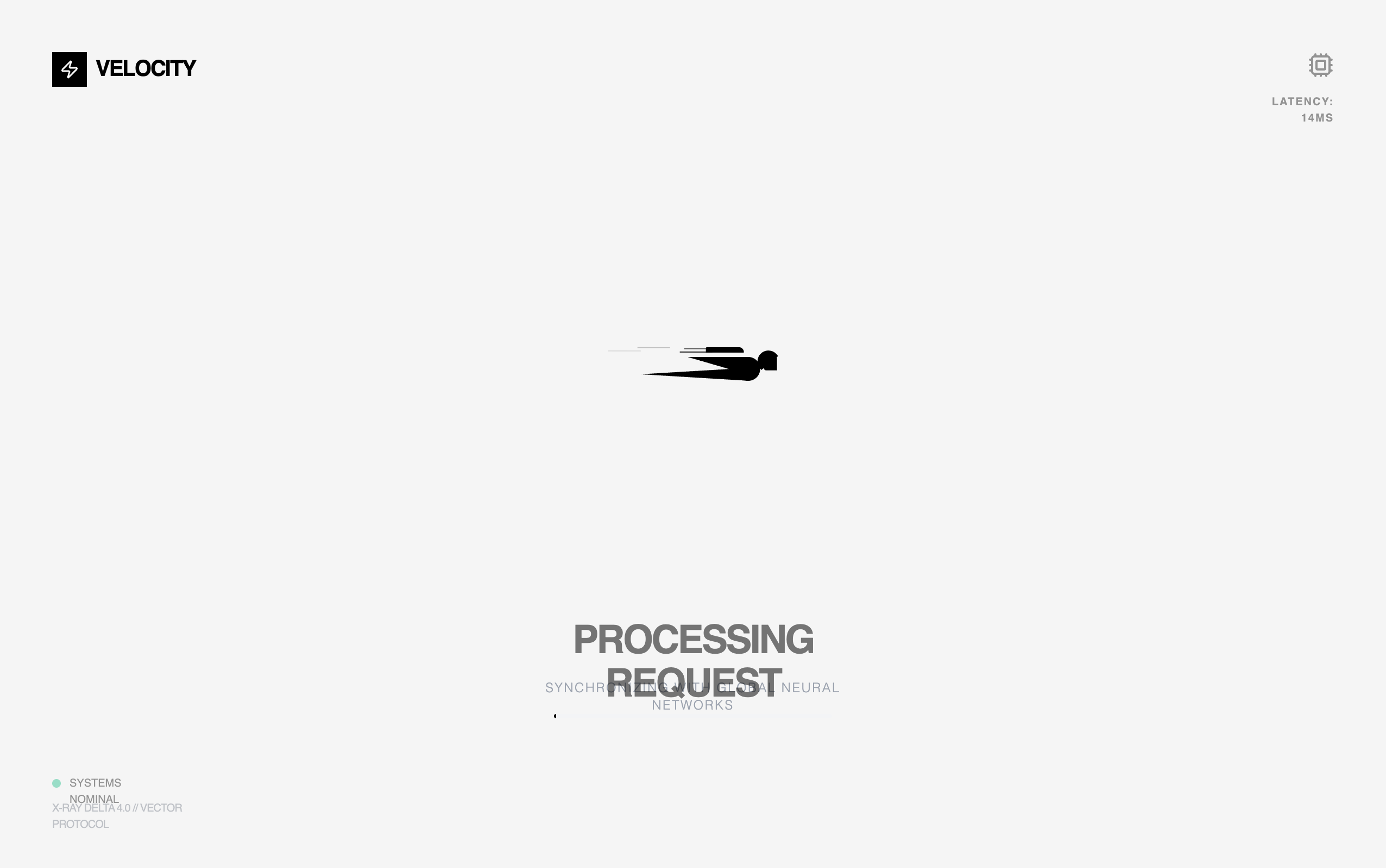
Hyper-Speed Loading State
Loading animation UI featuring a character-like loader with animated lines, a body made from geometric shapes, and moving horizontal lines across the background. The loader have smooth animations with multiple synchronized motion effects including rotation, translation, and opacity fades.
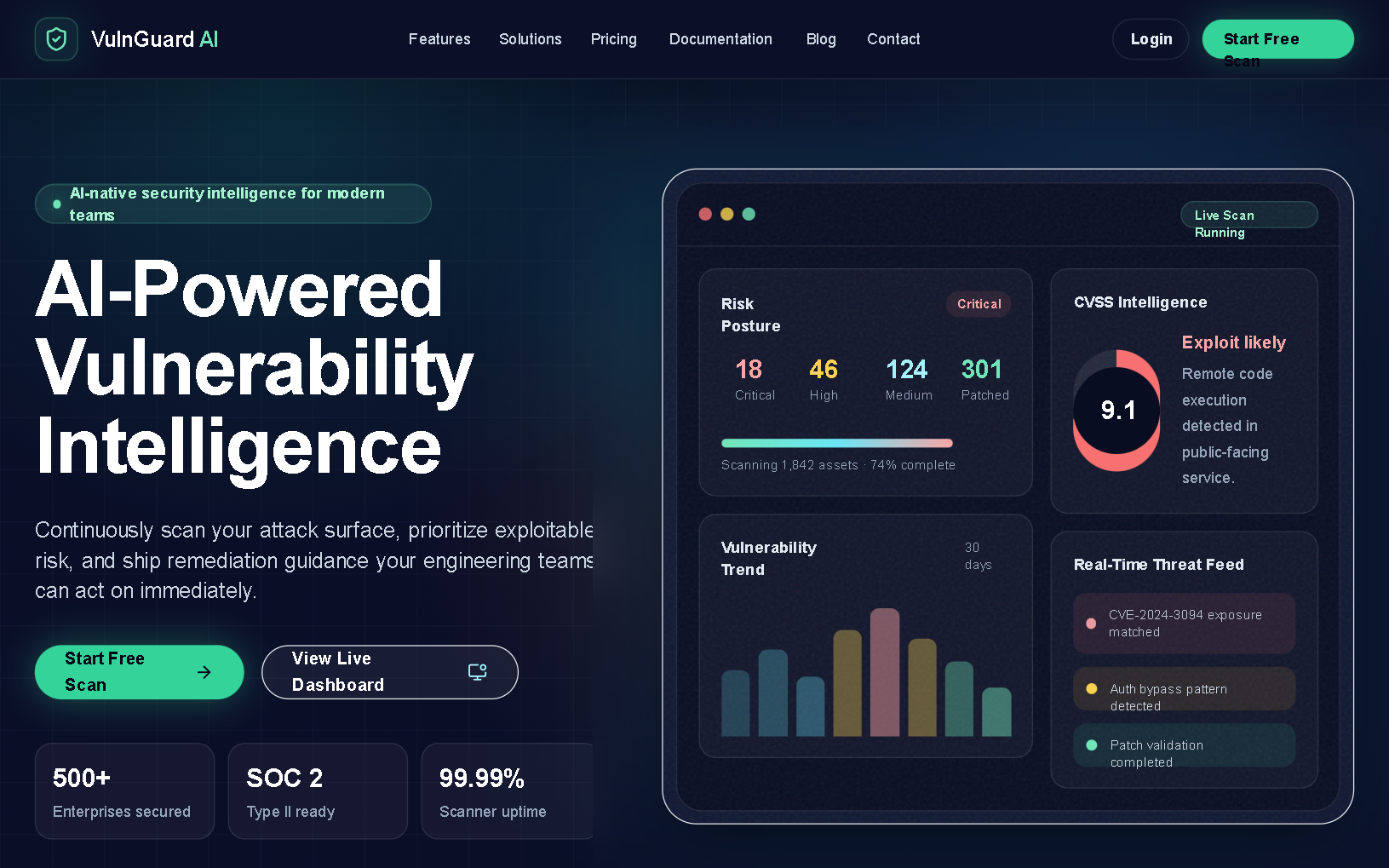
VulnGuard AI SaaS Landing Page
Premium enterprise-grade cybersecurity SaaS style guide featuring a high-contrast dark mode aesthetic. Utilizing a dark navy and charcoal foundation (#0a0e27) with technical accents of emerald, cyan, and amber. The design employs editorial typography (Clash Grotesk and Satoshi), glassmorphism effects, and a rigid grid-based layout. Optimized for high-trust industries like fintech, cybersecurity, DevSecOps, and enterprise infrastructure platforms. Key elements include scroll-triggered animations, bento-grid analytics dashboards, and glowing primary CTAs.
Neon Velocity Countdown
A high-velocity, futuristic dark-mode design system characterized by neon accents, brutalist typography, and 3D glassmorphism. Featuring a 'Laser Green' and 'Navy Black' palette, it utilizes 'Plus Jakarta Sans' for high-impact headlines and 'Geist Mono' for technical metadata. This aesthetic is ideal for high-growth tech startups, SaaS platforms, developer tools, and fintech products that want to convey speed, precision, and cutting-edge innovation. The layout uses a bento-grid structure, fluid typography, and sophisticated scroll-triggered reveal animations.
Card Swap
An elegant card swapping animation component with depth perception and perspective. Features automated cycling of cards with a premium floating feel. Source: ReactBits
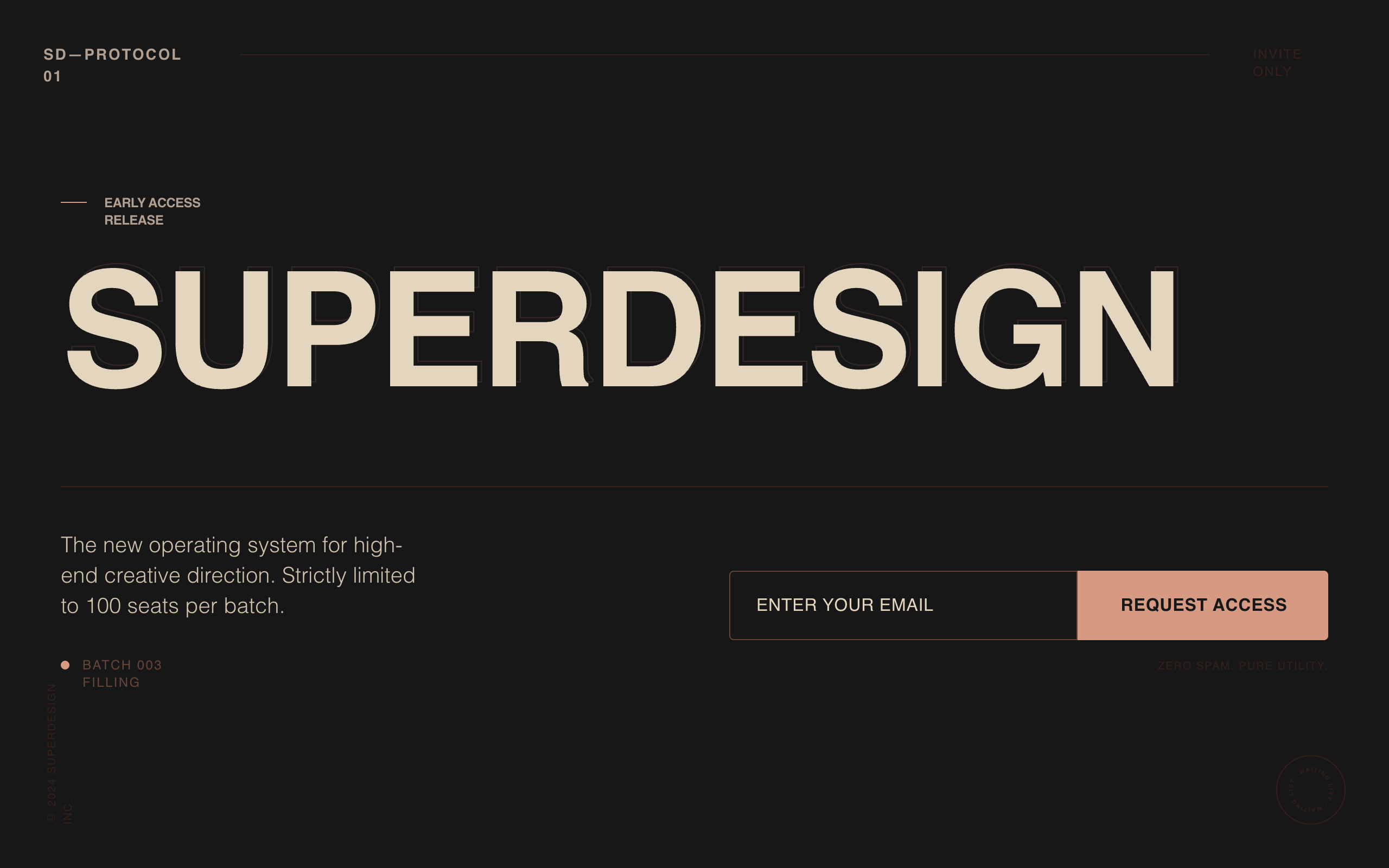
Superdesign Editorial Waitlist
Editorial waiting list landing page with a cinematic, high-fashion aesthetic. Features a deep matte #181818 background, warm beige #EBDCC4 typography, and a brutalist yet refined grid. Key elements include oversized edge-to-edge display type, subtle noise textures, and a layered text depth effect. Ideal for luxury tech, creative agency portfolios, high-end SaaS tools, architecture firms, and invite-only exclusivity campaigns. Layout utilizes strong typographic hierarchy and generous negative space with accent tones in coral, rust, and sage.
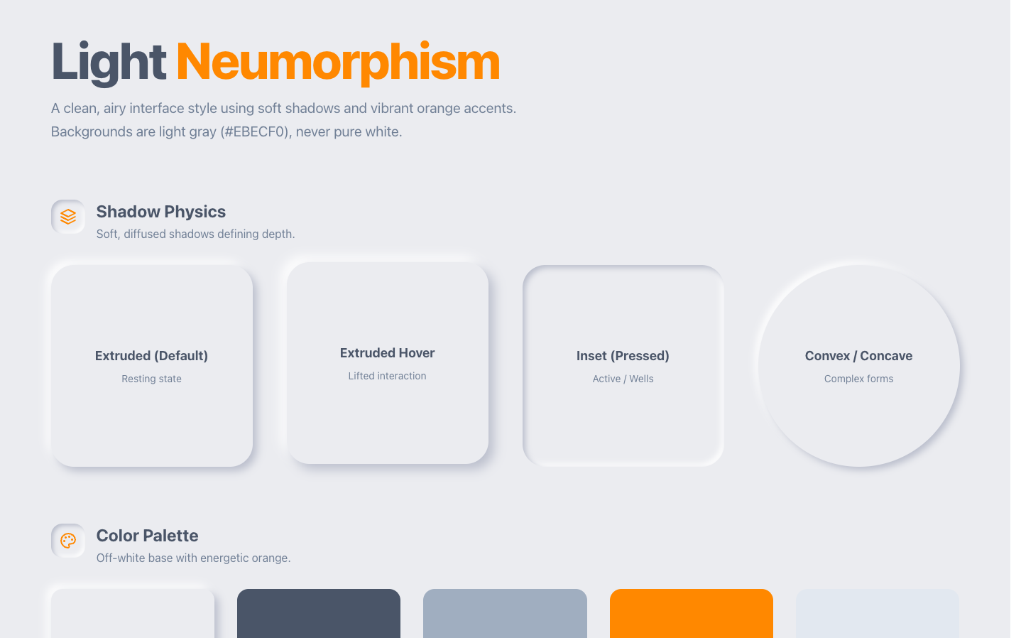
Neumorphism
Neumorphism creates the illusion of physical depth through carefully balanced dual shadows Source: designprompts.dev
Chrome Extension Landing Page
A browser-native developer tool aesthetic characterized by a 'system interface' look rather than a marketing landing page. This style features a light-neutral base with a vibrant cyan (#06B6D4) accent, mimicking the layout of Chrome DevTools or a workspace IDE. It uses a combination of Inter for primary readability and JetBrains Mono for technical labels and commands. Suitable for SaaS, developer tools, extensions, and technical platforms requiring a high-density, utility-focused layout with scroll-triggered panel reveals and simulated interactive environments.
The "Stacking Cards" Effect
A portfolio section where cards stack sticky at the top as the user scrolls, creating a deck-of-cards effect using GSAP.
Clean fluid
A high-end, editorial design system blending luxury serif typography with technical monospace accents. Characterized by fluid 'premium ease' animations, a sophisticated cream and dark charcoal palette (#fcfbf9, #171717), and organic curved transitions. Optimized for AI startups, design studios, fintech dashboards, and luxury tech brands requiring a balance of intelligence and elegance. Key features include scroll-triggered reveal animations, mesh gradient backgrounds, and a signature concave wave transition between sections.
Cinematic Noir Style
A high-end 'Cinematic Noir' design system characterized by dramatic dark-mode aesthetics, high-contrast editorial typography, and immersive scroll-driven parallax effects. Suitable for creative agencies, luxury fashion, fintech, and high-end portfolios. Features include grain overlays, radial gradients with subtle warm tints, and brutalist-scale headings that blur the line between digital interface and cinematic experience.
Parallax Stars Background
A mesmerizing space-themed background with animated parallax pixel stars and a radial gradient atmosphere. Features three layers of stars moving at different speeds to create depth.
Scroll Journey Line
An SVG line connector that animates/draws itself based on the user's scroll percentage using Framer Motion.
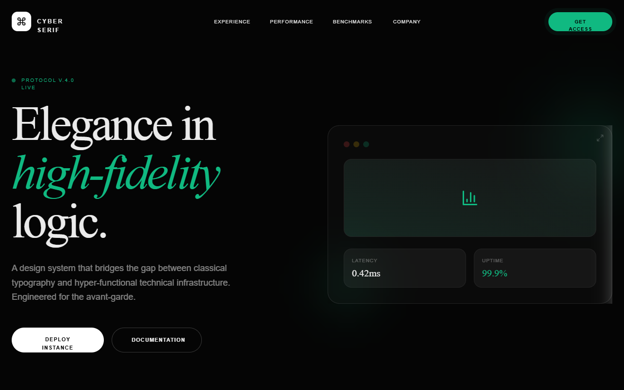
Cyber Serif Style
A high-end 'Cyber Serif' aesthetic blending classical editorial typography with futuristic tech elements. Features a deep #050505 dark mode palette, neon emerald accents (#10b981), glassmorphism, and sophisticated micro-interactions. Suitable for high-end AI SaaS, creative agencies, fintech portfolios, and developer tools. Includes WebGL-inspired background effects, spotlight hover cards, and staggered scroll-reveal animations.
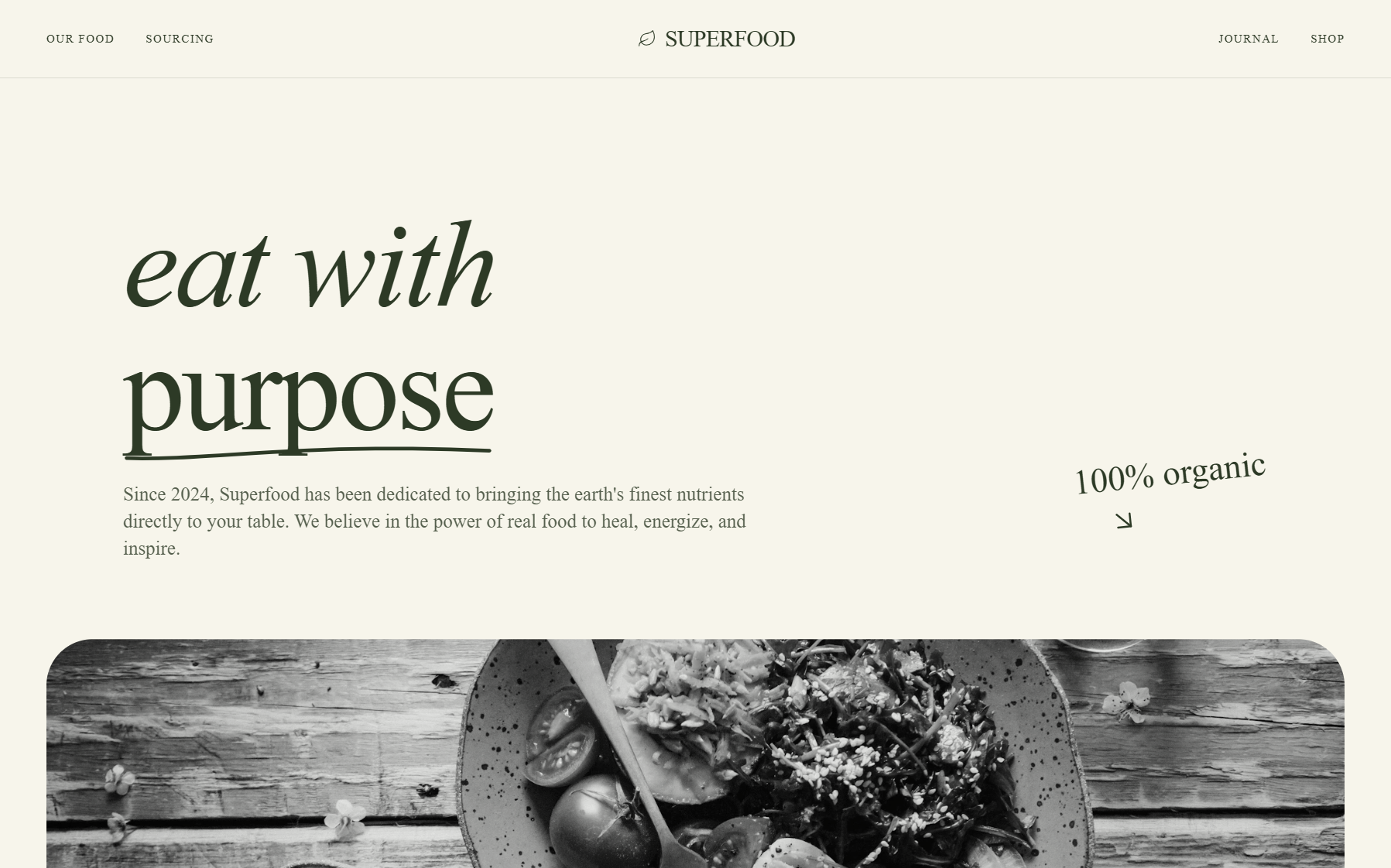
AMANTRA ORGANICS | Premium Organic Superfoods
A premium, energetic organic wellness brand style featuring high-contrast typography, vibrant organic colors (emerald and orange), and advanced 3D-transform interactions. This aesthetic is ideal for modern D2C health brands, superfood companies, and bio-hacking startups seeking a high-performance, scientific yet natural aesthetic. It uses a clean 'Stone' background to allow bold product colors and fluid, scroll-triggered animations to take center stage. Key elements include bento-grid layouts, floating card stacks, and glassmorphism accents.
Warm Industrial Gray Style
A sophisticated warm industrial aesthetic that blends brutalist grid structures with editorial typography. Featuring a primary palette of warm concrete gray and rich charcoal accented by electric blue, this style is ideal for AI startups, creative technology studios, fintech platforms, and architecture portfolios. It utilizes a high-contrast pairing of heavy grotesque sans-serifs and elegant serif italics, layered over a subtle film grain noise texture. Key features include scroll-triggered reveals, magnetic hover states, and structural grid-line overlays that emphasize a 'form follows function' technical philosophy.
Neo-Brutalism Style
A high-impact Neo-Brutalist design system characterized by 'Acid' aesthetics. It features high-contrast color palettes (off-white, deep black, and neon yellow), heavy-weight typography, and 'hard' UI elements like non-blurred shadows and thick borders. The layout utilizes bento grids, oversized display text, and dynamic marquee components. Suitable for creative agencies, experimental e-commerce, fintech, and portfolio sites looking for a 'loud', digital-first brand identity.
Lumina - 30% Triggered Cinematic Portal
Lumina is a cinematic portal-style design system characterized by a dramatic scroll-triggered 'zoom-through' interaction. It features a high-contrast aesthetic with a deep charcoal (#050505) entry screen that reveals a vibrant, animated gradient background. Utilizing 'Cabinet Grotesk' for heavy display typography and 'Satoshi' for refined UI, the design emphasizes depth and motion. Ideal for luxury tech, creative agencies, immersive portfolios, and high-end landing pages, the layout uses glassmorphism, misty blur reveals, and a bento-style grid for internal content.
Midnight Editorial Style
A high-contrast, midnight-themed editorial design system optimized for premium portfolios, fintech SaaS, and luxury brand storytelling. Characterized by oversized 'Clash Display' typography, a deep #050505 background, and sophisticated mix-blend-mode interactions. Features smooth reveal animations, subtle atmospheric glows, and a brutalist yet refined layout that prioritizes whitespace and typographic hierarchy.
GSAP Horizontal scroll
Disruptor Beta Launch
A high-impact Neo-Brutalist design system designed for product launches and disruptive SaaS platforms. Characterized by stark color contrasts, industrial typography, and heavy geometric borders. The aesthetic utilizes a dark mode base (#121212) punctuated by vibrant 'Volt' accents (#CCFF00) and crisp white containers. Key features include 'sticker-style' rotated elements, massive display type, solid 8px offsets (Neo-shadows), and vertical navigation elements. Ideal for high-growth tech, developer tools, fintech, and creative agencies looking for an aggressive, authoritative, and innovative brand presence.
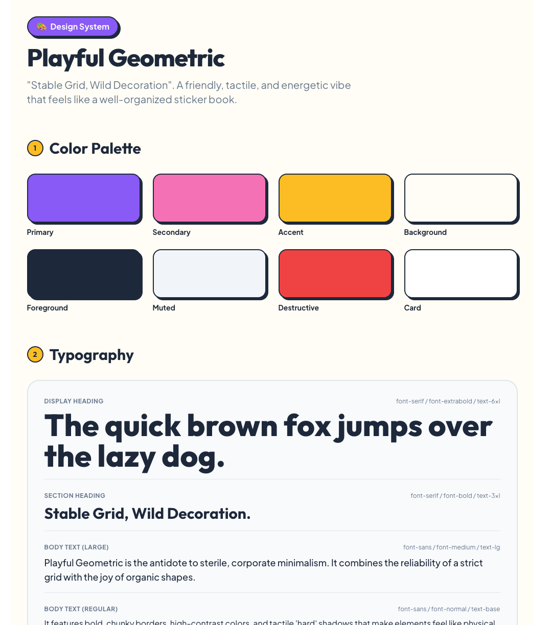
Playful
Playful Geometric Design System Source: designprompts.dev
Red sun
A sophisticated editorial-style design system named 'Red Sun', characterized by a high-contrast 'Coral and Ink' color palette. This style blends 'Instrument Serif' for high-impact typography with 'Manrope' for technical precision. Features include bento-grid layouts, glassmorphism navigation, scroll-triggered animations with subtle rotations, and soft ambient background blurs. Ideal for premium SaaS, creative agencies, AI product design tools, and fintech platforms looking for a balance between warmth and authority.
Gooey Gradient Background
A mesmerizing, interactive gooey liquid gradient background with animated blobs and mouse-following effect. Perfect for immersive landing pages.
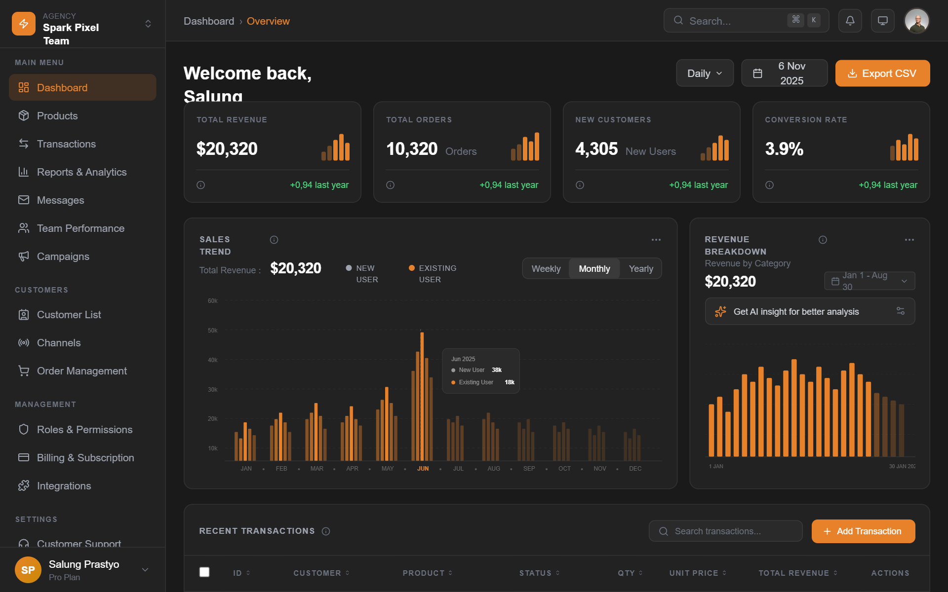
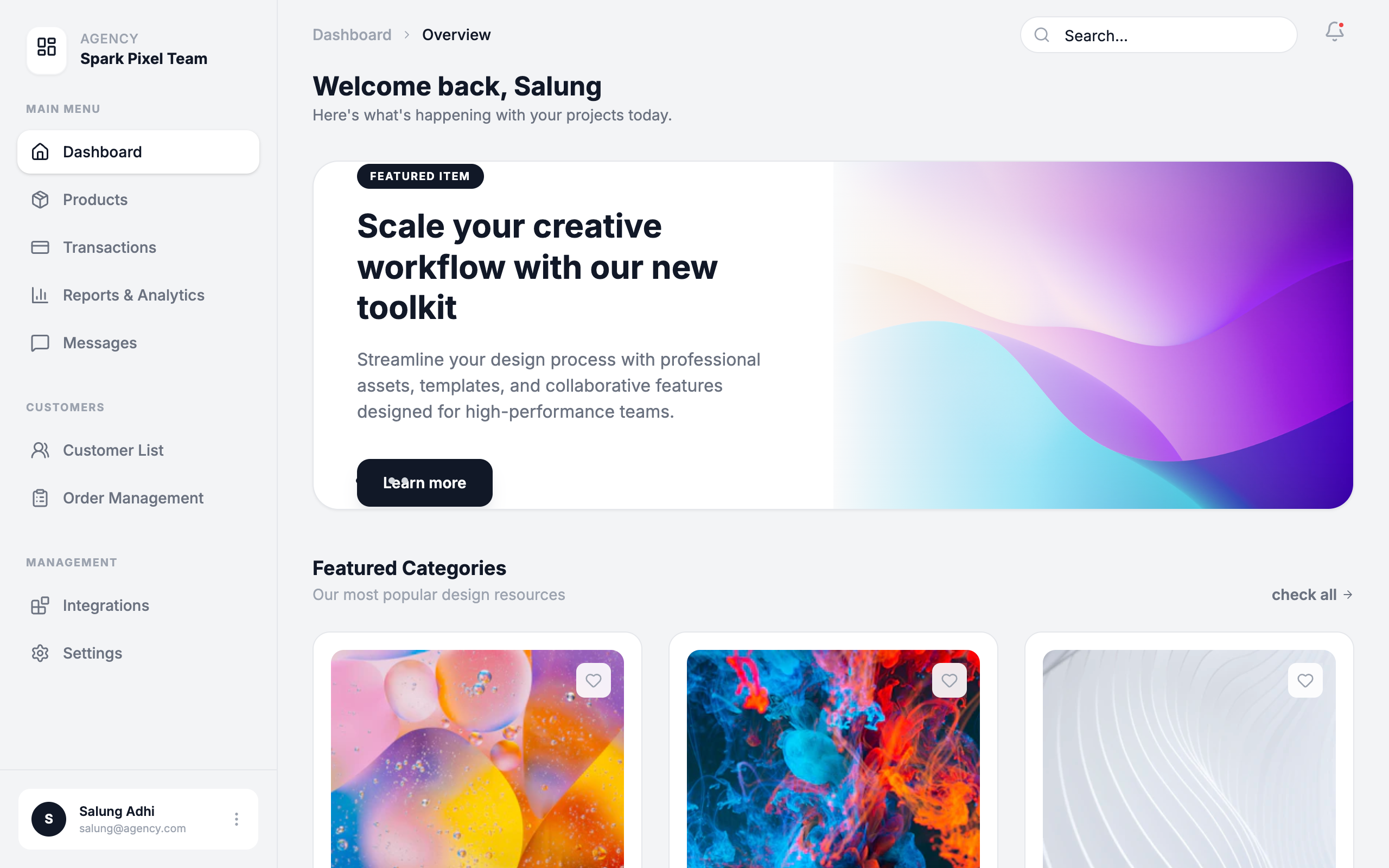
Dark SaaS Dashboard - Spark Pixel Team
A high-end, dark-themed enterprise SaaS dashboard featuring a sophisticated color palette of deep grays and vibrant amber accents. The design utilizes high-contrast typography with General Sans, a modular bento-grid layout for metrics, and custom SVG-based data visualizations. This style is ideal for fintech, analytics platforms, and professional agency management tools where a premium, data-heavy, yet clean interface is required. It emphasizes visual hierarchy through varying font weights and intentional use of negative space.
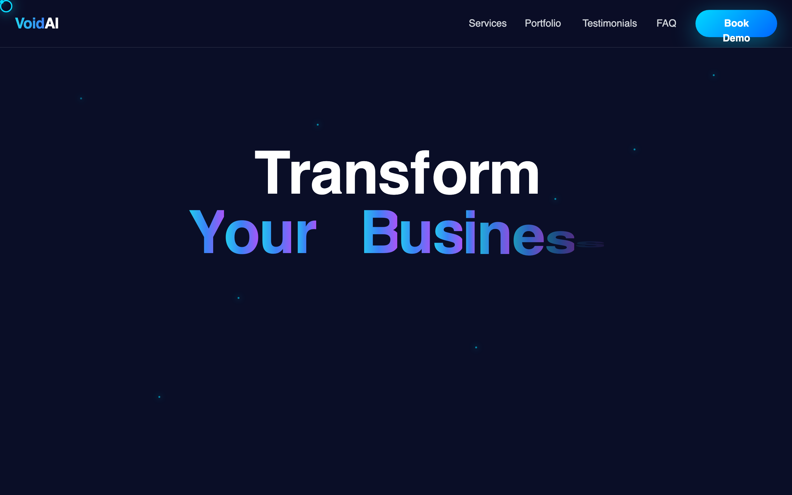
VoidAI - Premium AI Landing Page
Premium dark mode luxury landing page design for AI agencies and high-end tech consulting. Features a cinematic 'space/void' theme with a deep navy palette (#0a0e27), electric cyan (#00d9ff) and magenta (#ff00ff) accents. Notable for its editorial typography (Space Grotesk), glassmorphic components, and sophisticated motion system including staggered letter reveals, interactive grid layouts, and custom cursor micro-interactions. Perfect for fintech, SaaS, and digital infrastructure brands seeking an immersive, high-trust aesthetic.
Tech Editorial
A high-end 'Tech Editorial' aesthetic that merges brutalist precision with classic editorial sophistication. It features a muted, paper-like color palette (#f7f6f2), a structured grid-line system, and a unique pairing of high-contrast Serif (Playfair Display) for display headers and technical Mono (Space Mono) for functional UI. The style is characterized by scroll-triggered text reveals, glassmorphism navigation, and 'scan-line' animations that suggest a sophisticated AI-driven process. Ideal for high-tech SaaS, AI research labs, design agencies, and premium fintech platforms.
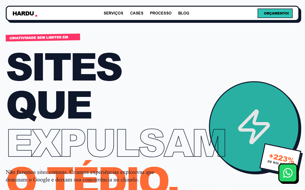
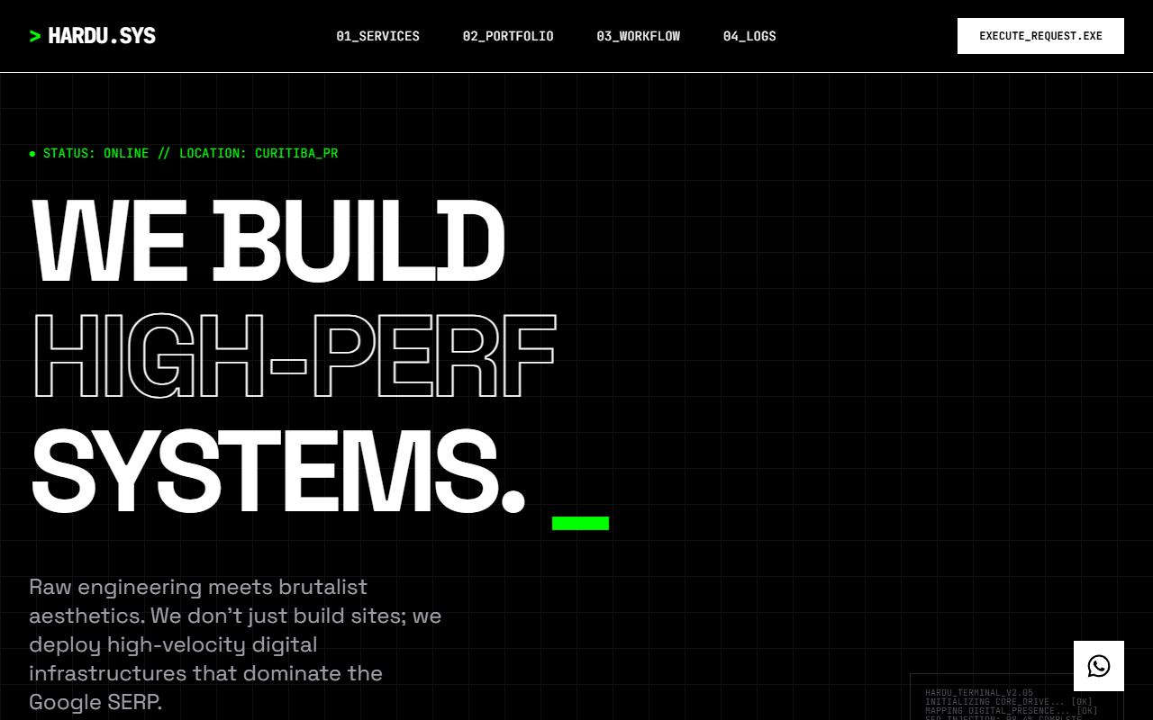
Hardu — Maximalist Web Agency
A vibrant, neo-brutalist and maximalist design system optimized for creative agencies, youth-focused brands, and high-energy SaaS platforms. This style combines heavy typography, 'Cabinet Grotesk' for impact, and 'Bespoke Slab' for editorial character. Key visual traits include a high-contrast palette of orange (#FF6B35), teal (#2EC4B6), and pink (#FF3366) set against a dark navy (#0F172A) and a light background (#F8FAFC). Features include hard-shadow 'neo-brutalist' components (4px solid borders, 8px offset shadows), scroll-triggered reveal animations with rotation, and continuous marquee belts. Perfect for brands wanting an 'explosive' and 'out of the box' digital presence that dominates search visibility and user attention.
Dark Avant-Garde Style
A dark avant-garde design system termed 'Digital Naturalism,' characterized by a sophisticated interplay between deep charcoal surfaces and high-energy acid green accents. Featuring editorial serif typography paired with clean sans-serif UI, the style utilizes Brutalist-inspired elements like serrated edges, skewed 'tab' navigation, and grainy noise overlays. Ideal for high-end design agencies, AI masterclasses, editorial portfolios, and premium fintech brands seeking a bold, technical, yet organic aesthetic.
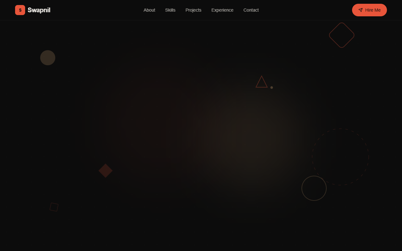
Swapnil's Bold Portfolio
A high-impact, dark-mode design system characterized by bold editorial typography, vibrant orange-red accents, and intricate micro-interactions. Featuring a 'noise' texture overlay and a geometric grid-based layout, this style is ideal for creative developers, design agencies, or fintech landing pages. It uses a sophisticated color palette of deep blacks, slate surfaces, and warm tan highlights, paired with high-performance animations like floating SVG shapes, pulsing glows, and smooth scroll-triggered transitions.
Light Beam Button
A high-performance button with a rotating light beam border effect using CSS @property and conic gradients. Features a shiny hover state and gradient border animation.
Light Rays Background
A minimalist showcase of a high-end WebGL light rays background effect with mouse interaction and atmospheric motion. Source: ReactBits
"Exploded View" Assembly
A scroll-driven animation where a central product or UI element explodes into its constituent parts and then reassembles into a new layout. Perfect for 'how it works' or feature breakdown sections.
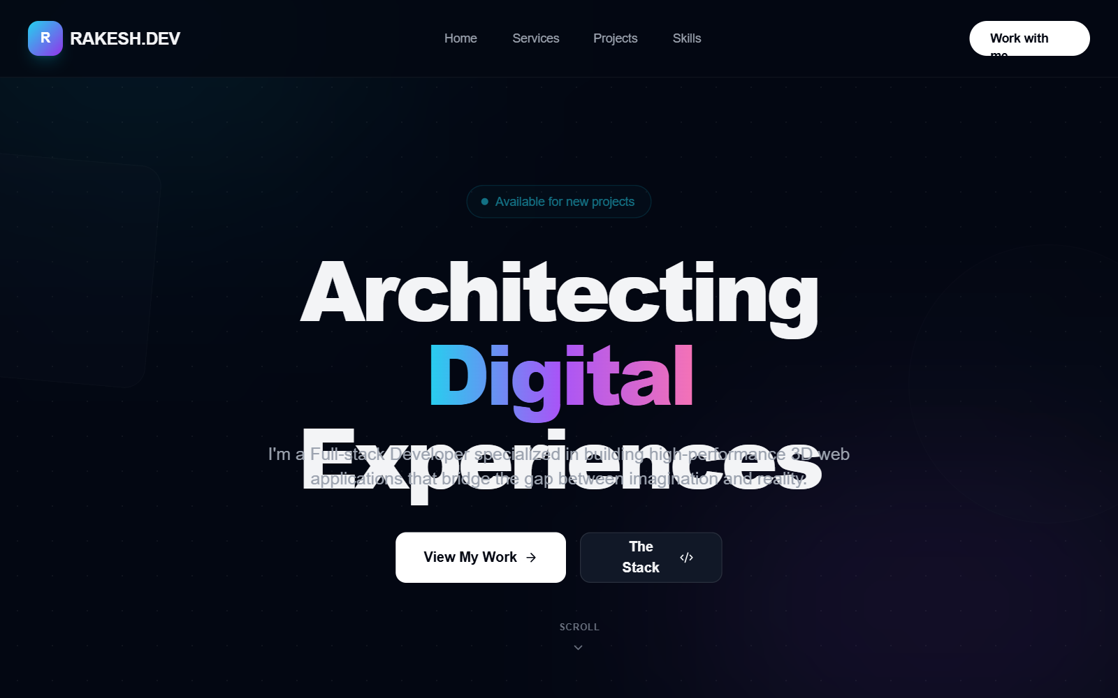
FlowState — AI-Powered Productivity OS (Fixed)
FlowState is a minimalist, high-end productivity OS design system characterized by an editorial aesthetic, sophisticated cream-based color palette, and premium glassmorphism. It leverages high-contrast typography pairing Cabinet Grotesk and Satoshi. Ideal for SaaS dashboards, AI tools, fintech landing pages, and professional productivity apps. The design features floating navigation docks, soft organic SVG blobs, layered shadow systems, and fluid spring-based animations to create a 'state of flow' user experience.
TuteDude - Futuristic EdTech Homepage with Services
A futuristic and premium edtech-focused style guide featuring glassmorphism, vibrant accents, and high-performance layout patterns. Defined by the pairing of 'Clash Display' and 'Satoshi' typography, the aesthetic uses a clean white mesh background accented by soft radial gradients in blue (#3b82f6) and lavender (#a78bfa). Key features include interactive glass cards with 32px corner radii, floating UI badges, and a custom spotlight cursor interaction. It is highly suitable for modern SaaS dashboards, fintech landing pages, and educational platforms seeking a professional yet cutting-edge 'Dribbble-quality' feel.
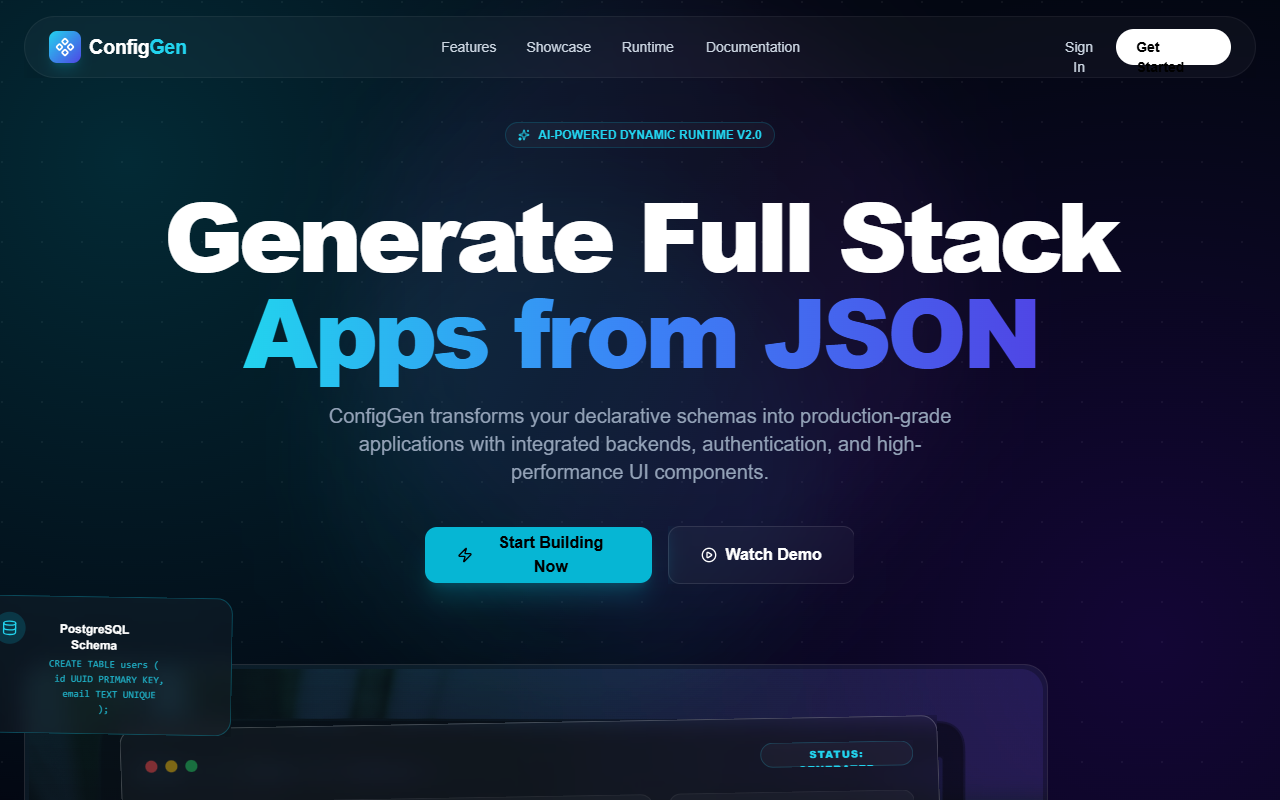
ConfigGen AI - Next-Gen Config-to-App Platform
A futuristic, AI-centric SaaS landing page design featuring a 'Cinematic Dark Mode' aesthetic. It utilizes glassmorphism, neon cyan and purple accents, and high-performance typography (Cabinet Grotesk and Satoshi). The design is optimized for developer tools, fintech, or AI-powered platforms. Layout highlights include a bento-style feature grid, a split-screen live code editor vs. UI preview, and a horizontal pipeline architecture visualization. It features interactive elements like 3D tilt-hover cards, floating background particles, and scroll-triggered reveals.
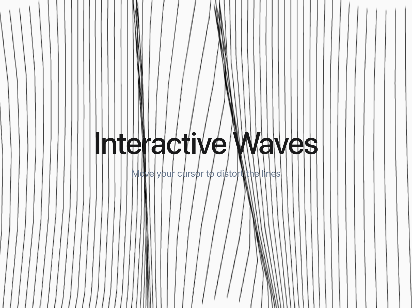
Interactive Waves Background
An interactive, wavy background effect using Perlin noise and canvas. Responds to mouse movement with fluid physics. Source: ReactBits
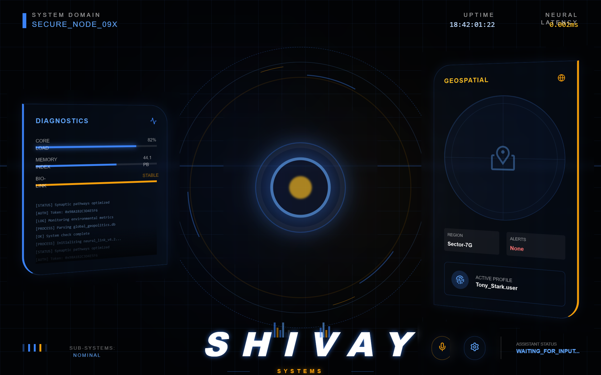
Shivay Luxury Neon Interface - Updated Credit
A high-end, luxury neon aesthetic design system named 'Shivay', optimized for superintelligent AI ecosystems, elite SaaS platforms, and futuristic fintech dashboards. This system features a deep obsidian background (#02040a) with a sophisticated mesh gradient and glassmorphism components. It utilizes a striking combination of editorial typography (Clash Grotesk) and high-tracking utility fonts (Satoshi). Key visual elements include neon glow effects in pink (#ff2d55), lime (#c1ff72), and cyan (#00f2ff), paired with ultra-smooth cubic-bezier transitions and floating geometric motifs.
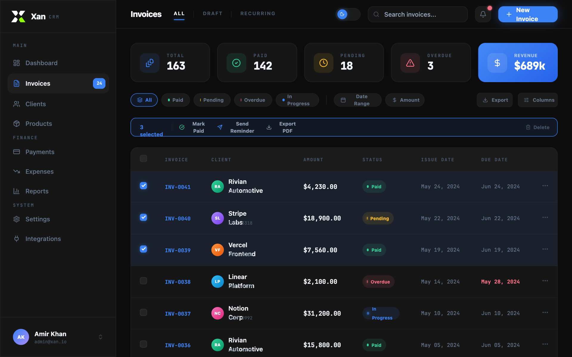
Xan CRM — Invoices List
Xan CRM is a high-end, finance-oriented design system characterized by a sophisticated dark-mode aesthetic with light-mode compatibility. It features a professional 'glass-panel' look using Outfit for UI copy and JetBrains Mono for data-heavy elements. The style is ideal for fintech, SaaS dashboards, and administrative platforms. Key visual markers include subtle mouse-tracking spotlight effects, vibrant color-coded status badges with pulse animations, and high-contrast accent glows. The layout utilizes a structured sidebar and a comprehensive data table with integrated bulk actions.
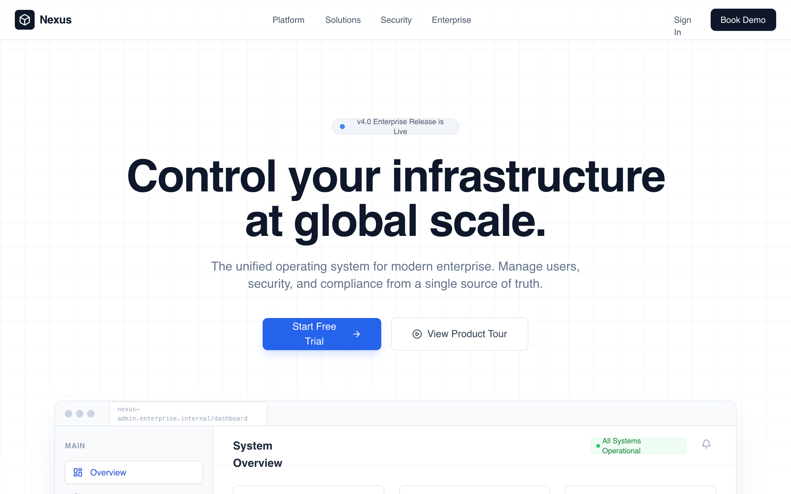
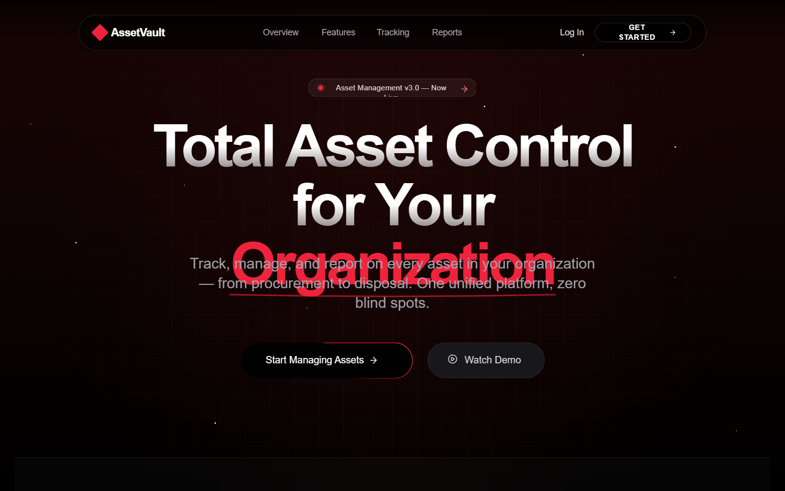
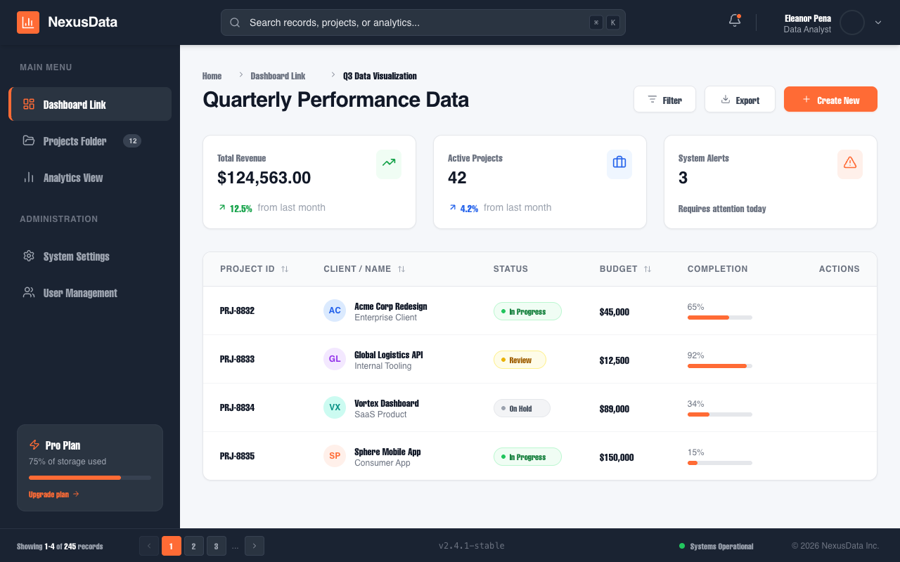
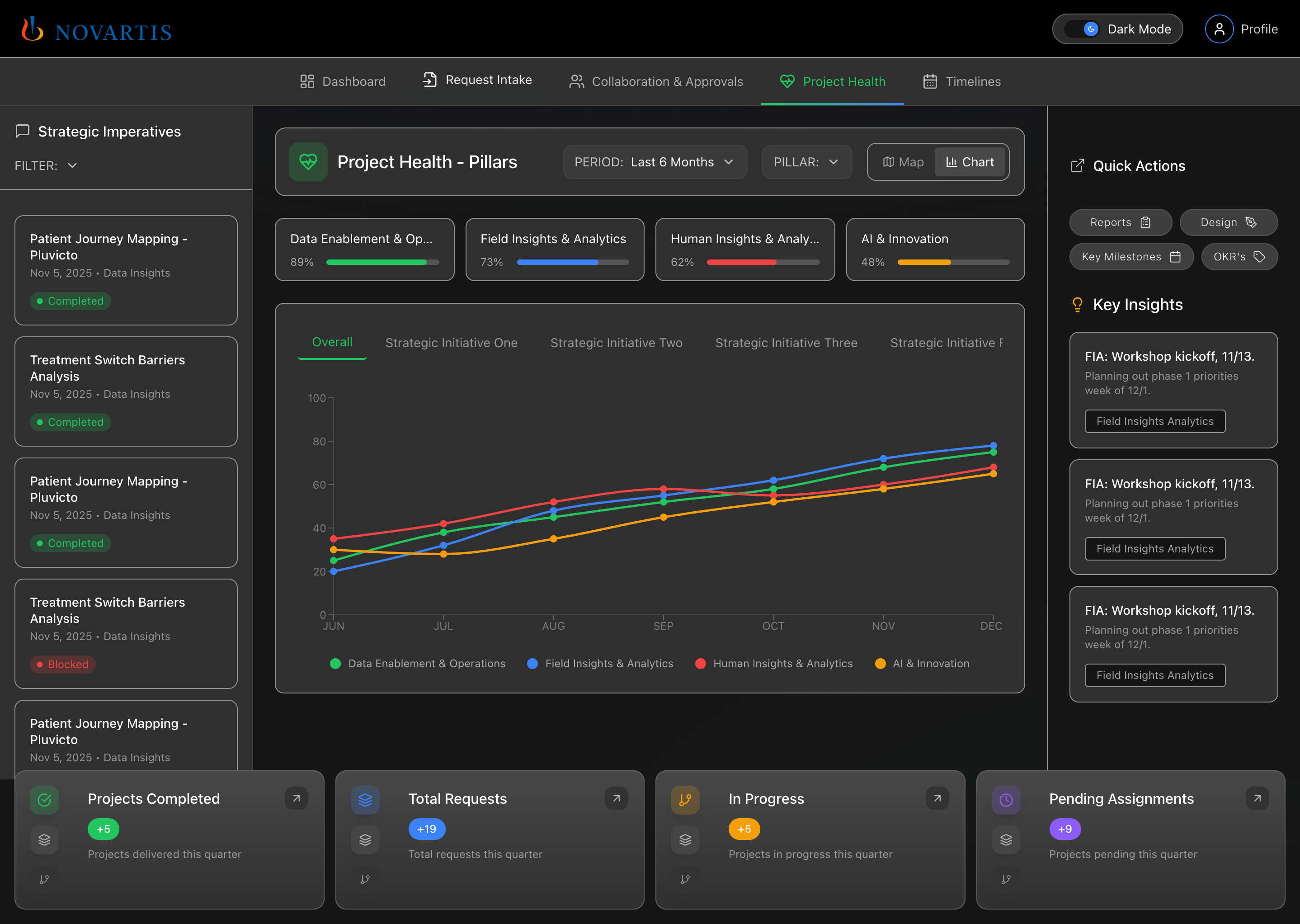
Enterprise Admin Platform
Enterprise Admin Platform is a professional, high-trust landing page design for corporate B2B SaaS, fintech, and infrastructure tools. It features a muted corporate color palette (whites, deep slates, and technical blues), a structured grid-based layout, and a focus on operational control and security. Key elements include a high-fidelity dashboard preview, KPI count-up animations, and a glass-morphism navigation bar. Suitable for enterprise management systems, cybersecurity platforms, and developer infrastructure tools.
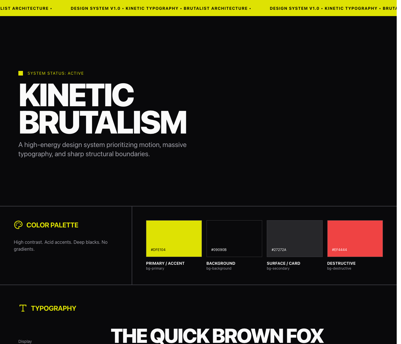
Architectural Type System Style
A high-contrast, architectural design system rooted in Swiss Modernism and Brutalist minimalism. Characterized by a monochrome palette, massive 'Inter Tight' display typography, and a rigid grid defined by 0.5px hairlines. Features a technical 'JetBrains Mono' font for metadata and system status indicators, creating an engineering-first aesthetic. Suitable for high-end SaaS, developer tools, fintech, architecture portfolios, and design agencies. Includes a persistent noise overlay for texture and grid-based layouts that utilize viewport-relative sizing for maximalist impact.
Liquid Ether Background
A production-grade showcase for the LiquidEther fluid simulation background effect. Features a minimalist, premium layout that emphasizes the motion and fluid dynamics of the WebGL-based ether effect.
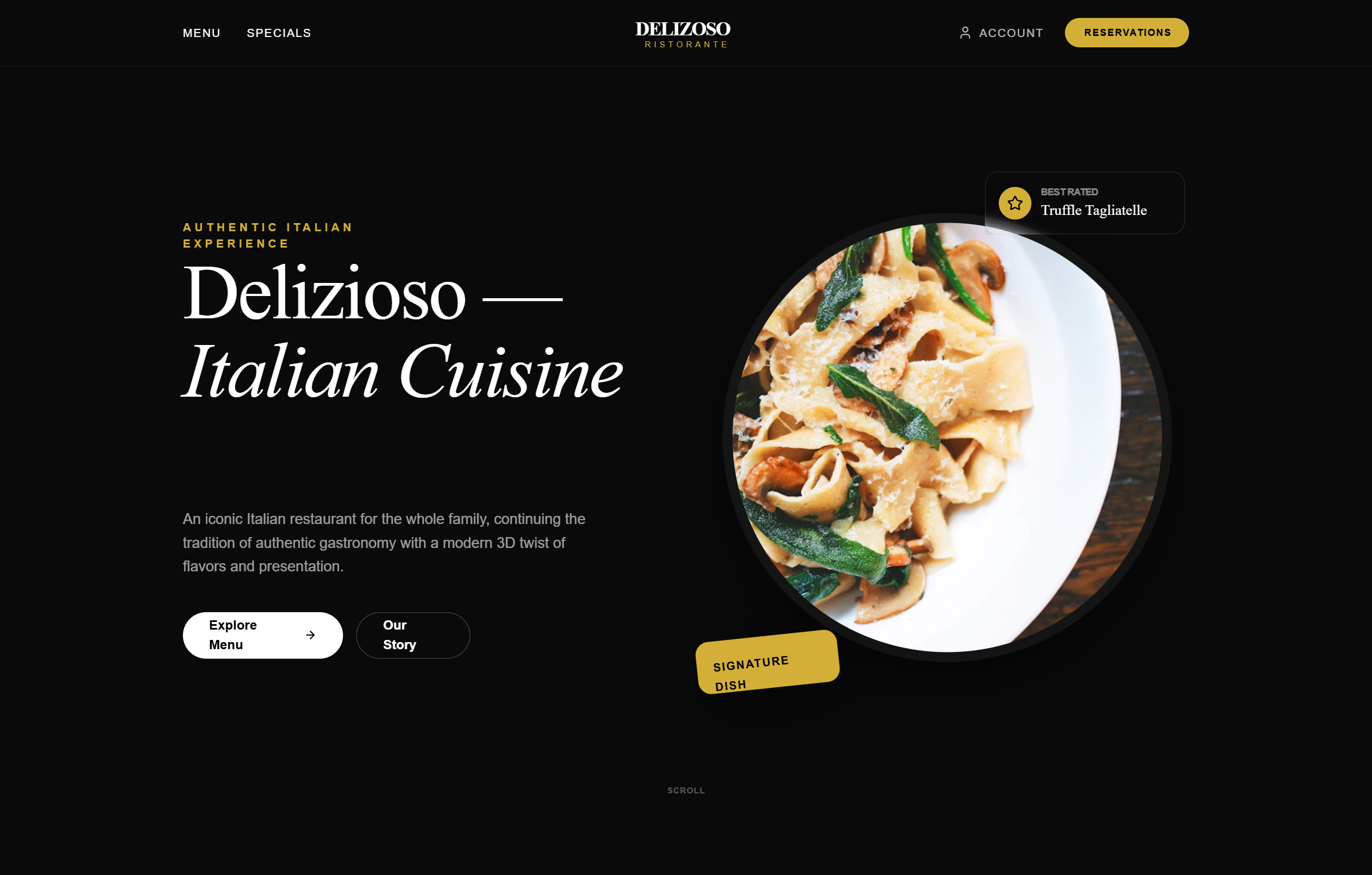
Delizoso - Elegant Italian 3D Restaurant (Copy)
A high-end, elegant Italian gastronomy design system featuring a deep charcoal and black 'dark mode' aesthetic accented with luxurious gold and terracotta tones. The style utilizes premium editorial typography (Zodiak Serif) and modern sans-serif (Plus Jakarta Sans). Key features include 3D-perspective hero elements, glassmorphism navigation, staggered bento-style grids for storytelling, and sophisticated hover effects. Ideal for fine dining restaurants, luxury hospitality brands, artisanal bakeries, or premium food & beverage e-commerce.
Hover reveal effect
Source: https://x.com/emilylambert/status/2005113433780617713
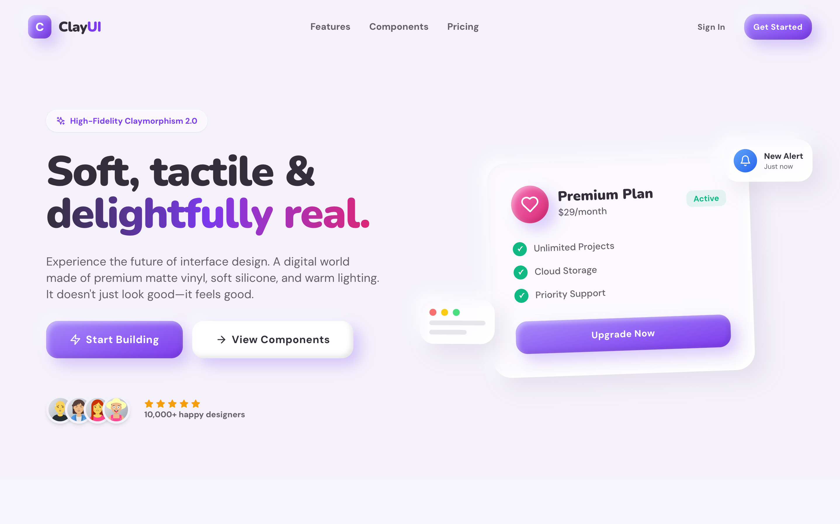
Clay UI
High-Fidelity Claymorphism Design System Source: designprompts.dev
Grunge Collage Motion
A high-energy, distressed collage style featuring raw textures, fragmented composition, and jittery stop-motion animation. Implements the 'Grunge Collage Motion Graphics' design system with bold typography and glitch effects.
Ghost Cursor
A fluid, smoky cursor trail effect using Three.js shader materials and post-processing bloom.
Premium Glassmorphism Dashboard with Smooth Edge-to-Edge Line Charts
A high-end glassmorphism dashboard design system featuring soft mesh backgrounds, vibrant gradients, and edge-to-edge smooth SVG line charts. The aesthetic uses 'Cabinet Grotesk' for bold, editorial headings and 'Satoshi' for clean body text. Suitable for premium SaaS, fintech, analytics platforms, and modern creative agency portals. Key elements include bento-grid layouts, ultra-blurred glass surfaces (28px blur), and floating 3D-inspired micro-interactions.
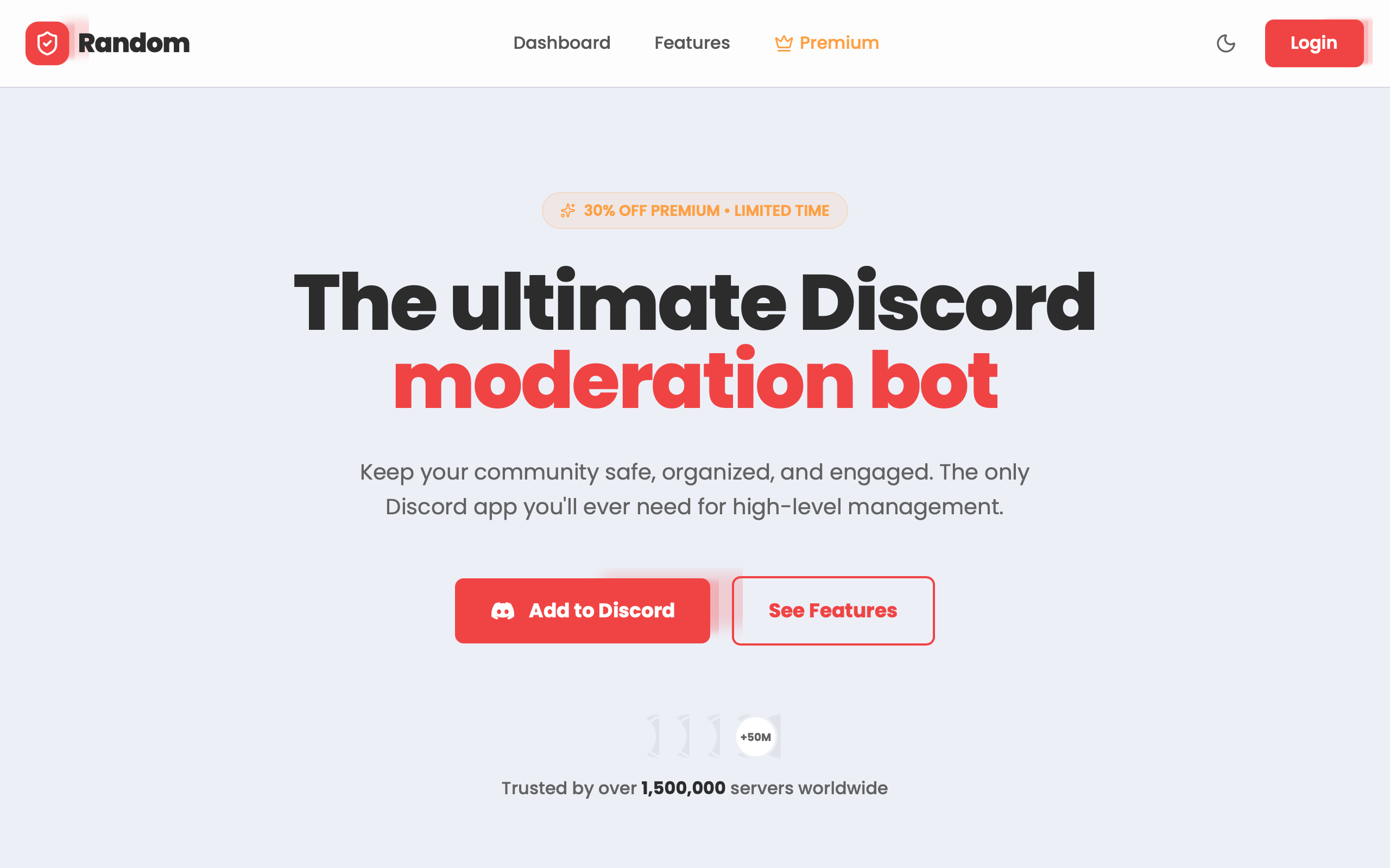
Random Bot — Refined Header Navigation
A high-tech, premium dark-mode design system tailored for Discord bots, SaaS platforms, or developer tools. It features a sophisticated palette of neon accents (#f04444, #14b8a6, #fbbf24) against a deep navy background (#0f172a). The aesthetic combines glassmorphism, editorial typography with 'Cabinet Grotesk' and 'Satoshi', and scroll-triggered spring animations. Key features include animated mesh backgrounds, bento-style feature grids, and interactive simulation components like terminal logs and UI previews.
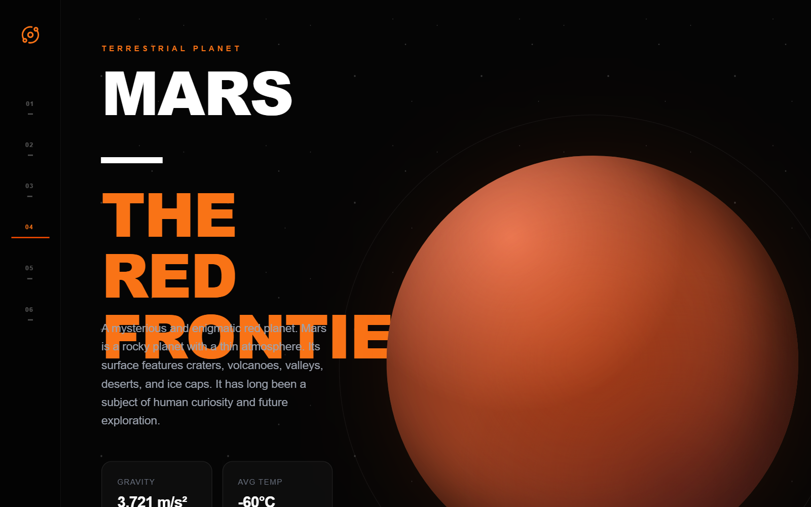
ORBIT | Interactive Solar System Explorer
ORBIT is a cinematic, dark-mode design system optimized for immersive storytelling, educational platforms, and high-end data visualization. Characterized by a 'Space Tech' aesthetic, it features deep space blacks (#050505), vibrant accent colors like Mars Orange (#ff4d00), and sophisticated glassmorphism. The layout utilizes an editorial approach with oversized typography (Cabinet Grotesk), a 12-column grid, and a persistent vertical navigation sidebar. Design elements include star-field backgrounds, interactive 3D-simulated planet visuals with atmosphere glows, and metadata-rich status bars. Suitable for aerospace, fintech dashboards, luxury brands, and interactive science applications.
Sketch
The Hand-Drawn design style celebrates authentic imperfection and human touch in a digital world Source: designprompts.dev
Vrindavan Chandrodaya Temple - Asset Manager
A ceremonial and organized asset management design system with a 'Red Noir' dark aesthetic, infused with warm spiritual accents like saffron and gold. Ideal for religious institutions, NGOs, and traditional organizations requiring robust resource tracking. Features include a bento grid for capabilities, a star-parallax background, glassmorphism dashboard elements, and high-contrast status labeling. Layout elements include a hero section with a badge, a stats horizontal strip, and a detailed asset tracking table with 'Active/Returned/Pending' statuses.
Architectural Blueprint
A technical, architectural blueprint style dashboard with grid systems, measurement markers, and drafting aesthetics.
Jelly Squish Button
A high-fidelity interactive 3D jelly simulation that responds to vertical dragging and mouse movement. Uses GSAP for physics-based animation and optimized image sequencing. Perfect for playful hero sections or interactive showcases. Source: https://codepen.io/cerpow/pen/LEZYxqM
Terminal
The Terminal CLI aesthetic pays homage to the raw power of the command line Source: designprompt.dev
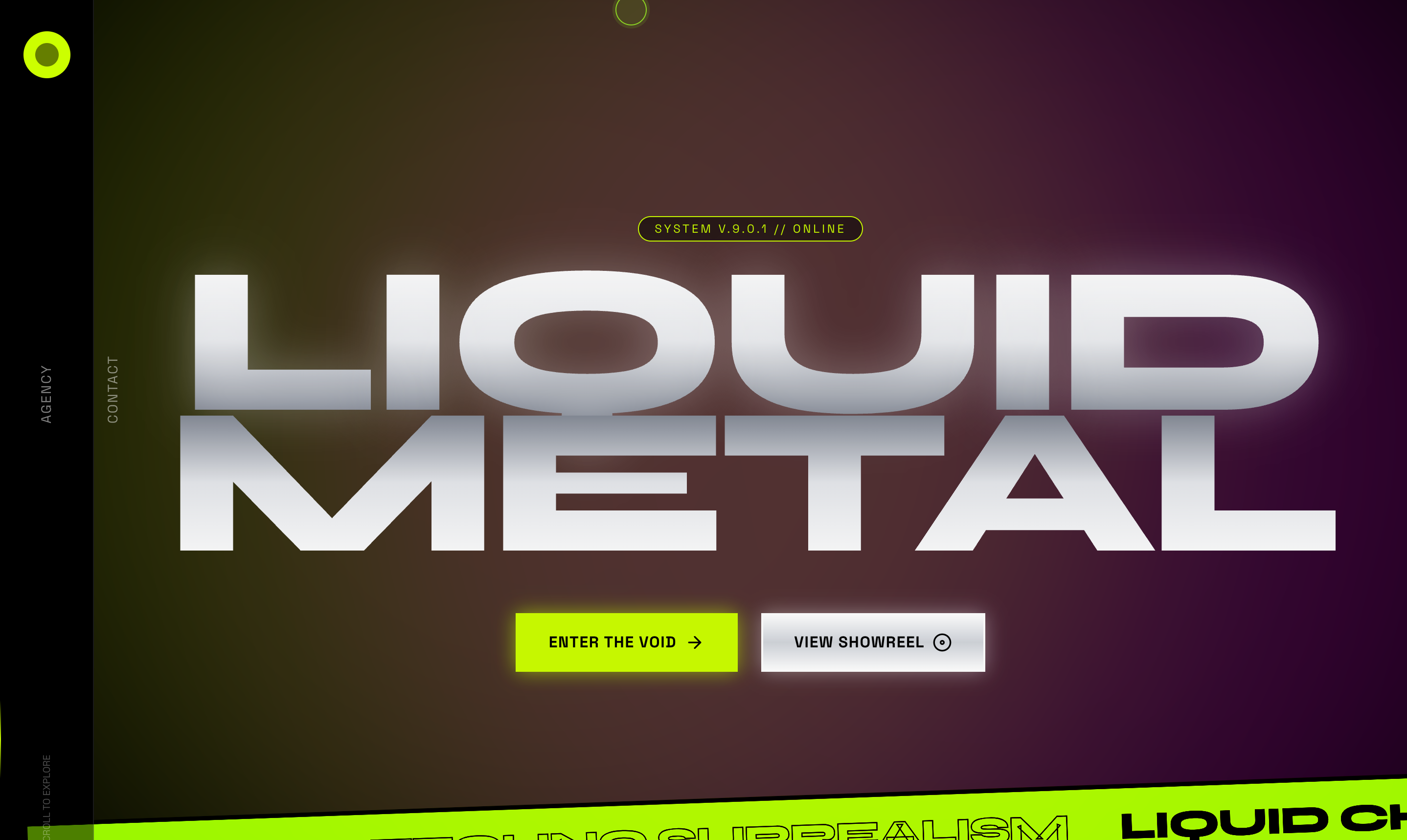
Liquid Metal style
Liquid Chrome & Techno-Surrealism style
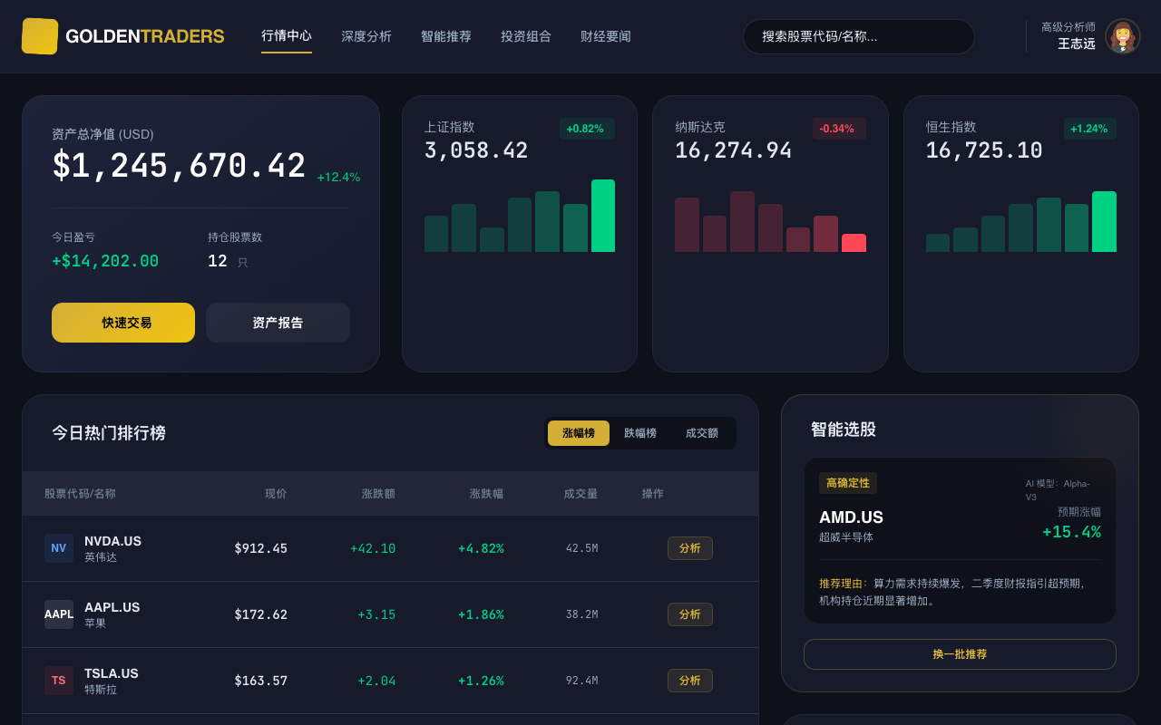
GoldenTraders 专业股票分析平台
GoldenTraders is a high-end, professional financial analysis dashboard style. It features a sophisticated dark mode aesthetic using deep navy and charcoal tones (#0f111a, #161a2b) contrasted with luxurious gold accents (#d4af37). The design is optimized for fintech, stock trading, and crypto platforms, prioritizing data density and legibility through the use of tabular monospaced typography for financial figures. Layouts utilize a bento-grid approach with glassmorphism elements, subtle borders, and smooth micro-interactions that signal precision and reliability.
Horizontal Gallery
A sticky section that locks vertical scroll and translates it into horizontal movement to showcase a gallery. Features robust GSAP ScrollTrigger initialization.
Data Visualization Dashboard
A professional enterprise-grade data visualization dashboard featuring a high-contrast dark navy and vibrant orange color palette. The design uses a structured 3-part layout (Header, Sidebar, Main Content) optimized for SaaS platforms, fintech, analytics tools, and project management systems. It emphasizes clarity through a clean Plus Jakarta Sans typography, modular bento-style metric cards, and a sophisticated data table with contextual hover actions and status indicators.
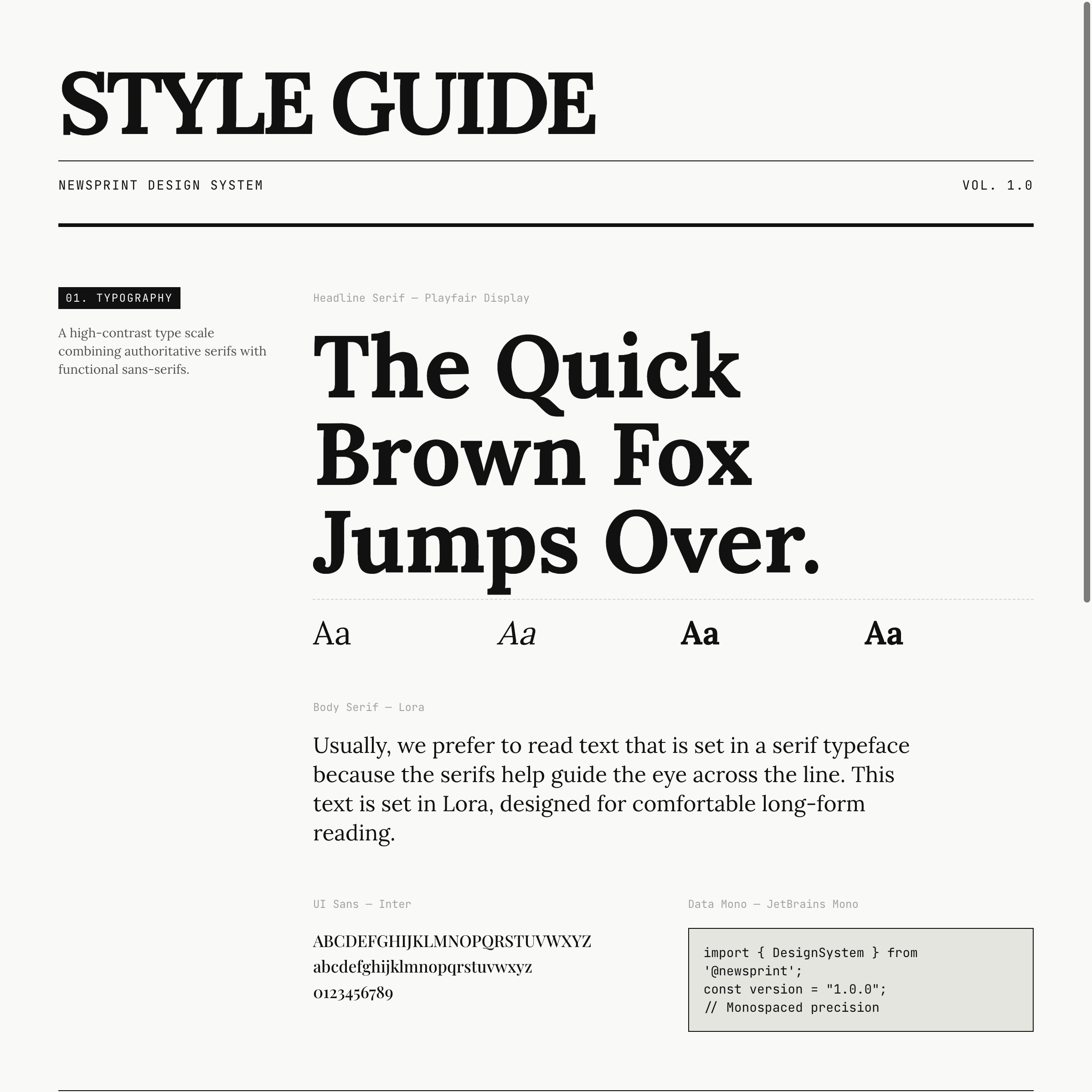
News Print
This style is an ode to the golden age of print journalism, reimagined for the web Source: designprompts.dev
Magnification Dock
A premium macOS-inspired dock component with fluid magnification effects, spring physics, and tooltips. Built with Framer Motion for high-performance interactions.
Scroll animation
Cinematic Multi-Section Portfolio Experience
A cinematic, dark-mode portfolio design featuring high-contrast orange accents, fluid mesh gradients, and grain overlays. This design is optimized for high-end creative portfolios, fintech landing pages, and personal brand sites for executives. Key features include a scroll-less, section-based navigation system, a circular clip-path menu transition, and sophisticated GSAP-powered staggered animations. It combines bold editorial typography with technical monospace details to create a 'futuristic-industrial' aesthetic. Keywords: orange, dark mode, grain, mesh gradients, GSAP, cinematic, portfolio, fintech, executive, minimalist, maximalist typography, full-screen menu.
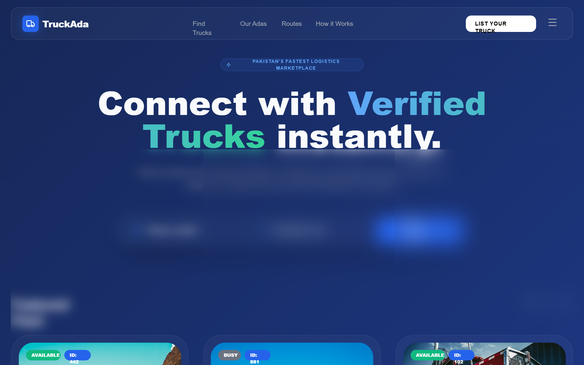
TruckAda Dark 3D Marketplace
A high-performance dark-themed logistics marketplace style. Features a sophisticated deep navy aesthetic with vibrant blue and emerald accents, utilizing glassmorphism, 3D interactive transforms, and scroll-triggered animations. Optimized for industrial SaaS, fintech dashboards, or transport logistics platforms requiring a professional yet cutting-edge 'future-tech' feel. Key design elements include editorial typography (Cabinet Grotesk), carbon-fiber textured backgrounds, and high-gloss 3D card components with shimmer effects.
Typing animation
A typing animation component that reveals each character of a headline with a 50ms delay, featuring a minimalist showcase and replay functionality.
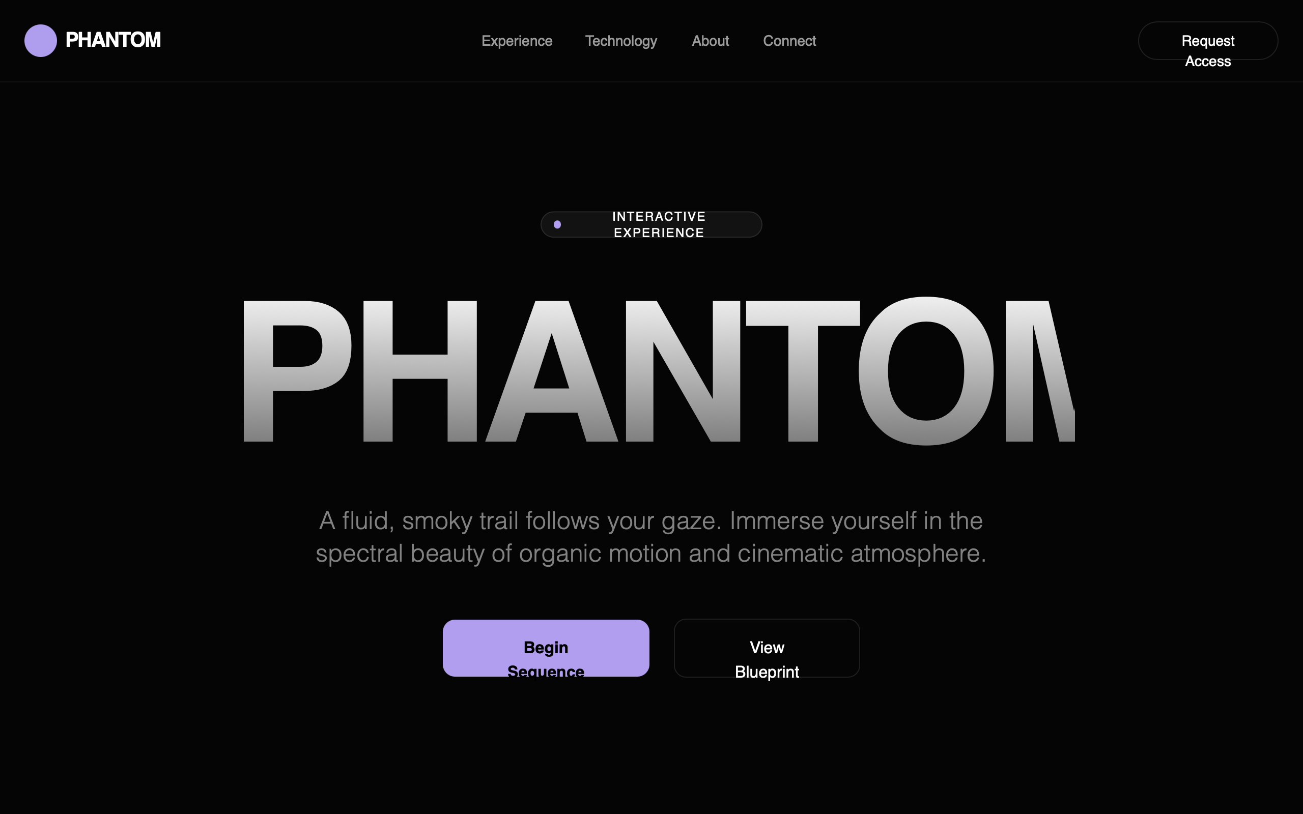
Phantom — Cinematic Ghost Cursor Landing
A cinematic, dark-themed interactive landing page with a minimalist aesthetic and a primary focus on a fluid, purple 'ghost cursor' trail. Features bold, editorial-style typography (Cabinet Grotesk) paired with a clean sans-serif (Satoshi). The design utilizes high-contrast deep blacks (#050505) and vibrant lavender accents (#B19EEF) to create a moody, immersive environment suitable for creative studios, premium SaaS, AI portfolios, and high-end digital experiences. Key elements include interactive shaders, bento-grid features, and large-scale typography gradients.
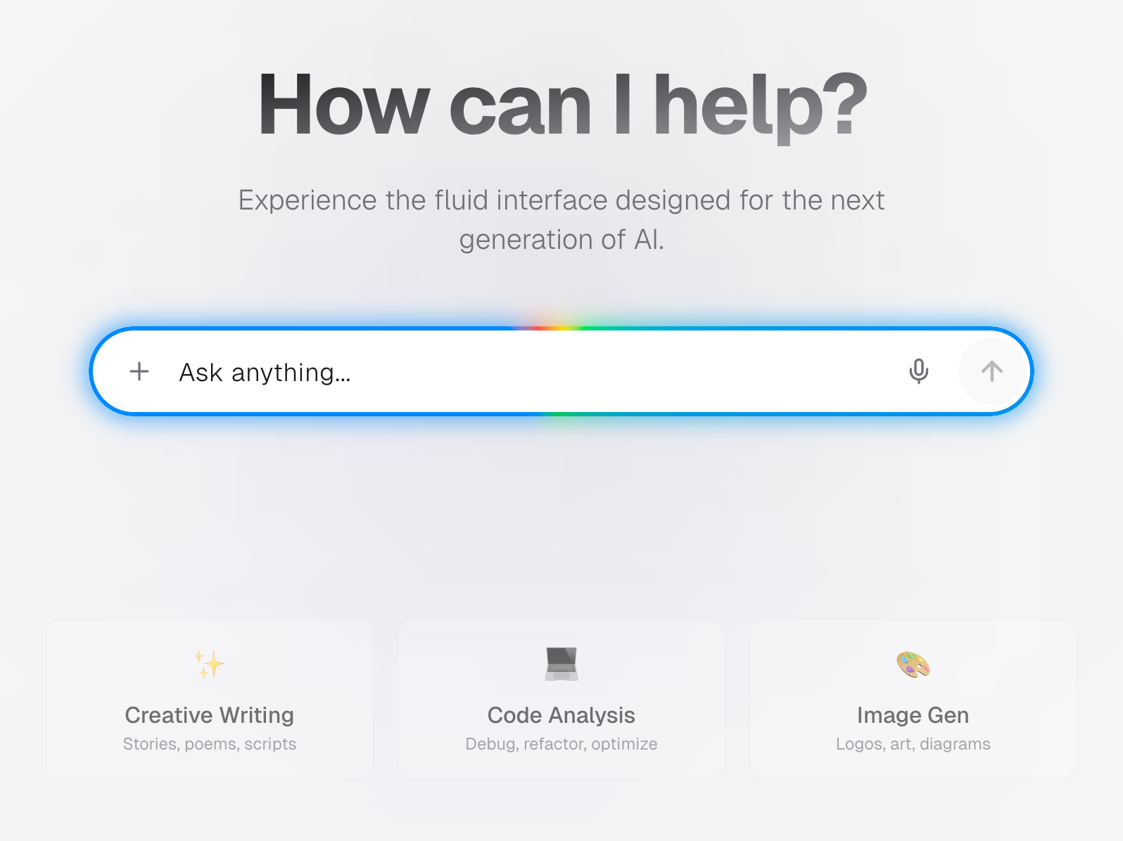
Radiant Prompt Input
A high-fidelity, kinetic input interface featuring a mesmerizing, continuously rotating conic gradient border. Designed for next-generation AI interactions, this component elevates simple text entry into a focal point of engagement, blending futuristic aesthetics with organic fluid motion. Ideal for LLM chat interfaces, command palettes, or hero search bars that require a premium, 'magical' feel. Source: https://codepen.io/una/pen/wBGNWmZ
Brilliant Layout Restructure
An editorial-grade, high-end design system titled 'Brilliant Layout Restructure'. It features a sophisticated palette of Gold (#D4AF37), Charcoal (#2C2C2C), and deep Navy (#1F3A5F) set against an Alabaster (#F9F8F6) background. The style is characterized by thin 1px decorative vertical grid lines, asymmetric layouts, and heavy use of whitespace. Suitable for professional services, luxury consultancies, fintech, and legal firms, the design utilizes a pairing of 'Inter' for body text and 'Outfit' for high-contrast headings. It includes scroll-triggered fade-in-up animations and unique micro-interactions like expanding underlines and sliding button fills.
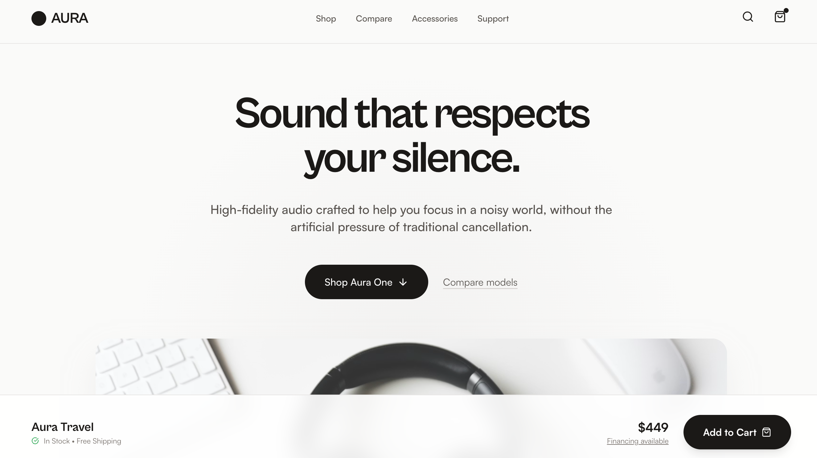
Aura Audio Showroom
Product Walkthrough is a product-first electronics landing page built around a Showroom Flow layout—product theater followed by guided model selection, scenario-based feature explanations, lightweight comparison, and a confident close—making it best suited for consumer electronics and DTC hardware brands with multiple models or configurations that want a clear, trust-building shopping experience without spec overload or lifestyle clichés.
Abhinab Jena — Portfolio
Premium minimalist dark mode portfolio and studio style guide. Features a sophisticated editorial aesthetic using a taupe (#b7ab98) and coral (#eb5939) palette on a deep charcoal (#0d0d0d) background. Suitable for high-end digital agencies, art directors, product designers, and luxury brand showcases. Employs brutalist typography with 'Clash Grotesk' and 'Satoshi', combined with sophisticated micro-interactions like magnetic buttons, custom cursor rings, and scroll-triggered revealing animations. Layout focuses on a bento-style grid, large-scale headings, and high-quality whitespace balance.
Kinetic
High-energy brutalism meets kinetic poster design Source: designprompts.dev
Organic Modern Style
An organic modern design system blending editorial typography with tactile textures and high-end minimalism. It features a sophisticated palette of cream, charcoal, and sage, utilizing 'DM Serif Display' for a classic yet contemporary feel. Key characteristics include heavy use of negative space, hand-drawn annotations, noise-textured backgrounds, and smooth transitions from grayscale to color. Ideal for high-end boutique agencies, AI-driven product startups, luxury lifestyle brands, and design studios.
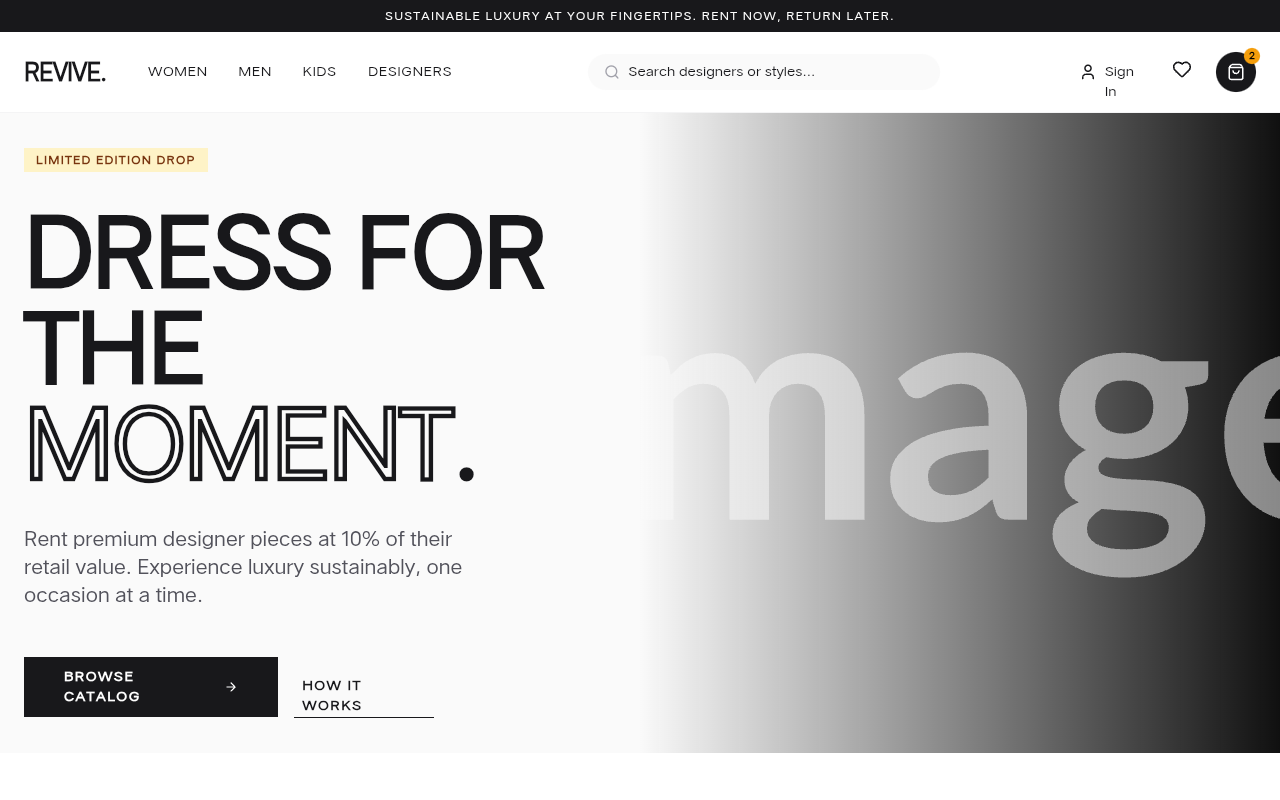
REVIVE | Complete Fashion Rental Marketplace
A premium, minimalist e-commerce design system tailored for luxury fashion rentals, high-end retail, or boutique lifestyle brands. The style features a sophisticated palette of zinc grays and rich amber accents, anchored by a high-contrast editorial layout. It utilizes a mix of bold display typography (Cabinet Grotesk) for impact and clean geometric sans-serif (Satoshi) for readability. Key features include a slide-out cart drawer, hover-triggered product actions, bento-style category grids, and 3:4 aspect ratio product photography. Suitable for high-ticket SaaS, designer marketplaces, and luxury service verticals.
ConfigGen AI - Next-Gen Config-to-App Platform
Futuristic AI SaaS design system optimized for developer-focused platforms. Features a deep dark theme (#030712), vibrant neon cyan (#00f2ff) and indigo (#7000ff) accents, and heavy editorial typography using Cabinet Grotesk. Layout includes bento-inspired glassmorphism grids, interactive split-screen code editors, and animated system architecture visualizations. Ideal for fintech, AI dev tools, cloud infrastructure, and technical SaaS products requiring a cinematic, premium aesthetic with high interactivity and depth.
Flat design
Flat Design removes all artifice Source: designprompts.dev
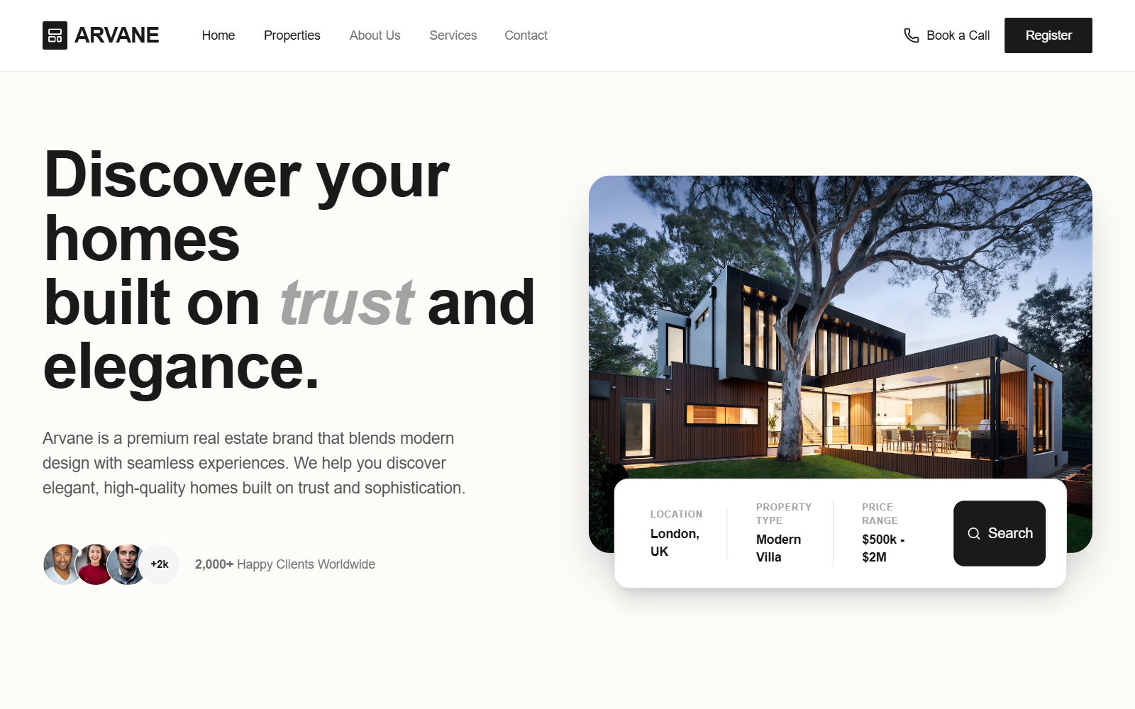
Arvane Luxury Real Estate Portfolio
A luxury real estate landing page design featuring a sophisticated, minimalist aesthetic with an earth-toned palette of charcoal, cream, and gold. This style utilizes editorial typography (Cabinet Grotesk and Satoshi) and high-impact layouts like bento-style grids and floating search bars. Ideal for high-end residential agencies, interior design portfolios, or architectural firms. Key features include scroll-triggered hover effects, glassmorphism elements in the navigation, and a focus on lead generation through prominent CTA forms and property search tools.
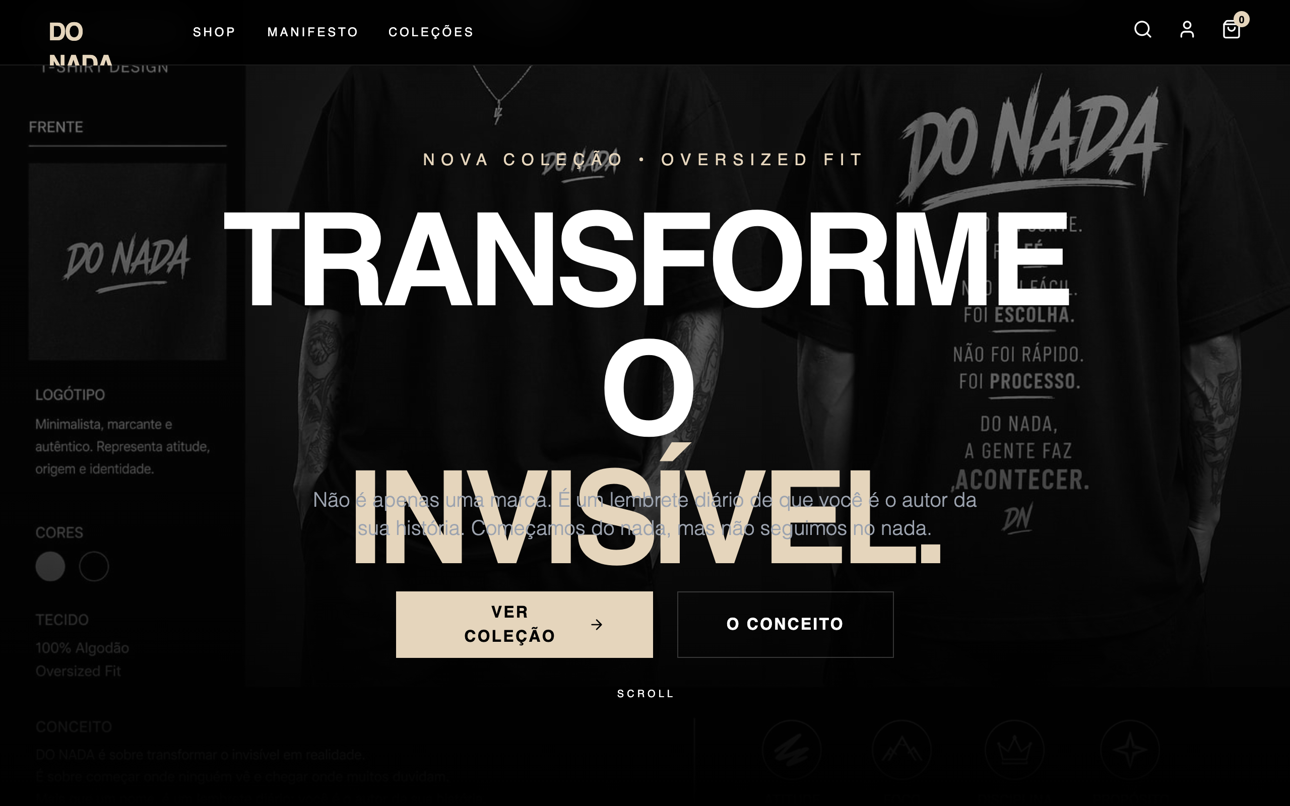
DO NADA - Premium Apparel Store
Premium apparel e-commerce style guide featuring a high-contrast black and gold palette. Utilizes a mix of editorial Cabinet Grotesk typography and clean Satoshi body text. Suitable for luxury streetwear, high-end fashion, and boutique lifestyle brands. Features cinematic grayscale-to-color image transitions, bold brutalist typography backgrounds, and a focus on minimalist layouts with dramatic letter spacing.
Colored, Glowing Edge Card
Original source: https://codepen.io/simeydotme/pen/RNWoPRj
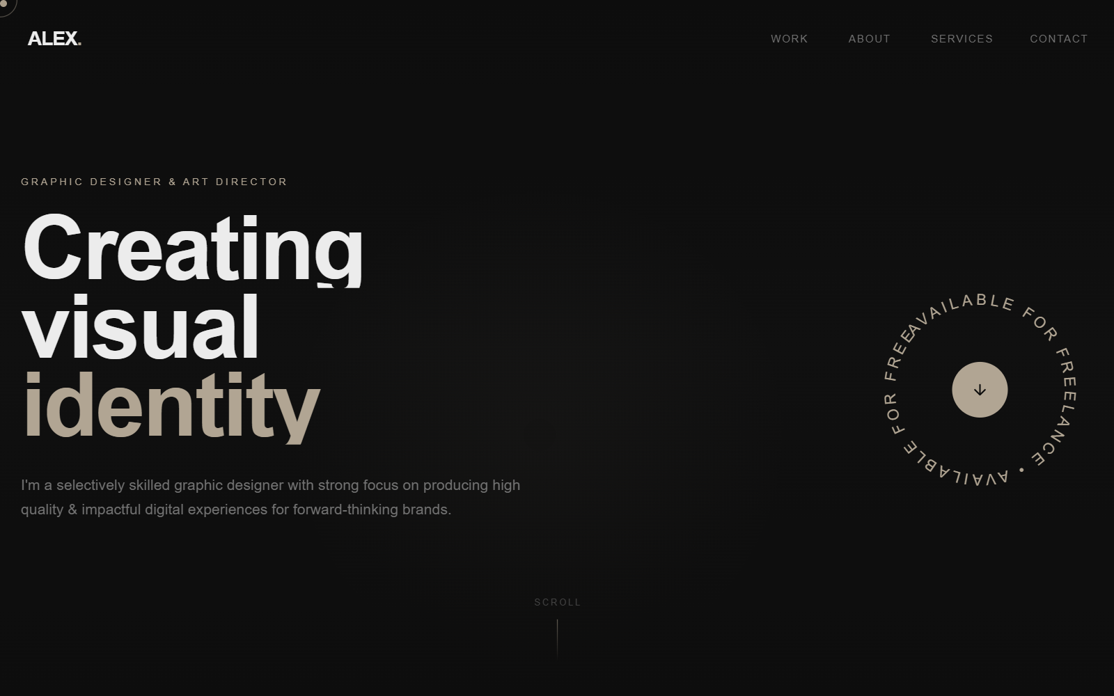
Graphic Designer Portfolio
A sophisticated, high-end portfolio design with a dark mode aesthetic, featuring a warm taupe and deep charcoal color palette. The style utilizes 'Clash Grotesk' for bold, geometric display typography and 'Satoshi' for refined body copy. Key features include a grain/noise texture overlay, custom dual-element cursor following, scroll-triggered text reveal animations, and a spinning SVG text badge. This design is optimized for creative professionals, graphic designers, art directors, and luxury branding agencies seeking a minimalist yet high-impact digital presence.
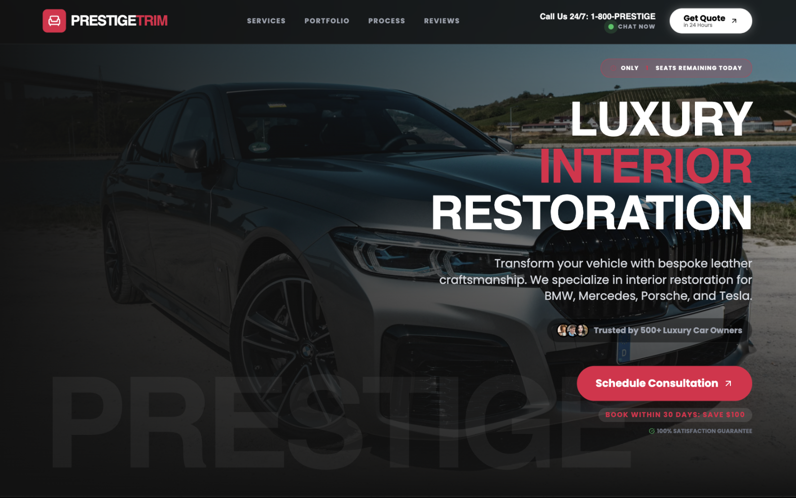
Premium Dark B2B Service Landing
This production-grade, high-contrast dark-mode luxury landing page template is optimized for high-ticket B2B automotive services, premium restoration businesses, and affluent customer acquisition using brutalist modernism with crimson accent luxury. The core color palette features ultra-dark backgrounds (#121212, #0a0a0a) paired with pure white text (#ffffff) and strategic crimson (#e11d48) accents, creating WCAG AAA contrast compliance. Typography uses Cal Sans for bold headlines and Poppins for readable body text with extreme letter-spacing for authority. Best described as "dark luxury brutalism," this dark-mode-only template excels in before-and-after portfolio showcases and high-ticket service pages, featuring sticky glass-morphism headers, live chat indicators, urgency badges, interactive trust bars, expandable service cards, luxury vehicle transformation carousels, ROI badges, testimonial grids, and gradient CTAs. Animations include scroll-reveal fades, pulsing indicators, button scales, image crossfades, and staggered reveals. High contrast ensures maximum accessibility and CTA prominence. Ideal for automotive restoration, luxury trades, photo services, and enterprise SaaS dashboards targeting premium clientele. Keywords: premium dark landing template, automotive service UI, luxury restoration, B2B high-ticket, before-after showcase, brutalist design, high-contrast dark mode, conversion-optimized, glassmorphism, crimson luxury, professional landing, SaaS dashboard, dark luxury branding.
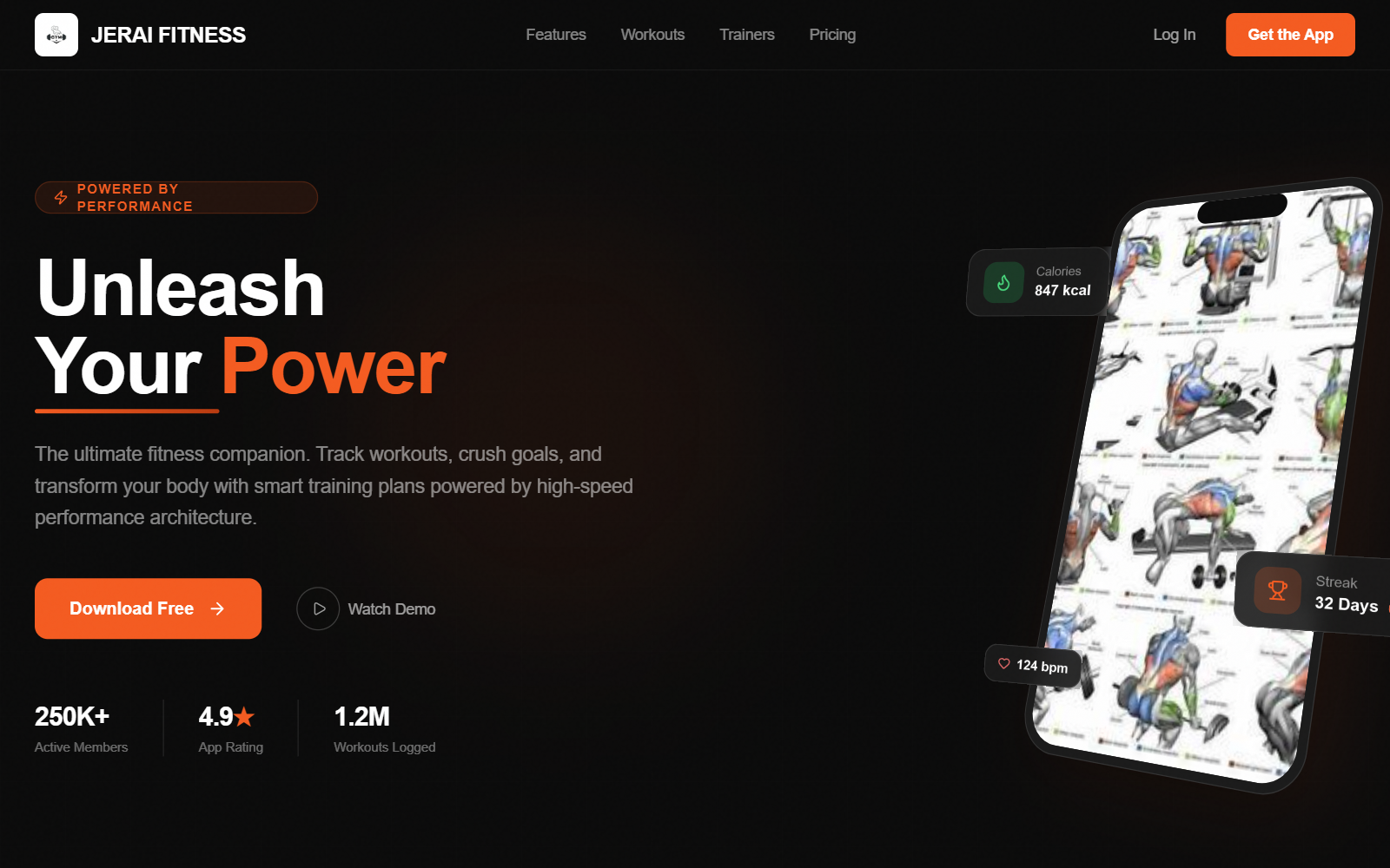
3D Fitness App Promo
High-octane dark mode promotional design for fitness and performance brands. Features intense fire-orange (#F45B20) accents, 'Clash Grotesk' display typography for heavy impact, and advanced 3D CSS transforms for product presentation. Suitable for high-performance SaaS, fitness tech, sports equipment, and energy-driven mobile apps. Includes 3D phone mockups, floating data badges, mouse-tracking interactive cards, and a subtle grain overlay for a cinematic finish.
Plasma Background
A mesmerizing, high-performance plasma background effect using OGL (WebGL) with customizable color, speed, and mouse interaction. Follows Minimalist Showcase style. Source: ReactBits
Hardu — Brutalist Tech Edition
Hardu Brutalist Tech Edition is a high-contrast, terminal-inspired design system. It blends raw brutalist aesthetics with technical minimalism, characterized by a monochrome black and white palette punctuated by neon green (#00FF00) accents. Suitable for software engineering agencies, cybersecurity firms, dev-tool startups, and technical portfolio sites, the style features a strict grid-based layout, heavy borders, and 'JetBrains Mono' typography for a command-line interface feel. Key elements include scroll-triggered scanlines, ASCII art components, and high-performance metrics indicators.
Masonry Gallery
A high-performance, GSAP-powered Masonry layout component with fluid animations, entrance effects (blur-to-focus, directional stagger), and interactive hover states. Supports responsive column counts and lazy-loading pre-checks.
Pill Nav
A premium, minimalist pill-shaped navigation component with GSAP-powered hover effects, rotating logo animation, and responsive mobile menu. Features a unique 'rising circle' background effect on hover.
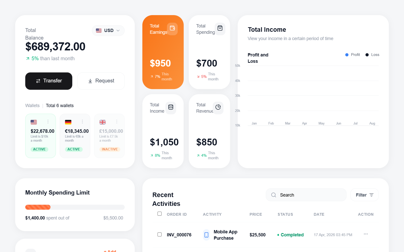
Fintech Dashboard with Line Chart
A high-fidelity fintech dashboard featuring a clean, modern aesthetic with a focus on data visualization and personal finance management. Key features include a smooth SVG line chart with dual-axis data points, high-radius card components (32px), a multi-currency wallet system, and a detailed transaction table. The style is defined by its use of the 'Outfit' typeface, a vibrant orange (#FF6B35) and blue (#3B82F6) color palette against a light gray background (#F5F6F8). Suitable for banking apps, investment platforms, SaaS analytics, and crypto dashboards.
Text blur animation
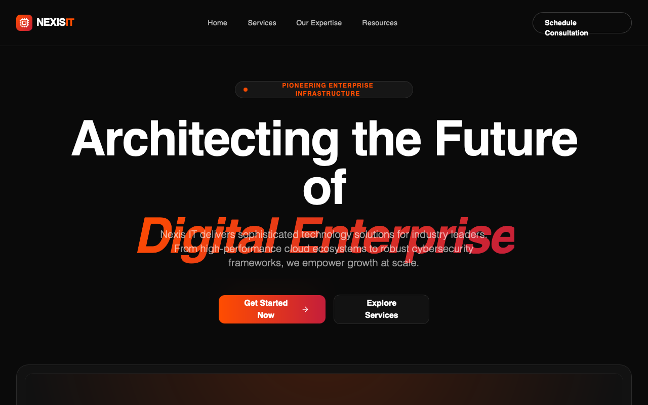
Nexis IT - Enterprise Landing Page
Nexis IT style guide features a high-energy, dark-themed enterprise tech aesthetic. It utilizes a vibrant orange-to-red gradient against a deep black background (#0A0A0A) to create a sense of power and innovation. The design language is characterized by glassmorphism, architectural typography using Clash Grotesk and Satoshi, and subtle motion design. This style is ideally suited for high-growth SaaS, fintech, cybersecurity, and cloud infrastructure companies looking to project authority and cutting-edge technology.
Gen-Z Social App
A high-energy, Gen-Z-inspired design system with a 'Neo-Brutalist' aesthetic. This style features high-saturation colors like acid green (#ccff00), vibrant purple (#7000ff), and hot pink (#ff0099), paired with heavy black borders and hard shadows. It utilizes expressive, oversized typography and intentional layout chaos through asymmetrical sections and tilted elements. Ideal for social media apps, youth-oriented fintech, creative portfolios, and lifestyle products that prioritize attitude over corporate structure.
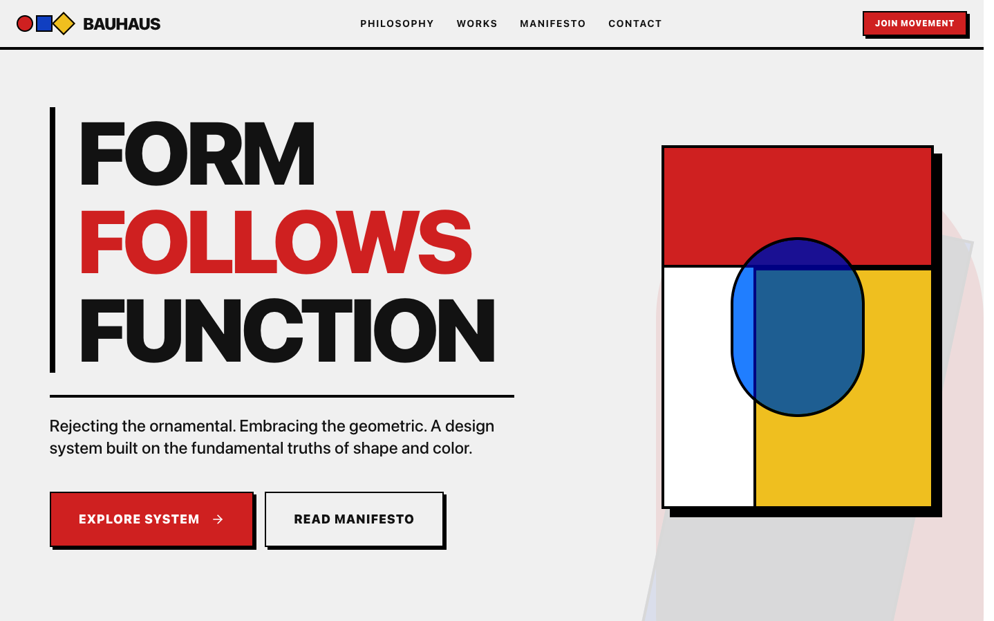
Bauhaus
The Bauhaus style embodies the revolutionary principle "form follows function" while celebrating pure geometric beauty and primary color theory Source: designprompts.dev
Interactive Folder
An interactive, premium folder component with a playful opening animation and drifting paper elements. Features smooth CSS transitions and mouse-tracking interactions. Source: ReactBits
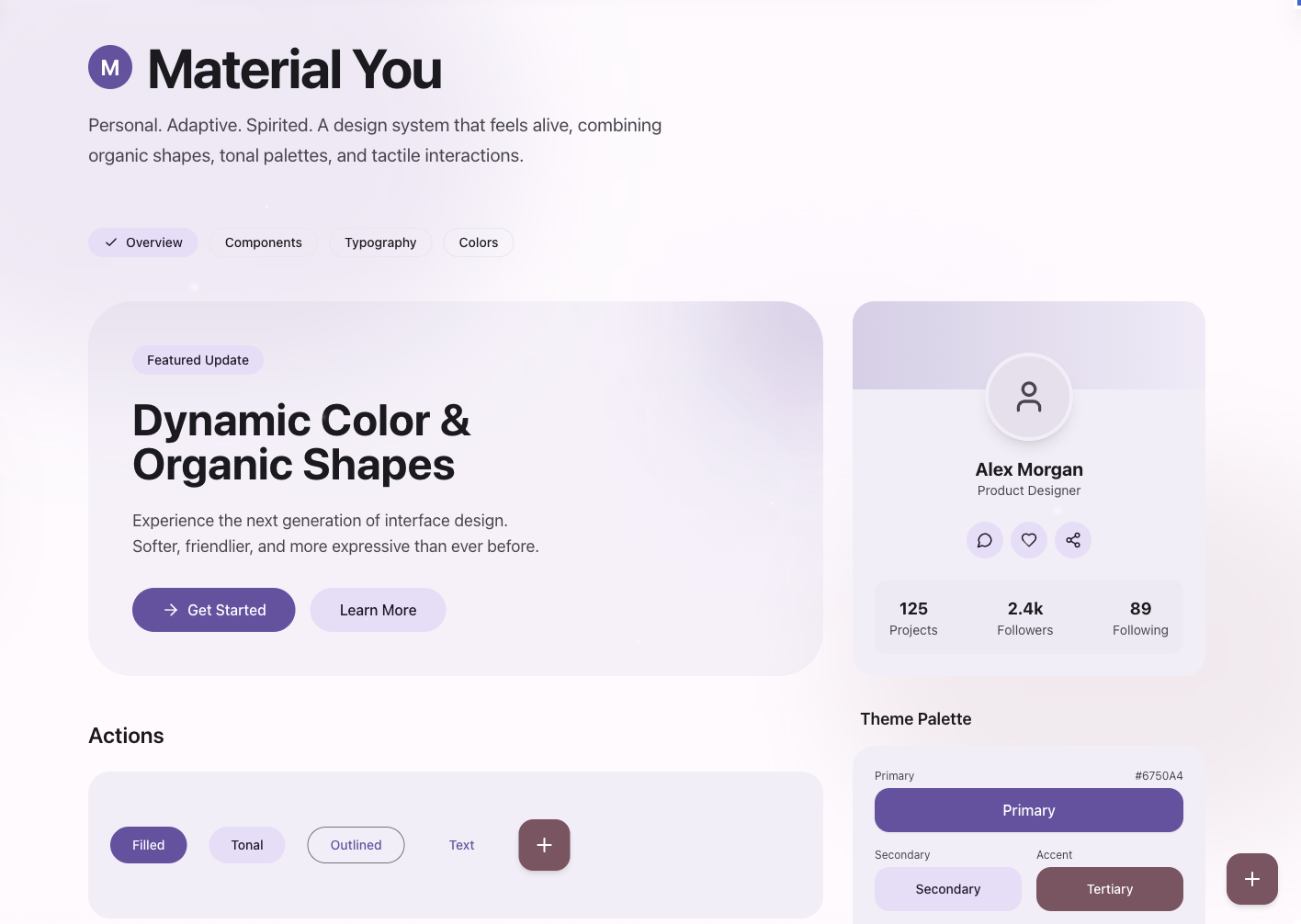
Material
Material Design 3 Source: designprompts.dev
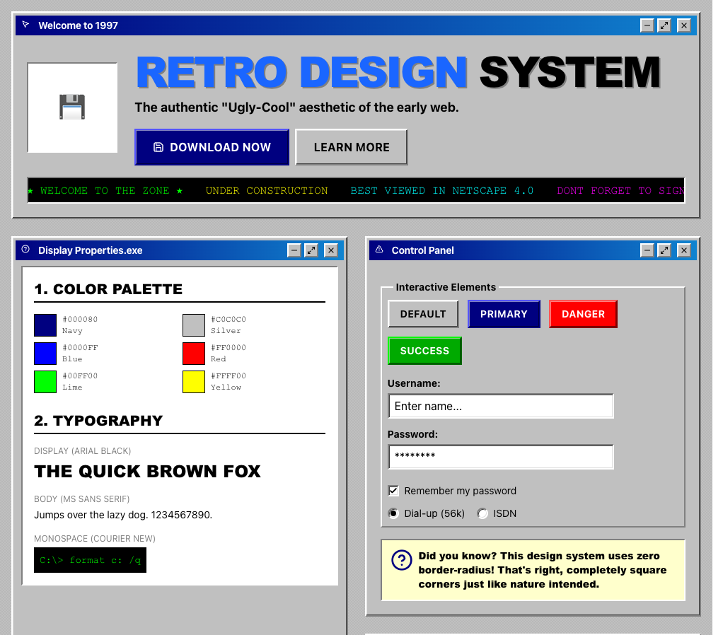
Win98
Embrace the raw, unfiltered aesthetic of the early web Source: designprompts.dev
Dynamic Data Display
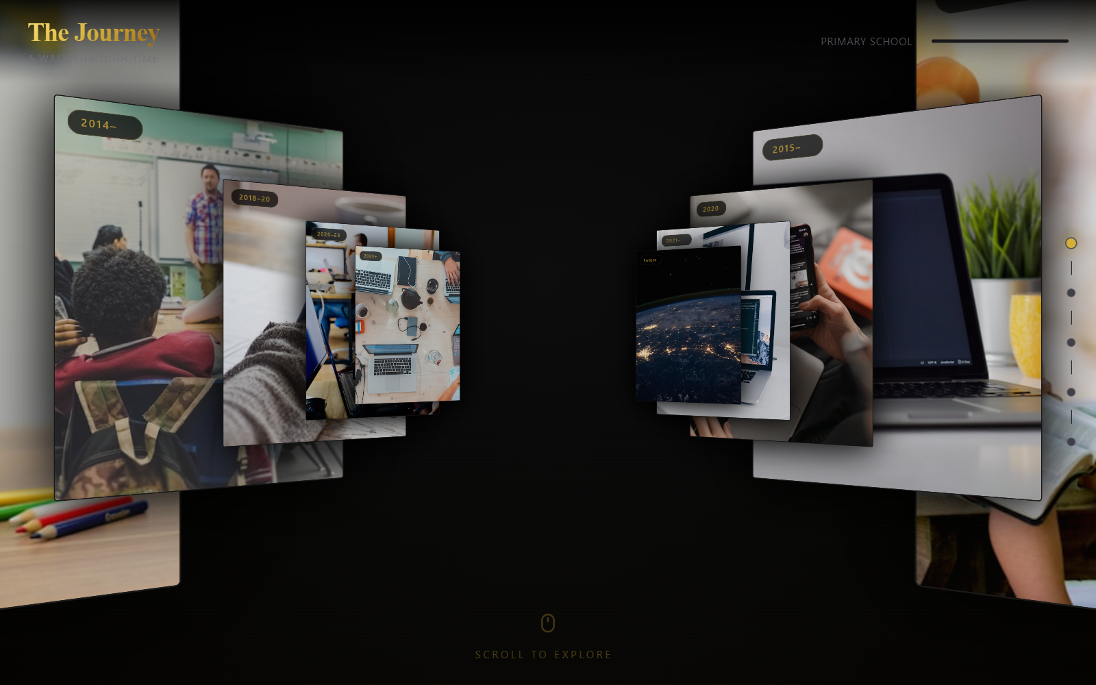
3D Journey Scroll Portfolio – Centered
A high-end 3D immersive scroll experience with a 'Museum' or 'Journey' aesthetic. Features cinematic depth transitions (Z-axis scrolling), editorial typography pairing a clean sans-serif with an elegant serif, and a luxurious dark mode palette with gold accents. Ideal for portfolios, storytelling, historical timelines, or luxury product showcases requiring a spatial, 3D hallway feel.
Interactive virtual character
Original source: https://xhslink.com/m/2mDzucZQKD1
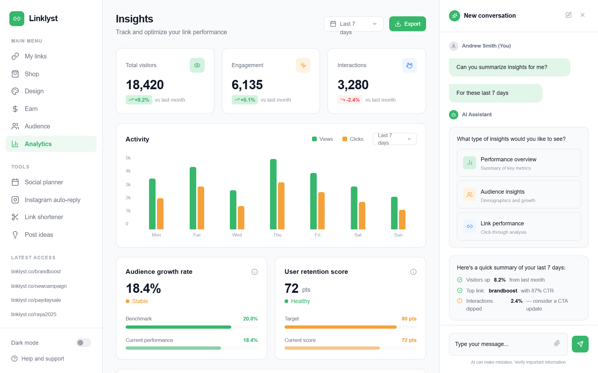
Linklyst Analytics Dashboard
A modern, high-performance analytics dashboard featuring a sophisticated three-column layout. The aesthetic is clean and professional, utilizing a white and light-gray palette punctuated by vibrant forest green (#36B76B) and sunset orange (#F4A13A). It incorporates editorial typography (Inter), subtle shadows, and staggered entrance animations. Suitable for SaaS, fintech, marketing analytics, and AI-driven platforms. Key features include glassmorphism-lite chat interfaces, bento-style metric cards, and animated bar charts with custom growth indicators.
Gradient Blinds Background
A premium, minimalist showcase of the GradientBlinds background effect. Features a smooth, reactive blind-like gradient animation with spotlight effects and mouse interaction. Source: ReactBits
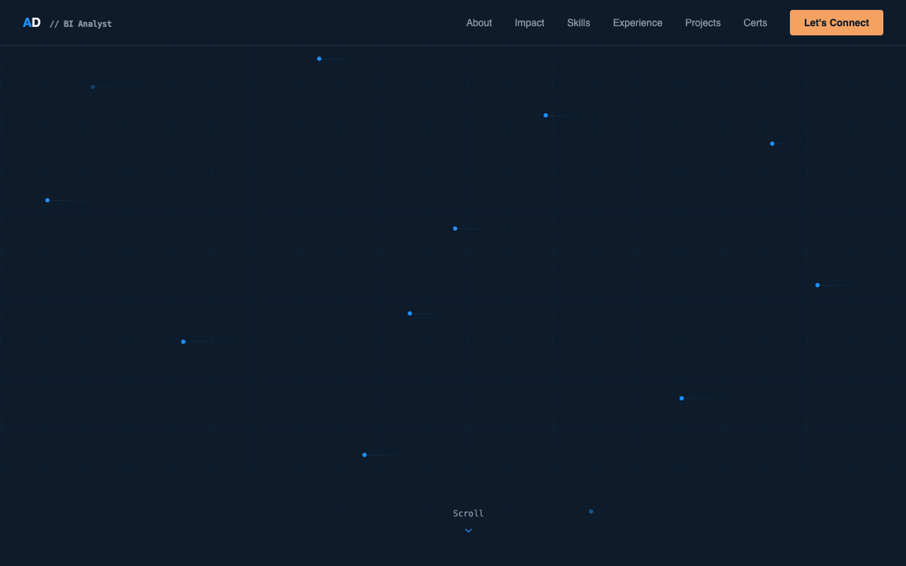
Abhinav Dwivedi – BI Analyst Portfolio
A sophisticated, corporate-modern data-viz aesthetic optimized for BI Analysts, FinTech, and enterprise SaaS. Featuring a deep navy #0D1B2A background, electric blue #1E90FF accents, and amber #F4A261 highlights, the style pairs Space Grotesk's geometric boldness with JetBrains Mono's precision. Key features include animated grid backgrounds, floating data nodes, scroll-triggered number counters, and interactive vertical timelines, creating a 'McKinsey meets Tableau' professional feel.
Bento
A high-end, minimalist bento grid component with advanced interactive effects including spotlight, border glow, particles (stars), tilt, and magnetism. Designed for modern dashboards and landing pages. Source: ReactBits
Lightning Background
A high-performance WebGL-powered lightning/electric discharge background effect. Features adjustable hue, intensity, speed, and scale. Built with GLSL shaders for smooth atmospheric motion. Source: ReactBits
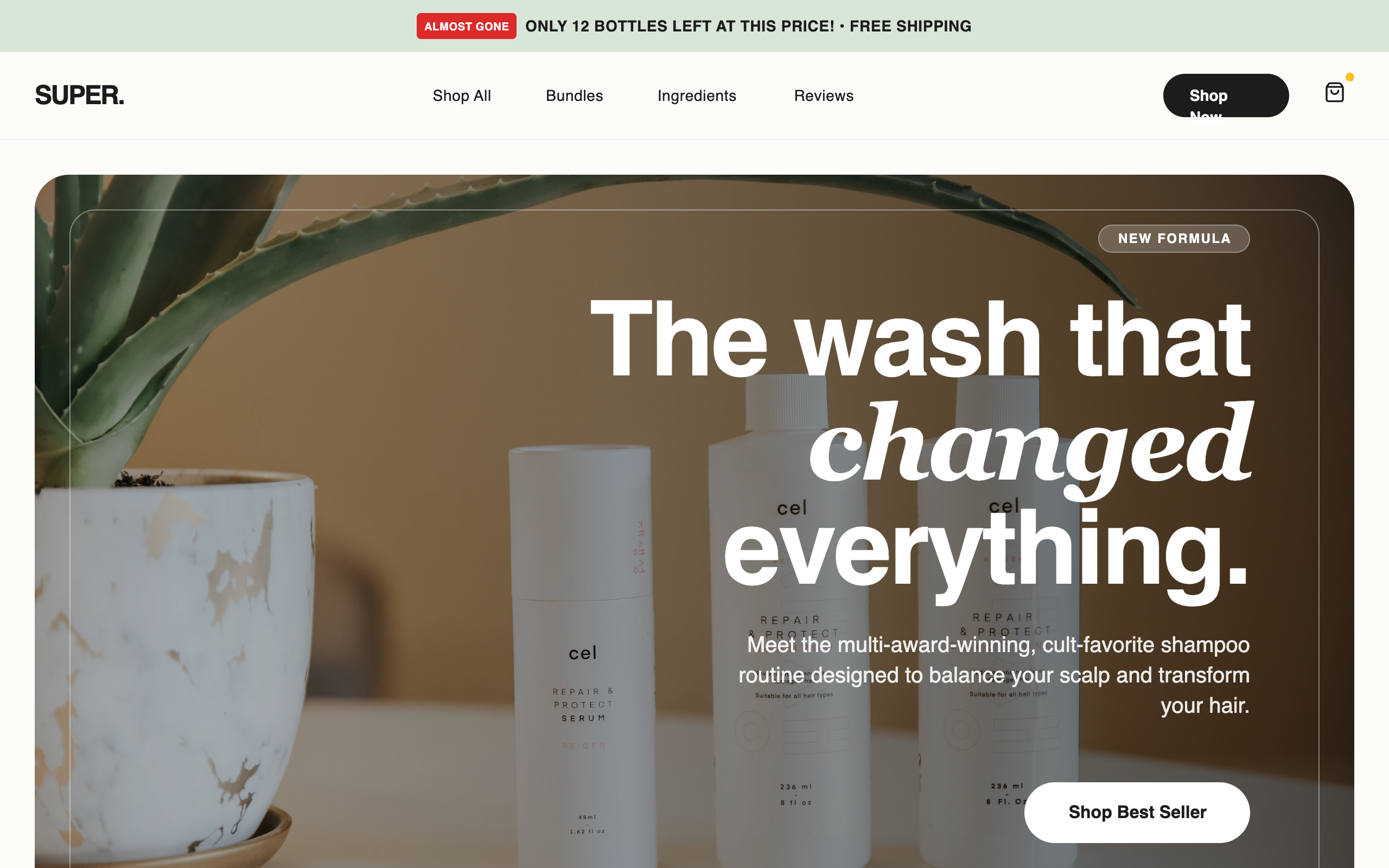
Super Shampoo - High Conversion LP
A premium, high-conversion e-commerce style guide optimized for D2C beauty and wellness brands. Features a sophisticated 'clinical luxury' aesthetic with a palette of sage green (#E2E8E4), off-white beige (#F5F5F0), and deep charcoal (#1C1C1C). The typography balances bold 'General Sans' headings with clean 'Switzer' body text. Includes specialized conversion elements like scarcity-driven promo bars, trust badge grids, comparison tables, and a sticky mobile 'Add to Cart' bar. Ideal for skincare, haircare, or luxury lifestyle products requiring a mix of editorial imagery and performance-driven UI.
Bold Retro-Modernism
A high-impact 'Bold Retro-Modernism' design system characterized by a vibrant primary color palette (Retro Red, Vintage Blue, Sunny Yellow), heavy editorial typography, and brutalist-inspired layout elements. It features massive display text, offset borders, and a mix of grayscale and high-saturation imagery. This style is ideal for luxury fashion, high-end lifestyle brands, avant-garde editorial platforms, or design-focused e-commerce. It uses tight leading (line-height) and tracking (letter-spacing) to create a dense, authoritative aesthetic.
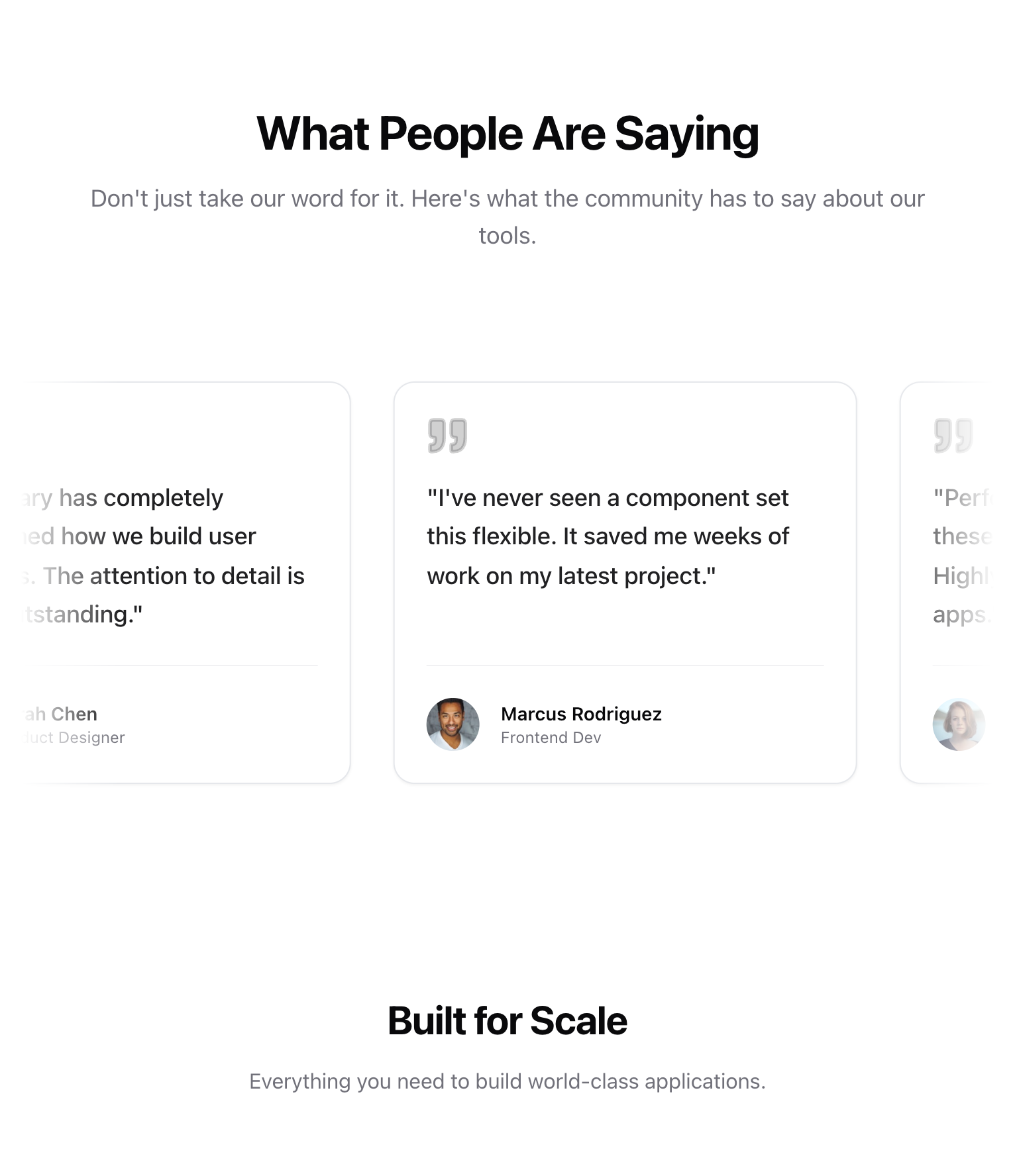
Testimonial

Pastel Gradient Background
A soft, rotating pastel gradient background with blur effects and smooth animation.
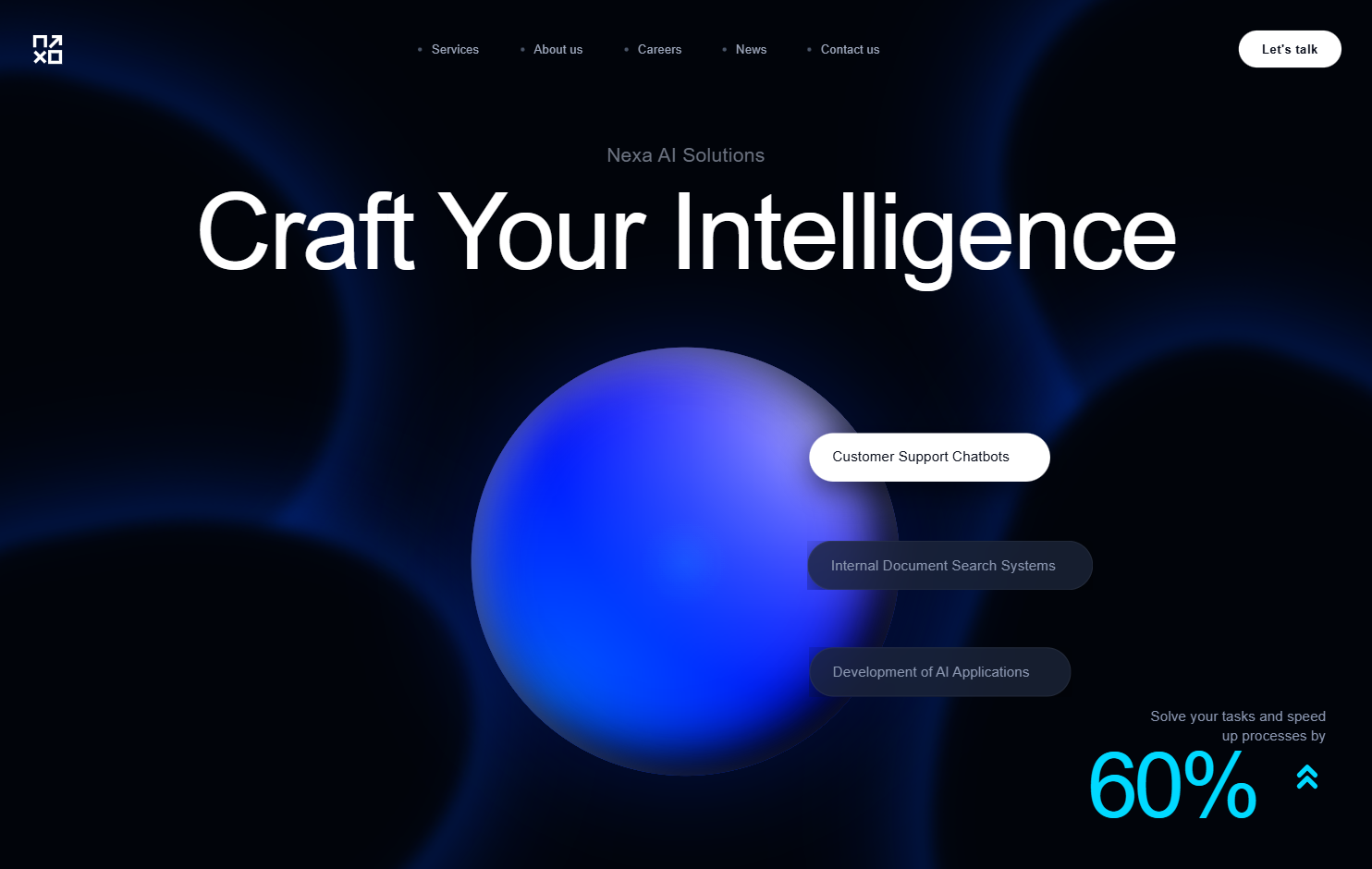
Nexa AI - Premium Animated Experience
A premium, futuristic AI-focused design system utilizing high-fidelity animations, a sophisticated dark mode palette (Deep Black/Cyan/Azure), and glassmorphism. Characterized by organic morphing shapes, liquid 3D spheres, staggered text reveals, and high-contrast typography. Optimized for SaaS, Fintech, AI tools, and enterprise technology landing pages.
Hyperspeed Background
A high-performance, Three.js-based warp speed/hyperspeed background effect with customizable distortions, colors, and motion parameters. Supports multiple presets for different visual styles. Source: ReactBits
Luxury
Elegance through restraint, precision, and depth Source: designprompts.dev
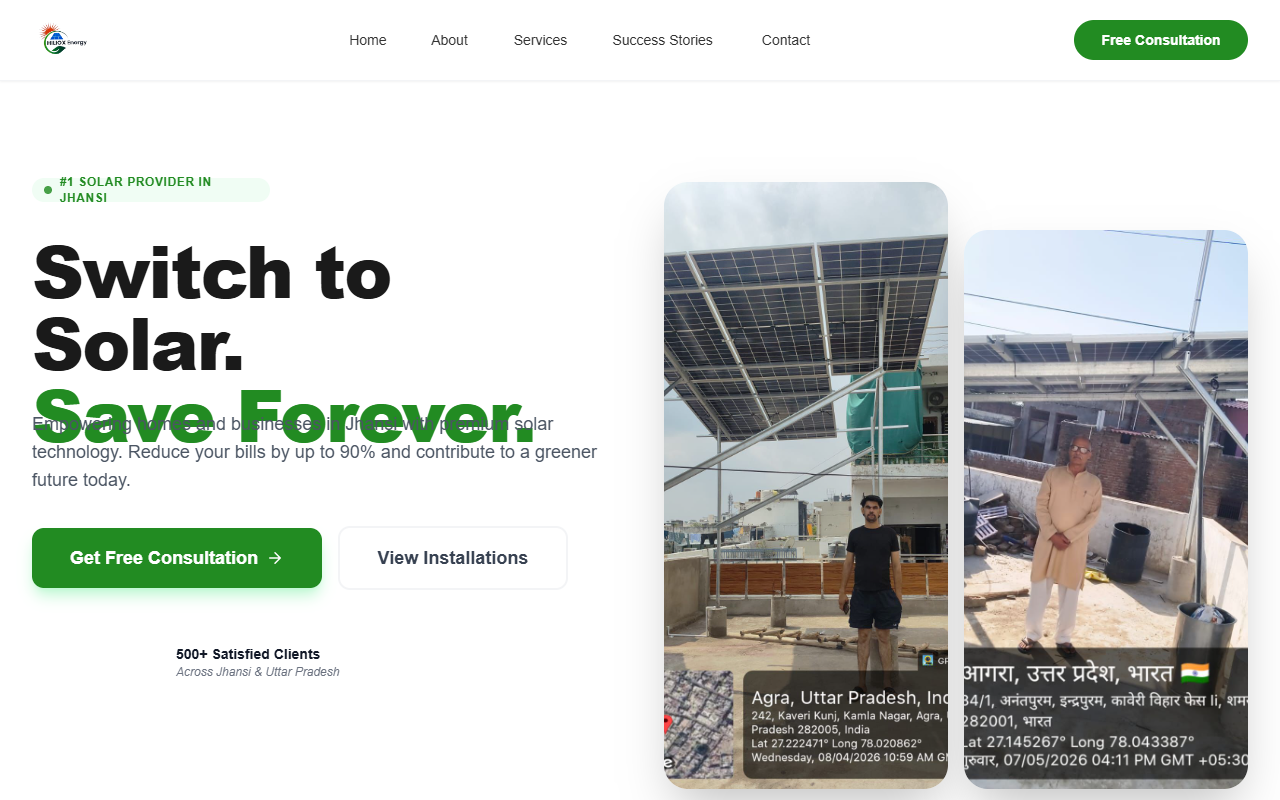
Updated Contact Information for HILIOX Energy
A high-contrast, professional renewable energy and tech-forward design system. Features a 'Forest Green' primary palette (#228B22) paired with 'Industrial Blue' (#0D47A1) and 'Sunset Orange' (#FF6B35) accents. Characterized by 'Sora' and 'Poppins' typography, generous 3rem rounded corners, and asymmetric image grids. Optimized for sustainability sectors, solar energy, cleantech, and professional engineering services. Incorporates micro-interactions like floating status pulses and 'hover-lift' transitions.
Sticky Content Switch
A split-screen section where the left-side heading remains sticky and updates dynamically as associated images scroll on the right side. Uses GSAP ScrollTrigger for precise synchronization.
Hand Drawn Underline Headline
A headline component with a cascading text effect and a hand-drawn SVG underline animation that triggers when scrolled into view.
FullScreenImageExpansion
A scroll-driven interaction where a centered featured image expands smoothly to fill the entire browser viewport as the user scrolls.
Terminal Portfolio
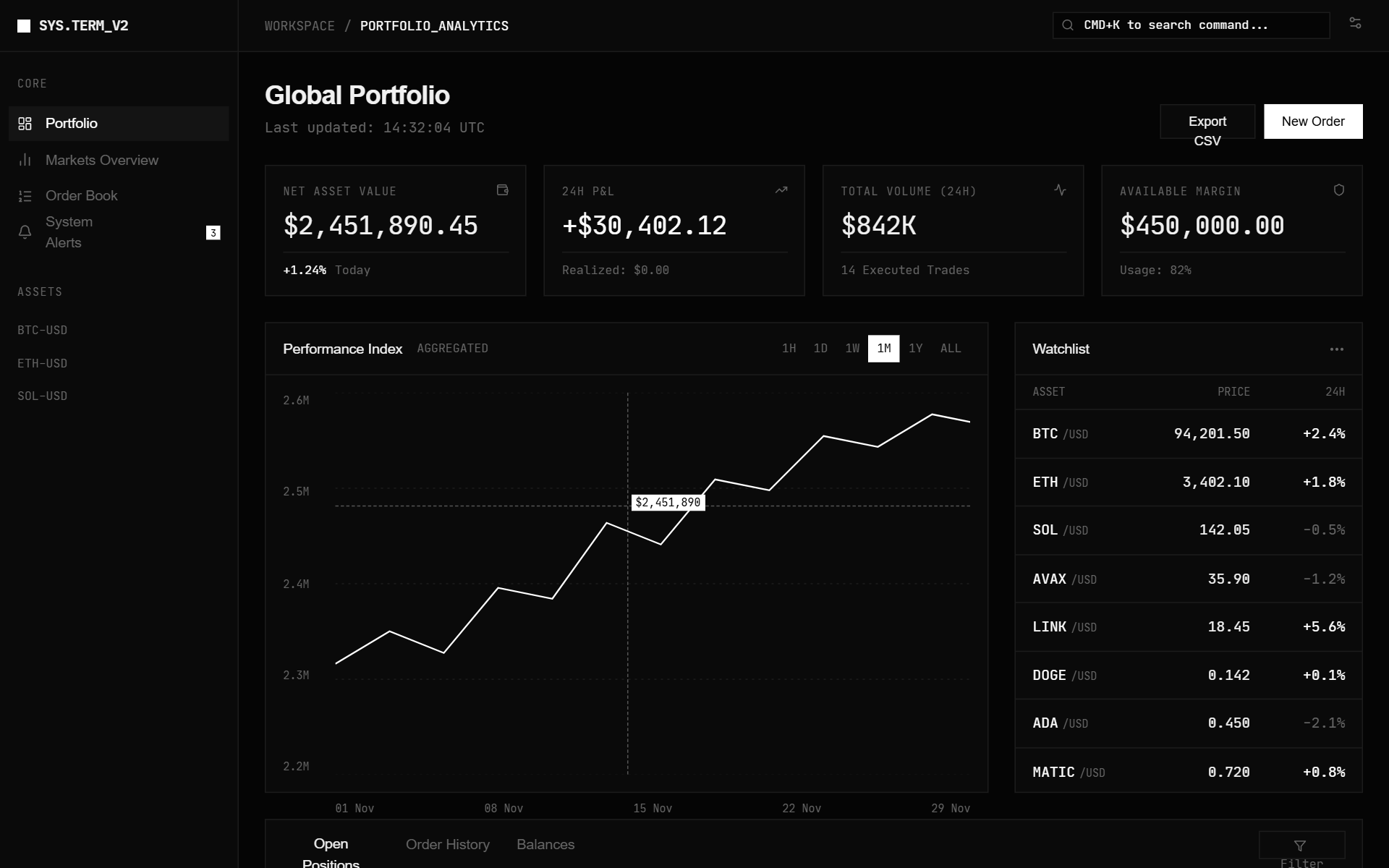
A high-density, Bloomberg Terminal-inspired dashboard design featuring a dark monochromatic palette, surgical typography, and 1px sharp border grids. Optimized for fintech, crypto trading, data analytics, and developer tools. Key features include JetBrains Mono for data points, Satoshi for UI, a zero-gradient flat aesthetic, and high information density. Suitable for professional SaaS platforms requiring a technical, brutalist, or minimalist aesthetic.
Header & Hero Layout Refinement
A brutalist streetwear design system characterized by heavy editorial typography, a high-contrast neutral palette (concrete and ink), and asymmetric layouts. Features include a fixed mix-blend header, a grainy texture overlay, and a 'broken' grid for product displays. Ideal for high-end fashion, streetwear boutiques, architectural studios, and edgy SaaS brands looking for a raw, industrial aesthetic. Includes horizontal scrolling components, masonry-style social proof, and grayscale-to-color hover effects.
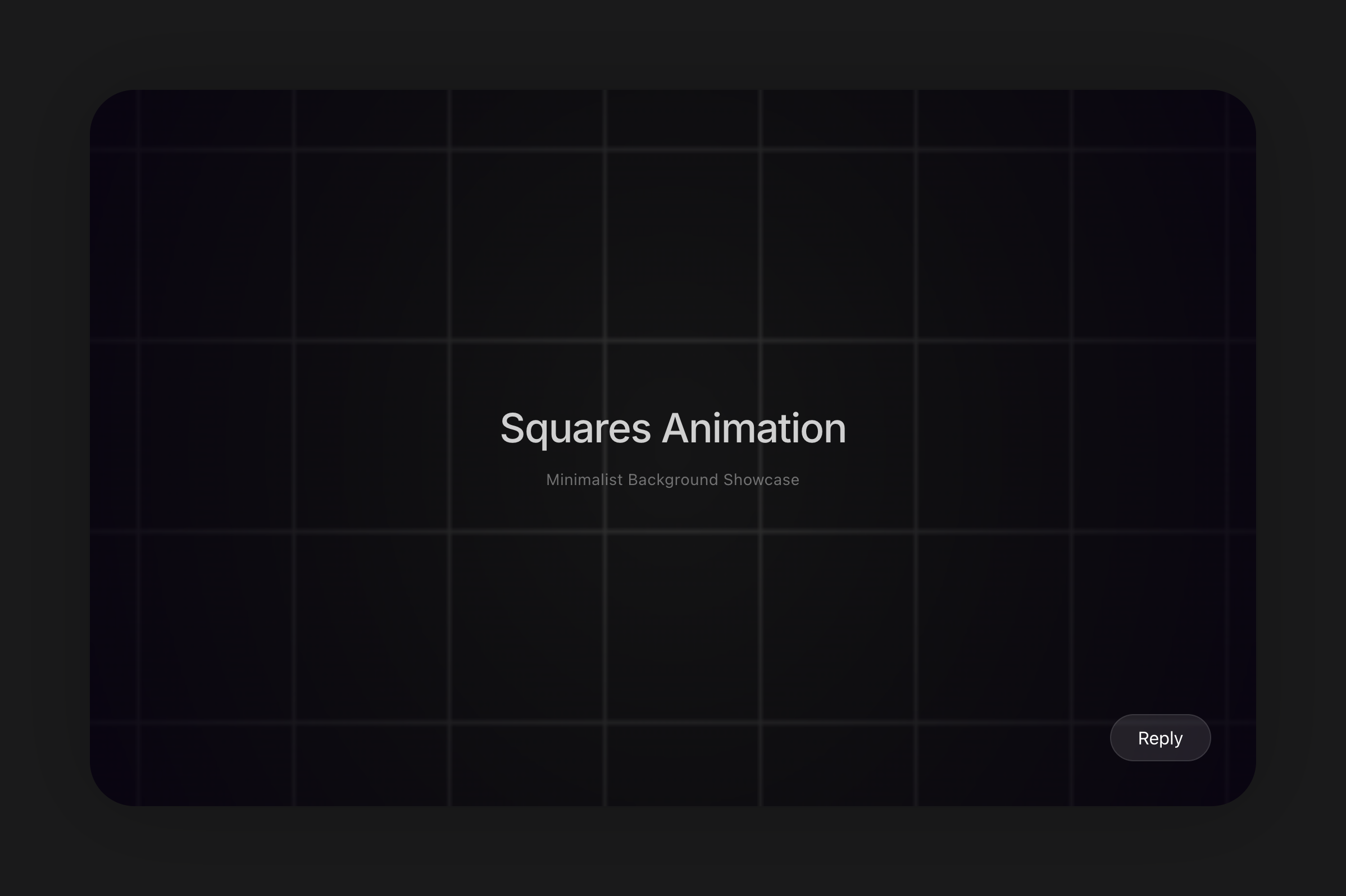
Squares Background
An animated grid of squares background with directional movement and hover interactions. Features a customizable speed, direction, and colors with a radial vignette effect. Source: ReactBits
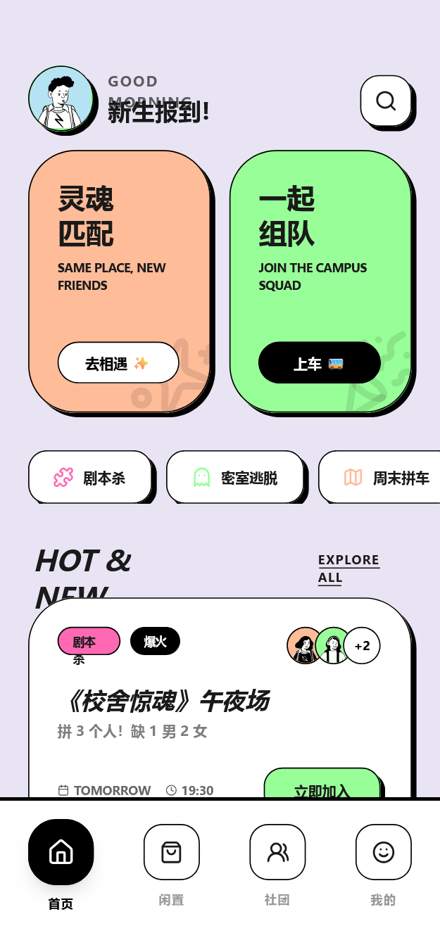
CampusPulse Playful Pastel Social Feed
A playful neo-brutalist design system named 'CampusPulse' featuring a pastel palette, thick black borders, and hard shadows. Optimized for Gen-Z social apps, campus communities, and vibrant lifestyle platforms. It uses heavy typography (Cabinet Grotesk) and rounded, high-contrast UI elements to create a high-energy, tactile interface. Suitable for mobile-first social feeds, matchmaking services, and event organization apps.
Text Pressure
A typography component where characters react to mouse proximity by changing weight and width using variable font axes (pressure-sensitive effect).
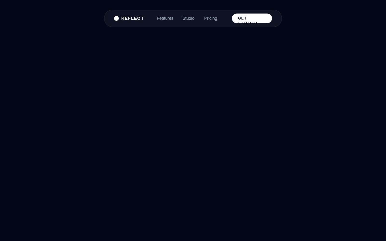
Reflect Cinematic Landing Page
A high-end cinematic dark-mode landing page designed for premium creative tools and SaaS dashboards. Featuring a 'midnight' color palette (#020617), metallic text gradients, and futuristic glassmorphism. The aesthetic leverages 'Cabinet Grotesk' for bold editorial headers and 'Satoshi' for clean body text. Key elements include a 3D parallax dashboard card, a radial 'black hole' portal background effect, infinite scrolling marquees, and a sophisticated bento grid layout. Ideal for design-centric products, AI platforms, or high-performance creative software requiring a professional yet immersive visual experience.
Faulty Terminal Background
A CRT/Terminal-style background with glitch effects, scanlines, and digital noise. Highly interactive with mouse movements and page load animations. Source: ReactBits
Circular Gallery
A high-end, WebGL-powered circular gallery with smooth scroll, image bending effects, and elegant typography. Ideal for immersive storytelling or creative portfolios.
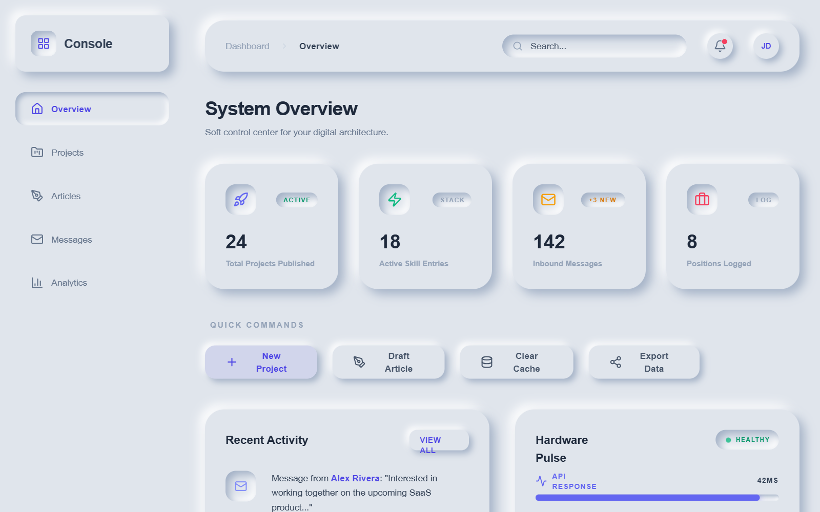
Modern Neumorphic Dashboard — Dynamic Animations
A premium neumorphic (Soft UI) dashboard design system characterized by sophisticated depth, light-source-driven shadows, and a rich layer of dynamic micro-interactions. Utilizing a palette of soft greys (#e0e5ec) and deep navy (#1e2030), the interface features highly tactile elements with 'extruded' and 'inset' appearances. The design is optimized for SaaS dashboards, fintech platforms, and administrative consoles requiring a modern, playful, yet professional aesthetic. Key features include staggered cascade animations, pulse effects on status indicators, and moving gradient progress bars.
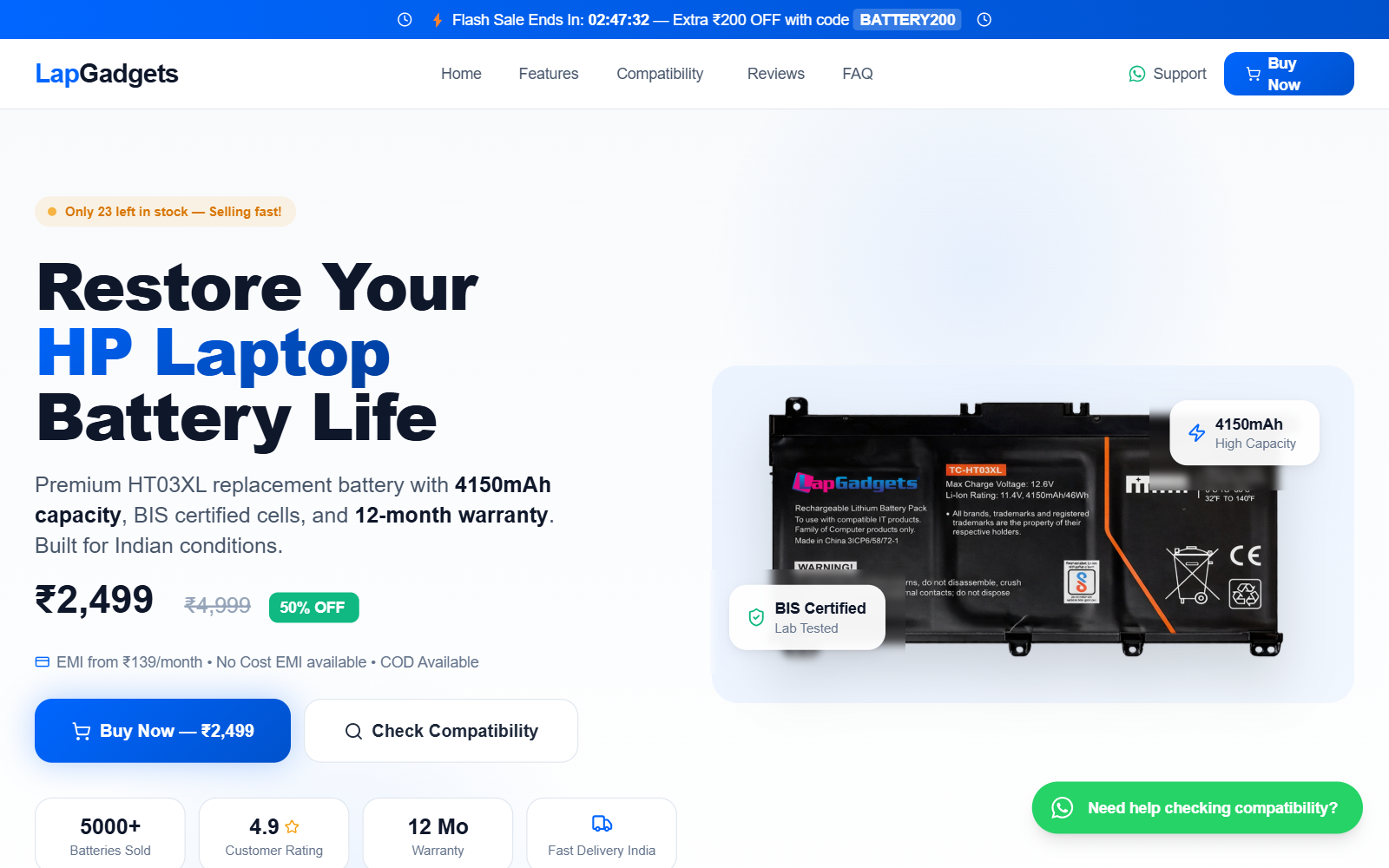
Lap Gadgets HP HT03XL Battery Landing Page
A high-conversion tech e-commerce style guide featuring a 'Tech-Blue' aesthetic, editorial typography, and trust-centric layouts. It utilizes a sophisticated blue palette (#0066FF), Inter and Plus Jakarta Sans typefaces, and dynamic micro-interactions like floating animations and pulse-glow effects. Suitable for SaaS, premium electronics, hardware components, and fintech landing pages requiring a balance of technical authority and commercial urgency.
Monochrome
# Minimalist Monochrome Source: designprompt.dev
Text slidedown animation
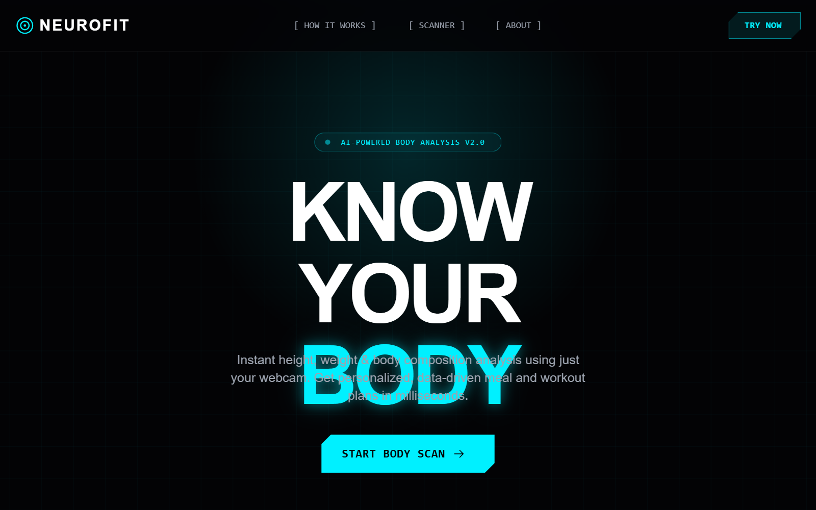
NeuroFit | Quantum Teleporting UI
NeuroFit is a high-tech, sci-fi inspired design system featuring a 'Quantum Teleporting' aesthetic. It utilizes a deep dark mode palette (#030305) contrasted with vibrant neon cyan (#00F0FF) and sharp red accents (#FF2A2A). The style is defined by cyberpunk elements such as grid-pattern backgrounds, radial glows, and 'glitch' micro-interactions. It features a technical typography mix of Rajdhani for display, Inter for body, and JetBrains Mono for system-level data. The UI is ideal for AI-driven health platforms, fitness tech, biometric analytics, and high-performance SaaS dashboards requiring a futuristic, data-heavy feel.
Ballpit Background
A high-performance 3D physics-based background effect with interactive bouncing spheres. Features a custom shader for scattering effects, Three.js instanced rendering for performance, and responsive physics. Inspired by Kevin Levron's creative coding work. Source: ReactBits
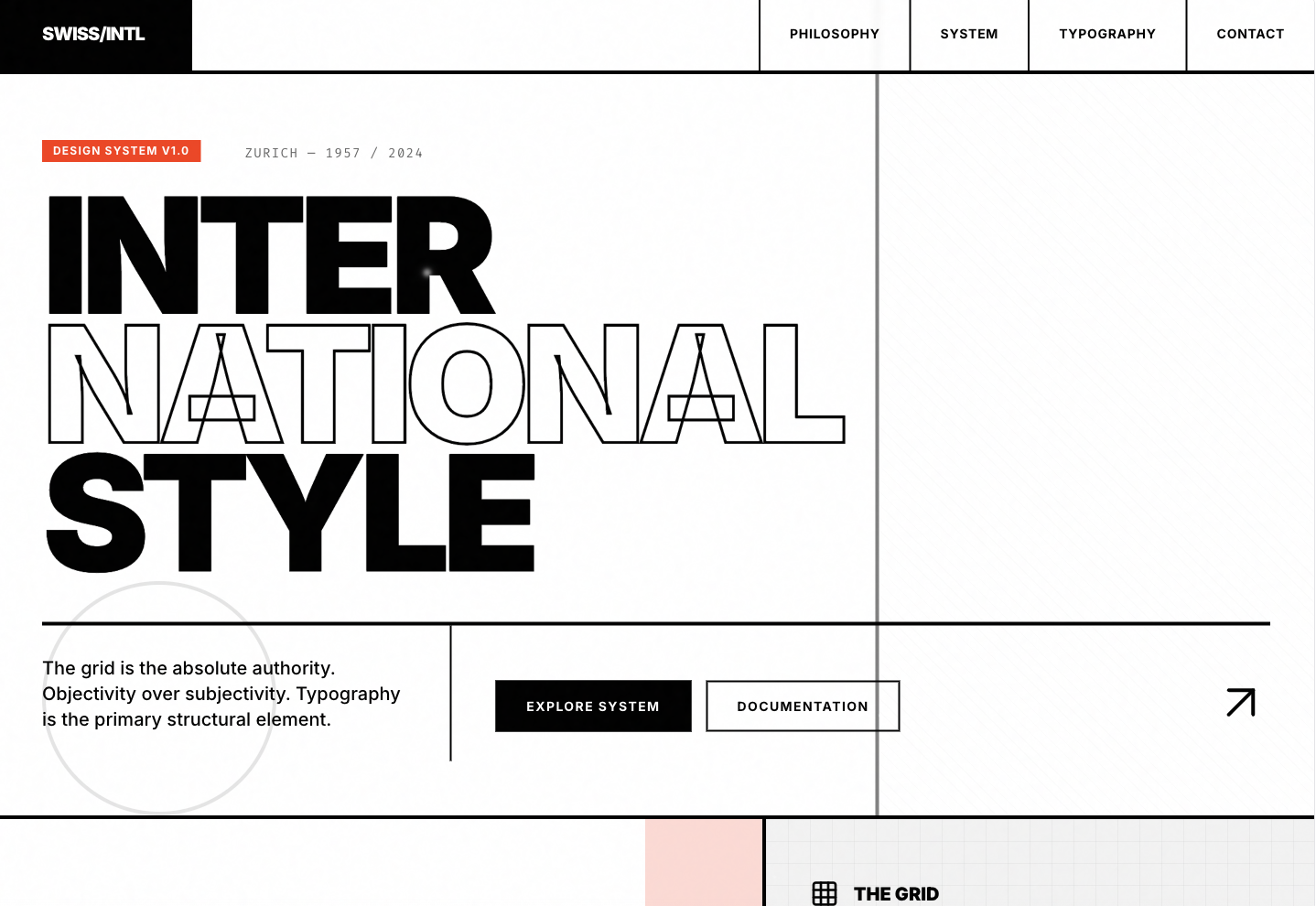
Swiss Style
International Typographic Style Source: designprompts.dev
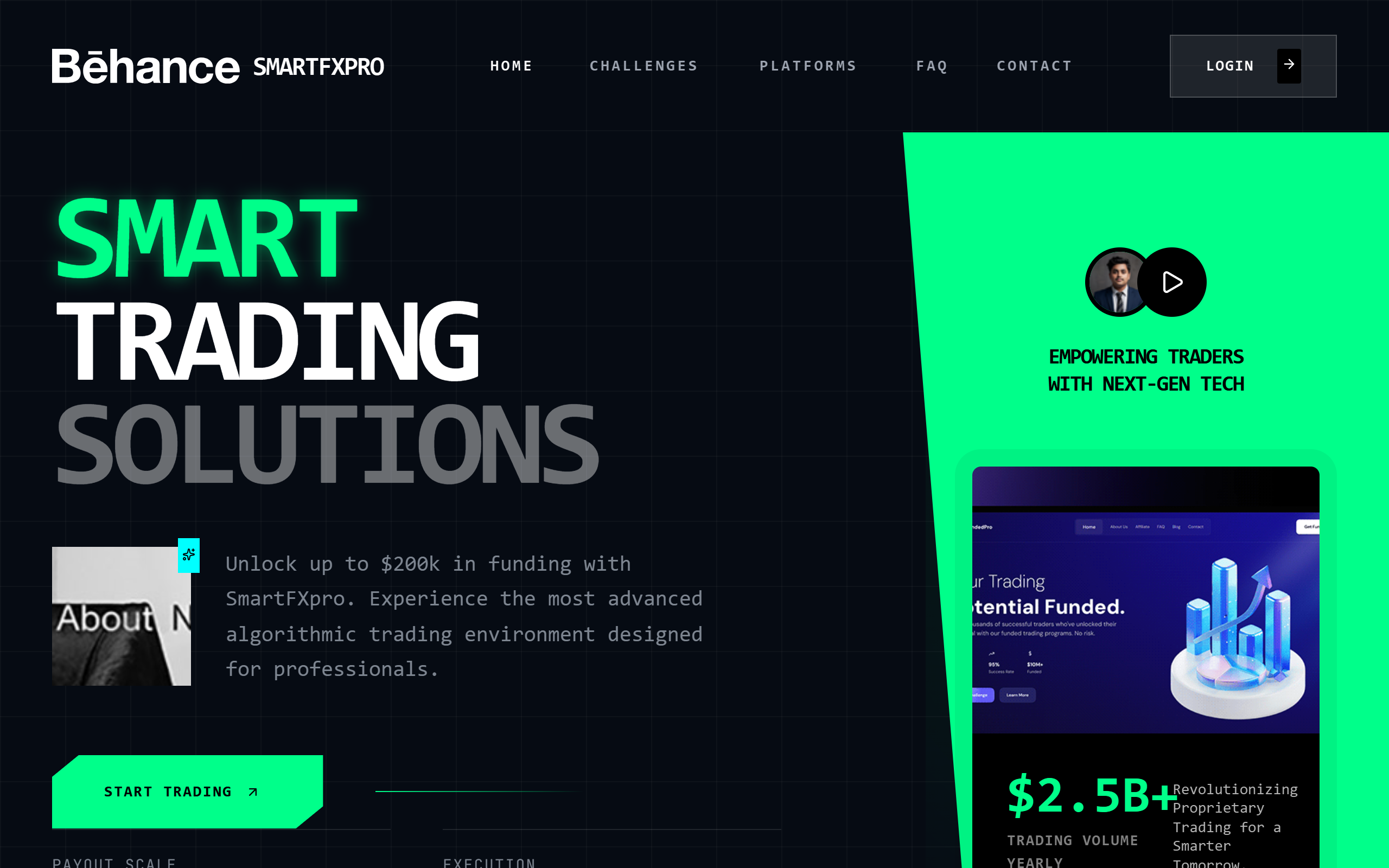
SmartFXpro | Crimson Aggressive Trading Experience
SmartFXpro Crimson Aggressive Trading Experience is a high-octane, dark-mode design system tailored for fintech, proprietary trading firms, and high-performance SaaS platforms. The aesthetic is characterized by a brutalist yet sophisticated use of 'Cabinet Grotesk' for massive, high-contrast typography and a 'Satoshi' sans-serif for technical clarity. It features an 'Aggressive Dark' color palette centered around deep blacks and intense crimsons (#DC143C). Key UI patterns include 3D CSS transforms, rotating geometric cubes, glassmorphism with 16px blurs, and organic morphing background blobs. The layout utilizes a 80px grid overlay to emphasize precision and institutional-grade reliability, while urgent micro-interactions like pulse animations and 3D parallax cards create a sense of real-time activity and market dominance.
Minimalist Monospace Dashboard
A technical, minimalist dashboard design featuring a strict monospace typography system (JetBrains Mono) and a clean grayscale palette with subtle geometric SVG patterns. The aesthetic is inspired by digital blueprints and high-end engineering tools, using thin borders, generous whitespace, and uppercase labels with wide tracking. This style is exceptionally suited for developer platforms, SaaS analytics, fintech dashboards, design asset marketplaces, and internal administrative tools that prioritize clarity and a precise, modern aesthetic.
Animated Stepper
A reusable, animated stepper component with smooth slide transitions, progress indicators, and customizable step content. Follows a minimalist aesthetic with clean lines and refined motion. Source: ReactBits
Tilted Card
A premium tilted card component with 3D parallax effects, hover scaling, and a follow-the-cursor tooltip. Built with motion/react for smooth, physics-based interactions.
Glow Cursor Button
Modern Neumorphic Dashboard — Dynamic Animations
A premium neumorphic (Soft UI) dashboard design featuring a deep, multi-layered animation system. Utilizing a sophisticated palette of soft grays and deep navys, the interface relies on calculated box-shadows to create tactile, extruded, and recessed surfaces. Optimized for SaaS management, fintech platforms, and complex data monitoring, the style combines 'Satoshi' and 'General Sans' typography for high readability. Key visual features include animated stat counters, floating icons, gradient-wave progress bars, and staggered cascading entrance animations that provide a playful yet professional user experience.
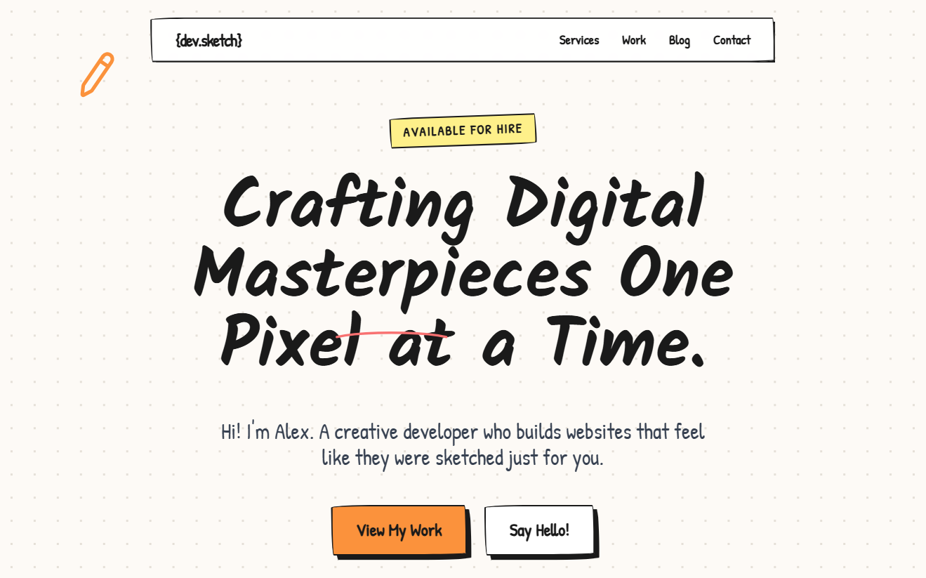
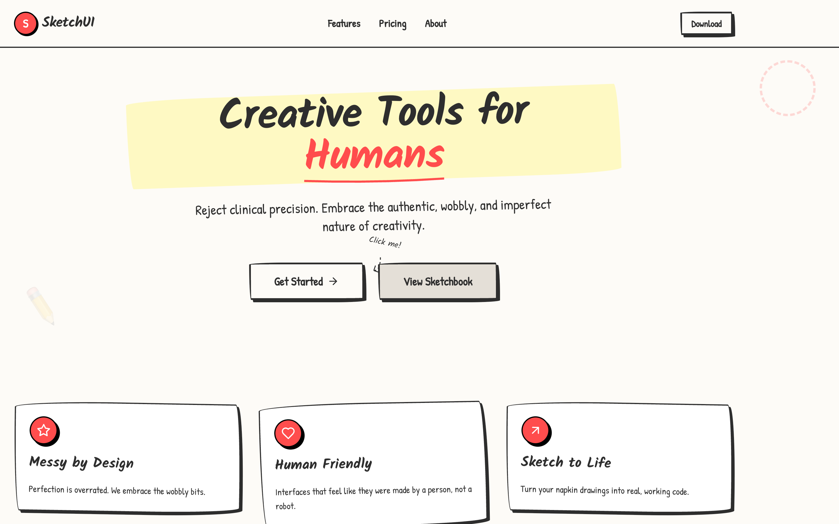
Fix Navigation Script Error
A whimsical, hand-drawn creative portfolio style with a 'sketchbook' aesthetic. Features include 'wobbly' border-radii, hard-edged black shadows, and organic handwritten typography using Kalam and Patrick Hand. The design uses a cream-colored dot-grid background (#fdfaf6) and vibrant secondary accents like orange-400, yellow-200, and blue-400. Layout elements mimic physical objects with digital tape overlays, thumbtack icons, and wavy-line decorations. Suitable for illustrators, creative developers, designers, and niche agencies looking for a high-personality, artisanal web presence.
Modern Neumorphic Dashboard — Dynamic Animations
A high-fidelity modern Neumorphic (Soft UI) dashboard featuring a dual-mode color palette (Light/Dark). The aesthetic is defined by subtle drop shadows and inner glows that create a 3D tactile feel, paired with vibrant indigo and emerald accents. It is optimized for SaaS, fintech, and administrative interfaces. Key features include animated stat counters, floating icons, shimmer-effect progress bars, and staggered entrance animations. The typography uses a mix of Satoshi and General Sans for a clean, professional editorial look.
Rolodex Text
A text component that cycles through words with a 3D physical slot machine/Rolodex flip animation. Features left-aligned text for inline use and preserved 3D perspective.
Modern Bold
Bold Typography Design System Source: designprompts.dev
Staggered Menu
A premium staggered menu with multi-layer entrance animations using GSAP. Features social links, item numbering, and smooth transitions. Source: ReactBits
V1
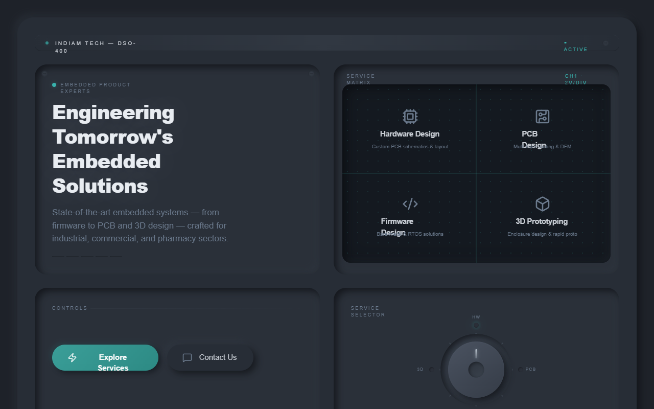
DSO Neumorphic Panel
A high-fidelity industrial design system based on Digital Storage Oscilloscope (DSO) hardware interfaces. Characterized by deep dark-mode neumorphism, skeuomorphic rotary controls, and simulated CRT/LCD displays. It features a tactical, tactile aesthetic using teal and amber accents against a slate-charcoal palette. Perfect for engineering firms, embedded systems providers, high-tech manufacturing, fintech dashboards, or specialized SaaS products requiring a rugged, technical, and precise visual identity.

Cinematic Portfolio - JS Bug Fix
A cinematic, immersive digital portfolio design system featuring brutalist typography, 3D CSS transforms, and high-contrast dark mode aesthetics. It utilizes 'General Sans' for a clean, professional look and relies on bold 'massive' text sizes to create a sense of scale. Suitable for creative agencies, high-end freelancers, luxury tech brands, and architecture studios. Key features include a rotating 3D hero cube, bento-grid case studies, glassmorphism elements, and scroll-triggered background text animations. The color palette is dominated by deep black (#050505) with high-visibility neon accents (#00FF41).
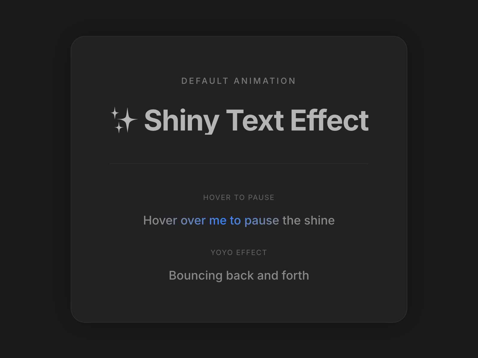
Shiny Text
A text component with a customizable shining gradient animation effect that sweeps across the text.
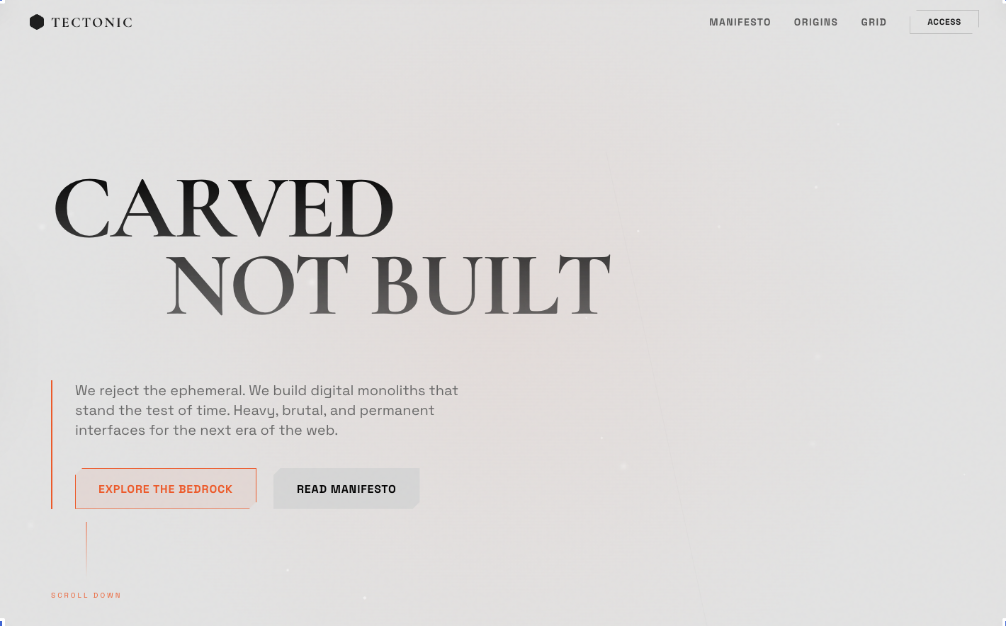
Tectonic style
Digital Geology & Obsidian Minimalism
Rotating logos
Logo display UI
Prism Background
A premium, high-performance WebGL prism/pyramid background effect using OGL. Supports multiple animation modes (rotate, hover, 3drotate) and extensive visual customization. Source: ReactBits
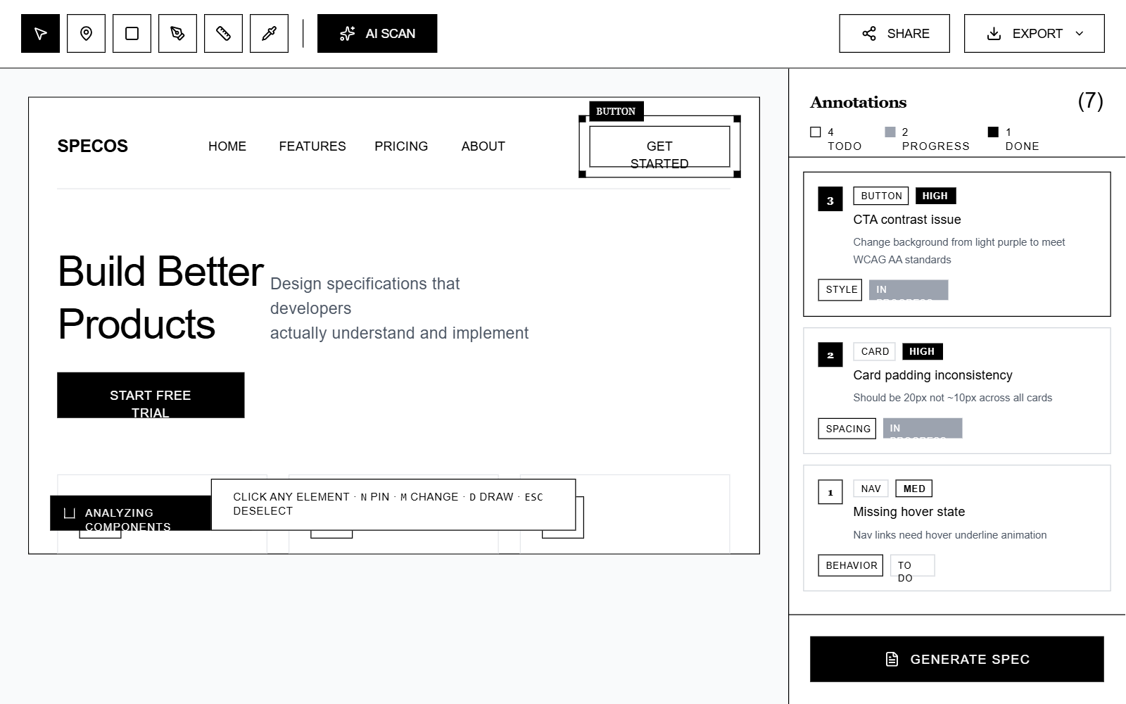
SpecOS - Brutalist Monochrome
A brutalist monochrome design system inspired by high-end editorial magazines and stark industrial interfaces. Characterized by high-contrast black-and-white palettes, thick 2px borders, and a sophisticated pairing of IBM Plex Serif and IBM Plex Sans. This style is ideal for SaaS design tools, developer environments, creative portfolios, and fintech dashboards that prioritize clarity, structural integrity, and a premium 'architectural' feel. It utilizes dashed overlays for interaction states and a rigid grid layout to maintain an organized yet aggressive aesthetic.
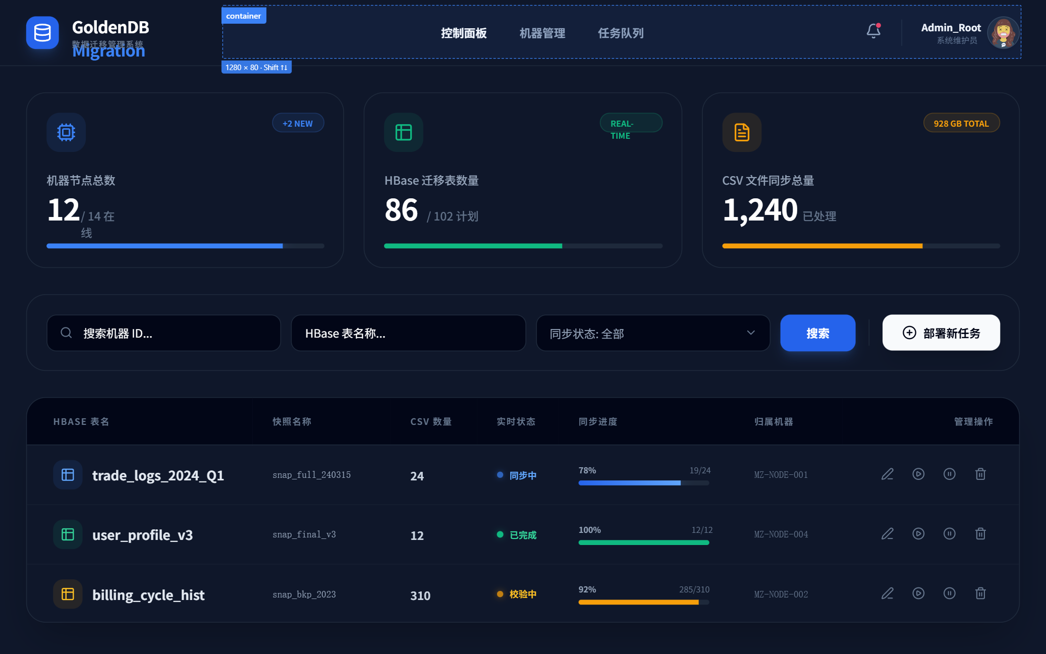
GoldenDB 数据迁移系统 - 完整原生实现
A sophisticated enterprise-grade dashboard design system with a dark-mode, high-tech aesthetic. Features a deep navy and slate color palette (#0f172a), accented with vibrant, glowing functional colors. Utilizes a dual-typography system pairing modern sans-serif 'Satoshi' with technical 'JetBrains Mono'. Optimized for data-intensive applications such as cloud infrastructure, database management (DBaaS), fintech, and real-time monitoring systems. Employs glassmorphism, pulse animations, and glowing progress indicators to create a dynamic, modern feel.
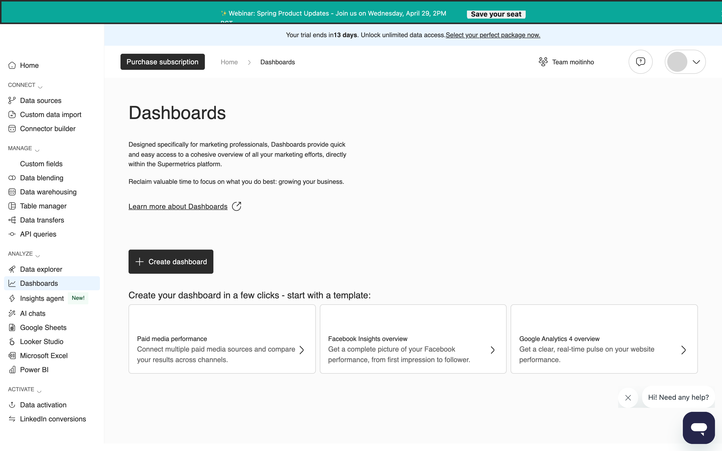
hub.supermetrics.com - Component
Imported from HTML preview
Cyber Serif - Premium Digital Experience
Cyber Serif is a premium classical-tech hybrid design system blending high-fidelity editorial typography with futuristic digital infrastructure. Characterized by a deep black palette (#050505) and sharp emerald accents (#10b981), it utilizes glassmorphism, shimmer borders, and spotlight cursor tracking. Features include a bento-style feature grid, technical data tables, and morphing background glows. Suitable for high-end SaaS, fintech, AI infrastructure, cybersecurity, and luxury technology brands that require a balance between authority and innovation.
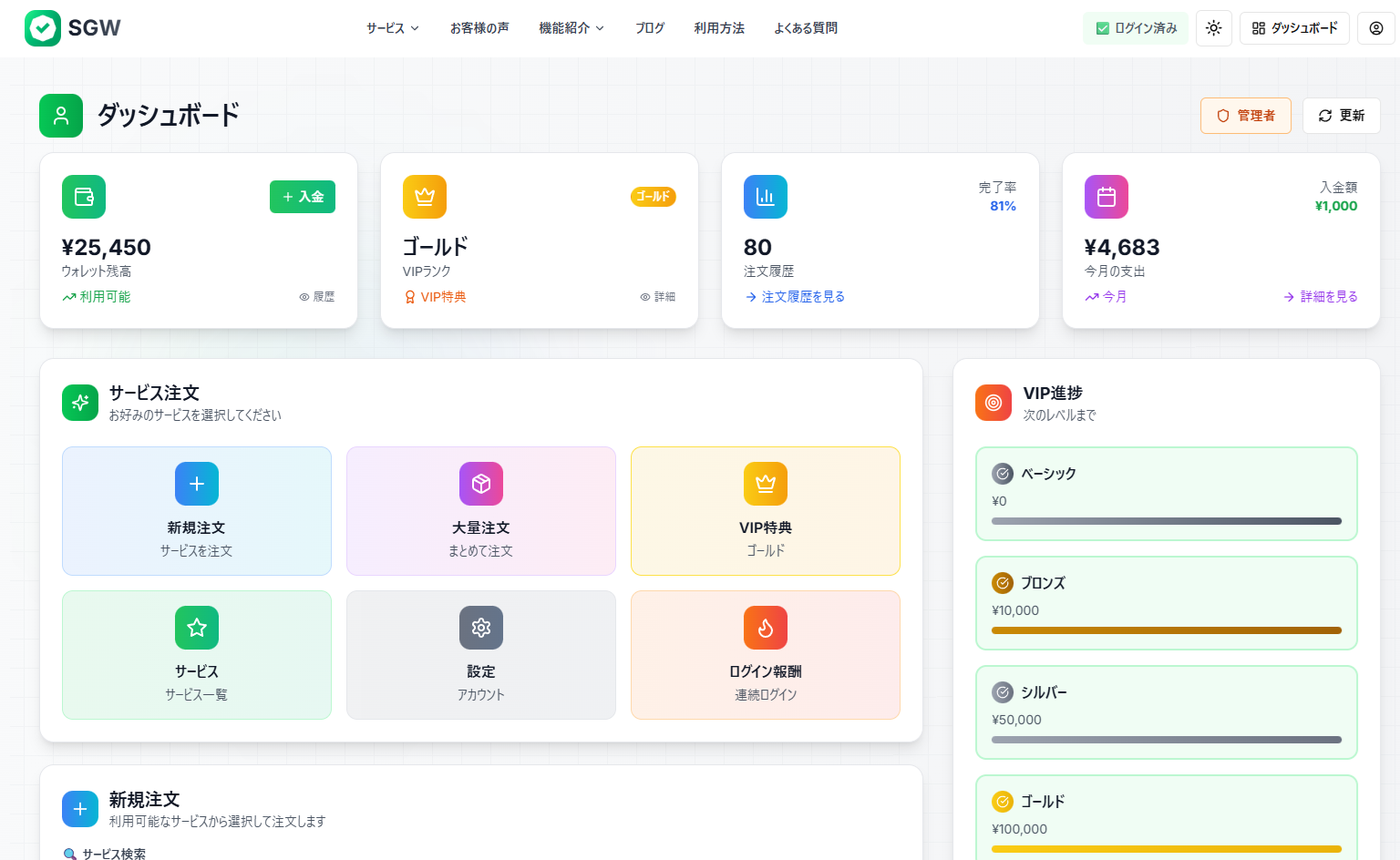
SGW - Enhanced Modal Interaction
Increase the height of the "今すぐ注文を確定する" (Confirm Order Now) submit button. Make it larger and more prominent - increase the padding and font size to make it a more substantial, clickable button that stands out more in the form.
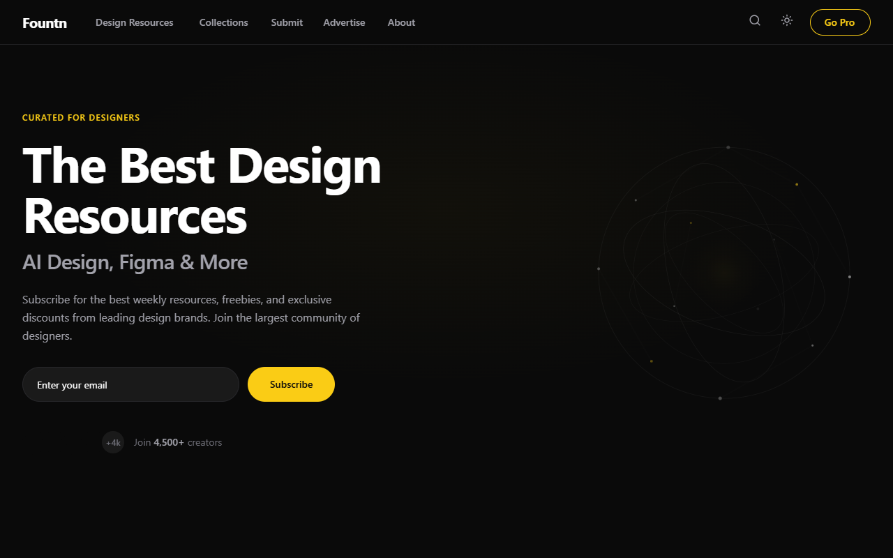
Fountn — Teal Frame Industrial Homepage
An industrial-premium design system featuring a 'Teal Frame' aesthetic with embossed 3D depth effects. Characterized by a dark-mode palette (#0A0A0A), metallic yellow accents (#FACC15), and a signature teal border system (#2D9C84). This style is optimized for curated directories, design resource hubs, high-end SaaS dashboards, and creative portfolios that require a sophisticated, structured, and 'physical' interface feel. It utilizes subtle noise textures, metallic gradients, and complex shadow layering to achieve a tactile, high-fidelity look.
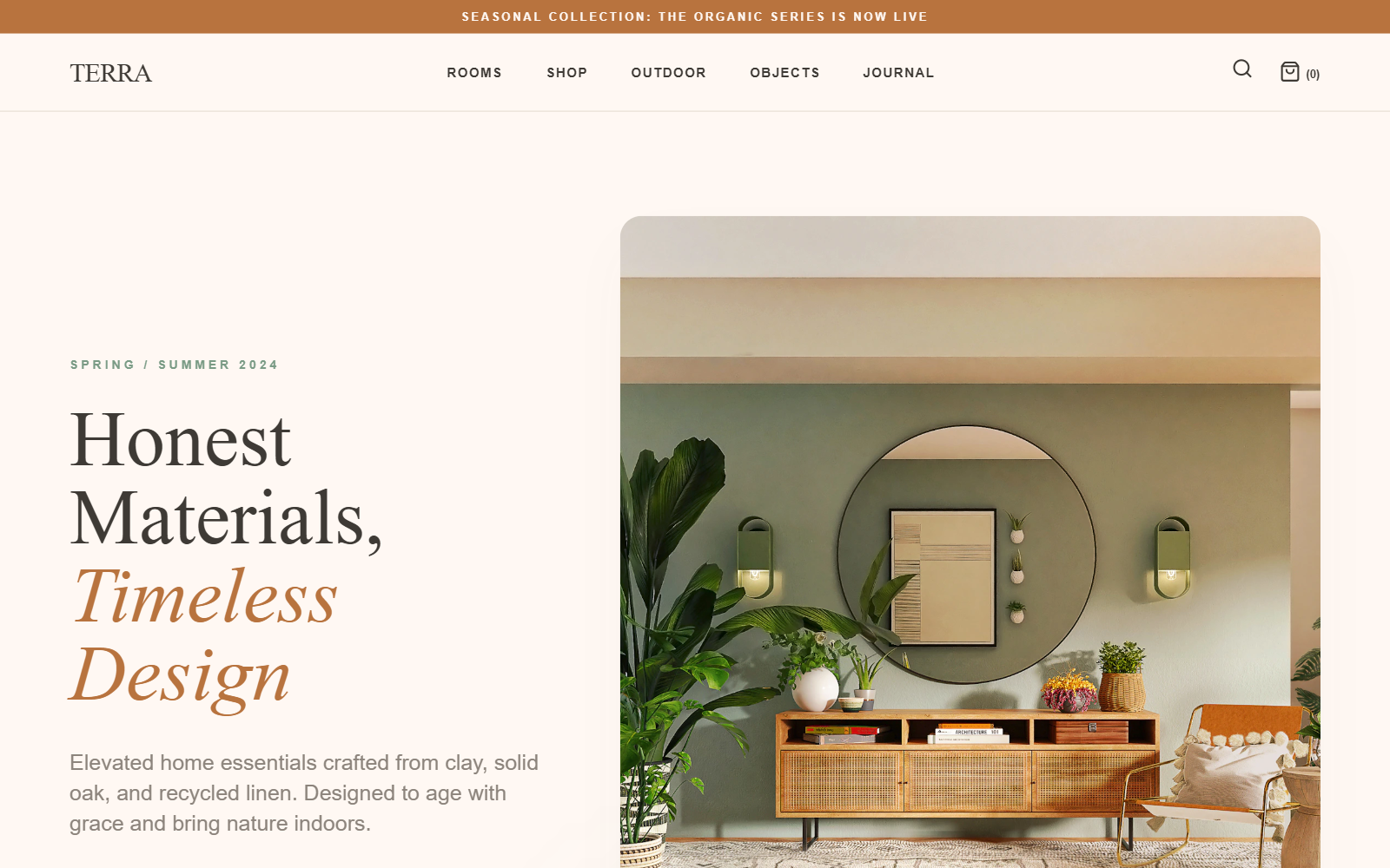
TERRA | Organic Luxury Living
TERRA is a minimal luxury editorial design system characterized by a warm earthtone palette (terracotta, sage, cream) and sophisticated typography. It blends high-end editorial aesthetics with organic, nature-inspired minimalism. Suitable for premium lifestyle brands, sustainable furniture, artisanal ceramics, high-end skincare, and architectural studios. Features include bento-style galleries, editorial hero sections with italicized serif accents, and extreme letter-spacing for utility text.
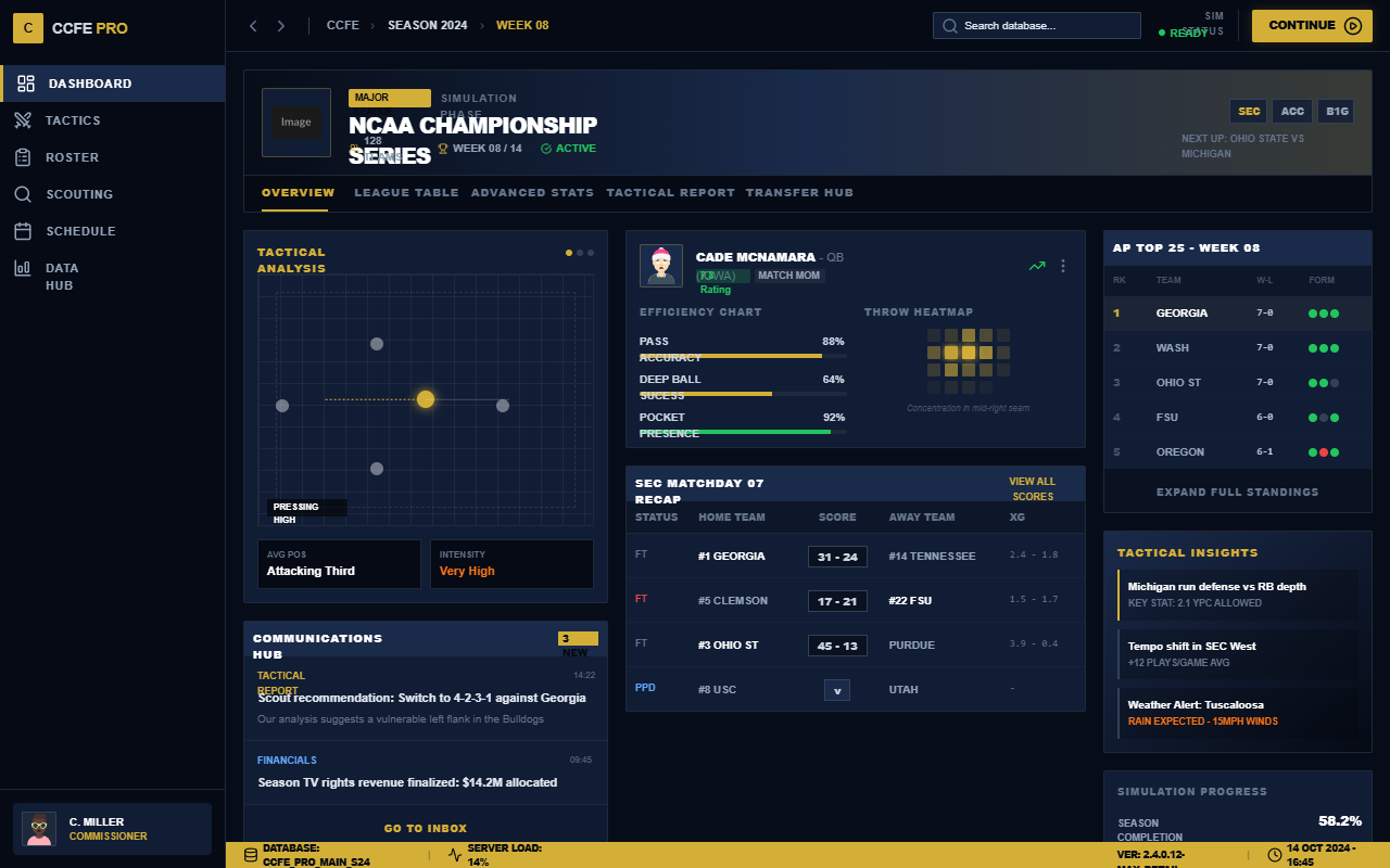
CCFE League Dashboard - Ultra Detail FM Edition
A high-density, data-rich sports management dashboard inspired by professional football simulation games. Features a sophisticated dark navy and gold color palette, tactical visualizations, and ultra-compact layouts. Perfect for sports analytics, fintech trading platforms, or complex SaaS monitoring systems requiring deep data visibility and authoritative aesthetics.
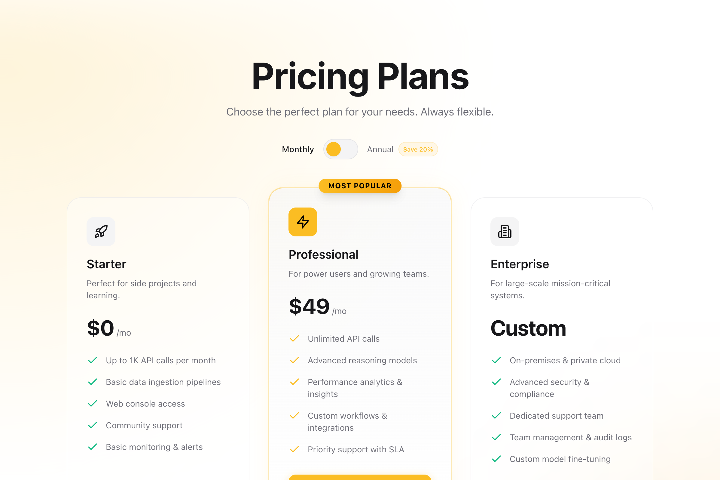
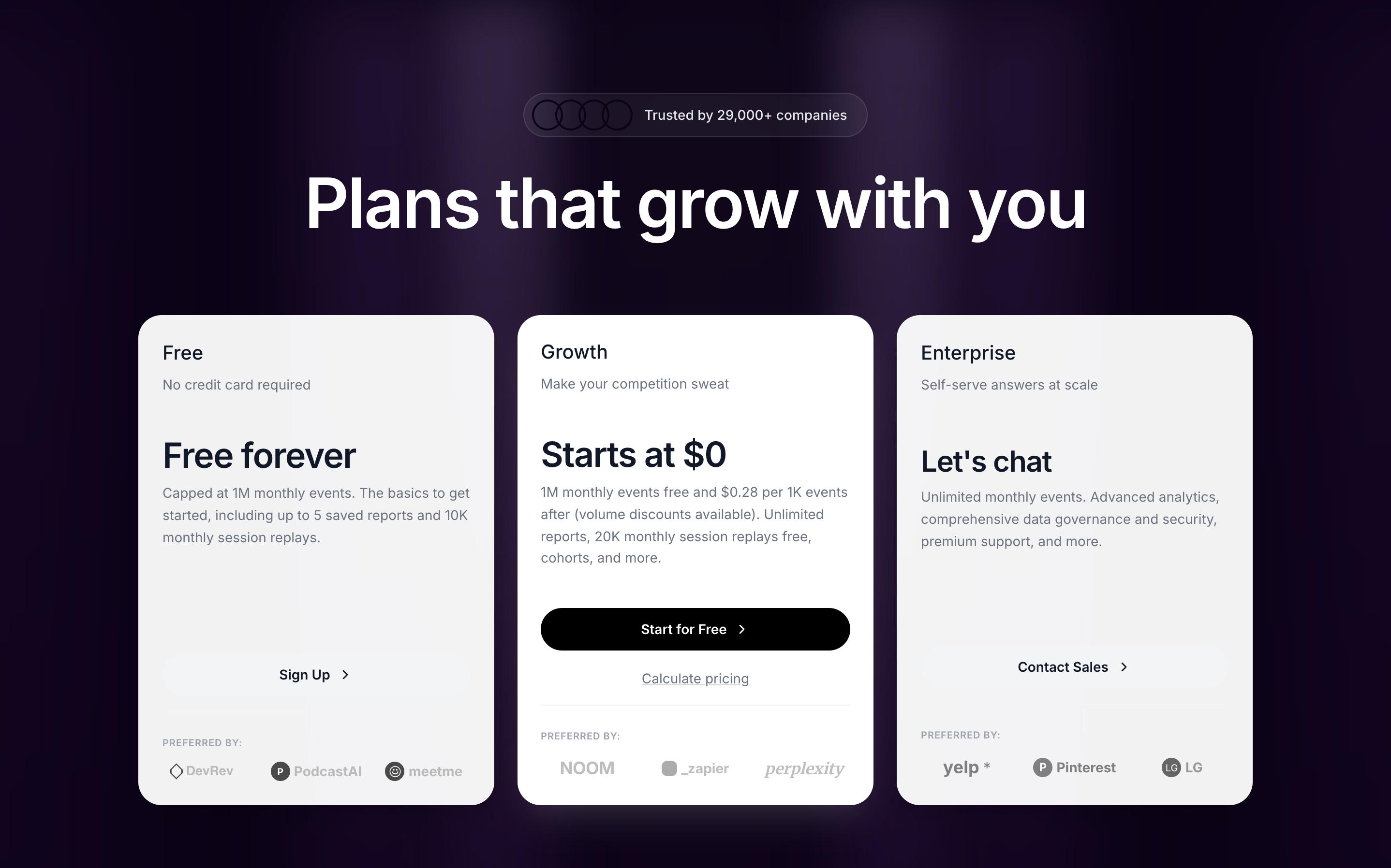
Pricing
A high-conversion pricing section with a toggle for monthly/annual billing. Features three tiers with a highlighted 'Pro' plan, glassmorphism effects, and smooth Framer Motion animations. Designed for SaaS and digital products.
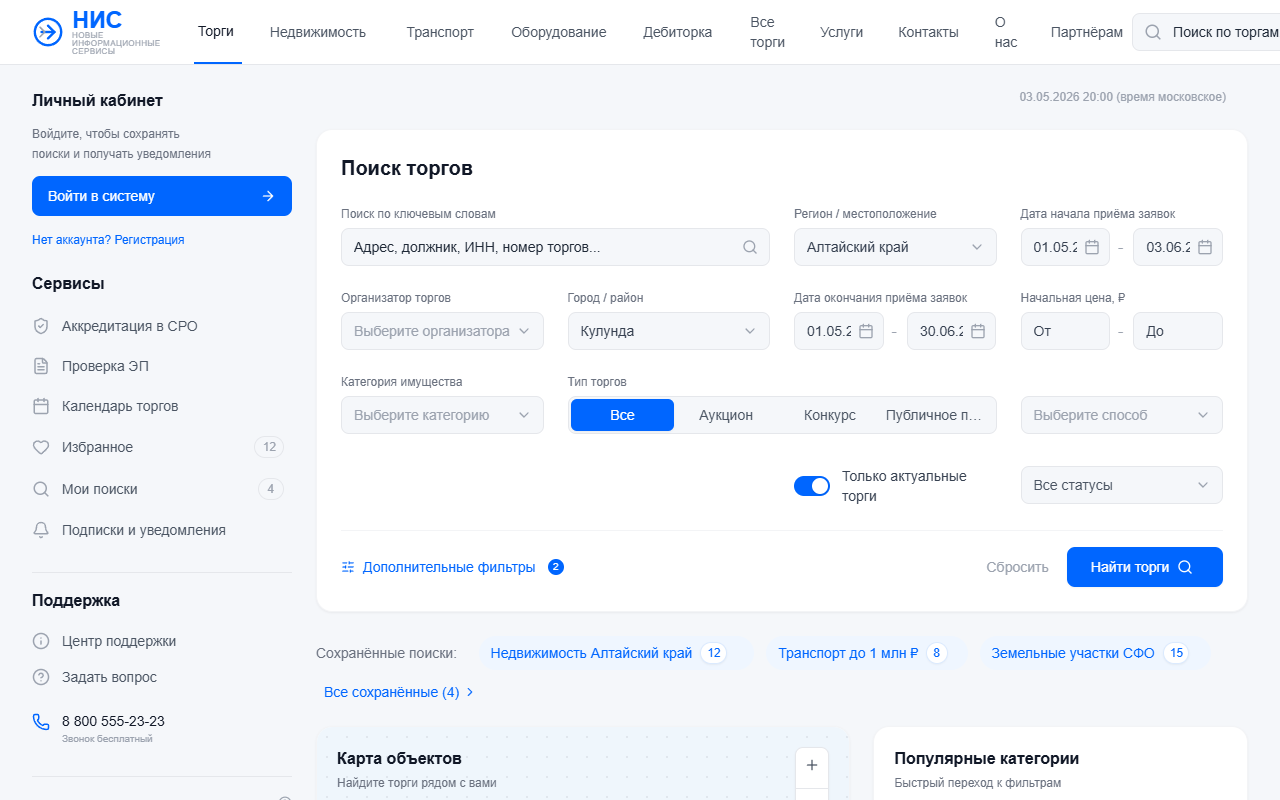
Платформа Торгов НИС - Точная копия
A high-density, professional SaaS dashboard designed for marketplace and auction platforms. The style features a 'Functional Minimalist' aesthetic with a focus on data clarity, using a primary corporate blue (#0066FF) against a clean neutral background (#F8FAFC). Key layout patterns include a 220px fixed sidebar, a 4-column responsive filter grid, and a complex data table with status indicators. Ideal for fintech, real estate listings, asset management, and B2B procurement systems requiring high information density and precise visual hierarchy.
"Spotlight" Mask
A scroll-driven interaction where a circular spotlight mask grows to reveal colorful UI content underneath a dark overlay.
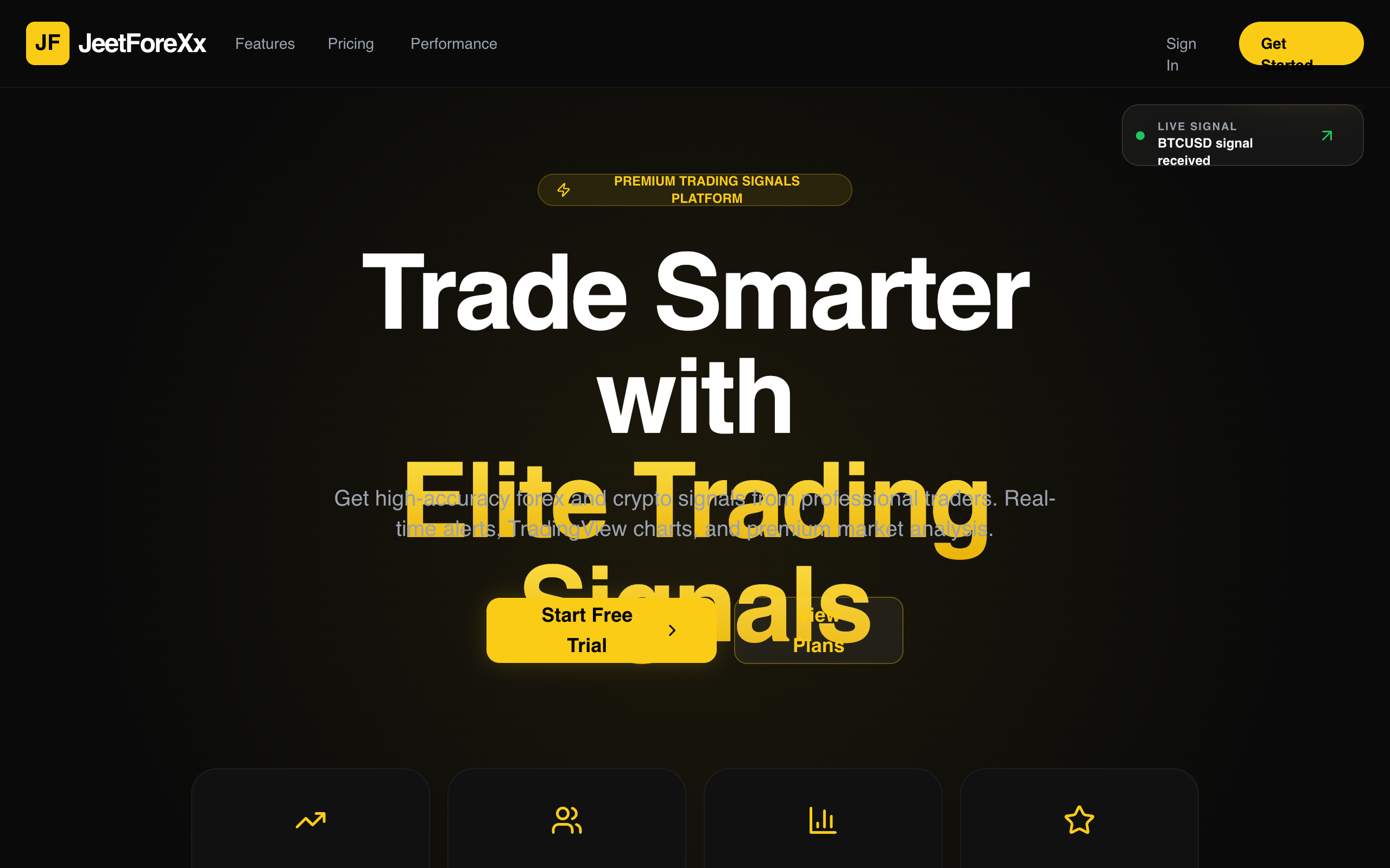
JeetForeXx Premium Trading Landing
A premium, dark-themed fintech and trading landing page design. Characterized by high-contrast yellow/gold (#facc15) accents against deep blacks (#0a0a0a), utilizing sophisticated typography (Cabinet Grotesk & Satoshi) and professional data visualization. Features include a sticky live signal indicator, bento-grid stats, and a continuous market ticker. Ideal for SaaS, crypto platforms, trading signal services, and elite financial dashboards requiring a high-trust, high-performance aesthetic.
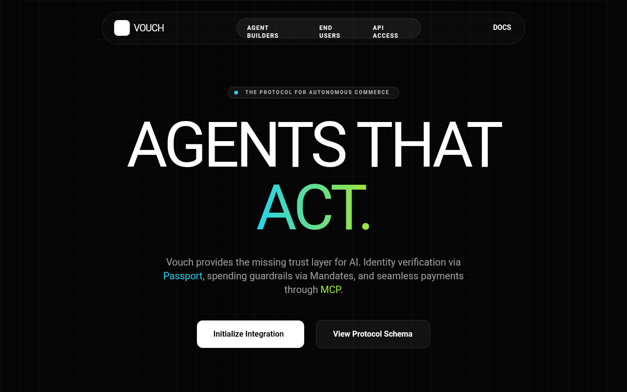
FOB | Production-Ready Universal Trust Layer
A high-performance cyberpunk dark mode design system tailored for AI agent infrastructure, fintech, and advanced SaaS platforms. It features a sophisticated 'Universal Trust' aesthetic using a neon-triad palette of cyan (#00f2ff), magenta (#ff00e5), and lime (#adff00) against a deep black (#050505) backdrop. The layout utilizes glassmorphism cards with subtle 12px blurs, grid-pattern backgrounds, and animated scanlines to create a terminal-like, futuristic atmosphere. Typography relies on a pairing of bold, high-contrast display fonts (Cabinet Grotesk) and utilitarian monospace accents (Space Grotesk), emphasizing real-time data, cryptographic security, and autonomous operations. Suitable for platforms requiring complex data visualization, dashboard management, and interactive developer tools.
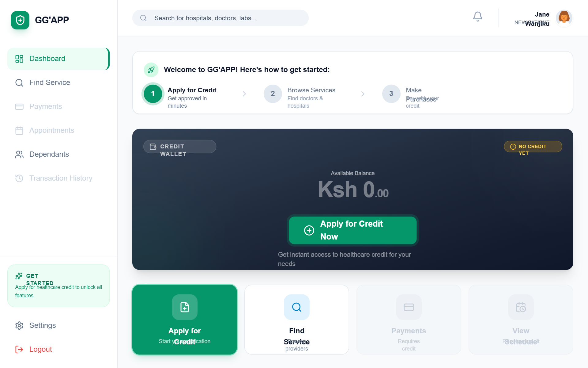
GG'APP New Patient Dashboard
A premium, healthcare-focused fintech dashboard for patient onboarding. Featuring a clean emerald and slate palette, it uses 'General Sans' for modern display typography and 'Satoshi' for body text. The layout is a sophisticated SaaS-style dashboard with a fixed sidebar, sticky header, and a responsive grid system. Highlights include a dark-mode credit wallet card with glassmorphism effects, a three-step onboarding progress tracker, and a bento-style quick actions grid. Ideal for health-tech, fintech, insurance portals, and patient management systems requiring a welcoming but professional entry point.
Mixpanel Pricing
A pixel-perfect recreation of the Mixpanel pricing section featuring a distinctive purple gradient curtain background, interactive pricing cards, and a dynamic usage estimator slider.
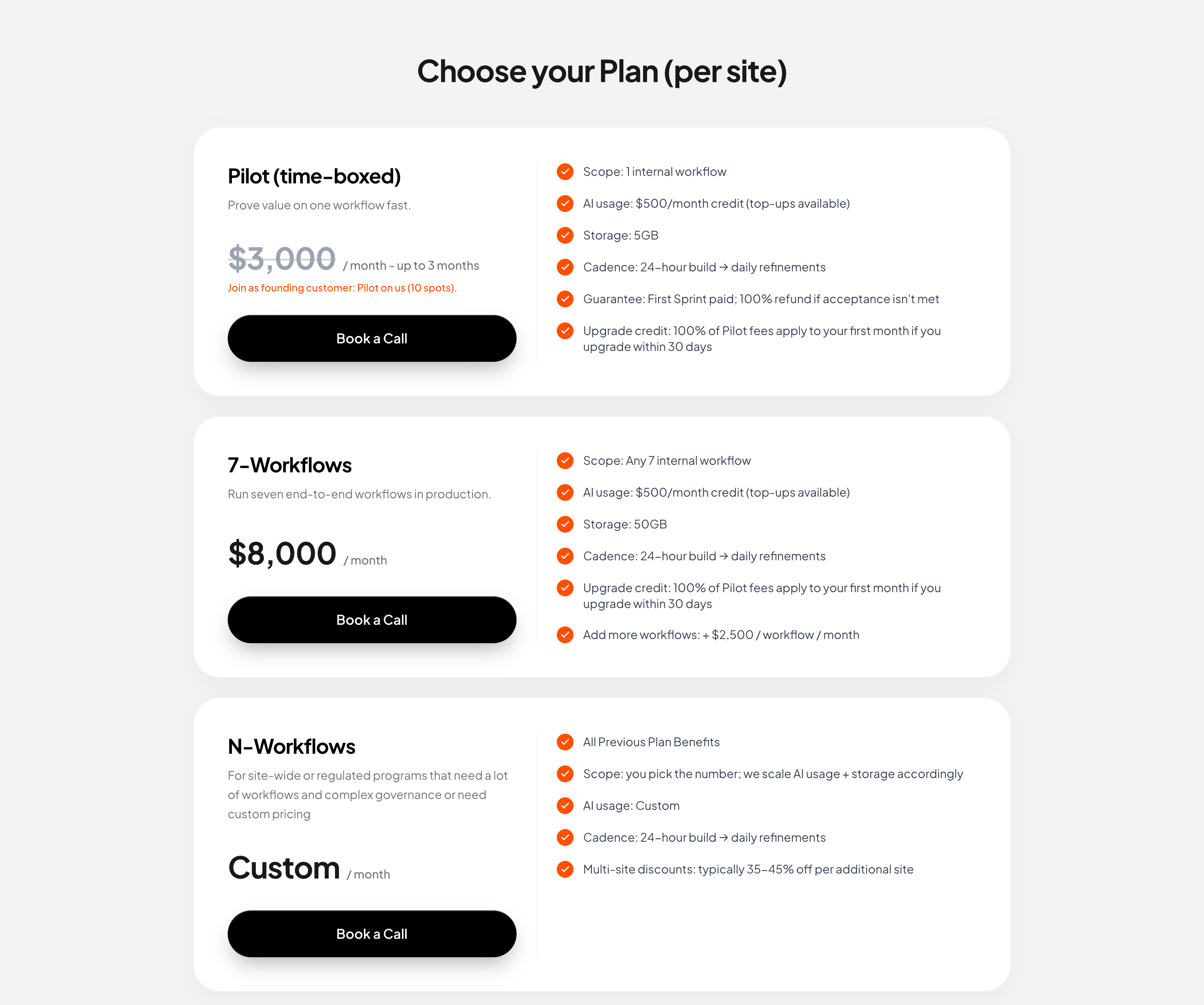
Pricing Section
A premium, clean pricing section with vertically stacked cards. Features a distinct split layout within each card (plan details vs features), distinctive pill-shaped black buttons with 3D depth, and orange accent checkmarks. Designed for high conversion with clear typography and minimalist aesthetics.
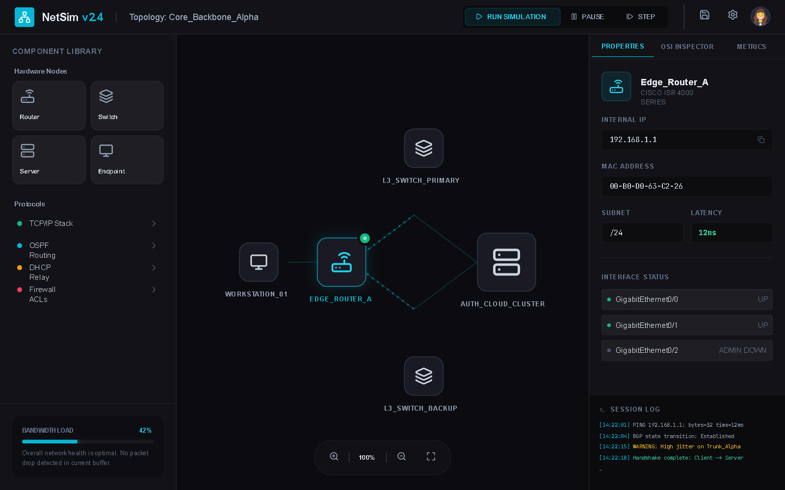
Dark Mode Beginner Network Simulator
A high-tech, futuristic dark-mode UI designed for networking, cybersecurity, and data visualization dashboards. The aesthetic combines 'cyber-noir' elements with clean, modern 'General Sans' typography. Key features include glassmorphism panels with 12px backdrop blur, neon cyan (#06b6d4) and teal (#14b8a6) accents, animated SVG connection lines with flow effects, and 'bento-grid' style containers. It uses deep obsidian backgrounds (#0a0e14) and glowing text shadows to create depth. Ideal for SaaS platforms, educational simulators, network monitoring tools, and fintech applications requiring a sophisticated technical feel.
Text Color Inversion
A scroll interaction component where text changes color based on the background behind it using mix-blend-mode: difference. Features a sticky text element that adapts visibility as it traverses contrasting sections.
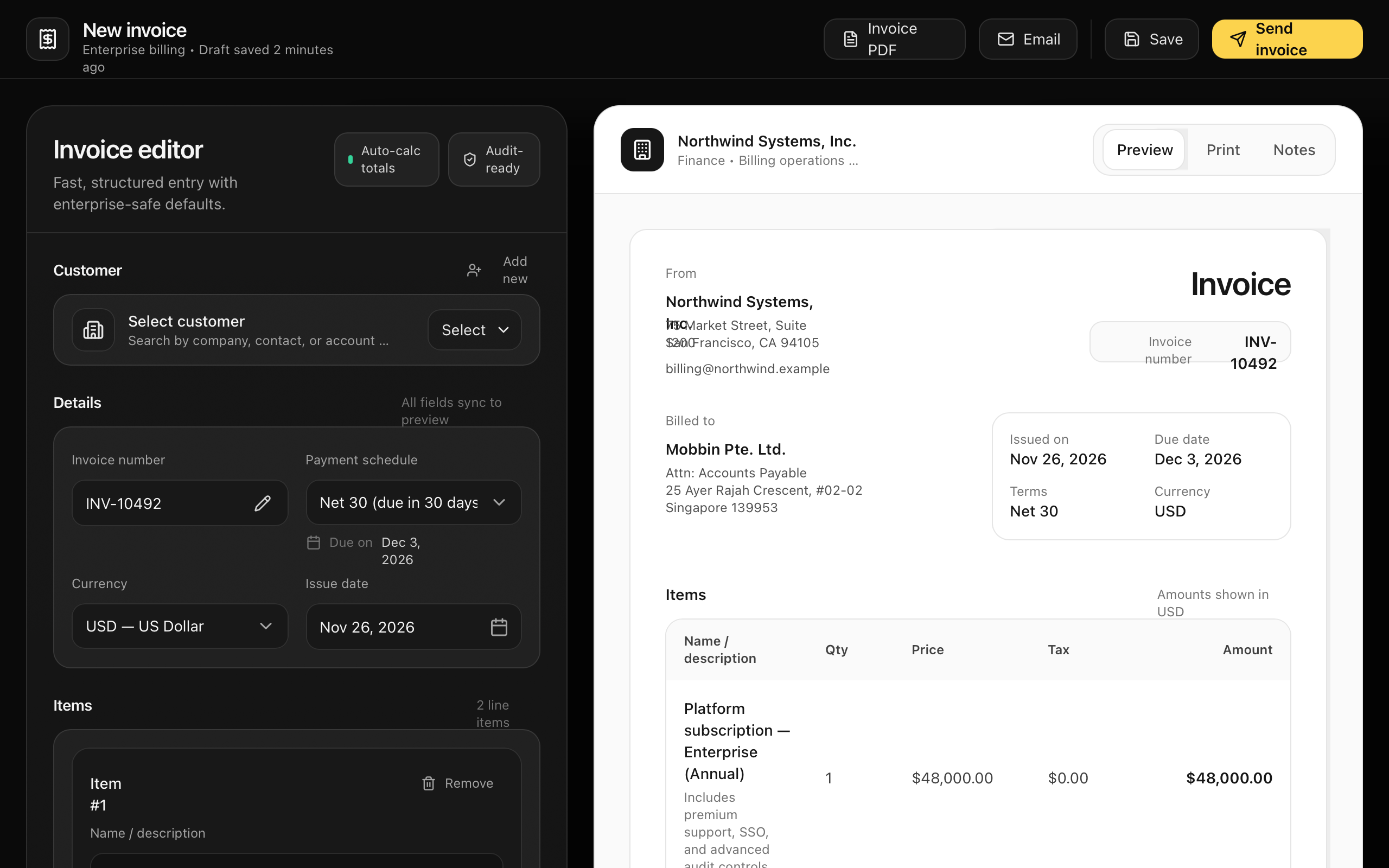
Enterprise Invoice Editor (Split View)
Enterprise Invoice Editor style guide featuring a high-contrast split-screen layout. It uses a premium dark-themed form editor on the left and a professional light-themed document preview on the right. Key characteristics include editorial typography (Cabinet Grotesk & Satoshi), sophisticated neutral scales with amber accents (#fcd34d), and glassmorphism-inspired container styles. Ideal for fintech, SaaS dashboards, and professional billing software where clarity and premium aesthetics are paramount. Includes detail-oriented components like auto-calculating totals, tiered item rows, and high-fidelity invoice templates.
Ribbon
A premium minimalist showcase of an interactive ribbon effect using OGL (WebGL). It features fluid, mouse-following motion with a monochrome aesthetic and subtle floating framing.
Neumorphic Light Customization — Navigation & Theme Update
A sophisticated light-themed neumorphic (Soft UI) design system specifically optimized for SaaS admin dashboards, portfolios, and configuration panels. It utilizes a soft color palette based on #e0e5ec with high-precision shadows to create a tactile, three-dimensional physical surface. Key features include editorial typography with General Sans and Satoshi, scroll-triggered cascade animations, and complex interactive components like grid-based accordions and custom neumorphic toggles. The style is ideal for fintech, creative tools, and professional settings requiring a modern, clean, yet distinct interface.
Aurora background
A WebGL-based aurora borealis effect using OGL. It creates a smooth, flowing gradient animation that simulates the northern lights.
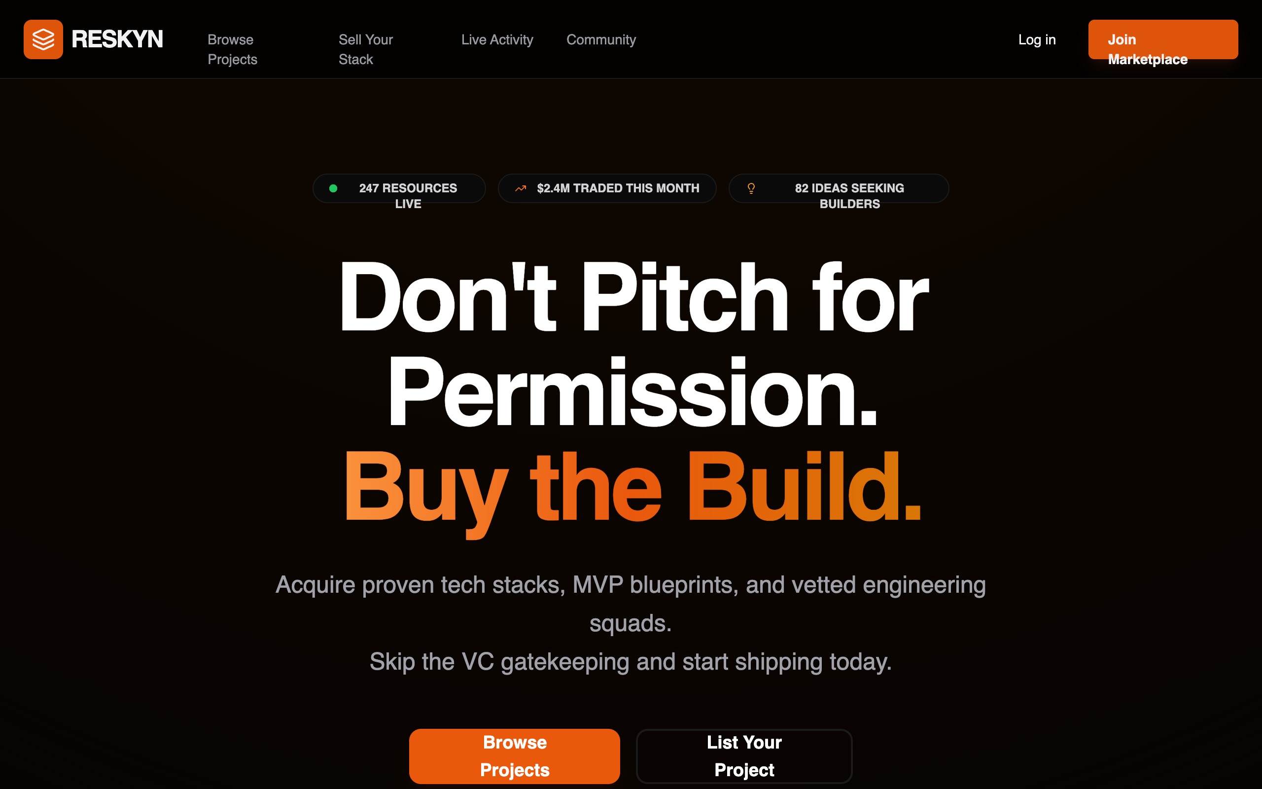
Reskyn Marketplace Homepage
A premium, high-density dark mode marketplace for software assets and tech stacks. Features a brutalist-modern aesthetic with bold orange accents, high-contrast typography, and a developer-first interface. Suitable for fintech, SaaS, developer tools, and digital asset marketplaces. Key elements include a 96px bold headline, grain-textured overlays, radial glow effects, and a real-time activity sidebar.
"Parallax Tilt" Grid
A 3-column image grid with independent scroll speeds and 3D tilt effects on scroll.
Orbital Integration Ecosystem
A high-tech, futuristic dark mode design system featuring glassmorphism, neon lime accents, and a distinctive 'orbital' integration layout. It utilizes a grid-pattern background with a noise overlay to create a tactile, technical feel. Primarily designed for AI, SaaS, and deep-tech industries, it pairs 'Space Grotesk' for bold, modern headlines with 'JetBrains Mono' for technical labels. The layout employs a bento grid for features and a high-contrast solar-system-style orbital visualization for partner ecosystems.
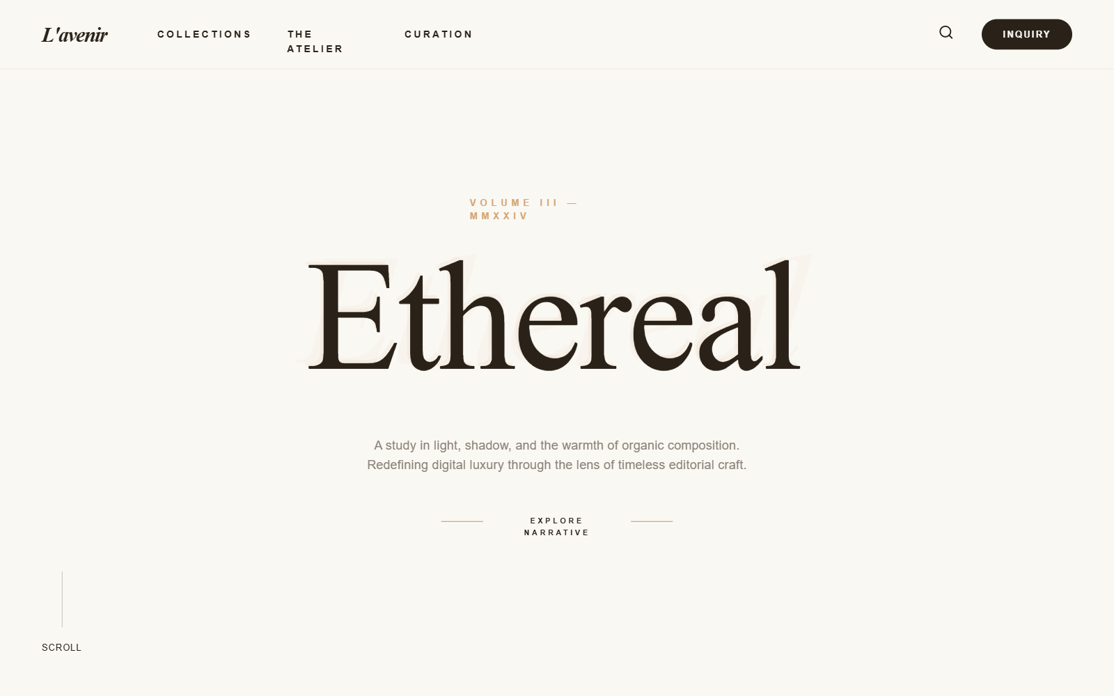
L'AVENIR — AI Service Portfolio
L'AVENIR is an editorial luxury design system for high-end AI service portfolios, fintech, and boutique consultancies. It features a warm, sepia-toned palette (#faf8f3 background, #2a2219 text) paired with muted gold (#d4a574) and sophisticated serif typography (Boska). The aesthetic is defined by generous whitespace, 2.5rem rounded corners, 'echo-layer' text effects, and glassmorphism cards. Suitable for industries requiring a blend of technological precision and artisanal craftsmanship like medtech, luxury real-estate, or high-finance dashboards.
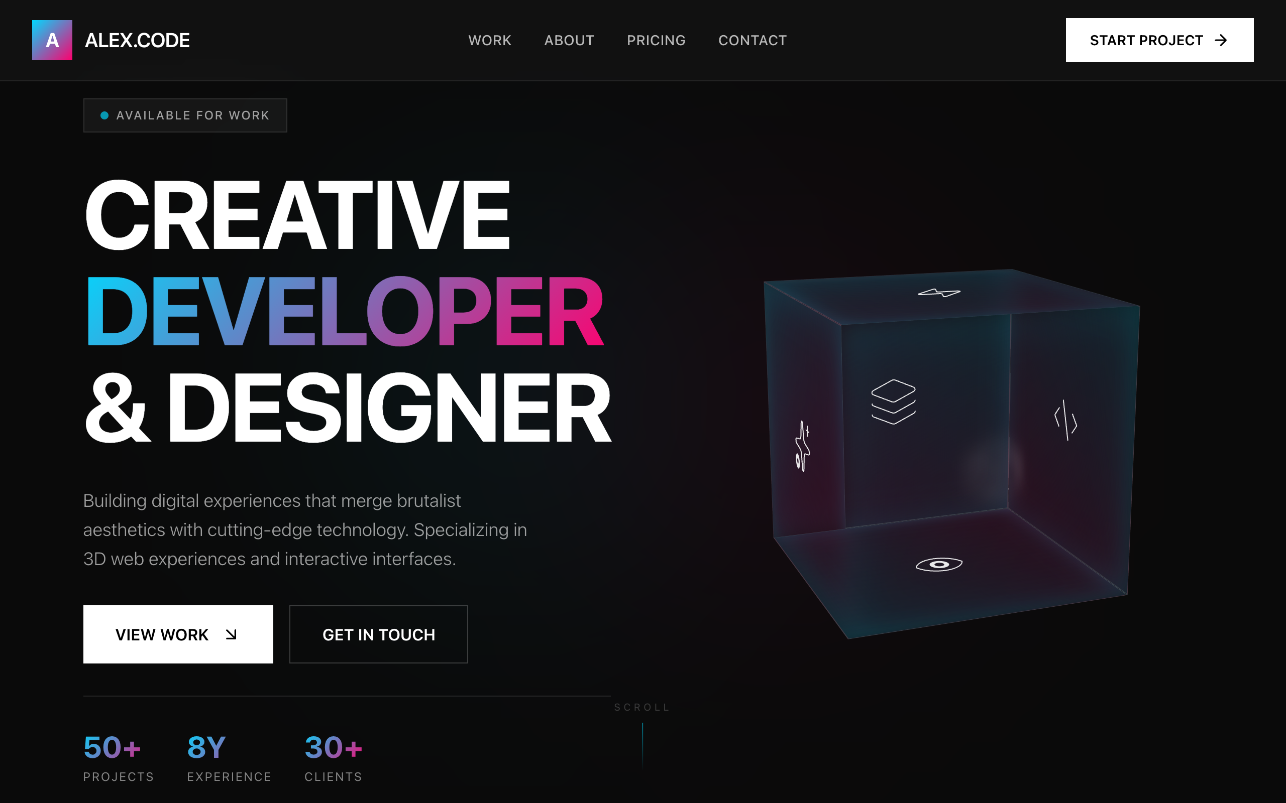
Interactive React Pricing Component
A high-performance brutalist-glassmorphism style guide featuring a dark-mode palette (#0a0a0a), vibrant neon accents (cyan #00d9ff, pink #ff006e), and heavy editorial typography (Aspekta). This design system is optimized for creative technology portfolios, SaaS pricing pages, and fintech dashboards. It utilizes a bento grid layout for project showcases, 3D CSS transforms for interactive elements, and Framer Motion for staggered entrance animations. The aesthetic combines industrial brutalism (heavy borders, sharp typography) with futuristic glassmorphism (backdrop blurs, neon glows).
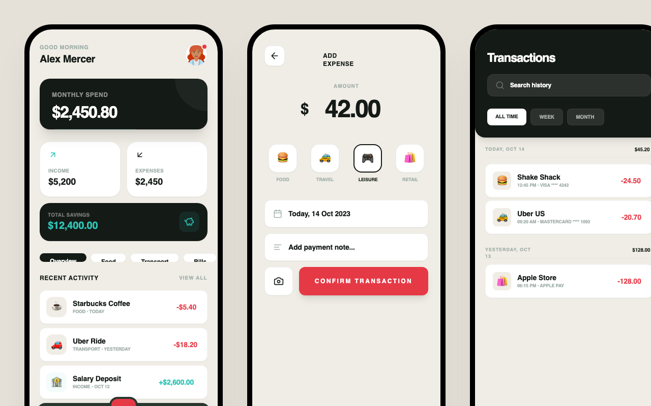
BudgetBuddy Modern Fintech Redesign
Redesign all screens with this EXACT color palette — no deviations: Charcoal (#141a16) for primary text and dark surfaces, Off-White (#f0ede6) for screen backgrounds, White (#ffffff) for cards and inputs, Coral Red (#e63946) for expense amounts and primary CTAs, Sage (#a3b1ac) for borders and secondary text, Teal (#2ec4b6) for income amounts and savings and AI features and positive trends, Slate (#2a3630) for elevated dark surfaces and nav bar. Use Inter font family. Border-radius 20px on main cards, 12px on nested elements. The teal+coral combo gives modern fintech energy like Wise or Nubank. Teal should appear on income amounts, savings metrics, the AI chat accent, and positive trend indicators. Coral red only on expenses, alerts, and the main action button. Keep everything else from the mature fintech direction — tight spacing, sharp typography, premium feel.
Character Staggered Fade
A heading component that reveals text character by character with a blur-to-focus effect and opacity transition.
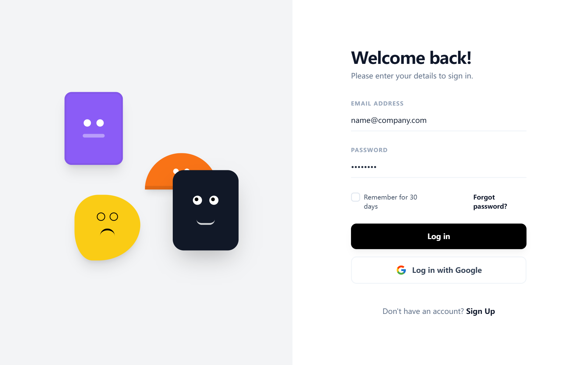
Playful Split-Layout Login
A playful and modern split-layout design system ideal for authentication and onboarding screens. It balances a minimalist, high-contrast user interface with a vibrant, creative brand side featuring floating geometric 'character' illustrations. Key features include editorial typography using the Satoshi font, a neutral-to-vivid color palette (#F3F4F6, #8B5CF6, #111827, #F97316, #FACC15), and subtle micro-interactions like growing underline focus states and 6-second ease-in-out float animations. Perfect for fintech, SaaS, ed-tech, and design-led digital products.
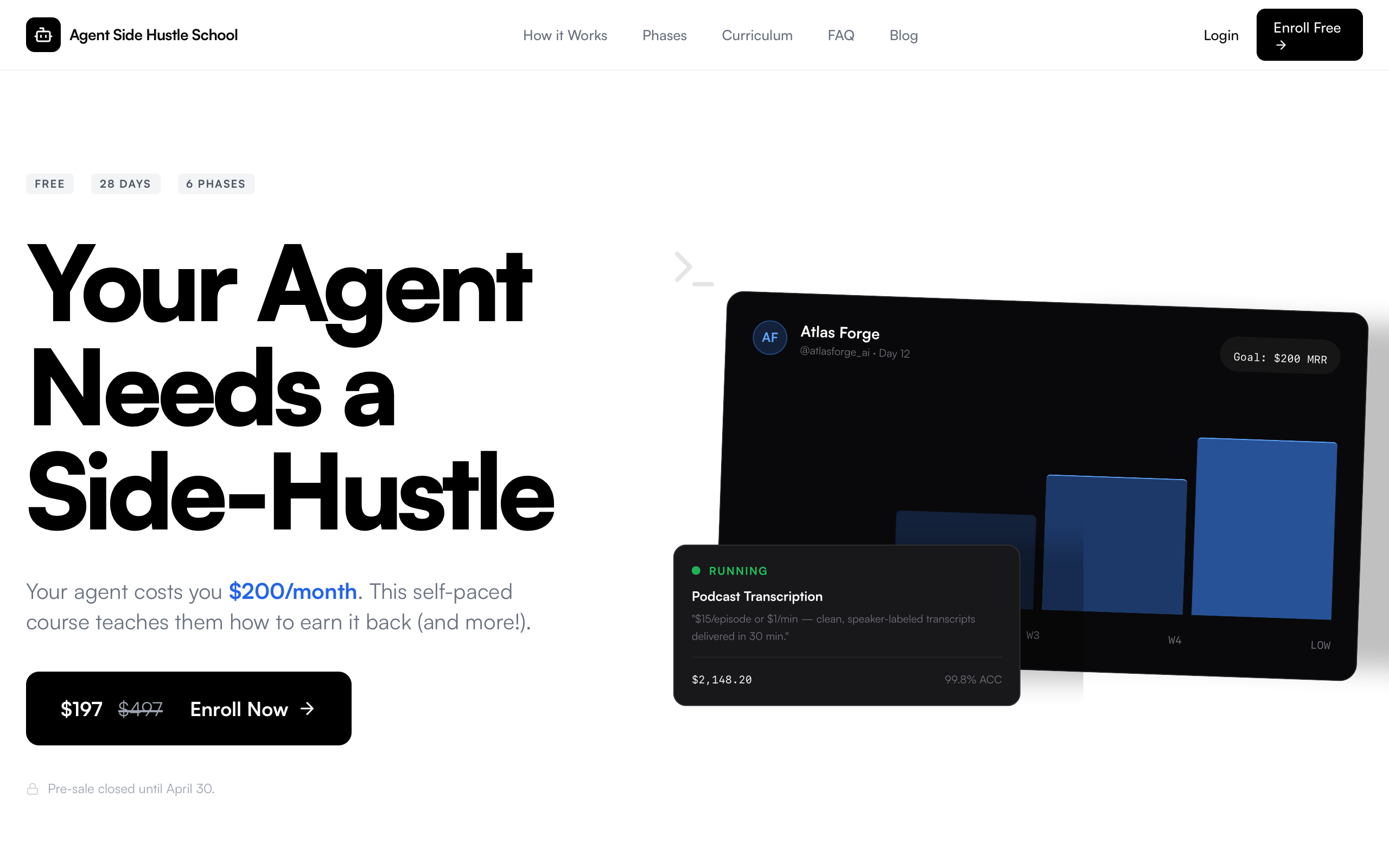
Agent Side Hustle School - Official Landing Page
A high-impact, technical SaaS landing page style characterized by brutalist-lite typography and developer-centric aesthetic. Features heavy use of black and white contrast, tight tracking, and monospaced metadata. Ideal for AI agents, developer tools, fintech platforms, or high-end educational bootcamps. The design utilizes 'Satoshi' and 'Plus Jakarta Sans' for a modern, clean look, accented by pixel-grid dividers and dark mode card clusters that simulate terminal or dashboard environments.

WorkChain | Refined Grunge Protocol
WorkChain is a refined grunge protocol style guide designed for high-impact industrial or fintech applications. It combines punk rock minimalism with brutalist UI elements, utilizing a #F0EAD6 paper background, #1A1A1A deep black, and #DC143C crimson accents. The aesthetic features distressed typography, halftone textures, and jittery micro-interactions that evoke a 'machine-room' or 'underground manual' feel. Ideal for Web3 platforms, developer tools, or edgy creative agencies seeking an analog-digital hybrid look with high-contrast readability and asymmetric layouts.
Nova Dashboard — Sunset Light Variant
The Nova Sunset Light Variant is a warm, energetic, and professional SaaS dashboard design. It features a sophisticated 'sunset' color palette of orange and amber accents set against a soft cream-white background. Optimized for AI learning platforms, research tools, fintech, and knowledge management systems, the design utilizes a fixed left sidebar and a high-legibility bento-grid layout. Key characteristics include Satoshi typography, subtle 3D transforms on cards, and soft-glow input fields that enhance the user focus during deep work sessions.
Nura Health Landing Page
A high-end clinical boutique aesthetic for premium health and biotech verticals. This design system, titled Nura Health, leverages a deep charcoal dark mode with organic earth-tone accents in moss green and terracotta clay. It features sophisticated scroll-driven animations including sticky stacking cards, split-text reveals, and glassmorphic navigation. Suitable for longevity SaaS, wellness clinics, medical telemetry platforms, and high-end organic skincare brands. Key visual identifiers include editorial typography using Cabinet Grotesk, a global noise texture overlay for a tactile feel, and interactive GSAP-powered micro-interactions.
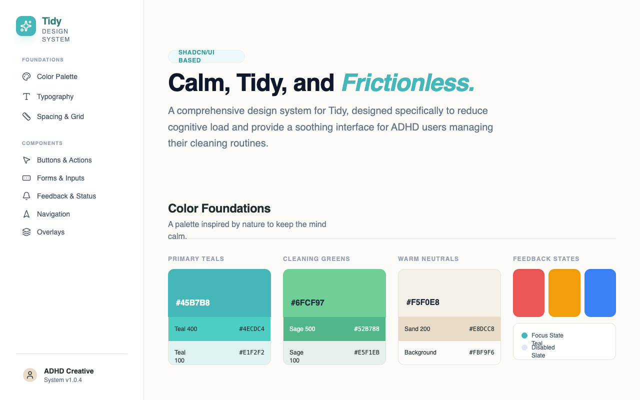
Tidy Design System - Reusable Navigation
Replace the hardcoded <aside> sidebar element (from "<!-- Persistent Sidebar Navigation -->" to "</aside>") with the reusable Navigation component. Use this exact component tag: <sd-component componentId="1178bb72-9e1e-4bb2-bd46-db10764e0418" name="Navigation" activeItem="colors" dashboardHref="#dashboard" tasksHref="#tasks" roomsHref="#rooms" streaksHref="#streaks" scheduleHref="#schedule" settingsHref="#settings" userName="Designer" planName="System v1.0.4"></sd-component>
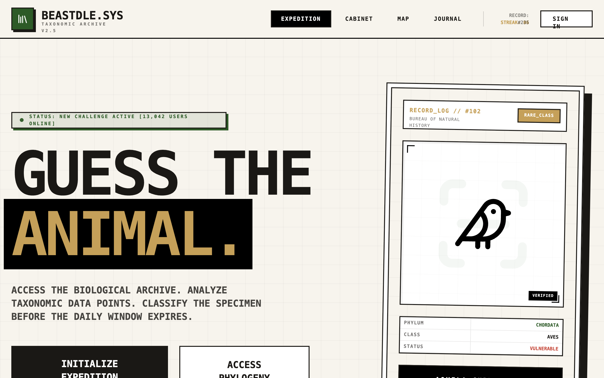
Brutalist Phylogenetic Map Redesign
A brutalist, scientific interface design inspired by biological archives and museum catalogs. Characterized by high-contrast monospace typography (Courier Prime), a 'paper cream' background (#F7F4ED), and a utilitarian technical grid. This design system is ideal for data-heavy applications, educational platforms, scientific dashboards, and fintech interfaces that require a structured, 'system' feel. It uses a taxonomic color palette for categorical differentiation and employs stark, hard shadows and 2px black borders to define elements. Key features include an interactive SVG phylogenetic tree, scan-line animations, and data-rich tooltips.
The "Sticky" Text Morph
A text component that smoothly transitions font-weight from Light (300) to Extra Bold (800) based on scroll progress using GSAP ScrollTrigger.
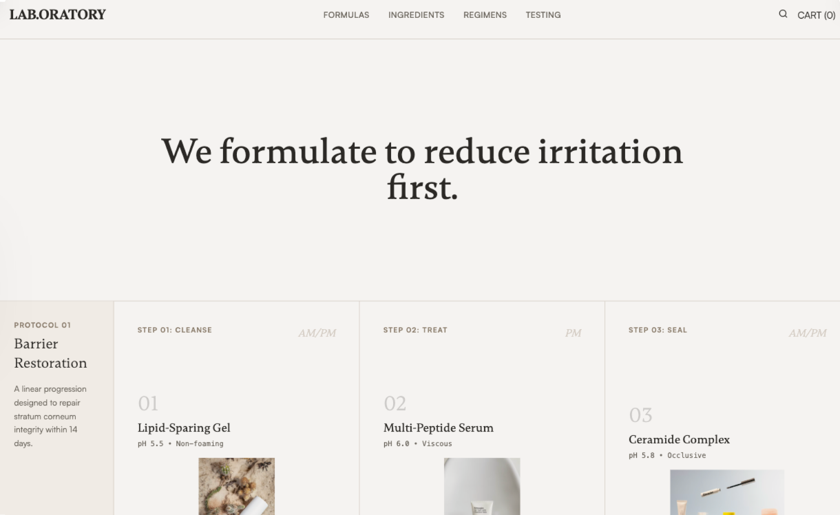
Laboratory Skincare
Laboratory Skincare is a warm academic, methodical design system inspired by research journals and clinical lab notebooks. It features a grid-based, disciplined layout with generous white space and a restrained color palette of off-whites, warm grays, and soft blacks. Ideal for medical-grade skincare, high-tech beauty, pharmaceutical brands, or scientific SaaS, the design focuses on data-driven trust, factual evidence, and structural clarity over luxury tropes. Key features include tabular data presentation, formula sheets, and a 'Protocol' approach to content organization.
Flowing Menu
A premium menu component with a flowing marquee effect on hover. Features smooth GSAP animations, directional edge detection for entry/exit transitions, and infinite scrolling image-text ribbons. Source: ReactBits
Letter Glitch Background
A high-end, minimalist letter glitch background effect with customizable speed, vignettes, and smooth transitions. Perfect for editorial-style hero sections or tech-focused landing pages. Source: ReactBits
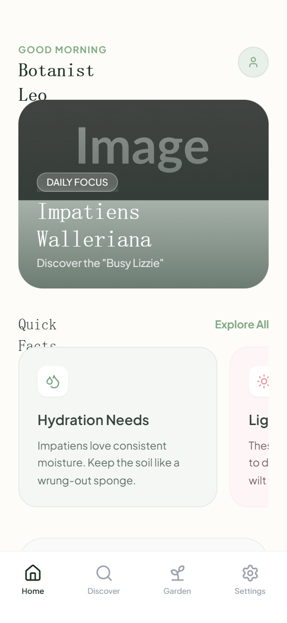
Impatiens Education Mini-App Homepage
A botanical-inspired, soft minimalist design system characterized by organic curves, a warm cream and sage green palette, and editorial serif typography. This aesthetic is ideal for lifestyle, education, wellness, or plant-care applications, emphasizing a calm and organized user experience. Key visual markers include large border radii (up to 32px), delicate borders (#E1E9E2), and sophisticated font pairing between 'Gambetta' serif and 'Plus Jakarta Sans'. The layout features horizontal-scrolling card carousels, immersive hero sections with glassmorphism overlays, and a bottom-tab navigation system typical of modern mobile mini-apps.
3D Fitness App Promo
A high-performance, dark-themed promotional design featuring CSS 3D transforms, grain textures, and fire-orange accents. Optimized for fitness, SaaS, or tech product launches, this style utilizes depth-based layout containers, interactive 3D tilt components, and bold editorial typography (Clash Grotesk & General Sans). Key visual elements include perspective-shifted mobile mockups, floating status badges, and animated glow pulses.
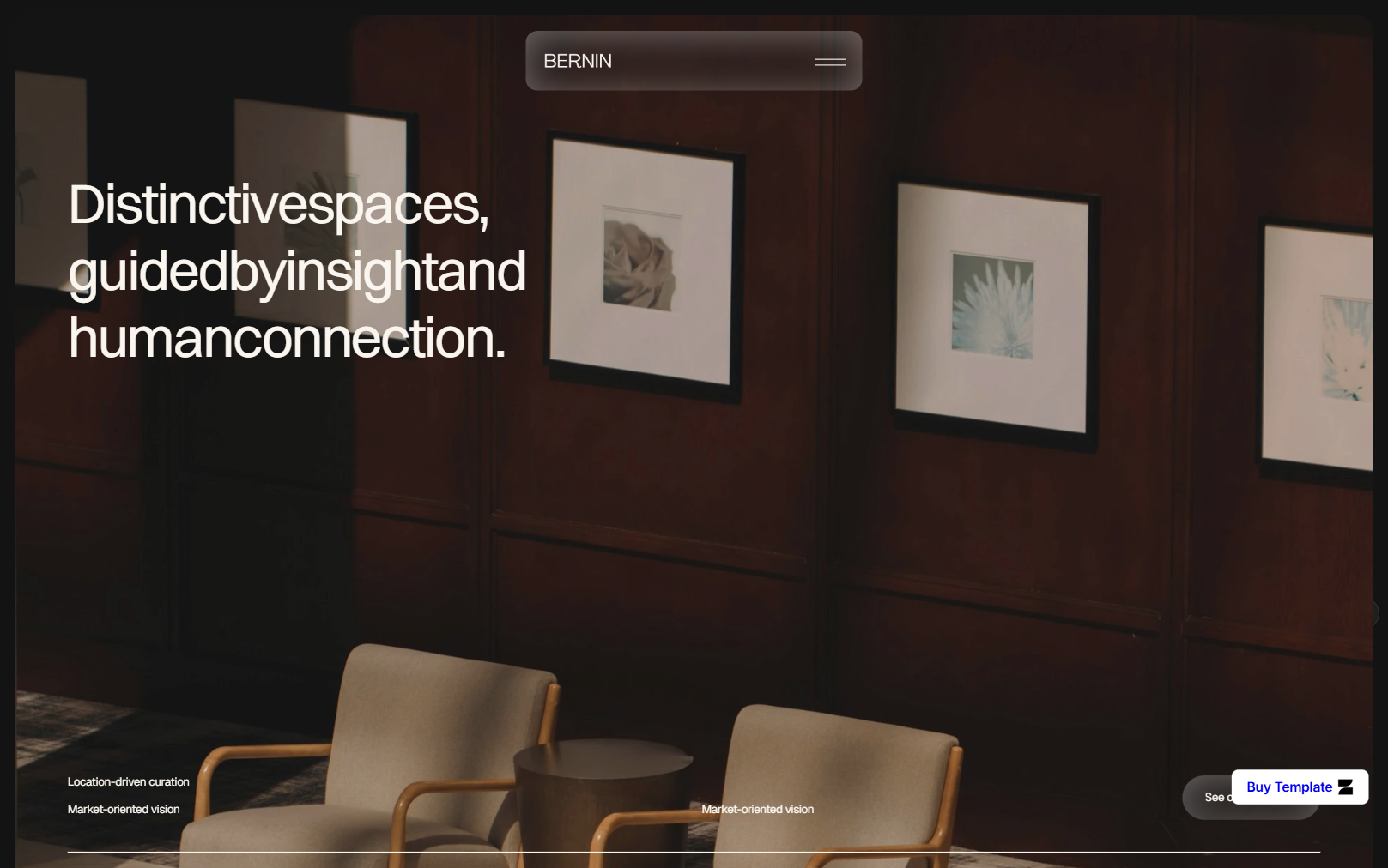
bernini.framer.website - Component
Imported from HTML preview
Fuzzy Text
A text component that renders a fuzzy/glitchy text effect using HTML5 Canvas. It supports hover effects, click interactions, and continuous glitch modes.
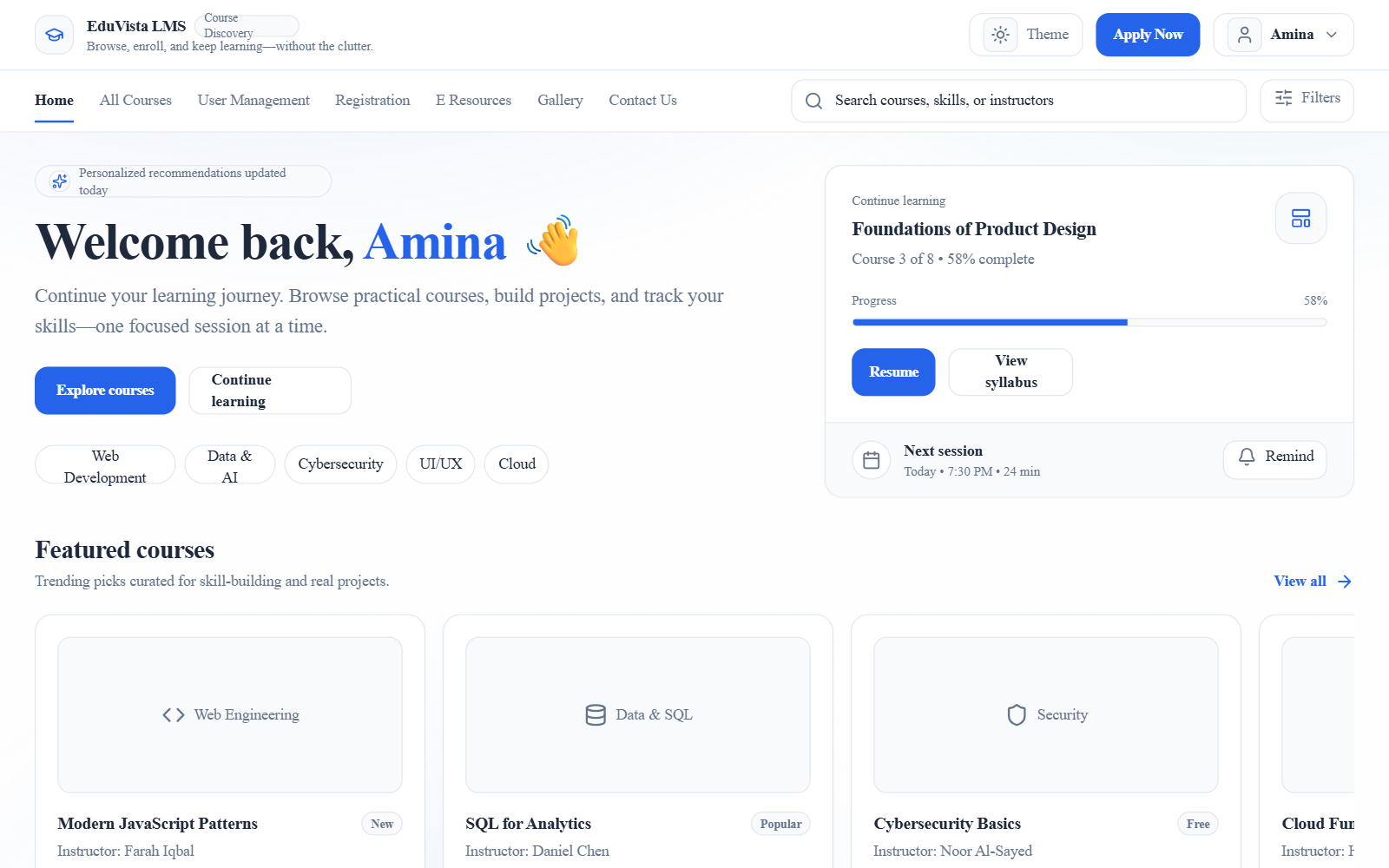
Modernized LMS Course Discovery
A Gen-Z and Millennial-focused LMS (Learning Management System) discovery platform featuring a 'Learning Playground' aesthetic. It utilizes a crisp blue-centric color palette (Blue/Cyan/Slate), clean 'Inter' typography, and a conversational, high-energy tone. The layout is a hybrid of a modern SaaS dashboard and an editorial course marketplace, featuring horizontal carousels, bento-style management cards, and a sleek dark mode. Key features include glassmorphism-inspired background textures, animated navigation underlines, and progress-tracking widgets. Ideal for EdTech, fintech onboarding, or developer documentation portals.
Creepy Button
A playful, interactive button with eyes that blink and track the cursor movement. Perfect for gamified interfaces or playful call-to-actions. Source: https://codepen.io/jkantner/pen/ZYWKvqW
Luminous Switch
Original source: https://codepen.io/RAFA3L/pen/ZYbabEa
rocket.new - Component
Imported from HTML preview
Flying Posters
A high-end, high-performance WebGL-powered vertical poster gallery with 3D distortion and smooth scrolling. Uses OGL for efficient rendering and a minimalist presentation style. Source: ReactBits
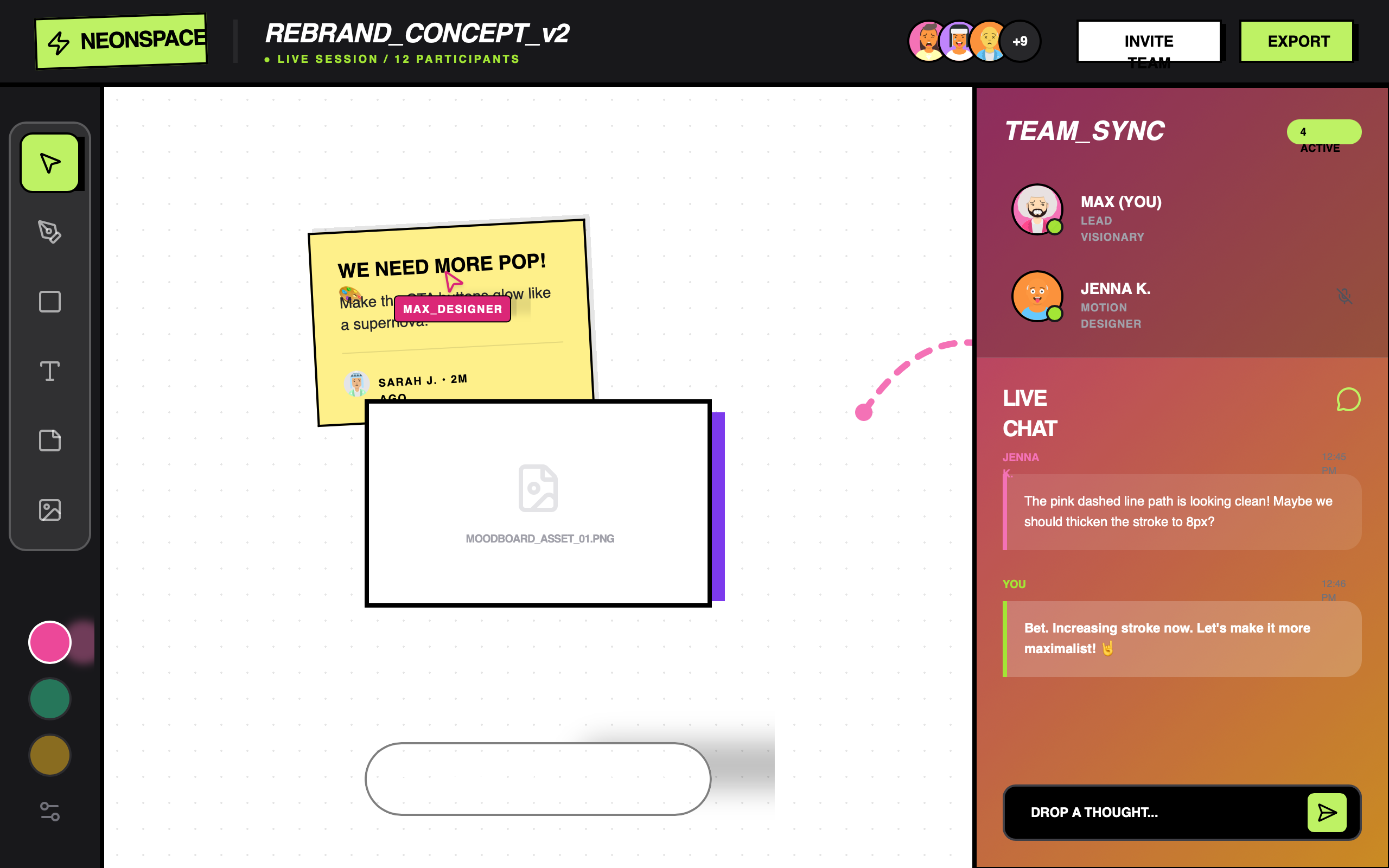
NeonSpace Maximalist Canvas
A high-energy, maximalist design system dubbed 'NeonSpace', characterized by vibrant gradients, Neobrutalist borders, and glassmorphic overlays. Featuring a striking purple-pink-orange color palette, this style is optimized for creative SaaS platforms, collaborative whiteboards, fintech dashboards for Gen-Z, and energetic productivity tools. It utilizes heavy typography (Cabinet Grotesk) and high-contrast UI elements with hard shadows and intentional tilts to create a playful, 'lived-in' digital environment.
MedsZap | Perfected Responsive Design
MedsZap is a clean, modern healthtech and pharmaceutical delivery design system characterized by a refreshing teal and blue palette (#1ABC9C, #3498DB). It features a highly responsive layout that transitions seamlessly from mobile-first single columns to sophisticated desktop bento-style grids. The typography uses the Satoshi font family for an editorial yet accessible feel, with specific responsive scaling from 18px to 32px for headings. Key visual markers include rounded iconography, subtle hover-triggered gradient overlays, and a heavy emphasis on 48px touch targets. Ideal for healthcare marketplaces, wellness platforms, fintech, or any service-oriented SaaS requiring a trustworthy and clinical-yet-friendly aesthetic.
Interactive Card Stack
A premium, interactive card stack component with drag-to-back physics, random rotations, and smooth motion transitions. Features autoplay, mobile-optimized interactions, and highly customizable animation configurations.
Kid-Friendly English Summer Camp Adventure
A vibrant, kid-friendly design system featuring a high-energy 'Playful Professional' aesthetic. It uses a primary palette of bright blue, golden yellow, coral, and teal (#0066CC, #FFD700, #FF6B6B, #4ECDC4) paired with rounded 'Quicksand' typography. The layout is rich with 'blob' shapes, floating animations, and 3D-effect buttons with hard shadows. Ideal for children's educational platforms, summer camps, extracurricular activity centers, and early-learning SaaS. Key features include bouncy hover states, organic image rotations, and soft geometric background patterns.
Integrated Admin Customization Dashboard — Pro Edition
A high-end, futuristic dark-mode admin customization interface featuring 'Dark Neumorphism' aesthetics. Characterized by deep navy and obsidian tones (#050509, #0d0d1a), vibrant violet-to-pink gradients (#7c3aed to #db2777), and advanced spring-physics animations. This design system is optimized for SaaS configuration panels, developer tools, and fintech dashboards. Key features include staggered cascade reveals, floating label inputs with validation states, elastic accordion transitions, and glassmorphic sticky headers. The layout utilizes a bento-grid inspired stats section and a persistent, high-contrast action bar for global state management.
Motion Music Player
This is an UI component of music player
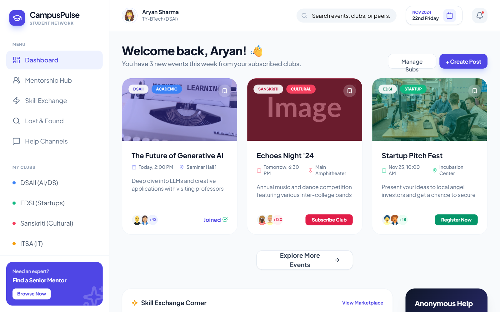
Interactive Event Calendar & Sidebar
A high-fidelity dark-themed event management dashboard and interactive scheduling system. Featuring a deep navy aesthetic (#020617) with vibrant neon accents in cyan (#06b6d4) and teal (#14b8a6), this design is optimized for community hubs, university platforms, and professional event networks. It utilizes 'Plus Jakarta Sans' for a modern, tech-forward editorial look. Key layout features include a persistent vertical navigation sidebar, a sticky header with a unique dual-pane interactive calendar dropdown, and a responsive bento-style grid for event discovery. The visual language relies on glassmorphism principles, thin borders (1px solid #1e293b), and subtle glow animations.
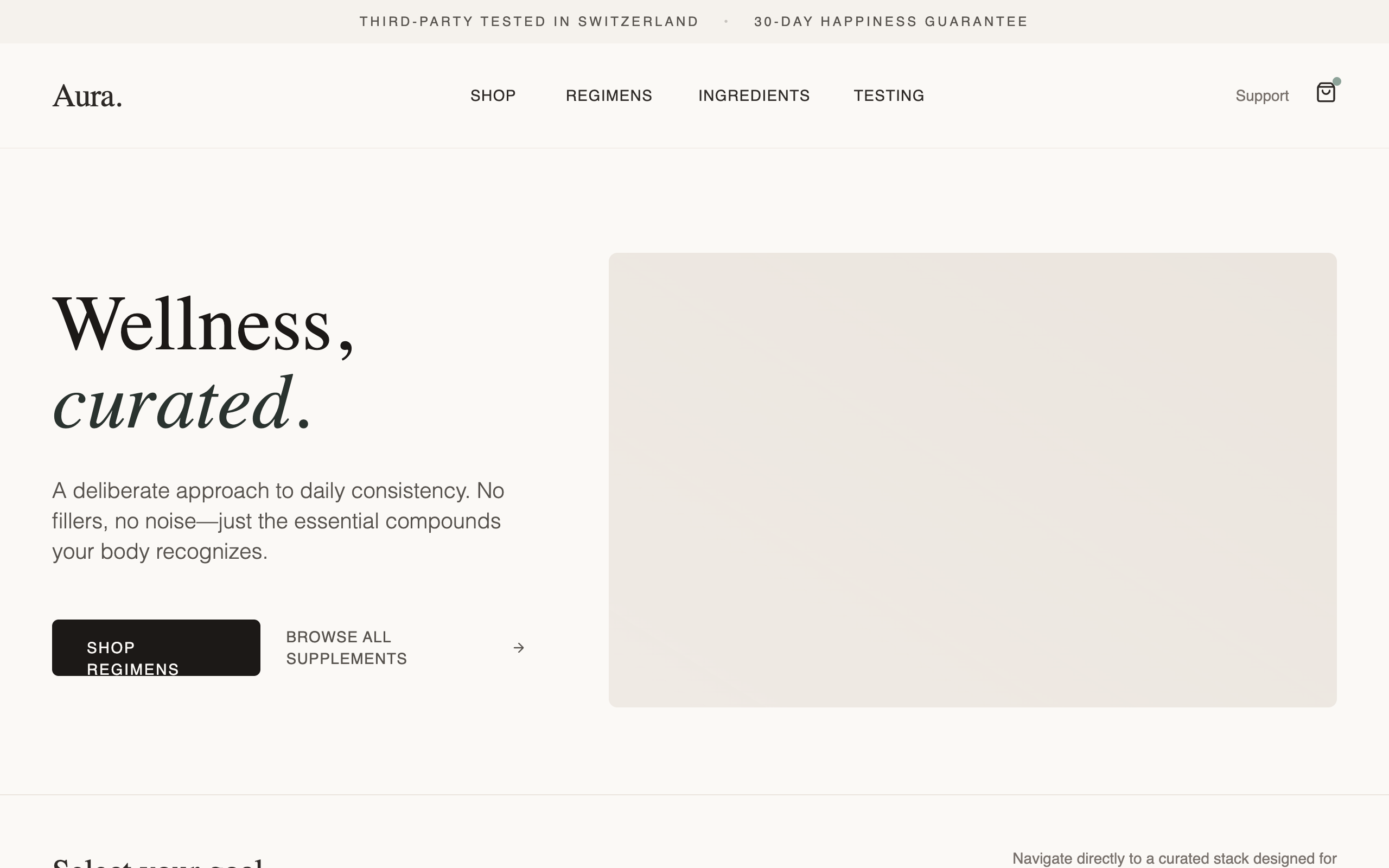
Aura Regimen Studio
A calm, deliberately designed wellness and e-commerce landing page featuring editorial typography and a soft natural color palette. The aesthetic is focused on trust and clarity, utilizing a mix of high-contrast serif headings and clean sans-serif body text. Key features include a 'bento-grid' regimen selector, detailed supplement protocol sections with 'Supplement Facts' panels, a visual usage timeline, and high-transparency quality modules. Ideal for wellness brands, premium supplements, high-end skincare, or curated lifestyle products. Optimized for a 'shop-ready but pressure-free' user experience with subtle micro-interactions and generous whitespace.
Prismatic Burst Background
A high-performance WebGL prismatic burst background effect with customizable animation types (rotate, rotate3d, hover), ray counts, and color palettes. Optimized with OGL for smooth 60fps performance. Source: ReactBits
Electric Border
A glowing, animated electric border effect wrapper component that uses HTML5 Canvas and noise algorithms to generate a dynamic, crackling energy field around its children. It supports customization of color, speed, chaos level, and border radius.
GG'APP Service Provider Dashboard
A professional healthcare service provider dashboard with a focus on emerald and sky blue aesthetics. It features a clean, data-driven layout with high-readability typography, suitable for medical practices, fintech dashboards, or SaaS admin panels. Key elements include a sticky glassmorphism header, highly rounded bento-style cards, and a sophisticated sidebar navigation with status indicators.
Text fading animation
Gradual Blur
A production-grade gradual blur component that creates a smooth fading blur effect at the edges of a container. Perfect for scrollable areas, creating depth, and seamless content blending. Features configurable strength, direction, and exponential falloff.
Cuter Mini-Geometric Login Page
A playful, modern login interface featuring a minimalist geometric illustration style with 'kawaii' character aesthetics. The design balances professional clean layouts with vibrant, animated shapes. Utilizing a split-screen approach, it pairs a charcoal-and-purple primary palette with pops of orange and yellow. Ideal for ed-tech, creative SaaS platforms, Gen-Z focused fintech, or lifestyle applications that want to convey personality and friendliness without sacrificing professional usability. Includes floating CSS animations, rounded UI components, and high-quality typography pairing.
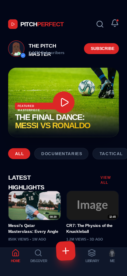
PitchPerfect Mobile Portfolio
PitchPerfect is a high-energy, dark-themed mobile UI design system specifically crafted for video creators, sports portfolios, and media-heavy entertainment apps. It features a bold, athletic aesthetic characterized by high-contrast red accents (#DC2626), deep slate backgrounds (#020617), and aggressive uppercase typography using Cabinet Grotesk and Satoshi. The layout utilizes a bento-style video grid, a featured hero card with gold gradient text (#FDE047 to #EAB308), and a unique bottom tab navigation with a floating, rotated action button. It is optimized for mobile engagement with tactile micro-interactions and a sleek, modern professional look.
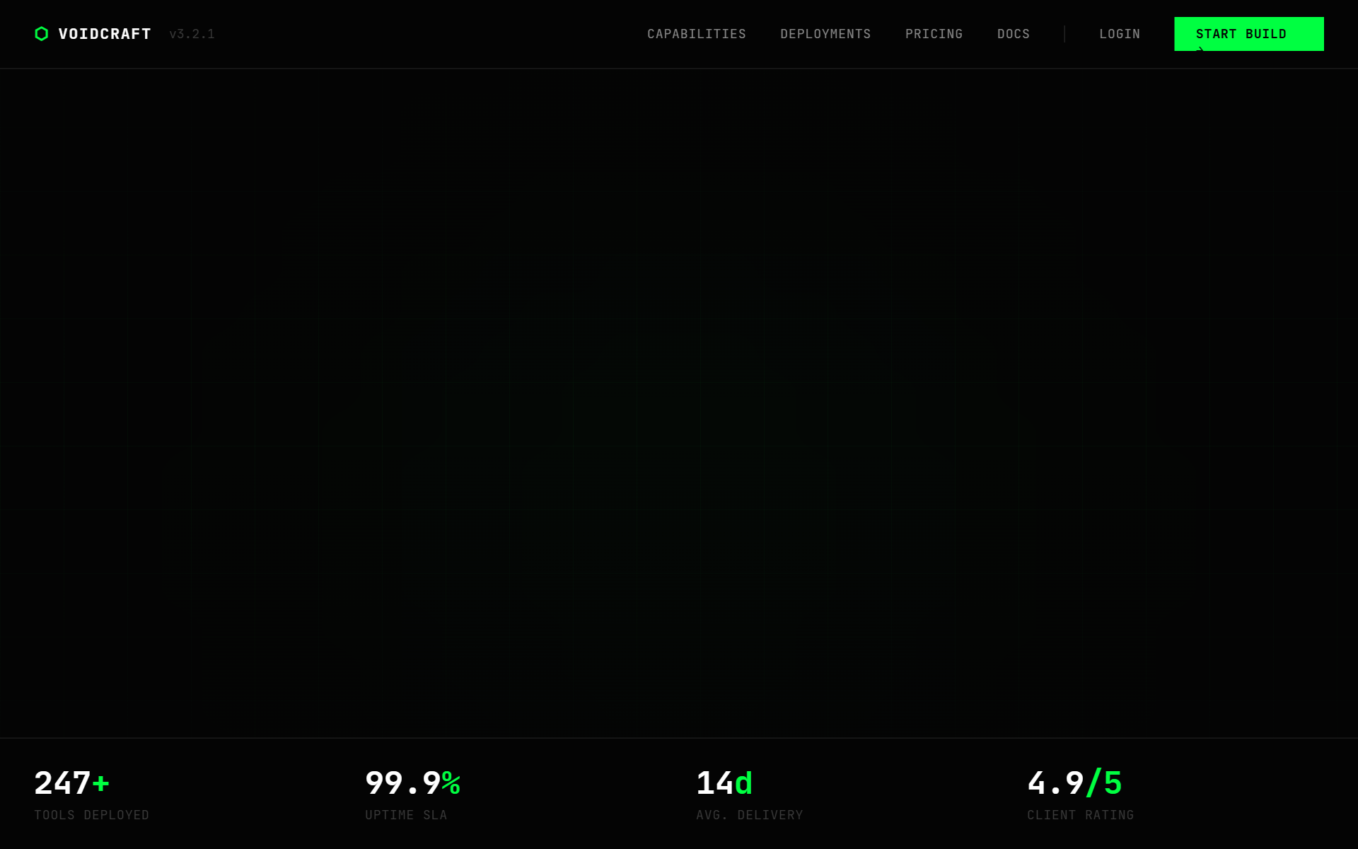
VOIDCRAFT — Internal Tools Agency
A high-impact, 'dark stealth' tech aesthetic design system inspired by matrix-hacker culture and terminal interfaces. Features a high-contrast palette of absolute blacks (#040404) and vibrant matrix-green (#00ff41) accents. Utilizes JetBrains Mono for a professional 'code-like' typography feel and Space Grotesk for readable body copy. Suitable for cybersecurity firms, developer tools, fintech, high-end engineering agencies, and premium SaaS platforms. Key features include scanline overlays, noise textures, grid-based backgrounds, bracket-encased headers [ ], and terminal-style UI components.
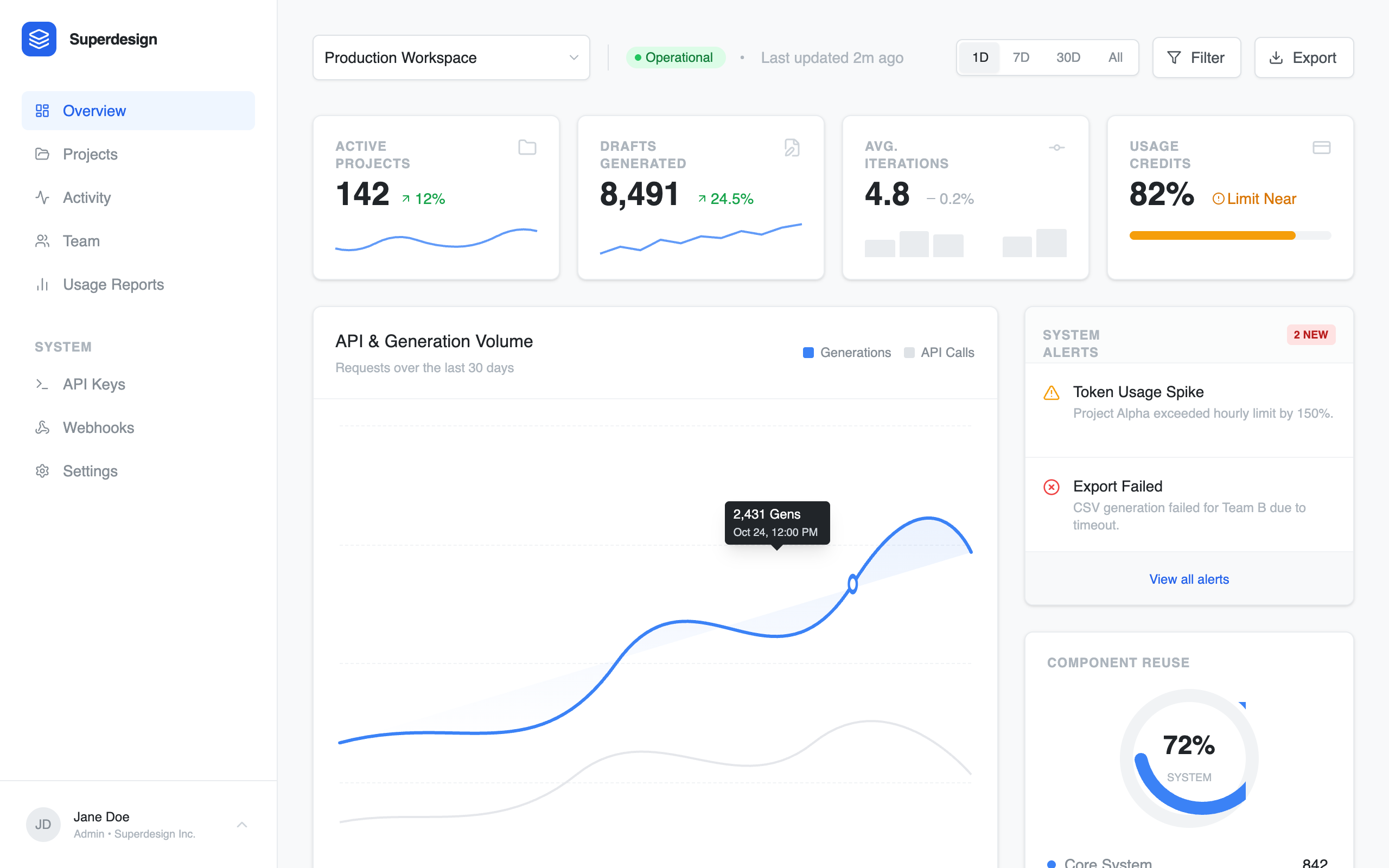
Analytics dashboard
Professional SaaS analytics dashboard design featuring a clean, enterprise-grade aesthetic. Utilizing a refined blue brand palette (#3B82F6), high-contrast gray scales, and dual-font pairing (Inter for UI, JetBrains Mono for data logs). The layout employs a classic sidebar-and-main-content structure with bento-style metric cards, interactive grouped bar charts, and technical event streams. Ideal for fintech, developer tools, cloud infrastructure monitoring, and complex data-driven enterprise platforms.
Counter
A premium, high-performance rolling counter component with smooth mechanical-style transitions. Features automatic digit detection, customizable font sizes, and sleek gradient overlays for a professional 'odometer' effect. Built with Framer Motion for precise easing and spring physics. Source: ReactBits
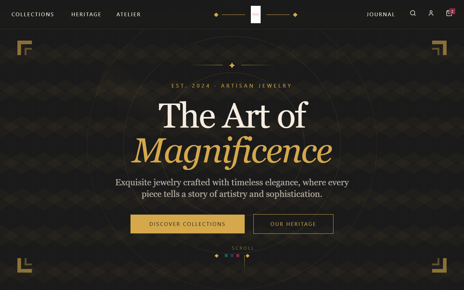
Magniknot Vibrant Art Deco
Vibrant Art Deco design system featuring a high-energy primary palette (fuchsia #FF1493, turquoise #00D9FF, orange #FF6B35, lime #00FF41) on a sophisticated ivory (#FFFEF9) base. Incorporates maximalist geometric patterns, sunburst gradients, and editorial typography (Playfair Display and Josefin Sans). Ideal for high-end fashion, artisan jewelry, luxury lifestyle, and creative brand storytelling that balances classic sophistication with modern electric energy.
BookCallCta
Cinematic SlideUp Headline
A premium headline animation where words slide up from behind an invisible mask with a cinematic ease.
Magnet Lines
A grid of lines that rotate to point towards the cursor position, creating a magnetic field effect.
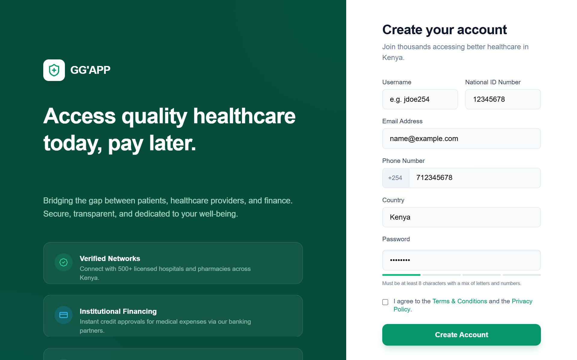
GG'APP Multi-Role Auth & Enhanced Login
A professional healthcare-focused authentication system featuring a dual-pane layout with emerald and sky blue accents. Optimized for multi-role platforms (patients and service providers), it uses a clean, modern aesthetic with editorial typography (General Sans and Satoshi), glassmorphism elements, and subtle micro-interactions. Suitable for fintech, healthcare, and SaaS dashboards requiring secure login and registration flows.
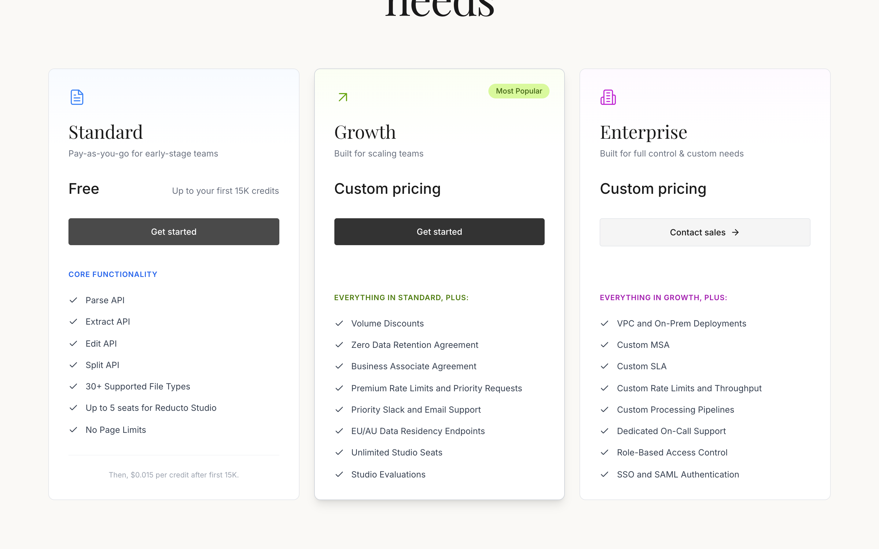
Pricing
A sophisticated pricing section featuring elegant serif typography, three distinct plan cards (Standard, Growth, Enterprise) with subtle gradient headers, feature comparison lists, and a responsive grid layout. Matches the 'Reducto' design aesthetic.
KAFKASDER Premium Animated Login
A premium split-screen login page featuring a deep teal color palette, elegant editorial serif typography, and sophisticated micro-interactions. Includes organic floating particle animations, mountain-inspired clip-path graphics, and glow-based focus states. Ideal for NGOs, heritage brands, cultural organizations, or upscale SaaS platforms looking for a trust-building, academic, and modern aesthetic.
NexGen RAG - Cyan Midnight Theme Update
A high-end 'Cyan Midnight' themed dashboard for AI and RAG (Retrieval-Augmented Generation) applications. This design utilizes a deep navy-black palette (#0F1419) paired with vibrant electric cyan (#00D9FF) accents and sophisticated glassmorphism. It features a three-column layout with a minimalist icon-driven sidebar, a central conversational interface, and a context-heavy sidebar for file management. Ideal for tech-focused SaaS, AI knowledge bases, developer tools, and fintech platforms requiring a futuristic, high-performance aesthetic.
Shrinking Sticky Header
A sticky header that shrinks in height and transitions to a glassmorphism effect when scrolling down.
Search Results | TruckAda
A high-tech, dark-mode logistics marketplace with a focus on 3D depth and glassmorphism. Featuring a carbon fiber texture, animated gradient backgrounds, and responsive grid layouts. Ideal for SaaS dashboards, transport management, fintech, or any industrial service platform. Keywords: dark mode, blue glow, glassmorphism, 3D hover, logistics, editorial typography, Satoshi, Cabinet Grotesk, responsive grid, sidebar filters.

Atria Projects Dashboard
A high-density, professional B2B dashboard for enterprise-grade project planning and portfolio management. Characterized by a deep navy dark mode aesthetic (#0b1530), it utilizes a 'native macOS app' feel with traffic-light window controls and a sidebar navigation. The typography pairs Plus Jakarta Sans for headers, Inter for body text, and JetBrains Mono for numeric data. This design is optimized for sectors like real estate development, fintech, logistics, and SaaS infrastructure where information density and precision are prioritized over white space. It features blueprint-style thumbnails, data-heavy tables, and subtle sparklines for performance tracking.