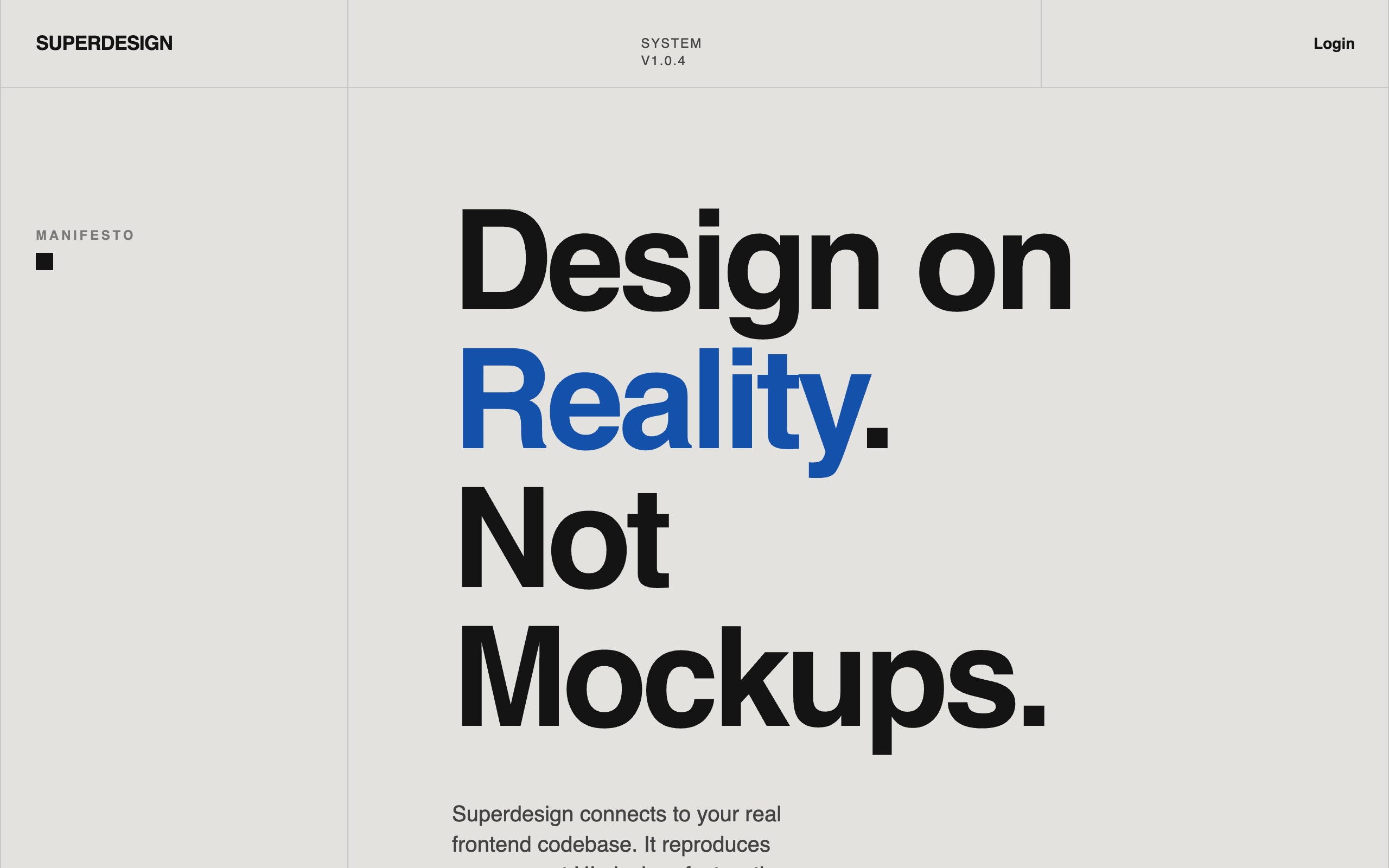
Landing Page Prompts
Prompts for complete, conversion-focused landing pages — heroes, feature sections and full marketing layouts. Copy one to ship a landing page fast.
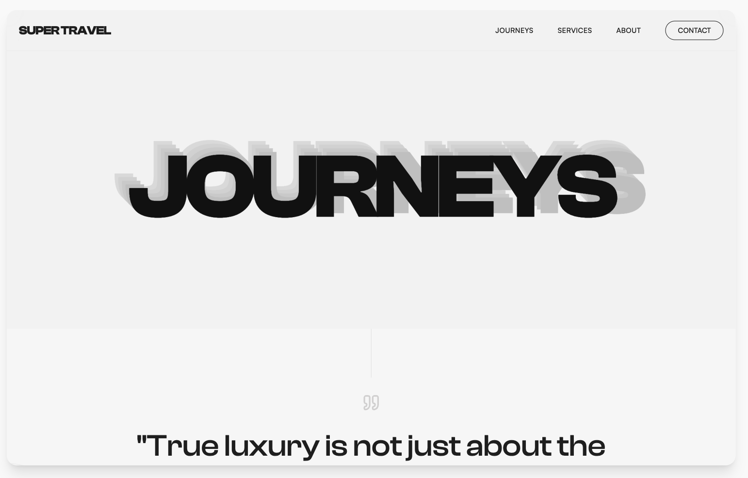
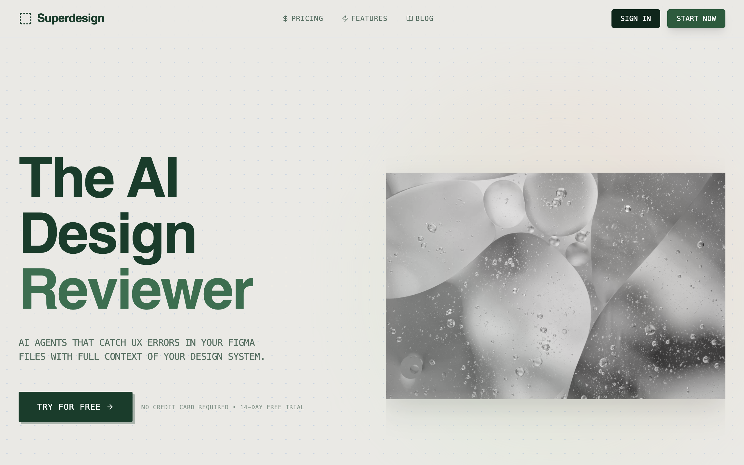
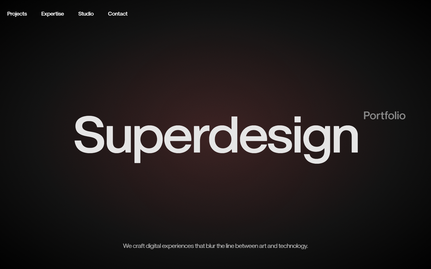
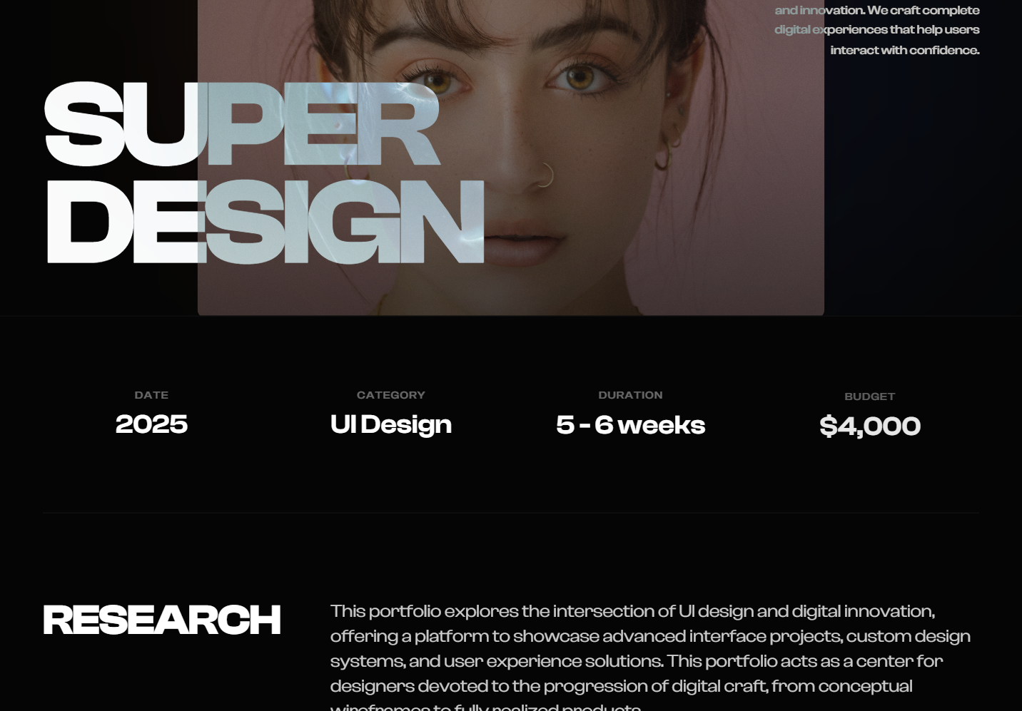
High Contrast Landing Page
A high-contrast Swiss-style minimalist design system utilizing brutalist typography and editorial layouts. Characterized by a neutral palette of off-whites, deep blacks, and monochromatic grays, this style emphasizes rhythmic patterns through stacked text 'echo' effects and asymmetrical grids. Ideal for luxury travel, architecture portfolios, high-end fashion, and premium editorial content where typography acts as the primary visual driver.
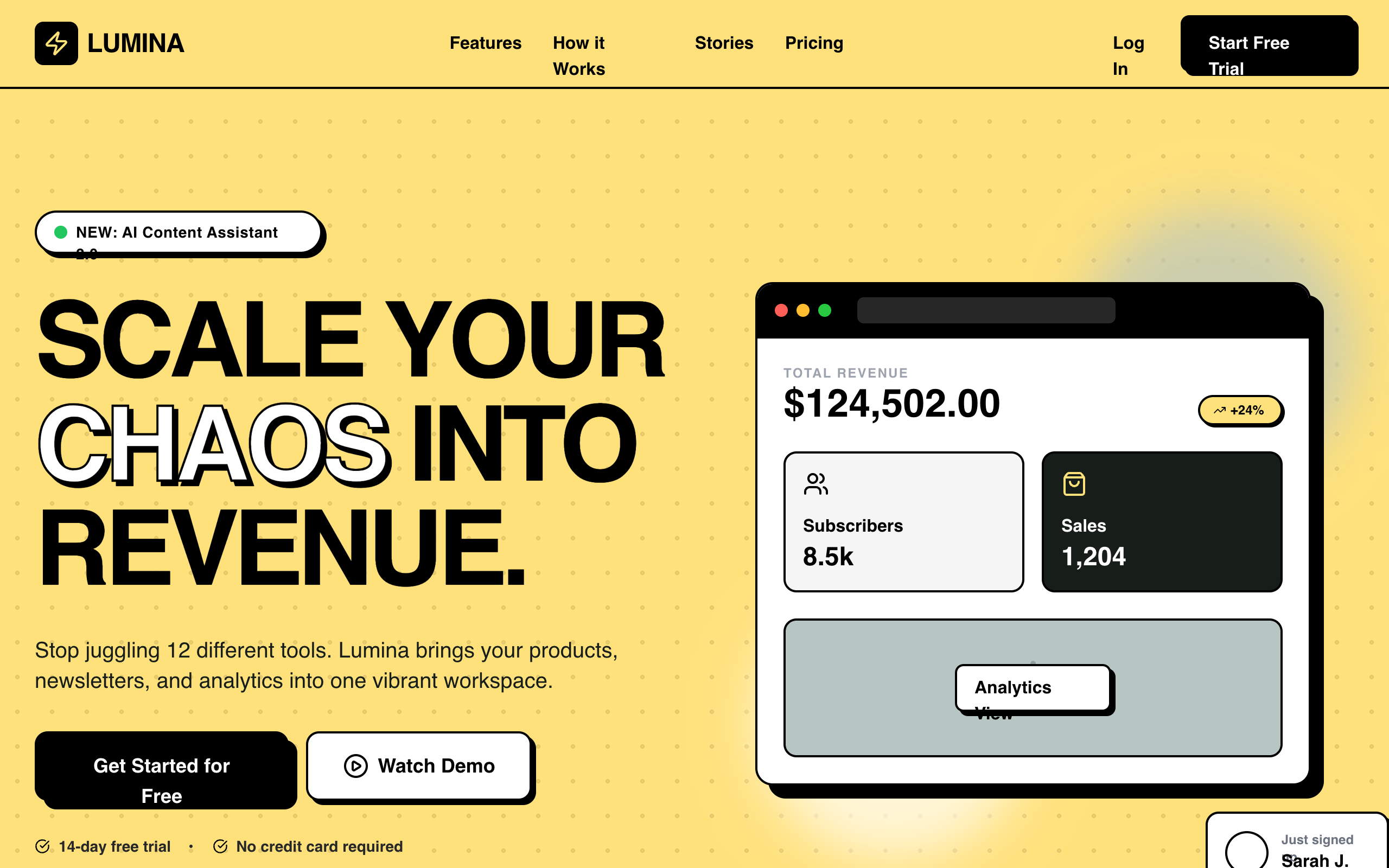
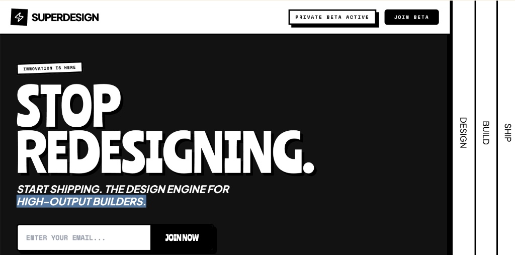
Lumina SaaS Landing Page
Lumina is a high-energy, Neo-Brutalist B2C SaaS design characterized by its bold #ffe17c yellow primary color, heavy 2px black borders, and zero-blur hard shadows. It utilizes a striking combination of 'Cabinet Grotesk' for display-heavy typography and 'Satoshi' for body copy. This style is ideal for the creator economy, modern fintech, edtech, or any startup looking to break the 'clean corporate blue' mold with a confident, high-contrast interface. The layout features bento-style grids, marquee animations, and playful asymmetric card shapes.
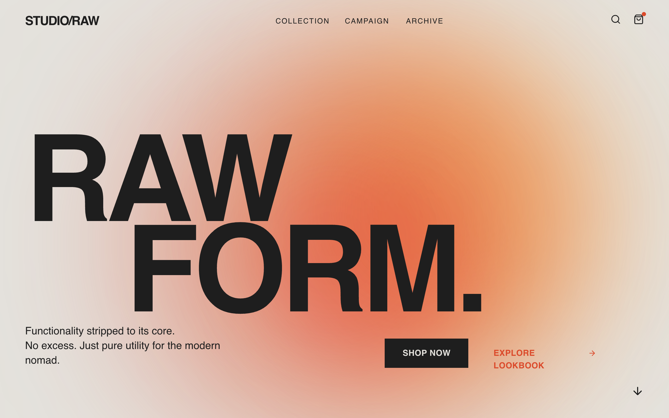
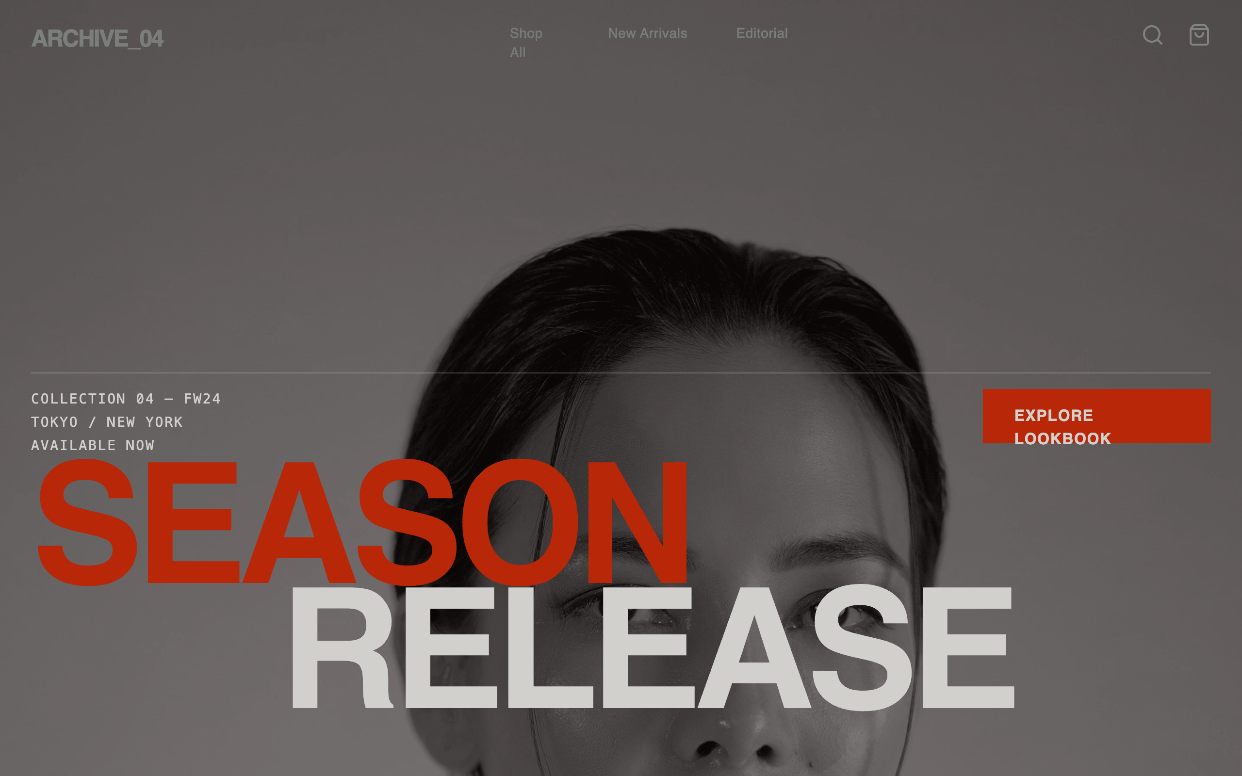
Brutalist E-commerce Page
A brutalist editorial e-commerce style guide inspired by poster-campaign aesthetics. Characterized by massive grotesque typography (Clash Display), soft-blurred gradient forms in red-orange tones (#DB4A2B, #F8A348), and a warm cream background (#E4E2DD). This aesthetic is optimized for high-end fashion, architecture, or lifestyle brands that want a 'poster-first' digital presence. Features include scroll-triggered entrance animations, mix-blend-mode interactions, and a clean, borderless grid structure.
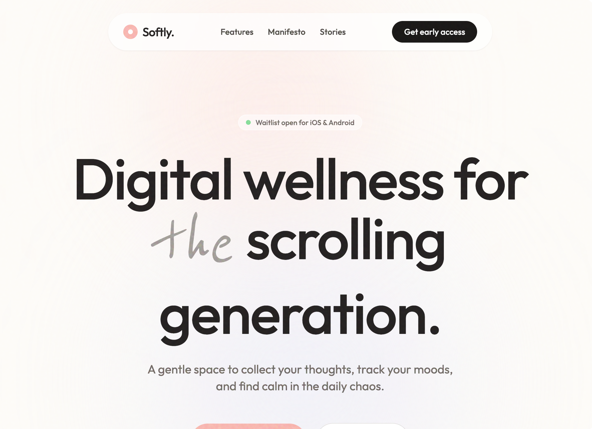
Softly - Digital Wellness App
A soft-aesthetic, Gen-Z oriented design system optimized for wellness, meditation, journaling, and lifestyle brands. Features a warm off-white foundation (#FDFCF8) layered with soft pastel accents (Coral #FFB7B2, Sage #E8EFE8, Lavender #EFEDF4), grain-textured overlays, and a mix of modern geometric sans-serif ('Outfit') and organic handwriting ('Reenie Beanie') typography. The layout emphasizes breathing room, gentle scroll-triggered reveals, and 'floating' organic shapes to reduce cognitive load and evoke a sense of calm.
Mosaic Grid Architecture Style
An architectural, technical-blueprint style design system featuring a minimalist mosaic grid, forest green (#1A3C2B) and light-gray paper-textured (#F7F7F5) palette. Optimized for B2B SaaS, developer tools, and high-end agency portfolios. Key features include editorial typography with Space Grotesk, JetBrains Mono labels, bento grid layouts, and 2D flat wireframe aesthetics with zero shadows.
Red Noir Style
A bold, dark-themed landing page featuring high-contrast red accents, glassmorphism, and smooth scroll animations. Designed for AI and tech products with a futuristic aesthetic.
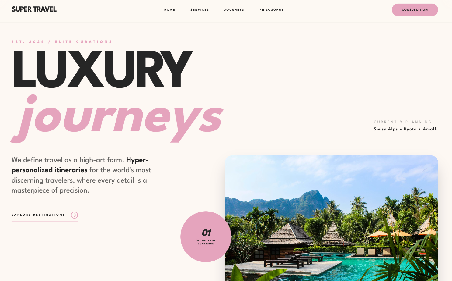
Luxury-focused Design System
A refined, editorial-style design system characterized by heavy geometric sans-serif typography, a sophisticated dusty rose and charcoal palette, and staggered grid layouts. This aesthetic is optimized for high-end luxury services, boutique hospitality, premium fashion brands, or architectural portfolios. It features scroll-triggered reveal animations, grayscale-to-color image transitions, and a 'glassmorphism' navigation bar. The layout focuses on massive, bold headlines paired with hyper-minimalist utility text, creating a contrast that feels modern yet timeless.
Glassmorphism Style
A high-tech glassmorphism design system featuring neon lime accents, deep obsidian surfaces, and a sophisticated blend of architectural grid patterns and organic glowing gradients. Optimized for high-end SaaS, AI product studios, and fintech platforms, this style uses JetBrains Mono for a developer-centric feel and Space Grotesk for bold, editorial headings. Key elements include backdrop-blur effects (glassmorphism), grain/noise overlays, and a 'floating shell' layout that gives the web interface a premium, app-like quality.
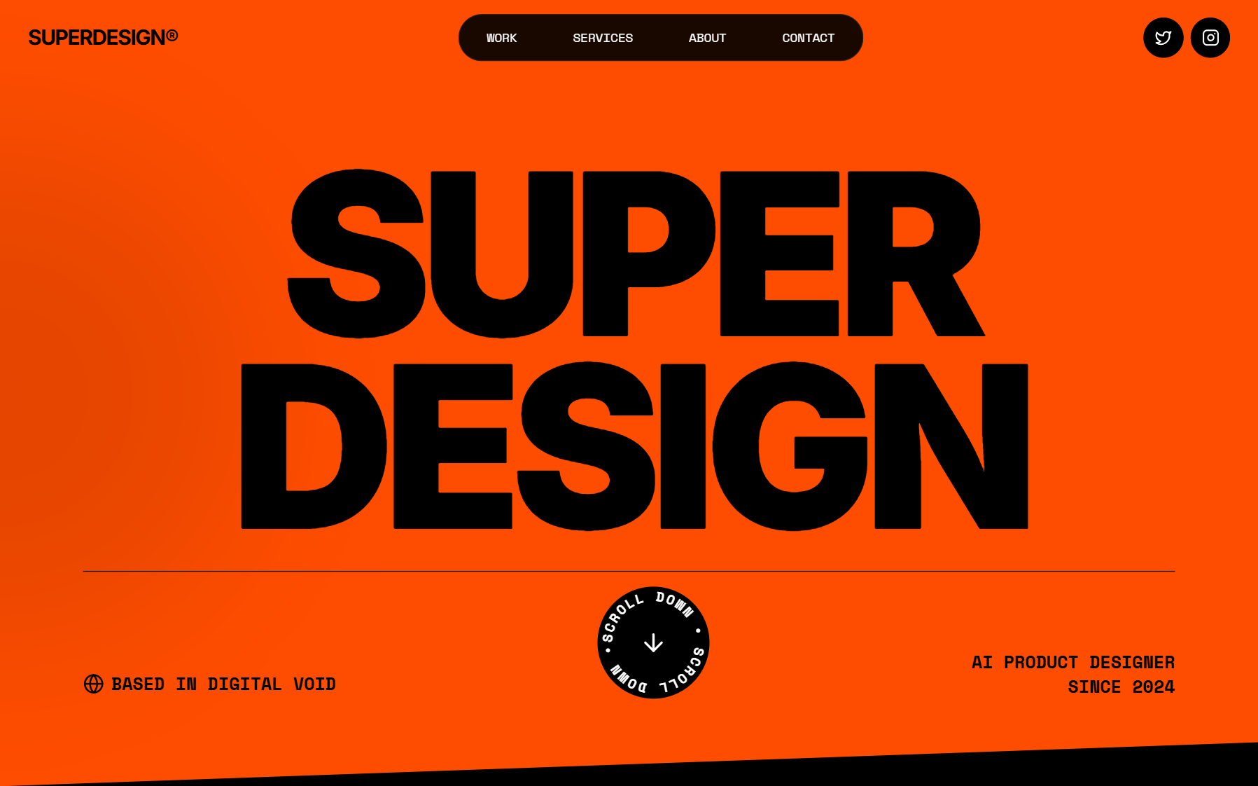
Kinetic Orange Style
A high-energy brutalist design system characterized by a high-contrast 'Kinetic Orange' (#FF4D00) and black palette. It features bold, oversized editorial typography, technical monospace accents, and rhythmic motion through marquees and rotating elements. Ideal for creative agencies, fintech, modern portfolios, or AI-driven startups looking for a 'loud' and confident brand presence.
SaaS Landing Page for Developer Tool
A bold modernist design system inspired by exhibition poster aesthetics and technical documentation. Characterized by a high-contrast 'cream and cobalt' color palette, oversized aggressive typography, and a rigid 12-column grid layout with 1px border dividers. This style is ideal for technical SaaS, developer tools, high-end design agencies, or architectural portfolios. Key elements include tight line-heights (0.85), no rounded corners, and a unique vertical labeling system in a dedicated left-hand grid column.
Brutalist Style Ecommerce Page
A brutalist editorial design system for high-fashion, streetwear, or luxury brands. Featuring a raw, industrial aesthetic with massive typography, high-contrast photography, and utilitarian components. Key elements include a noise-grain texture overlay, a monochromatic palette with burnt orange and neon green accents, and asymmetrical layout grids. The style uses 'Clash Grotesk' for aggressive impact and 'General Sans' for technical clarity. Ideal for product launches, lookbooks, and fashion portfolios looking for a 'Raw Campaign' or 'Modern Brutalist' feel with scroll-triggered visual impact.
Cinematic Style
A high-end 'Cinematic' design system characterized by deep-space dark backgrounds, sophisticated 3D CSS transforms, and bold editorial typography. Optimized for premium portfolios, creative agencies, fintech, and high-tech SaaS. It features a signature 3D rolodex/cube hero section, glassmorphism elements, and smooth GSAP-driven scroll parallax. Key aesthetics include 'mix-blend-difference' navigation, vibrant neon gradients (cyan to pink), and a monochromatic 'Aspekta' font foundation with heavy weights and tight tracking.
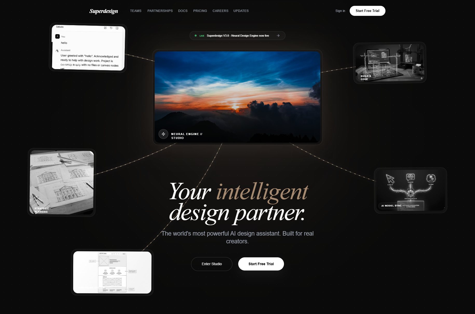
Neural Noir Interface Style
The Neural Noir Interface Style is a high-end, futuristic aesthetic characterized by a 'tech-noir' atmosphere. It blends deep dark backgrounds (#0a0a0a) with sophisticated gold and bronze accents (#a78b71, #e8d5b7) and editorial typography. Key features include glassmorphism, neural network-inspired SVG connection lines, and a bento-grid layout. This style is optimized for premium AI platforms, creative design engines, high-end SaaS, and editorial-driven tech portfolios. It utilizes a combination of sleek sans-serif (Inter) for functional elements and elegant serif italics (Playfair Display) for headlines, creating a contrast between high-tech performance and classic sophistication.
Bold Editorial Style
A high-contrast, editorial-style SaaS landing page design optimized for designers and creative tools. It features bold Anton display typography, a sophisticated palette of golden yellow (#ffe17c) and deep charcoal (#171e19), and a structured layout combining grid patterns and bento-box feature blocks. This style is characterized by aggressive visual hierarchy, oversized headlines, and a minimalist yet punchy aesthetic suitable for high-velocity startups, fintech, or creative agency portfolios.
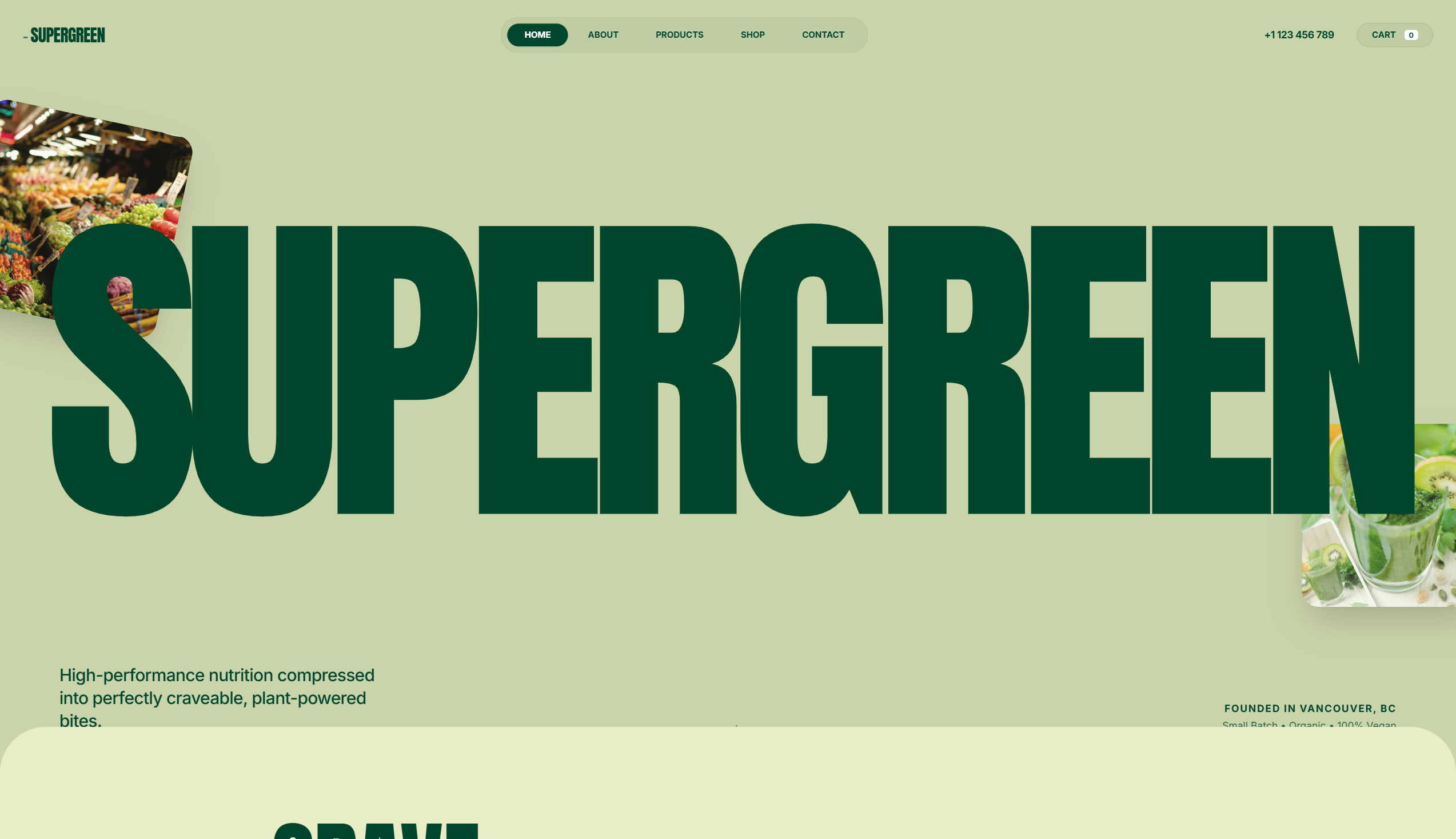
Nature Inspired Style
A nature-inspired 'Organic Brutalist' design system perfect for wellness, sustainable CPG, eco-friendly lifestyle brands, or high-end nutrition. Characterized by a palette of deep forest greens and earthy sages, the style utilizes massive editorial typography (Anton) paired with functional sans-serifs (Inter). The layout features 'bento-adjacent' rounded grids, floating organic elements with parallax effects, and a subtle film grain noise overlay that gives the digital experience a tactile, premium paper-like feel. Key elements include oversized headings, ultra-rounded corners (up to 5rem), and fluid reveal animations.
Bold Editorial Studio Style
Bold Editorial Studio Style is a high-impact, minimalist design system characterized by massive typography, a strict monochromatic palette, and sophisticated micro-interactions. It features a signature 'editorial' look using ultra-large display fonts (up to 12vw), custom cursor logic, and fluid marquee animations. Ideal for creative agencies, high-end portfolios, fashion brands, and premium fintech products, the system leverages white space and motion to create a premium, curated feel. Key elements include mix-blend-mode navigation, staggered text reveals, and asymmetrical image containers with varied border radii.
Glassmorphism card
A premium, high-tech glassmorphism design system characterized by deep translucent layers, dark-to-light transitions, and editorial typography. Featuring a 'Superdesign' aesthetic, it utilizes heavy background blurs, grain textures, and emerald accents. This style is ideal for SaaS, AI platforms, fintech, and high-end design agencies requiring a sophisticated, futuristic feel with bento-grid layouts and fluid animations.
Futuristic SasS Landing Page
A modern, atmospheric SaaS design system featuring a high-contrast blend of dark mode hero sections and light mode content areas. Characterized by glassmorphism, sophisticated serif-sans typography pairing, and ethereal glows, it is ideal for AI startups, design tools, creative portfolios, and premium digital platforms. The style emphasizes depth through backdrop blurs, subtle borders (1px), and smooth micro-interactions like scroll-triggered navigation and hover-based transforms.
Synapse
A high-performance 'neural' dark mode design system characterized by deep black backgrounds (#030303), vibrant neon accents in violet (#8B5CF6) and cyan (#06B6D4), and a sophisticated blend of editorial serif typography (Instrument Serif) with functional sans-serif (Inter). The style utilizes glassmorphism, animated mesh gradients, and 'shimmer' text effects to evoke a sense of advanced intelligence, encryption, and institutional-grade technology. Ideal for Fintech, AI, Cybersecurity, and Web3 verticals where speed, security, and technical sophistication are core values.
Bold Editorial Design Style
A premium, bold editorial design system characterized by high-contrast brutalist typography and a sophisticated dark navy and sage color palette. Optimized for creative agencies, design portfolios, luxury architecture, and high-end digital studios. Features include 'Anton' display headers, a custom crosshair cursor, floating ambient gradients, asymmetric masonry layouts, and smooth scroll-triggered reveal animations. The aesthetic balances minimalist white space with massive, impactful type and subtle micro-interactions like mix-blend-mode navigation and grayscale-to-color image transitions.
Midnight Editorial Style
A premium, ultra-modern dark aesthetic featuring deep black backgrounds (#050505), massive 'Satoshi' typography for impact, and striking coral (#FF6B50) accents. Designed for high-end agencies and portfolios that prioritize storytelling and visual drama.
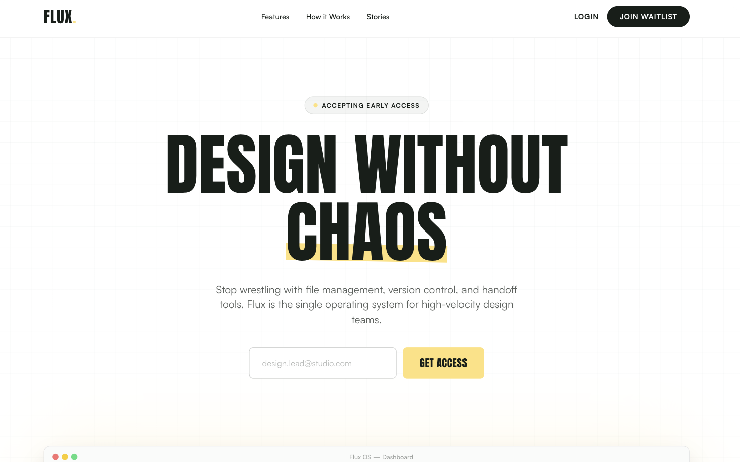
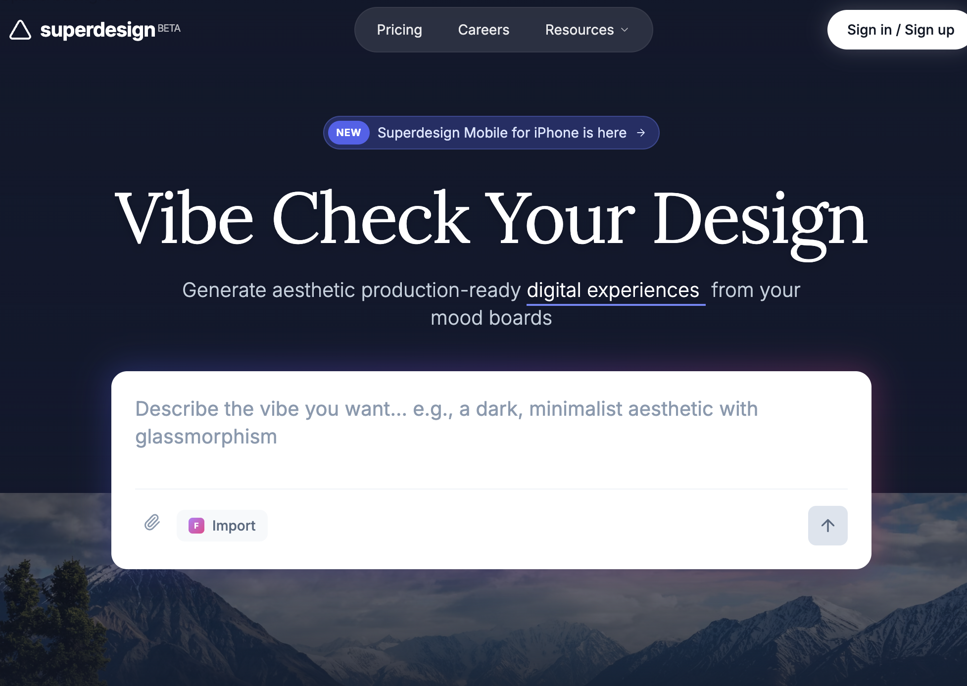
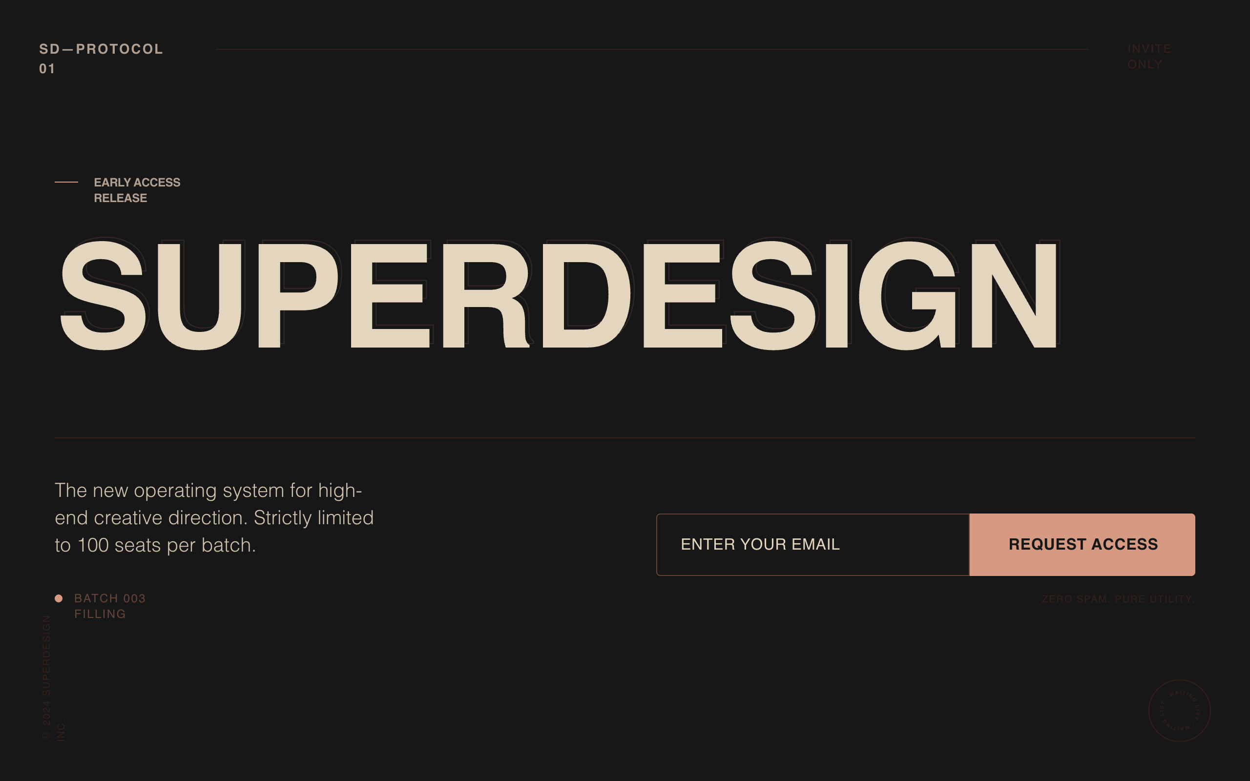
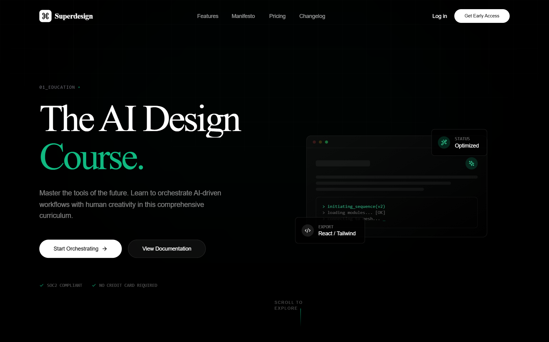
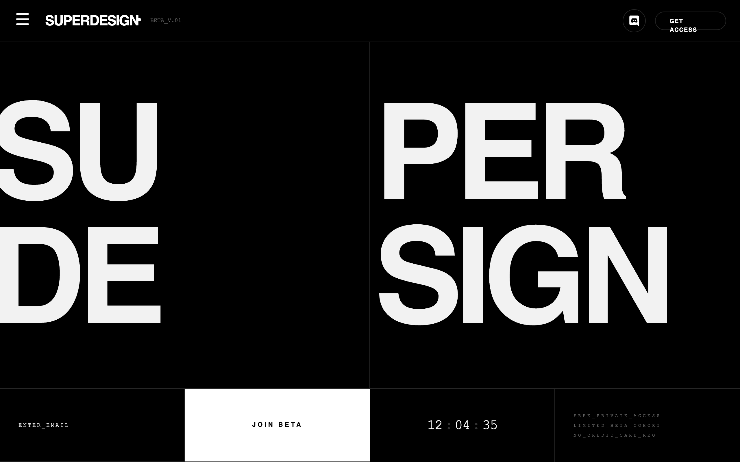
Minimalist Beta Capture
A high-end 'Editorial Brutalist' style guide optimized for SaaS waitlists, fintech, or premium developer tools. It features a dark-mode palette (#080808), high-contrast monochromatic typography (DM Serif Display + Geist Mono), and sophisticated glassmorphism. The layout utilizes a bento-grid structure and fluid width (92vw) with oversized hero typography. Key features include scroll-triggered slide-up animations, a silver-metallic gradient system, and a persistent floating mobile navigation bar.
Neon Velocity Countdown
A high-velocity, futuristic dark-mode design system characterized by neon accents, brutalist typography, and 3D glassmorphism. Featuring a 'Laser Green' and 'Navy Black' palette, it utilizes 'Plus Jakarta Sans' for high-impact headlines and 'Geist Mono' for technical metadata. This aesthetic is ideal for high-growth tech startups, SaaS platforms, developer tools, and fintech products that want to convey speed, precision, and cutting-edge innovation. The layout uses a bento-grid structure, fluid typography, and sophisticated scroll-triggered reveal animations.
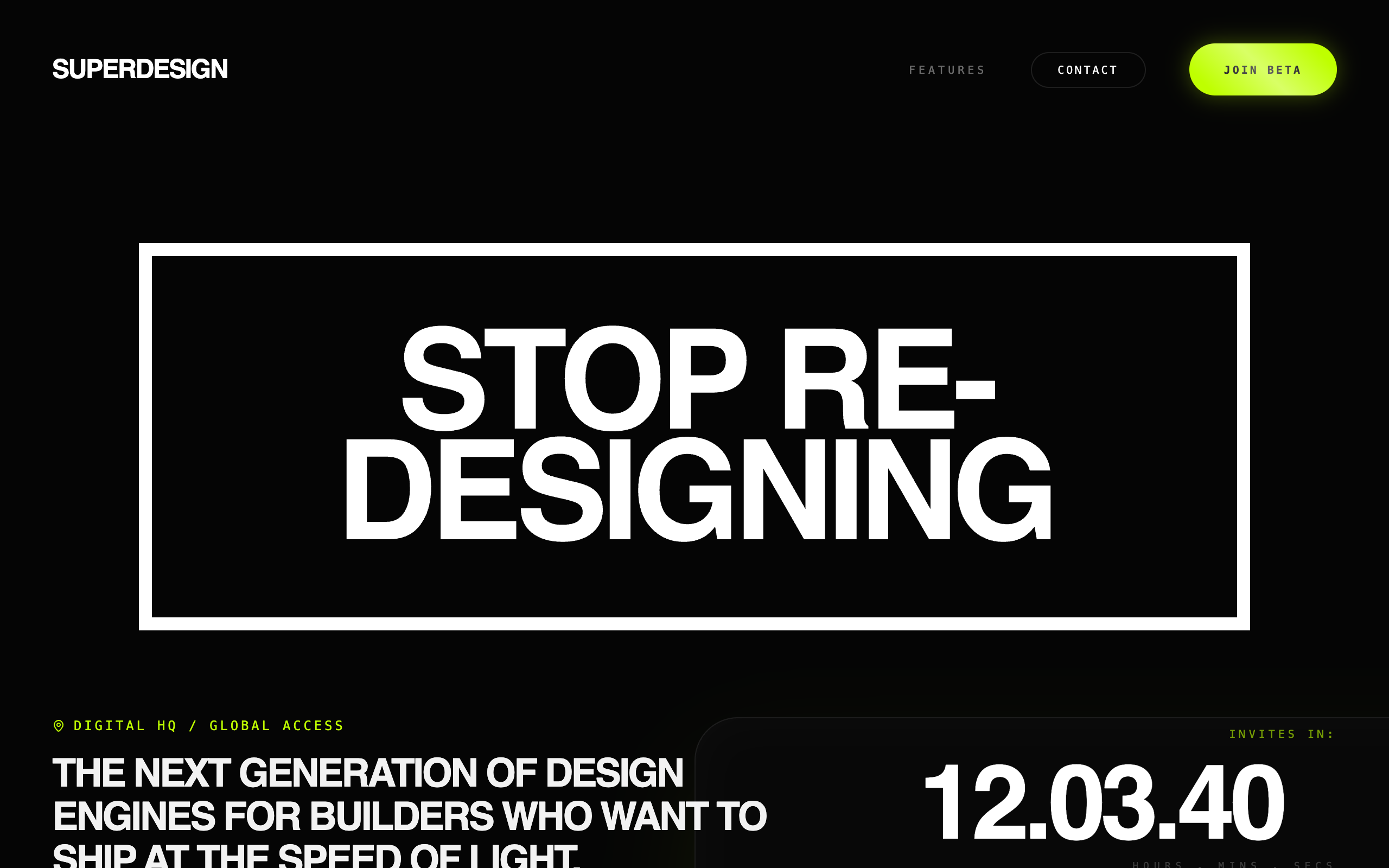
Superdesign Editorial Waitlist
Editorial waiting list landing page with a cinematic, high-fashion aesthetic. Features a deep matte #181818 background, warm beige #EBDCC4 typography, and a brutalist yet refined grid. Key elements include oversized edge-to-edge display type, subtle noise textures, and a layered text depth effect. Ideal for luxury tech, creative agency portfolios, high-end SaaS tools, architecture firms, and invite-only exclusivity campaigns. Layout utilizes strong typographic hierarchy and generous negative space with accent tones in coral, rust, and sage.
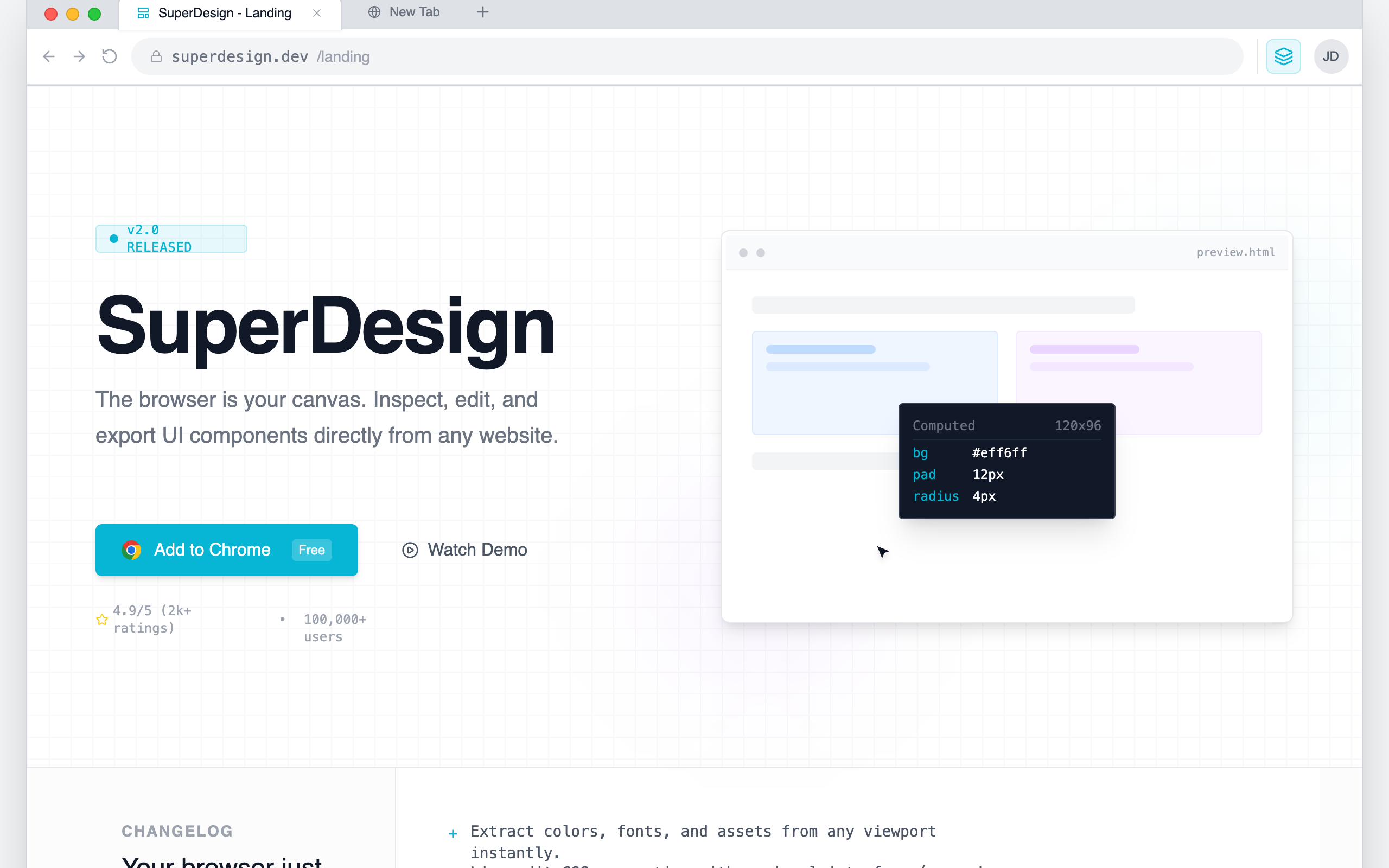
Chrome Extension Landing Page
A browser-native developer tool aesthetic characterized by a 'system interface' look rather than a marketing landing page. This style features a light-neutral base with a vibrant cyan (#06B6D4) accent, mimicking the layout of Chrome DevTools or a workspace IDE. It uses a combination of Inter for primary readability and JetBrains Mono for technical labels and commands. Suitable for SaaS, developer tools, extensions, and technical platforms requiring a high-density, utility-focused layout with scroll-triggered panel reveals and simulated interactive environments.
The "Stacking Cards" Effect
A portfolio section where cards stack sticky at the top as the user scrolls, creating a deck-of-cards effect using GSAP.
Clean fluid
A high-end, editorial design system blending luxury serif typography with technical monospace accents. Characterized by fluid 'premium ease' animations, a sophisticated cream and dark charcoal palette (#fcfbf9, #171717), and organic curved transitions. Optimized for AI startups, design studios, fintech dashboards, and luxury tech brands requiring a balance of intelligence and elegance. Key features include scroll-triggered reveal animations, mesh gradient backgrounds, and a signature concave wave transition between sections.
Cinematic Noir Style
A high-end 'Cinematic Noir' design system characterized by dramatic dark-mode aesthetics, high-contrast editorial typography, and immersive scroll-driven parallax effects. Suitable for creative agencies, luxury fashion, fintech, and high-end portfolios. Features include grain overlays, radial gradients with subtle warm tints, and brutalist-scale headings that blur the line between digital interface and cinematic experience.
Cyber Serif Style
A high-end 'Cyber Serif' aesthetic blending classical editorial typography with futuristic tech elements. Features a deep #050505 dark mode palette, neon emerald accents (#10b981), glassmorphism, and sophisticated micro-interactions. Suitable for high-end AI SaaS, creative agencies, fintech portfolios, and developer tools. Includes WebGL-inspired background effects, spotlight hover cards, and staggered scroll-reveal animations.
Warm Industrial Gray Style
A sophisticated warm industrial aesthetic that blends brutalist grid structures with editorial typography. Featuring a primary palette of warm concrete gray and rich charcoal accented by electric blue, this style is ideal for AI startups, creative technology studios, fintech platforms, and architecture portfolios. It utilizes a high-contrast pairing of heavy grotesque sans-serifs and elegant serif italics, layered over a subtle film grain noise texture. Key features include scroll-triggered reveals, magnetic hover states, and structural grid-line overlays that emphasize a 'form follows function' technical philosophy.
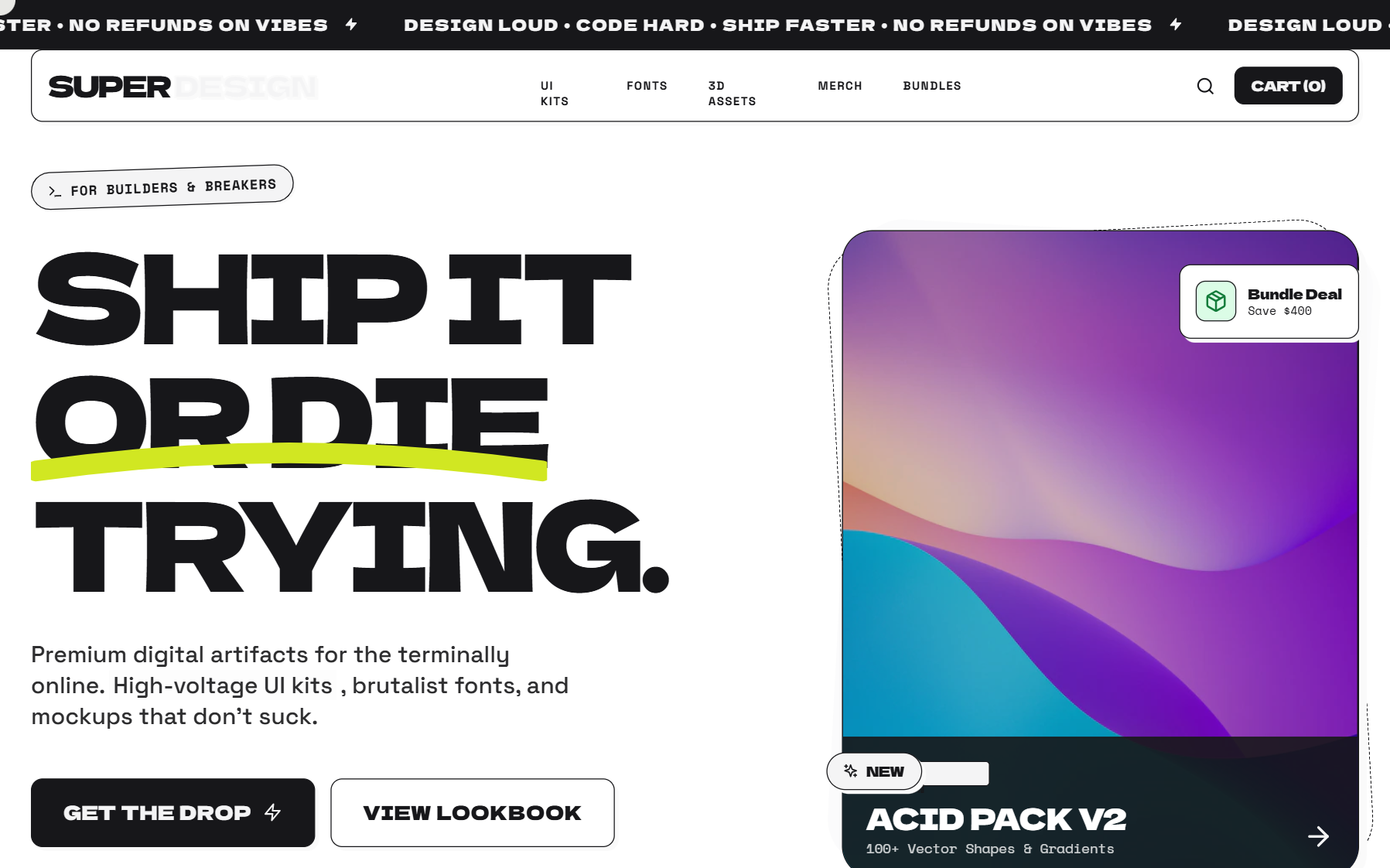
Neo-Brutalism Style
A high-impact Neo-Brutalist design system characterized by 'Acid' aesthetics. It features high-contrast color palettes (off-white, deep black, and neon yellow), heavy-weight typography, and 'hard' UI elements like non-blurred shadows and thick borders. The layout utilizes bento grids, oversized display text, and dynamic marquee components. Suitable for creative agencies, experimental e-commerce, fintech, and portfolio sites looking for a 'loud', digital-first brand identity.
Midnight Editorial Style
A high-contrast, midnight-themed editorial design system optimized for premium portfolios, fintech SaaS, and luxury brand storytelling. Characterized by oversized 'Clash Display' typography, a deep #050505 background, and sophisticated mix-blend-mode interactions. Features smooth reveal animations, subtle atmospheric glows, and a brutalist yet refined layout that prioritizes whitespace and typographic hierarchy.
GSAP Horizontal scroll
Disruptor Beta Launch
A high-impact Neo-Brutalist design system designed for product launches and disruptive SaaS platforms. Characterized by stark color contrasts, industrial typography, and heavy geometric borders. The aesthetic utilizes a dark mode base (#121212) punctuated by vibrant 'Volt' accents (#CCFF00) and crisp white containers. Key features include 'sticker-style' rotated elements, massive display type, solid 8px offsets (Neo-shadows), and vertical navigation elements. Ideal for high-growth tech, developer tools, fintech, and creative agencies looking for an aggressive, authoritative, and innovative brand presence.
Red sun
A sophisticated editorial-style design system named 'Red Sun', characterized by a high-contrast 'Coral and Ink' color palette. This style blends 'Instrument Serif' for high-impact typography with 'Manrope' for technical precision. Features include bento-grid layouts, glassmorphism navigation, scroll-triggered animations with subtle rotations, and soft ambient background blurs. Ideal for premium SaaS, creative agencies, AI product design tools, and fintech platforms looking for a balance between warmth and authority.
Tech Editorial
A high-end 'Tech Editorial' aesthetic that merges brutalist precision with classic editorial sophistication. It features a muted, paper-like color palette (#f7f6f2), a structured grid-line system, and a unique pairing of high-contrast Serif (Playfair Display) for display headers and technical Mono (Space Mono) for functional UI. The style is characterized by scroll-triggered text reveals, glassmorphism navigation, and 'scan-line' animations that suggest a sophisticated AI-driven process. Ideal for high-tech SaaS, AI research labs, design agencies, and premium fintech platforms.
Dark Avant-Garde Style
A dark avant-garde design system termed 'Digital Naturalism,' characterized by a sophisticated interplay between deep charcoal surfaces and high-energy acid green accents. Featuring editorial serif typography paired with clean sans-serif UI, the style utilizes Brutalist-inspired elements like serrated edges, skewed 'tab' navigation, and grainy noise overlays. Ideal for high-end design agencies, AI masterclasses, editorial portfolios, and premium fintech brands seeking a bold, technical, yet organic aesthetic.
"Exploded View" Assembly
A scroll-driven animation where a central product or UI element explodes into its constituent parts and then reassembles into a new layout. Perfect for 'how it works' or feature breakdown sections.
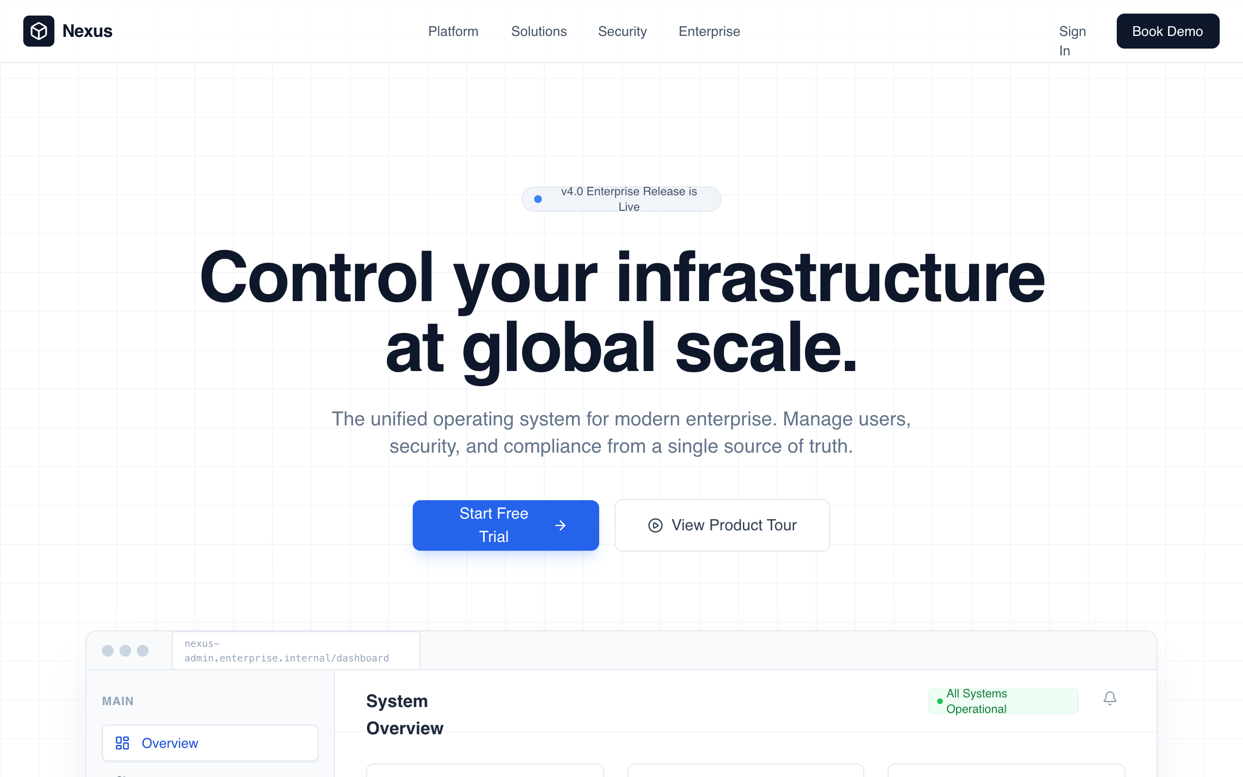
Enterprise Admin Platform
Enterprise Admin Platform is a professional, high-trust landing page design for corporate B2B SaaS, fintech, and infrastructure tools. It features a muted corporate color palette (whites, deep slates, and technical blues), a structured grid-based layout, and a focus on operational control and security. Key elements include a high-fidelity dashboard preview, KPI count-up animations, and a glass-morphism navigation bar. Suitable for enterprise management systems, cybersecurity platforms, and developer infrastructure tools.
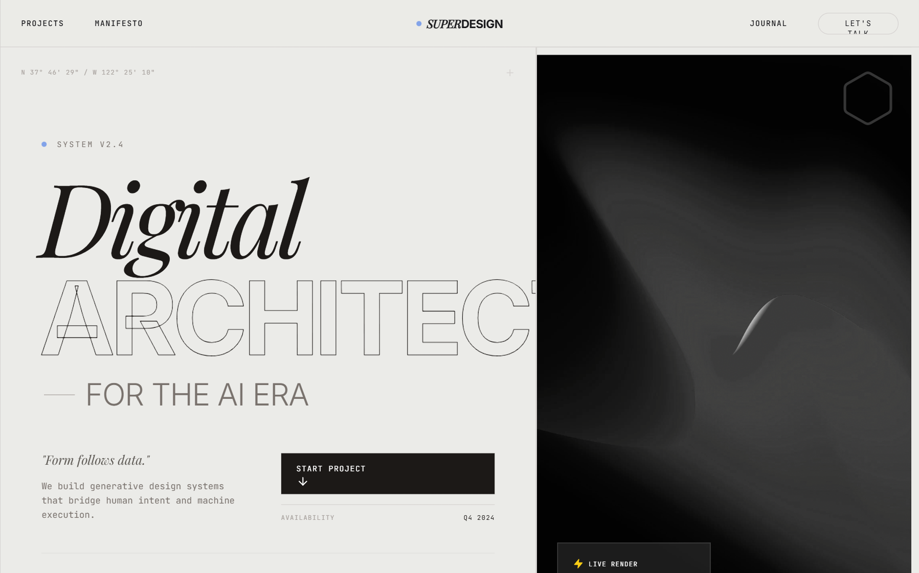
Architectural Type System Style
A high-contrast, architectural design system rooted in Swiss Modernism and Brutalist minimalism. Characterized by a monochrome palette, massive 'Inter Tight' display typography, and a rigid grid defined by 0.5px hairlines. Features a technical 'JetBrains Mono' font for metadata and system status indicators, creating an engineering-first aesthetic. Suitable for high-end SaaS, developer tools, fintech, architecture portfolios, and design agencies. Includes a persistent noise overlay for texture and grid-based layouts that utilize viewport-relative sizing for maximalist impact.
Hover reveal effect
Source: https://x.com/emilylambert/status/2005113433780617713
Scroll animation
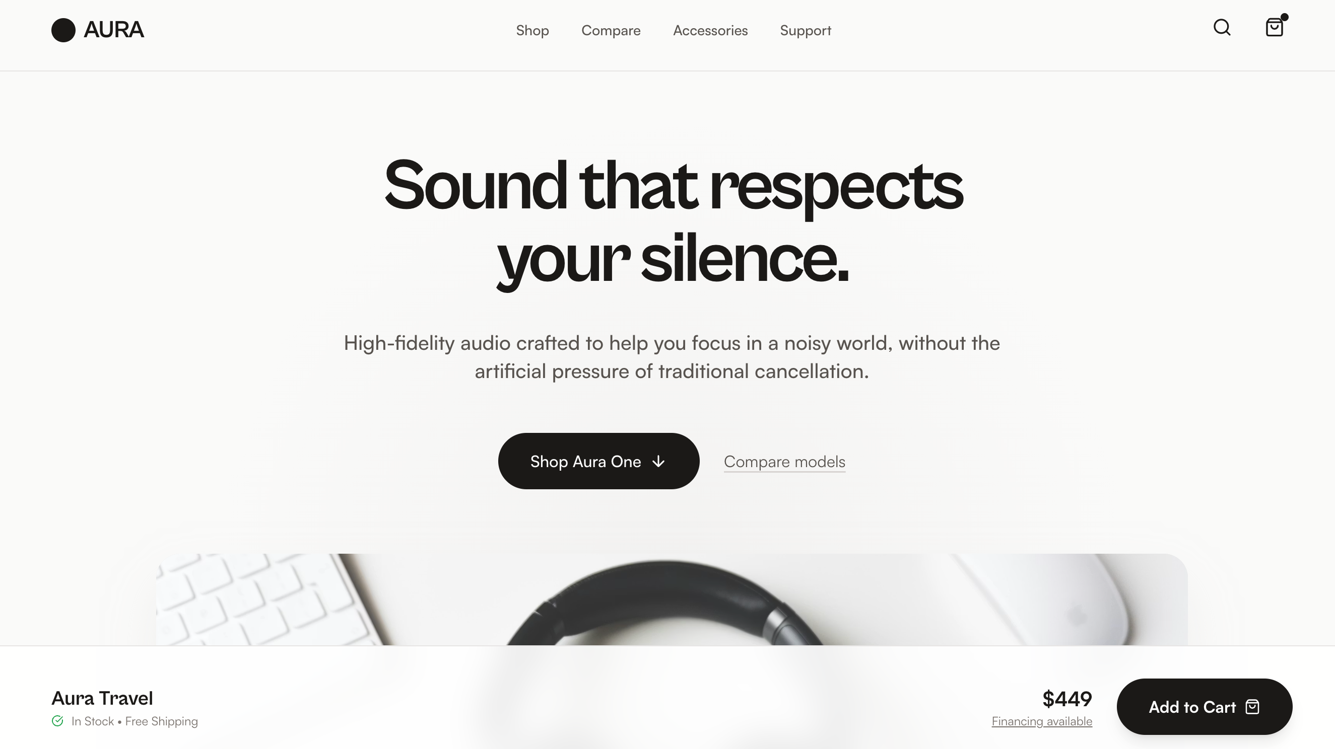
Aura Audio Showroom
Product Walkthrough is a product-first electronics landing page built around a Showroom Flow layout—product theater followed by guided model selection, scenario-based feature explanations, lightweight comparison, and a confident close—making it best suited for consumer electronics and DTC hardware brands with multiple models or configurations that want a clear, trust-building shopping experience without spec overload or lifestyle clichés.
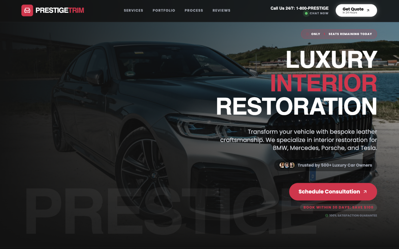
Premium Dark B2B Service Landing
This production-grade, high-contrast dark-mode luxury landing page template is optimized for high-ticket B2B automotive services, premium restoration businesses, and affluent customer acquisition using brutalist modernism with crimson accent luxury. The core color palette features ultra-dark backgrounds (#121212, #0a0a0a) paired with pure white text (#ffffff) and strategic crimson (#e11d48) accents, creating WCAG AAA contrast compliance. Typography uses Cal Sans for bold headlines and Poppins for readable body text with extreme letter-spacing for authority. Best described as "dark luxury brutalism," this dark-mode-only template excels in before-and-after portfolio showcases and high-ticket service pages, featuring sticky glass-morphism headers, live chat indicators, urgency badges, interactive trust bars, expandable service cards, luxury vehicle transformation carousels, ROI badges, testimonial grids, and gradient CTAs. Animations include scroll-reveal fades, pulsing indicators, button scales, image crossfades, and staggered reveals. High contrast ensures maximum accessibility and CTA prominence. Ideal for automotive restoration, luxury trades, photo services, and enterprise SaaS dashboards targeting premium clientele. Keywords: premium dark landing template, automotive service UI, luxury restoration, B2B high-ticket, before-after showcase, brutalist design, high-contrast dark mode, conversion-optimized, glassmorphism, crimson luxury, professional landing, SaaS dashboard, dark luxury branding.
Text blur animation
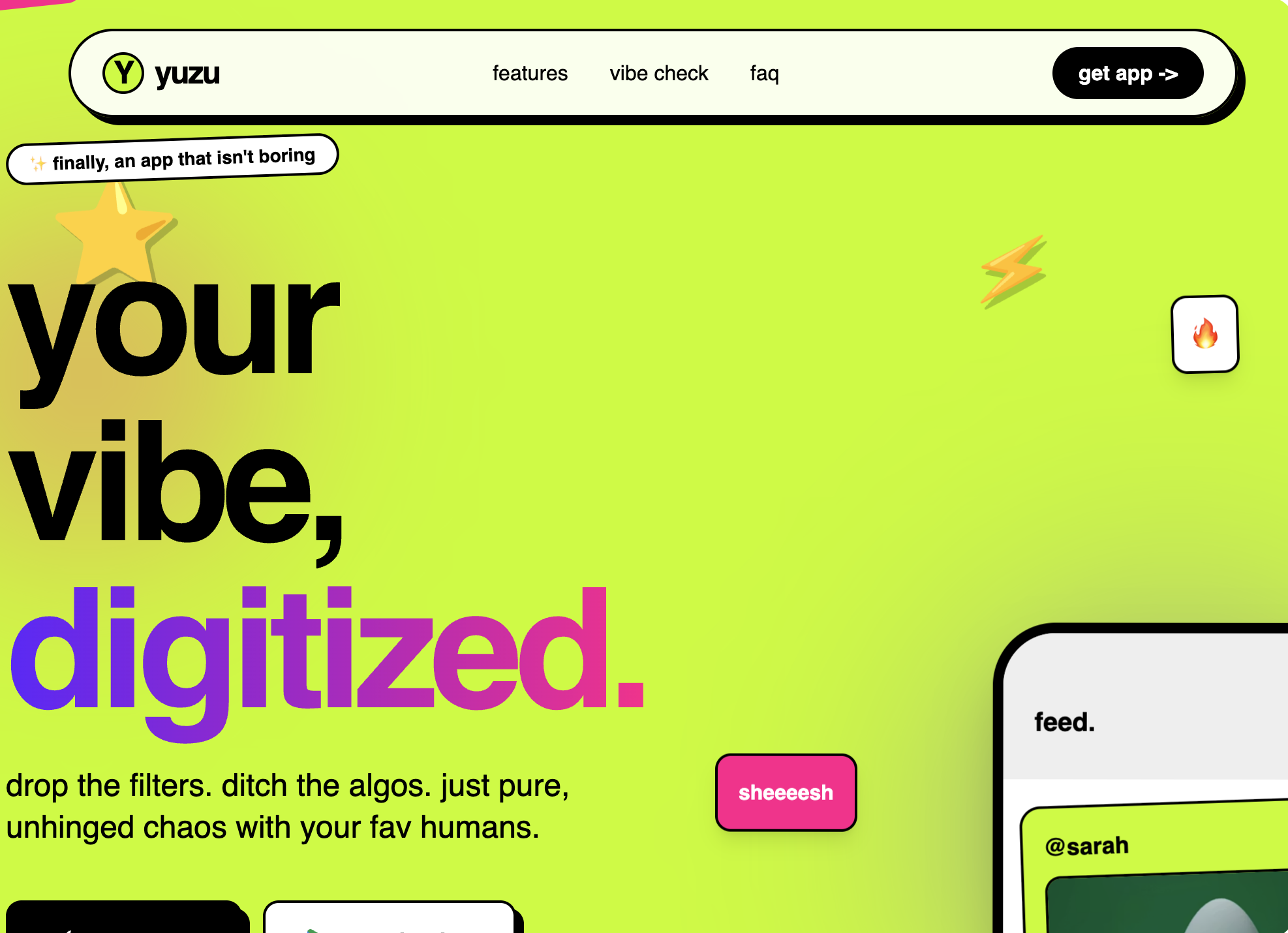
Gen-Z Social App
A high-energy, Gen-Z-inspired design system with a 'Neo-Brutalist' aesthetic. This style features high-saturation colors like acid green (#ccff00), vibrant purple (#7000ff), and hot pink (#ff0099), paired with heavy black borders and hard shadows. It utilizes expressive, oversized typography and intentional layout chaos through asymmetrical sections and tilted elements. Ideal for social media apps, youth-oriented fintech, creative portfolios, and lifestyle products that prioritize attitude over corporate structure.
Dynamic Data Display
Bento
A high-end, minimalist bento grid component with advanced interactive effects including spotlight, border glow, particles (stars), tilt, and magnetism. Designed for modern dashboards and landing pages. Source: ReactBits
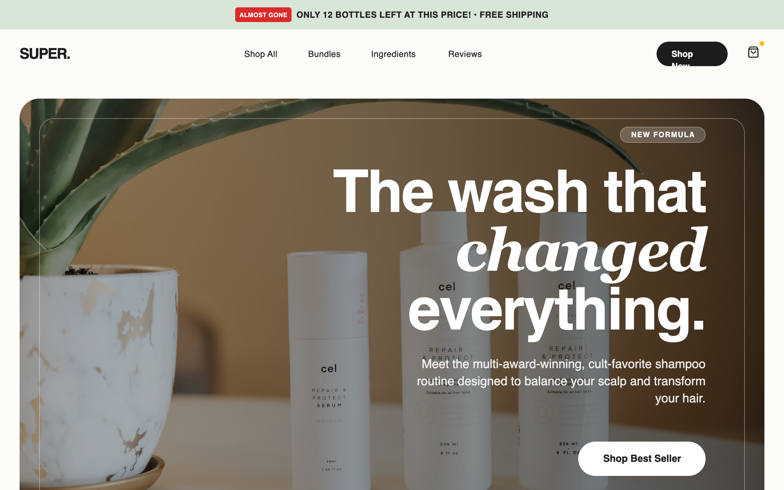
Super Shampoo - High Conversion LP
A premium, high-conversion e-commerce style guide optimized for D2C beauty and wellness brands. Features a sophisticated 'clinical luxury' aesthetic with a palette of sage green (#E2E8E4), off-white beige (#F5F5F0), and deep charcoal (#1C1C1C). The typography balances bold 'General Sans' headings with clean 'Switzer' body text. Includes specialized conversion elements like scarcity-driven promo bars, trust badge grids, comparison tables, and a sticky mobile 'Add to Cart' bar. Ideal for skincare, haircare, or luxury lifestyle products requiring a mix of editorial imagery and performance-driven UI.
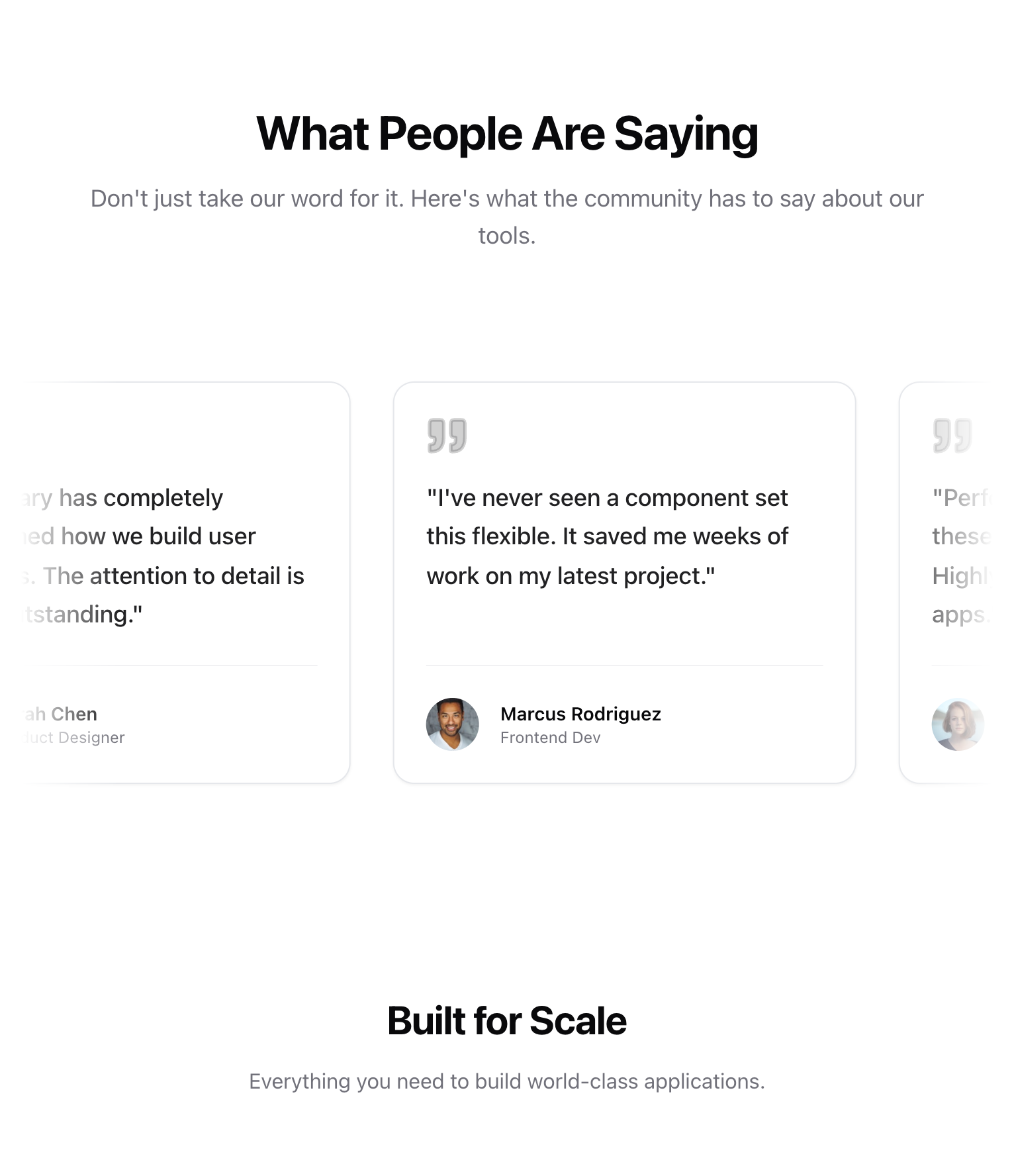
Testimonial
Sticky Content Switch
A split-screen section where the left-side heading remains sticky and updates dynamically as associated images scroll on the right side. Uses GSAP ScrollTrigger for precise synchronization.
Header & Hero Layout Refinement
A brutalist streetwear design system characterized by heavy editorial typography, a high-contrast neutral palette (concrete and ink), and asymmetric layouts. Features include a fixed mix-blend header, a grainy texture overlay, and a 'broken' grid for product displays. Ideal for high-end fashion, streetwear boutiques, architectural studios, and edgy SaaS brands looking for a raw, industrial aesthetic. Includes horizontal scrolling components, masonry-style social proof, and grayscale-to-color hover effects.
Circular Gallery
A high-end, WebGL-powered circular gallery with smooth scroll, image bending effects, and elegant typography. Ideal for immersive storytelling or creative portfolios.
Text slidedown animation
Rotating logos
Logo display UI
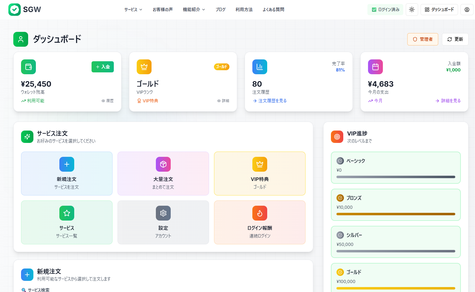
SGW - Enhanced Modal Interaction
Increase the height of the "今すぐ注文を確定する" (Confirm Order Now) submit button. Make it larger and more prominent - increase the padding and font size to make it a more substantial, clickable button that stands out more in the form.
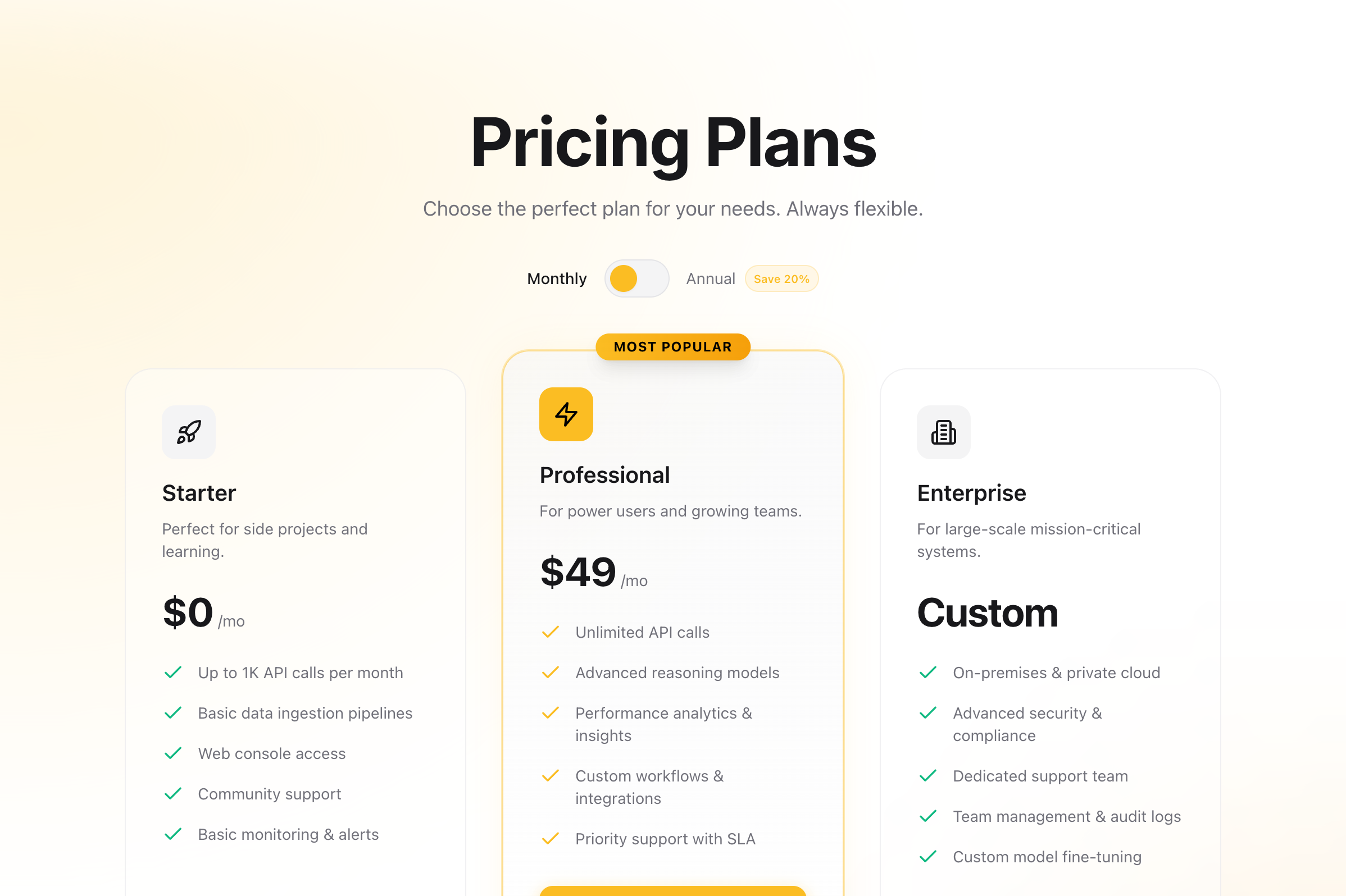
Pricing
A high-conversion pricing section with a toggle for monthly/annual billing. Features three tiers with a highlighted 'Pro' plan, glassmorphism effects, and smooth Framer Motion animations. Designed for SaaS and digital products.
"Spotlight" Mask
A scroll-driven interaction where a circular spotlight mask grows to reveal colorful UI content underneath a dark overlay.
Mixpanel Pricing
A pixel-perfect recreation of the Mixpanel pricing section featuring a distinctive purple gradient curtain background, interactive pricing cards, and a dynamic usage estimator slider.
Aurora background
A WebGL-based aurora borealis effect using OGL. It creates a smooth, flowing gradient animation that simulates the northern lights.
"Parallax Tilt" Grid
A 3-column image grid with independent scroll speeds and 3D tilt effects on scroll.
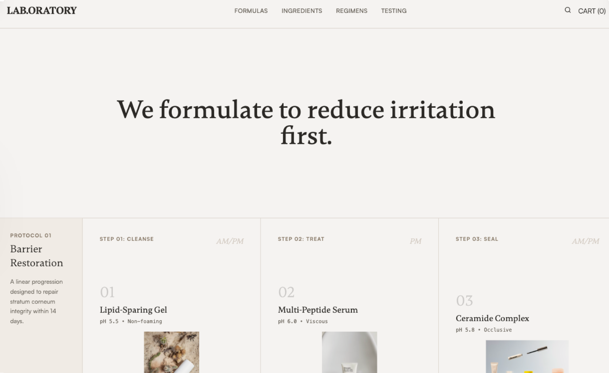
Laboratory Skincare
Laboratory Skincare is a warm academic, methodical design system inspired by research journals and clinical lab notebooks. It features a grid-based, disciplined layout with generous white space and a restrained color palette of off-whites, warm grays, and soft blacks. Ideal for medical-grade skincare, high-tech beauty, pharmaceutical brands, or scientific SaaS, the design focuses on data-driven trust, factual evidence, and structural clarity over luxury tropes. Key features include tabular data presentation, formula sheets, and a 'Protocol' approach to content organization.
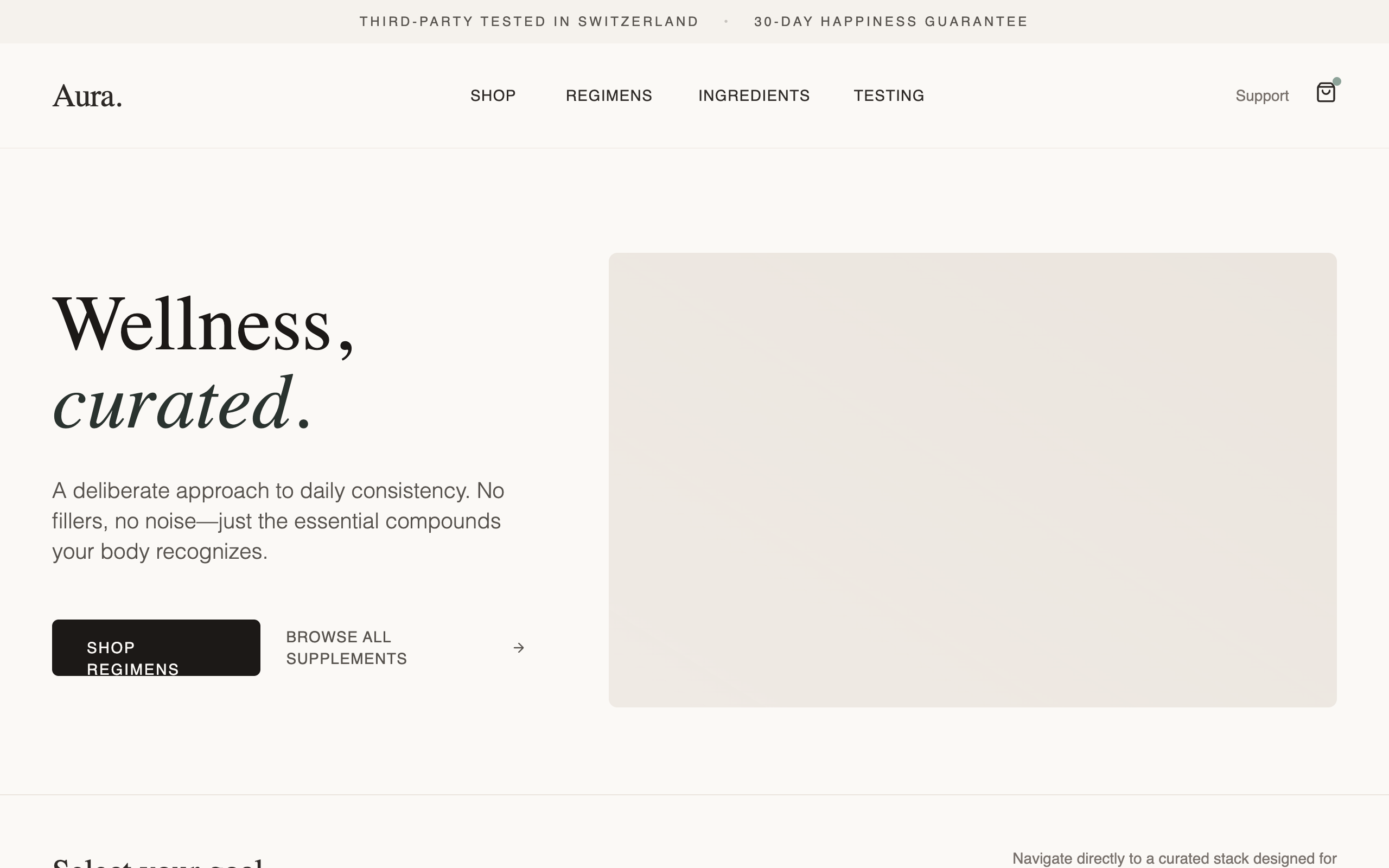
Aura Regimen Studio
A calm, deliberately designed wellness and e-commerce landing page featuring editorial typography and a soft natural color palette. The aesthetic is focused on trust and clarity, utilizing a mix of high-contrast serif headings and clean sans-serif body text. Key features include a 'bento-grid' regimen selector, detailed supplement protocol sections with 'Supplement Facts' panels, a visual usage timeline, and high-transparency quality modules. Ideal for wellness brands, premium supplements, high-end skincare, or curated lifestyle products. Optimized for a 'shop-ready but pressure-free' user experience with subtle micro-interactions and generous whitespace.
Text fading animation
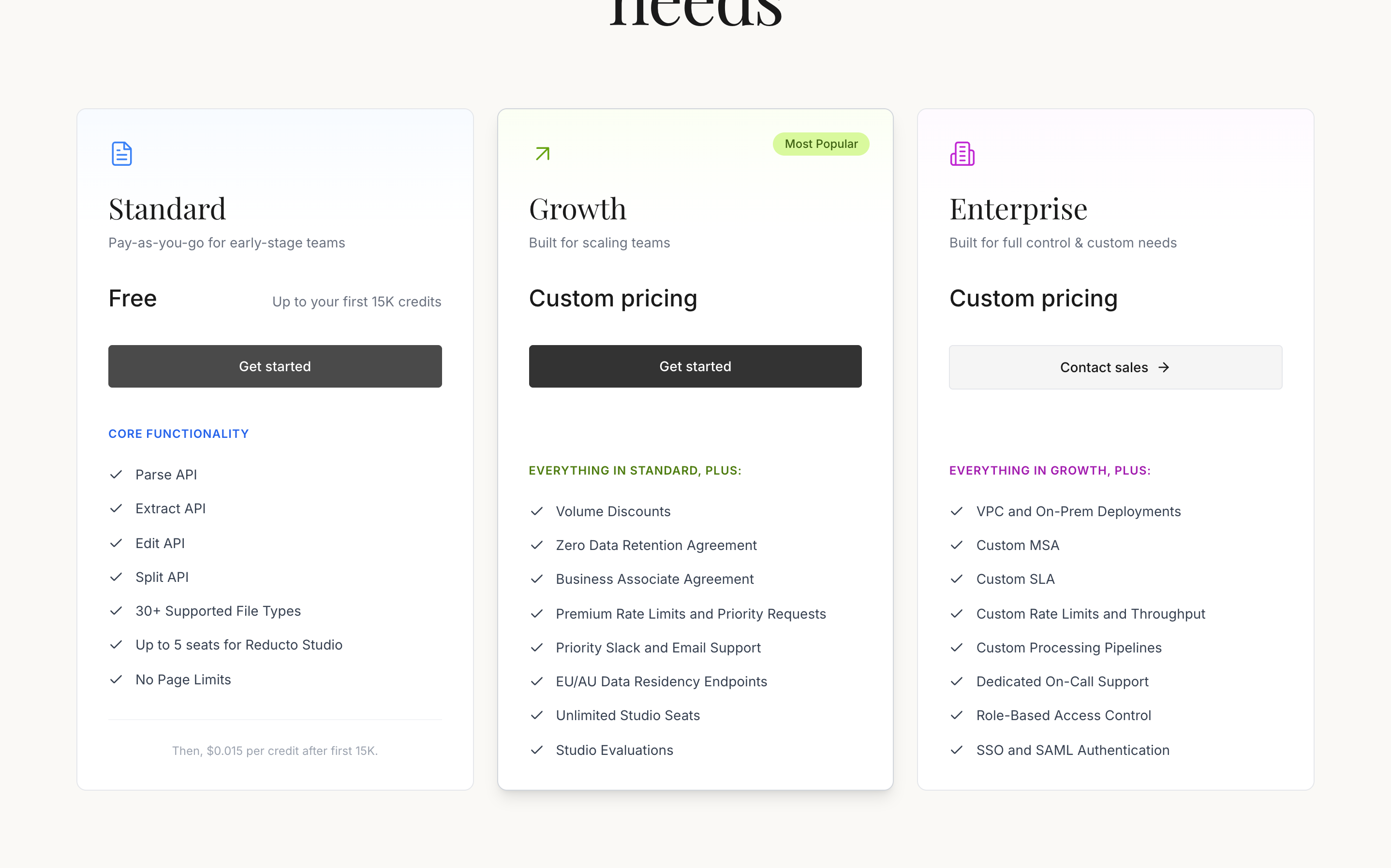
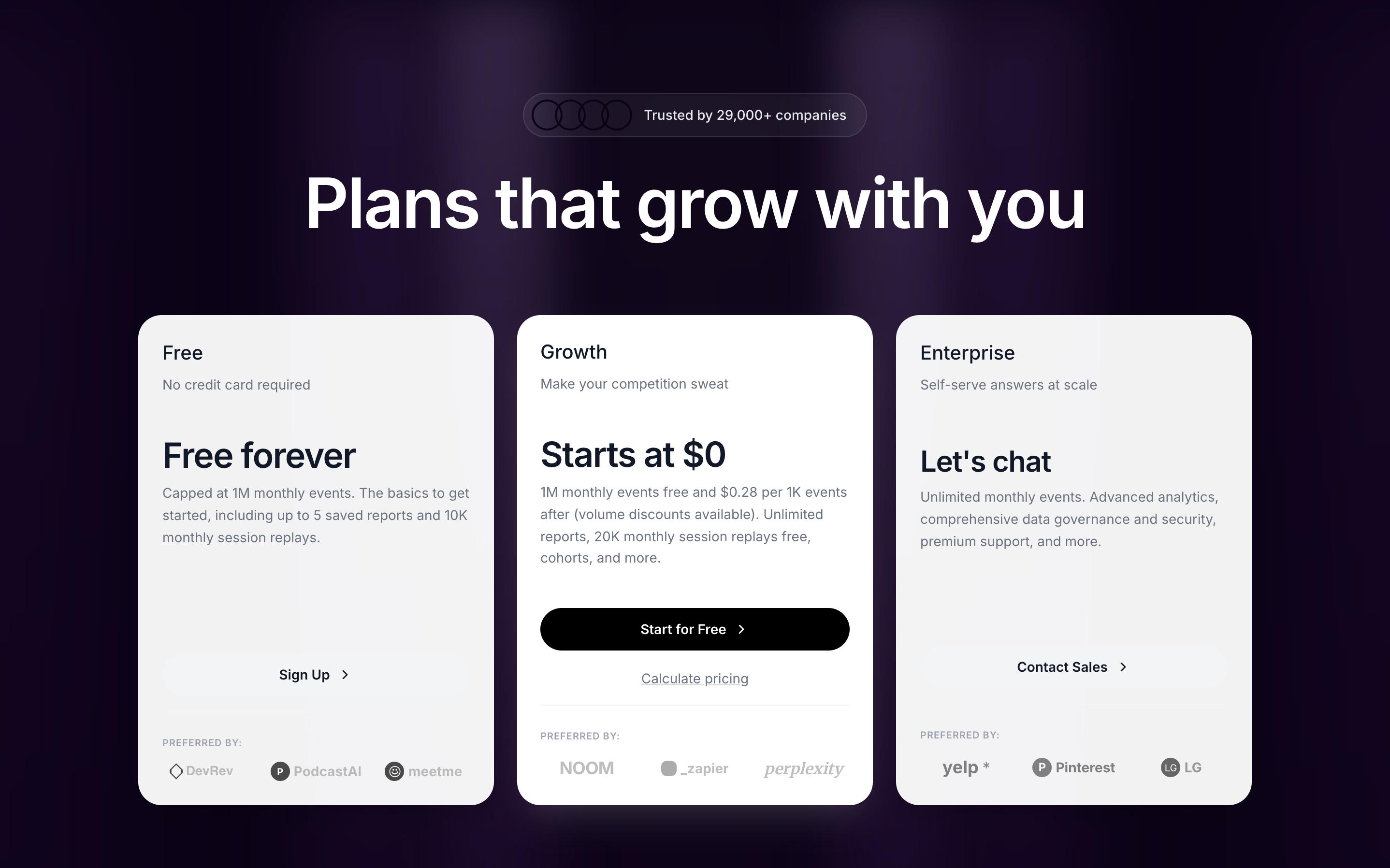
Pricing
A sophisticated pricing section featuring elegant serif typography, three distinct plan cards (Standard, Growth, Enterprise) with subtle gradient headers, feature comparison lists, and a responsive grid layout. Matches the 'Reducto' design aesthetic.
Image Trail
A premium minimalist showcase for a high-end image trail animation effect. Features multiple animation variants (lerp-based movement, scaling, brightness shifts, 3D rotations) with a clean, editorial aesthetic. Source: ReactBits
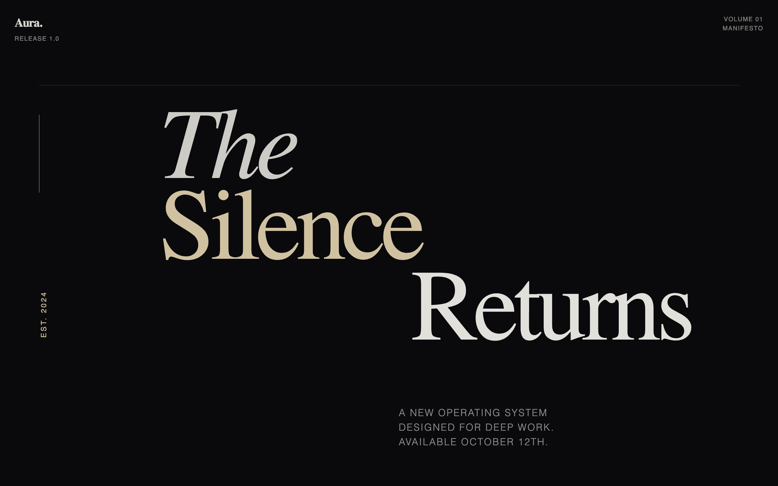
Aura OS - Launch Manifesto
An editorial, typography-heavy design system mimicking a high-end magazine or manifesto. Features high-contrast serif and grotesk font pairings, asymmetric layouts, and a sophisticated dark-mode palette with cream accents. Suitable for high-end product launches, boutique SaaS, architectural portfolios, and literary-focused platforms that value narrative and white space.
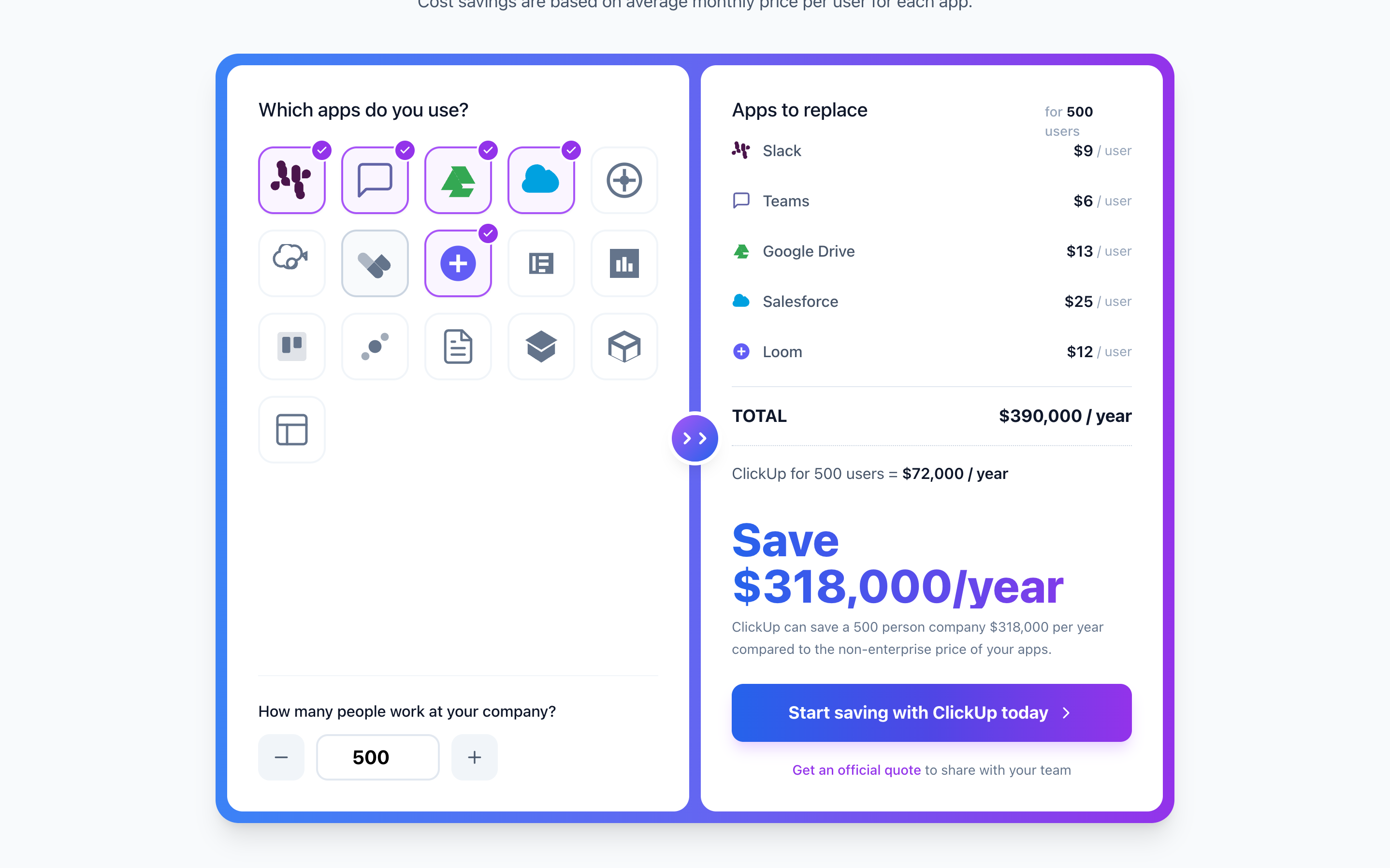
ClickUp Pricing Calculator
A cost savings calculator section comparing app spending vs ClickUp. Features an interactive app selection grid, user count input, and dynamic cost breakdown with a distinctive gradient border design.
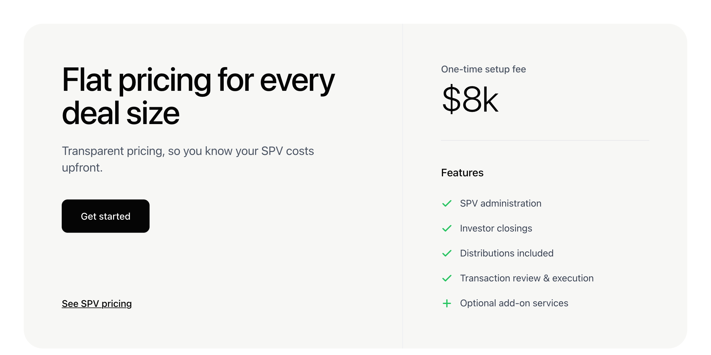
Single Pricing
[SECTION] A clean, two-column pricing section with a flat fee highlight and feature list. Mimics the AngelList SPV pricing design.
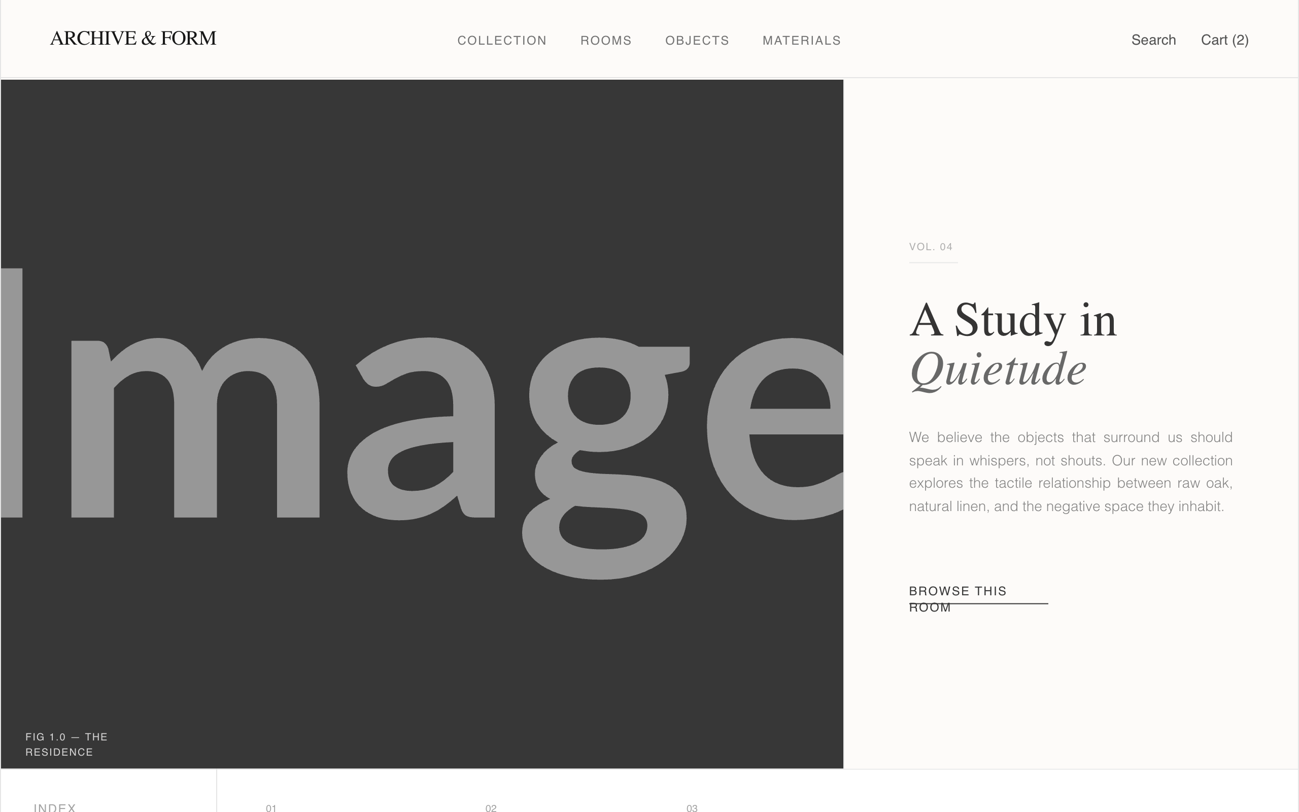
Archive & Form - Updated Hero Image
An editorial, museum-grade furniture catalog design system with an 'Archive & Form' aesthetic. Featuring a warm minimalist color palette of off-white and charcoal, it utilizes a sophisticated pairing of Zodiak serif and General Sans typography. The layout mimics high-end print magazines with asymmetric grids, thin architectural borders, and generous negative space. Suitable for luxury furniture, high-end architecture firms, fashion lookbooks, and minimalist eCommerce brands. Key features include scroll-triggered fades, slow-scale image interactions, and index-style navigation.
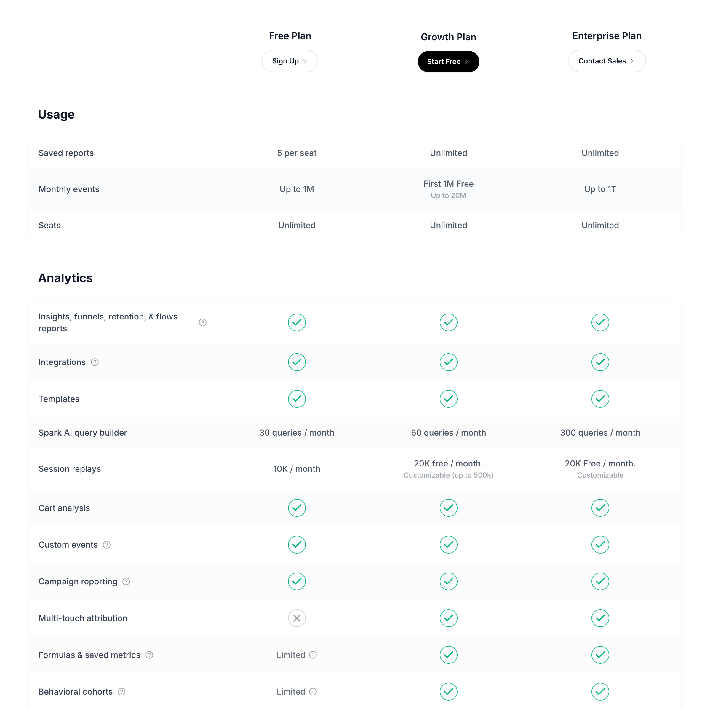
Pricing Comparison Table
A detailed, pixel-perfect pricing comparison table replicating the Mixpanel pricing page. Features sticky headers, collapsible sections (Usage, Analytics), tiered columns (Free, Growth, Enterprise), and extensive feature lists with status indicators (check, cross, text).
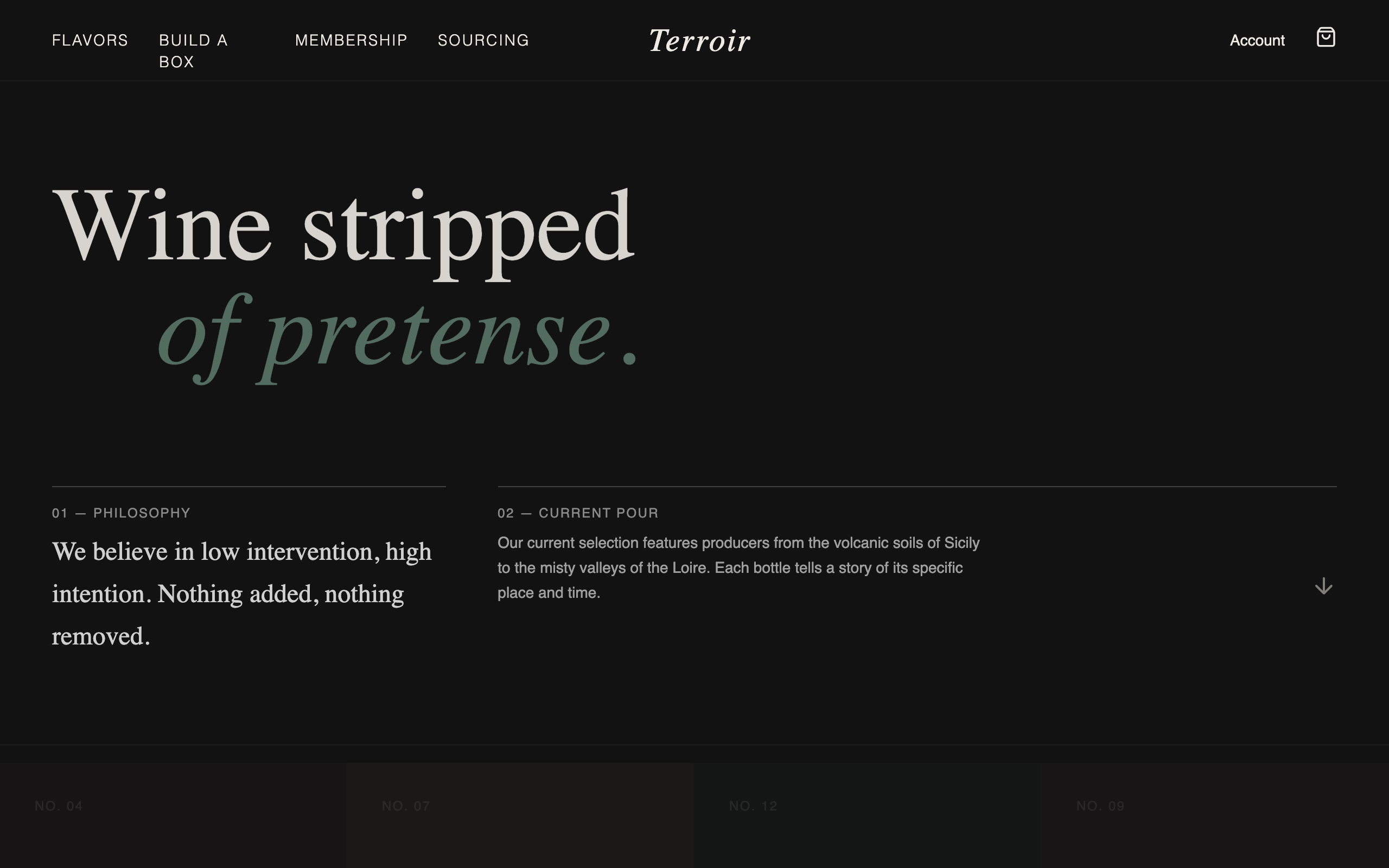
TERROIR | Natural Wine Boutique
A high-end, dark-mode editorial design system inspired by boutique natural wine tasting rooms. Features a moody palette of charcoal, burgundy, and sage, anchored by the Cormorant Garamond serif and Manrope sans-serif. Ideal for luxury DTC brands, artisanal beverages, high-end furniture, or museum-curated collections. Utilizes generous whitespace, subtle grain textures, and restrained scroll-triggered animations to create a sophisticated, museum-like atmosphere.