Design prompts for hero sections
A hero section has one job: in the few seconds before someone bounces, say what the product does, who it is for, and what to do next. The ones that convert lead with a clear promise instead of a clever line, put one primary action ahead of a quiet secondary one, show a real product instead of a stock blob, and back it with a line of social proof. The prompts below are the most-copied hero designs in the Superdesign library, from Swiss big-type and editorial serif to dark cinematic and metric-led SaaS. Open any one to see the exact prompt behind it, then tweak the copy and generate your own editable version in seconds.

Header & Hero Layout Refinement
A brutalist streetwear design system characterized by heavy editorial typography, a high-contrast neutral palette (concrete and ink), and asymmetric layouts. Features include a fixed mix-blend header, a grainy texture overlay, and a 'broken' grid for product displays. Ideal for high-end fashion, streetwear boutiques, architectural studios, and edgy SaaS brands looking for a raw, industrial aesthetic. Includes horizontal scrolling components, masonry-style social proof, and grayscale-to-color hover effects.

Archive & Form - Updated Hero Image
An editorial, museum-grade furniture catalog design system with an 'Archive & Form' aesthetic. Featuring a warm minimalist color palette of off-white and charcoal, it utilizes a sophisticated pairing of Zodiak serif and General Sans typography. The layout mimics high-end print magazines with asymmetric grids, thin architectural borders, and generous negative space. Suitable for luxury furniture, high-end architecture firms, fashion lookbooks, and minimalist eCommerce brands. Key features include scroll-triggered fades, slow-scale image interactions, and index-style navigation.

Formula Genius - Enhanced Conversion Hero
A technical minimalist design system featuring editorial typography, a muted 'paper' color palette, and a brutalist-lite aesthetic. Suitable for SaaS, developer tools, fintech, and data-driven applications. Key elements include hairline 1px borders, monospaced technical labels with high tracking, bento-style grids, and 'L-shaped' corner markers. Features a sophisticated mosaic SVG background pattern and confidence-signal UI indicators.

Stijlvinder Cinematic Video Hero Redesign
A high-end cinematic editorial style featuring immersive video backgrounds, sophisticated glassmorphism, and dynamic layout transitions. The design utilizes a neutral palette of deep blacks and soft creams (#fdfbf7) accented by vibrant orange (#ea580c), optimized for luxury fashion, premium retail, or tech-enabled lifestyle services. Key features include a glassmorphic value proposition with an animated scan-line, a brand marquee ticker, and interactive vertical 'navigation slices' that expand with smooth cubic-bezier easing. Typography pairs bold Cabinet Grotesk for headlines with clean Satoshi for body text to maintain an aspirational, editorial feel.

Naseeb - Soft Pastel Hero Screen
A soft pastel, dreamy hero screen design featuring a sophisticated tri-tone gradient (cyan to lavender to peach). Using the Nunito typeface throughout, the design emphasizes serenity and friendliness. Perfect for wellness apps, modern dating platforms, Gen-Z focused SaaS, or lifestyle brands. Key elements include organic glow overlays, subtle grain texture for a tactile feel, and smooth staggered entry animations.

FrameWatch | Matrix Enhanced Hero
A high-end, light-themed tech aesthetic with a 'Matrix' inspired twist. It features a clean white/slate background punctuated by vibrant rose/coral accents (#fb7185) and diverse code-snippet colors. Suitable for cybersecurity, SaaS, fintech, or AI identity protection startups. The style utilizes glassmorphism, bold editorial typography (Satoshi), and sophisticated scroll-triggered animations. Notable for its 'Code Matrix' hero background where floating snippets of logic create a technical yet breathable atmosphere.

Kahani - Hero-First Immersive (Production-Ready)
Kahani is a premium, hero-first immersive design system tailored for high-end hospitality, fine dining, and boutique lifestyle services. Characterized by a sophisticated deep teal and cream palette, it utilizes elegant Zodiak serif typography and Satoshi sans-serif for a refined, editorial feel. The layout emphasizes high-quality photography through full-bleed hero sections with sophisticated dark gradients, horizontal scrolling product cards, and glassmorphism navigation. It features smooth scroll-triggered micro-interactions and view transitions, making it ideal for mobile-first luxury commerce, concierge services, and upscale restaurant booking platforms.

Hero + Sticky Action Detail
Features a fixed action bar with safe-area anchoring, 4:5 hero visuals, and subtle glassmorphism effects on floating elements. Ideal for luxury retail, furniture showcases, editorial commerce, and minimalist lifestyle apps.

Coverflow - Carousels that turn heads (dark coverflow aurora)
A dark, aurora-lit 3D coverflow carousel landing page: a sticky frosted-ink nav, then a centered hero (a 'depth-aware coverflow engine' status pill, a big 'Carousels that turn heads, not stomachs.' heading whose 'turn heads' is teal-to-magenta gradient text, and a soft lead) wrapping a real CSS 3D coverflow stage. Seven gradient cards sit on a 1600px perspective stage: the active card faces front with a teal glow ring while neighbours rotate ~42-48deg and recede in Z, scaling and fading by distance, each card carrying a top-left sheen and a bottom gradient label. Below the stage, a round glass prev button, pill dots (active = a wide teal-to-magenta gradient bar), and a next button; clicks, dots, arrows and the left/right keys re-lay the stage. Then a CTA pair, a grayscale logo strip, a 3-up glass feature grid, a 'from prompt to motion' showcase split with a faux terminal card, a gradient-thumb templates grid, a dark gradient CTA, and a social footer. Inter + Space Grotesk fonts, near-black ink #0b0f14 ground, aqua #2dd4bf + magenta #e879f9 accents, glass panels and aurora blobs, Iconify Phosphor icons; responsive geometry drops far cards on small screens and collapses the nav into a hamburger.

Hero Left Text & Full-Width Banner
A luxury e-commerce design system tailored for high-end retail, specifically jewelry or boutique fashion. It features a sophisticated burgundy and gold color palette, high-contrast typography using the Rajdhani heading font, and a mobile-optimized layout. Key elements include a 55/45 split-column hero section, horizontal circular category scrolling, and full-width banners with floating animations. The aesthetic combines traditional elegance with modern mobile UI patterns like fixed bottom navigation and snap-scrolling.

Bilal Jutt - Dark Portfolio Hero
A high-impact, high-contrast dark mode portfolio style designed for personal branding, professional mentors, and educational institutes. Characterized by 'Clash Grotesk' bold italic editorial typography and a signature red accent (#DC2626) against a deep black (#000000) backdrop. The aesthetic combines industrial brutalism with modern SaaS elegance, featuring large-scale type stacks, subtle gradient light leaks, and a structured contact information grid. Ideal for design professionals, tech influencers, and creative directors looking for a commanding digital presence.

One Link, No Passwords - Passwordless Magic-Link Sign-In
A passwordless 'magic-link' sign-in page on a soft off-white canvas with a single teal accent: sticky nav, a two-column hero (pitch + benefits) beside a magic-link login card AND a 'Check your inbox' success card, plus Google/SSO social, a 3-step how-it-works, and a dark security stat strip.

Atelier - The Brief Designs Itself (editorial serif / burgundy)
Editorial magazine-style hero for an AI design agent: warm paper-cream canvas, Fraunces serif display headline with one italic burgundy accent word, minimal underlined text CTA, asymmetric 7/5 grid with a tinted framed photo, gold hairline rule, and a sticky translucent nav.

AURELIO - Cinematic Hero (cinematic-dark-warm)
Cinematic dark-warm hero section: a full-bleed dusk cityscape photo graded toward amber, layered with a warm sepia wash, an amber atmosphere bloom and a heavy vignette, under a translucent blurred sticky nav. Space Grotesk display + Inter body on near-black #0a0a0c with an amber #f0a868 accent and cream #f5f1ea text; a huge clamp headline with an amber gradient word, a live-showreel pill, an amber gradient CTA + ghost watch button, a trust row, and a bottom showreel control bar with a scroll cue.

Aurora Glass - Sign in to the canvas
Dark aurora-glass split sign-in screen: frosted glassmorphic auth card with a glowing aqua focus ring and an aqua-to-magenta gradient CTA, floating over neon aurora blobs on near-black ink, beside a product pitch column. Space Grotesk + Inter.

Carousel - Logo Marquee (teal)
A clean, light SaaS landing page built around an infinite logo-marquee carousel: a sticky frosted white nav (a teal rounded-square carousel-icon logo + a 'Carousel' wordmark, a hidden-on-mobile link row -- Customers / Product / Library / Pricing -- a ghost 'Sign in' link and a solid teal 'Start free' pill, plus a mobile hamburger), then a centered grid-textured hero (a teal 'Design system, generated in seconds' status pill, a big 'Ship interfaces the whole world already recognizes' heading whose 'recognizes' is teal with a hand-drawn SVG underline swash, a soft lead, and a primary teal 'Generate your first design' button + a ghost 'Watch the canvas' button). The anchor section is a two-row trusted-by logo marquee: 'Trusted by design & product teams at', then two edge-faded infinite-scroll rows of icon+wordmark logo chips (the top row scrolls left at 40s, the bottom row scrolls right at 28s), each row duplicated twice so the CSS translateX(-50%) loop is seamless, with a left/right transparent mask fade at the edges and a hover-to-pause + per-logo teal tint. Below it: a 4-up metric trust strip (57k+ / 2.4M / 4.9/5 / 12s) in a hairline-divided rounded card, a 3-up feature grid (Prompt to mockup / Infinite canvas / Clean export), a teal gradient CTA card with corner glow blobs, and a social footer. Inter font, teal #0f766e + #0d6660 + #115e59 accents on a slate #f8fafc ground, Iconify Phosphor icons, and a responsive reflow that collapses the nav into a hamburger.

Carousel Design - Brutalist Slider
A raw neo-brutalist slider carousel built as a complete one-screen 'Carousel/Design' landing on an off-white paper palette (#f4f1ea) with pure-black ink and a single acid-yellow accent (#e8ff00). Hard 3px black borders, blocky offset drop shadows (8px 8px 0 #000), heavy Archivo Black uppercase headlines and Space Mono labels. A sticky paper nav with a square 'C' logo sits over a grid-paper hero (a 'CAROUSELS that don't blink' headline with an acid highlight + a 2x2 brutalist stat-slab grid). The centerpiece is a no-JS radio-driven BRUTALIST SLIDER: a bordered slide panel with a hard acid+ink offset shadow, chunky square prev/next arrow buttons, an oversized blocky numeral index in an inverted ink/acid slab, and a row of 3 square index buttons; three slide layouts (acid 'Stacked panel', paper 'Split feature', inverted-ink 'Invert hero') snap with zero fade. Below: a scrolling ink marquee strip, a 6-up bordered feature 'Kit' grid, a 'prompt.txt' code slab with acid-highlighted tokens, a 3-tier brutalist pricing grid, an acid CTA band and a paper footer. Archivo / Archivo Black / Space Mono, Iconify Phosphor icons, tactile press (buttons travel on click), fully responsive.

Design at the Speed of Thought - Sunset Centered Hero
A warm golden-hour centered hero: a soft cream-to-peach sunset gradient field, an oversized two-line headline with a coral-to-amber gradient accent line, and a single frosted glass pill that combines an envelope icon, an email field and a gradient sign-up button, over a sticky frosted nav, avatar social proof and a trusted-by logo strip.
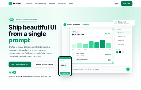
Drafted - Ship beautiful UI from a single prompt (split product, emerald)
Light split-screen SaaS hero for an AI product-design agent: white ground with a soft emerald wash and a faint dotted grid, Inter type. Left = a NEW eyebrow pill, a big two-line headline with one emerald accent word, a sub-line, a solid-emerald + white dual CTA and a 5-star social-proof row; right = a floating product-app window (top bar, tool rail, infinite canvas with a generated dashboard in an emerald selection box, Layers/Style panel, AI prompt bar) plus a floating notification chip, a phone mock and a trust logo strip.

Driftly: Ship a startup site your whole team is proud of
Playful illustrated 'sunny sky' startup-website landing page for an AI design agent: cream paper base with a sky-blue + coral duo-tone, rounded Poppins type, a hand-illustrated hero scene (layered SVG hills, floating clouds, sun, tiny rooftop town, founder mascots), sticky blurred nav, two-up feature cards, a numbered 3-step how-it-works band, stats row, a gallery strip, and a deep-sky rounded CTA banner.

Forma - Emerald Classic SaaS (legibility-fixed)
A classic light-mode SaaS landing page on emerald-and-white with Inter type: sticky blurred nav, a centered hero with a hand-drawn underline accent and an in-app canvas mockup, logo cloud, stat strip, alternating feature rows, a bento testimonial wall, a featured 3-tier pricing table, a dark CTA banner, and a 5-column footer, fully responsive.

Forms in Low Light - A Graphite Image Carousel
A calm, editorial image carousel built as a complete one-screen gallery landing on a graphite + off-white 'paper' palette with a single platinum accent. A sticky translucent paper nav over a centered hero band (a 'Carousel Design' pill eyebrow, an extrabold tight-tracked 'A gallery that frames the work, not itself.' headline, a muted intro line), then the carousel: a meta row ('Editorial Set 04' / 'Forms in Low Light' + an '03 / 09' counter) above a single commanding 16:9 hero frame on a near-black graphite stage with a soft bottom vignette, quiet glass prev/next caret arrows that stay calm until hover, a bottom-left 'Frame 03 / Ridge at Dusk' caption, a bottom-right glass play/fullscreen cluster and centered dot pagination, synced to a horizontally-scrolling thumbnail strip whose active thumb wears a double-ring highlight (the rest at 55% opacity, brightening on hover, the right edge masked). Below: a hairline-gridded three-up feature row, a full-bleed dark graphite palette section with a four-swatch ramp (#1c1c1e / #2c2c2e / #c7c7cc / #fbfbfa) and an 'Open the editor' CTA, and a paper footer. Inter throughout with tight display tracking.

Ledgerline - Deep-Teal + Mint Fintech Startup (Dashboard Hero)
A trustworthy deep-teal fintech-startup landing page with a mint accent and cream text: a split hero with a product dashboard mock and a floating virtual card, a bento feature grid, a stats traction band, a security certifications grid, and a glowing CTA.

Loomly - Sunset Spotlight Testimonial
A warm full-viewport 'sunset spotlight' testimonial section built around one big editorial pull-quote, centered on a layered coral/amber golden-hour gradient with cocoa-ink type, a gradient-ringed avatar, a coral->amber 'Start free' nav and a legibility-safe darkened-gradient highlight on the key clause. Plus Jakarta Sans, Iconify Phosphor.

Loved by makers - a pastel masonry wall of designer voices
Bright pastel testimonial MASONRY WALL section for a prompt-to-UI product: a sticky frosted-cream nav, a centered header (heart 'Loved by 57,000+ makers' chip + a Poppins extrabold headline whose tail sits over a hand-drawn sky highlight swipe), and a true CSS-columns masonry wall (1/2/3 responsive) of testimonial cards, mostly plain white with two oversized HIGHLIGHTED gradient cards woven in (one sky #38bdf8, one coral #fb7185) carrying white text, a giant corner quote-mark and a glassy avatar. Coral five-star ratings, initials avatars, a sky verified seal + an X-share badge, and a footer CTA strip (overlapping +5k avatar cluster + 'Join the wall. Start designing free'). Soft pastel shadows with hover lift over a dotted-grain + ambient sky/coral glow ground. Poppins, Iconify Phosphor icons, vanilla-JS hamburger menu.

Lumina · Design, Prompted (glass-aurora-dark hero)
Dark glassmorphic SaaS hero for an AI prompt-to-UI tool: an animated aurora field (teal #2dd4bf + magenta #e879f9 on ink #0b0f14), a frosted-glass sticky nav, a Space Grotesk headline with an aqua-to-magenta gradient accent line, two floating glass product cards (prompt + canvas output) with small feature chips, and a quiet logo trust row.

Metric-Led Teal Trust Hero - "Design UI at the Speed of a Prompt"
Metric-led teal trust hero: a deep teal gradient hero (near-black teal dissolving into an off-white canvas) with a faint white grid overlay, a glassy 'New' eyebrow pill, an extrabold Inter headline 'Design production UI at the speed of a prompt', a dual CTA (solid teal + glassy watch-demo), an avatar-stack + 4.9-star trust signal, three overlapping white metric cards (2.4M / 9x / 12k+) with teal top-accent bars, and a six-logo trust strip. Phosphor icons, conversion-optimized SaaS landing hero.

Palette - illustrated pastel hero (mobile clip fixed)
Warm hand-drawn illustrated pastel hero section for an AI design product: cream paper ground with a friendly sky-blue + coral accent duo, Poppins type, a big extrabold headline with a hand-drawn coral squiggle underline, a sky pill CTA + avatar social proof, and a playful illustration zone (sky gradient circle, rotating dashed ring, tilted ink-outlined mock screen, and floating component/prompt pills). Cheerful, approachable, craft-y, mobile-clip fixed.

Prism - Design at the speed of thought (Swiss big-type red hero)
Swiss / International-Typographic-Style hero section for an AI design tool: pure white ground, near-black Inter type and one hot signal red. A 12-col grid with a HUGE three-line Inter 800 headline ('Design at / the speed / of thought.') where only the last word is red, an index-rule eyebrow, a single underlined uppercase CTA and a trust row, paired with an angled clip-path 'canvas' panel of floating generated artifacts (red block, component card, swatch chip, prompt tag), a sticky blurred nav and a full-bleed use-case marquee.

Prismline - Aurora Glass: Ship a SaaS Site That Looks Designed, Not Generated
A premium dark aurora-glass SaaS marketing site: frosted pill nav, duotone aqua-to-magenta hero, a floating infinite-canvas mockup, a 6-card feature grid, bento showcase, 3-tier pricing with a featured Pro plan, and a glass footer.
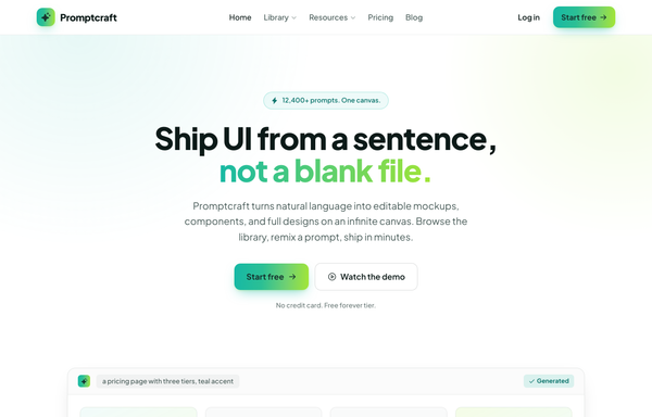
Promptcraft - Gradient CTA (teal→lime) navbar landing
A clean light-SaaS sticky navbar carried by one teal-to-lime gradient: a frosted white bar (white/85 + backdrop-blur over a hairline border) with a sparkle-tile 'Promptcraft' wordmark, five absolutely-centered nav links (Home, Library▾, Resources▾, Pricing, Blog) with a gradient underline that wipes in on hover, and a right cluster of a quiet 'Log in' link plus a gradient-filled 'Start free' CTA pill with a soft teal+lime glow shadow. Plus Jakarta Sans, Iconify Phosphor icons, gradient-text accent headline, and a hamburger reflow on mobile.

SPEED OF A PROMPT - Acid-Brutalist Hero
A neo-brutalist acid-yellow landing hero on warm paper: 3px ink borders, hard offset shadows, an oversized boxed display headline with a highlighted keyword, and a rotated spec-card cluster, for AI/dev tools that want a bold print-poster look.
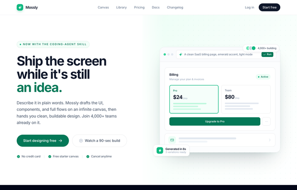
Split-image CTA - emerald (Mossly), legibility-fixed
Full-bleed split-image CTA: bold left copy with dual buttons and trust chips, a drawn product-UI mock on an emerald-washed dotted-grid right half. Light mode, emerald accent, Inter, sticky frosted nav + dark footer.

Splitframe - Show the Difference
A warm sand/terracotta landing page for a draggable before/after image-comparison slider: a bold black 'Show the difference.' hero with a circular-grip comparison frame (warm dusk 'After' wiping over cool night 'Before'), a dark marquee, a 3-step how-it-works grid, a 2-up gallery of more sliders, a copy-the-prompt code block and a terracotta CTA. Inter, single terra accent on sand neutrals, sticky translucent nav, reflows to one column below lg.

Storyframe - Stories That Tap Forward
A cinematic, full-bleed fullscreen story carousel built as a complete one-screen 'Storyframe' landing on a deep-navy palette with a single amber accent and warm cream text. A sticky translucent navy nav over a two-column hero: a 'FULLSCREEN STORY CAROUSEL . NEW PATTERN' pill eyebrow with a pulsing amber dot, a black 'Stories that tap forward.' headline (amber highlight), a cream intro and a 'Generate a story carousel' / 'See it live' button pair, beside the centerpiece: a 9/16 phone-shaped story-card mock with five segmented progress bars across the top (one animating on a 5s fillbar keyframe), a story meta row (an 'SF' avatar + 'Storyframe' + '2 of 5 . 4s'), left/right tap-to-advance zones that reveal a circular arrow on hover, and a bottom caption block (a 'Chapter 02' amber tag, a 'The Golden Hour' title, a Continue + bookmark button row), with a floating 'tap -> advance' accent card. Below: a trust strip, a 'Showcase' three-up full-bleed story-card gallery (each reusing the segmented-bars + tag + caption pattern), a full-bleed 'Prompt Library' two-column section with a 'story-carousel.prompt' code card, a 6-up bordered 'Craft' feature grid, a full-bleed gradient CTA panel and a navy footer. Inter throughout, Iconify Solar icons, immersive and cinematic.

The hero image carousel, done with restraint
A restrained, light hero-image carousel: one large 16:9 active frame flanked by soft-faded peek frames, a thin emerald progress bar, stretched-pill dot indicators, and a thumbnail strip, all on near-white surfaces with a single emerald accent and Inter type.

The profile card, perfected - Cardly component showcase
A clean white-card profile card showcase on a soft dotted slate canvas with a single emerald accent: the hero pairs a bold 'The profile card, perfected.' headline (emerald gradient on the last word) with the star component, a 380px rounded white profile card holding a ringed circular avatar + verified badge, name and role, a 3-column stat row (Projects / Followers / Following), a short bio, skill tags, and a Follow + Message action pair. Below: a 4-up 'built from deliberate parts' anatomy grid, a full-bleed dark copy-the-prompt code panel, and a footer. Inter, slate 'ink' neutrals + emerald accent, sticky translucent blurred nav, reflows from a 2-col hero to a single column below lg.

Voices from the Canvas - Aurora Carousel
Dark aurora-glow testimonial CAROUSEL section for a prompt-to-UI product: a sticky glass nav, a centered header (live-dot 'Loved by 57,000+ builders' badge + a Space-Grotesk headline whose tail is painted in an aqua->sky->magenta aurora gradient), and a big glass 'stage-card' carousel holding the active testimonial (aurora-ring avatar, name/role with the company in aqua, five magenta stars, a large pull-quote, a hairline divider, animated aqua->magenta pagination pill + glass/solid-white prev/next arrows), with two rotated, floating ghost peek cards behind it and a three-up trust-stats strip (4.9/5, 120k+, 9x) below, over a grain + ambient aqua/magenta glow ground. Space Grotesk + Inter, Phosphor icons, vanilla-JS slide engine.
How to prompt a hero section that looks designed, not generated
An AI design agent has a strong default for every part of a hero, and most of those defaults read as generic: a dark purple gradient, the Inter typeface, a clever vague headline, one weak button, an abstract blob, and no proof. A good prompt is really a list of constraints that override those defaults. Here is each default you need to override, the words that do it, and a template that bakes them all in.
Design a hero section for [product], a [what it is] for [who it is for].
Headline: state the promise in plain language, [your promise in one line]. Pass the five second test, no clever wordplay.
Subhead: one sentence on how it works or who it is for, [the supporting line].
Primary CTA: [the main action, e.g. Start designing free], solid and dominant. Secondary CTA: [a lower-commitment action, e.g. Watch the demo], quiet and subordinate. Add a microcopy line like "no credit card needed".
Social proof above the fold: [a user count or rating], an avatar stack, and a [N]-logo customer strip.
Visual: show a real [product screenshot or UI mock], not an abstract gradient blob or stock photo.
Layout: [centered or split] with everything above the fold, hero height about 70 to 90 percent of the viewport.
Style: a neutral base with one [accent] color reserved for the primary action. Headline typeface [name], body [name], not the default Inter.
Headline clarity
Default: It writes a vague, clever headline like "Unlock Your Potential Today" that could sit on any site and says nothing about the product.
Constrain it: State the promise in plain language and make it pass the five second test. Name what it does and who it is for, no wordplay.
CTA hierarchy
Default: It drops one faint outline button, or two buttons with equal weight, so nothing pulls the eye toward the action you want.
Constrain it: Name a solid, dominant primary CTA and a quiet secondary one, and add a microcopy line like "no credit card needed".
Social proof
Default: It ships a headline and a button with nothing to address the skepticism a first-time visitor brings.
Constrain it: Ask for proof above the fold: a user count or star rating, an avatar stack, and a strip of recognizable customer logos.
Layout
Default: It centers a single block of text on a dark canvas with no real structure and the action floating in the middle.
Constrain it: Spell out the layout: centered or split, everything above the fold, a hero about 70 to 90 percent of the viewport, text on one side and the product on the other.
Color and type
Default: Left alone it defaults to Inter, a dark theme with a purple gradient, and rainbow accents used as decoration.
Constrain it: Name a headline and body typeface and one accent color on a neutral base, and reserve that color for the primary action.
Show the product
Default: It fills the visual slot with an abstract gradient blob or generic stock art that shows nothing about what you actually get.
Constrain it: Ask for a real product screenshot or a UI mock of the core feature, framed in a browser or device, not an abstract shape.
Frequently asked questions
What makes a good hero section?
A clear promise in the first read, one dominant call to action, a real product visual, and a line of social proof. A visitor decides in a few seconds whether to stay, so say what the product does and who it is for in plain language, then make the next step obvious.
What should go in a hero section?
A headline that states the value, a one-line subhead, a primary CTA with an optional quiet secondary one, a real product visual or UI mock, and a trust signal such as a customer count, a rating, or a logo strip. Keep it all above the fold.
Why does my AI-generated hero section look generic?
Because a vague prompt gets the model defaults: a dark purple gradient, the Inter typeface, a clever but empty headline, one faint button, and an abstract blob instead of a product. Name a plain-language promise, a dominant primary CTA, a real product visual, one accent color, and a non-default typeface, and it stops reaching for the average.
Should a hero section have one CTA or two?
Usually one dominant primary CTA, with an optional quiet secondary action like "Watch the demo" for visitors who are not ready yet. The point is hierarchy: the primary should be larger and higher contrast so there is no doubt which step matters. Two buttons of equal weight split attention.
How do you write a prompt to generate a hero section UI?
Describe the brief, not the vibe: the product and who it is for, the headline promise in plain words, the primary and secondary CTAs, the social proof, a real product visual, the layout, one accent color, and a named typeface. The template above walks through each part, and you can open any example here to see a full prompt that works.