Design prompts for tables
A data table has one job: let someone scan a wall of records and find the row that needs them in seconds. The ones that read well right-align their numbers in a tabular figure font so the digits line up, turn status into a colored pill instead of a raw value, use hairline rules instead of a heavy boxed grid, show only the columns that matter with sort, filter and pagination for the rest, and reflow into cards on a narrow screen. The prompts below are the most-copied table designs in the Superdesign library, from dense SaaS admin and CRM tables to financial watchlists, invoice ledgers and comparison matrices. Open any one to see the exact prompt behind it, then tweak the copy and generate your own editable version in seconds.

Pricing Comparison Table
A detailed, pixel-perfect pricing comparison table replicating the Mixpanel pricing page. Features sticky headers, collapsible sections (Usage, Analytics), tiered columns (Free, Growth, Enterprise), and extensive feature lists with status indicators (check, cross, text).

Slate ROI-Calculator Pricing
A frameless dark SaaS pricing page in inky slate with one electric mint accent: an interactive ROI savings calculator, a 4-tier plan grid with a highlighted Pro card and monthly/annual toggle, a comparison table, and an accordion FAQ.

Design at the Speed of Thought - Lumen Pricing Tiers
Light SaaS pricing section with a teal accent: sticky glass nav, centered heading + monthly/annually toggle, and a 3-tier card row where the middle 'Pro' tier is a scaled-up, solid-teal 'Most popular' card flanked by two white ghost cards.

Editorial Violet SaaS Pricing Matrix
A light, editorial SaaS pricing page led by a full-width grouped comparison matrix with a sticky 3-plan header, electric-violet accent, and a monthly/annual toggle.

Electric Dark Usage-Based Pricing Calculator
An electric dark dev-tool pricing page built around an interactive slider calculator that live-computes included quota plus tiered pay-as-you-go overage, with a lime accent, a highlighted plan card row, and an FAQ accordion.

Electric Magenta Creator-SaaS Pricing
A bright-white creator-marketplace SaaS pricing page with an electric magenta accent, a billing toggle, four tier cards (dark inverted 'Most popular'), a magenta earnings stat band, and a grouped comparison table.

Electric Phosphor Terminal Dev-Tool Pricing
A pure-black CRT terminal-themed SaaS pricing page in phosphor green and monospace, with a 3-tier card row (Pro highlighted), an animated monthly/annual toggle, and a man-page-style comparison matrix in a fake terminal window.

Emerald 4-Tier SaaS Pricing Table
A light-mode emerald-accented SaaS pricing page with a Monthly/Annual toggle and four tiers fused into one bordered table, the Pro column lifted and ring-highlighted as 'Most popular'.

Hairline Mono-Minimal SaaS Pricing
A frameless light-mode SaaS pricing page in editorial mono-minimal style: warm off-white paper, hairline-divided three-tier cards with an inverted dark Pro tier, indigo accent, a monthly/annual toggle, and a clean comparison table.

Ledger Equities Desk - Trading-Floor Watchlist
Dark navy trading-floor watchlist table with a sticky glass nav, a scrolling price ticker, index/P&L stat cards, and a dense financial data table: right-aligned tabular figures, green/red deltas, % pill badges, and inline SVG sparklines.

LEDGER/01 - Tables With a Spine
A neo-brutalist marketing page anchored on one audit-grade invoice data table: thick 3px black cell borders, an inverted black header row, squared status badges, right-aligned tabular-numeral money, and a bold total footer, all on off-white paper with a single acid-yellow accent, hard zero-blur offset shadows, and an Archivo-black + JetBrains-Mono type system.

Nebula - Mission Control (dark glass aurora task table)
Luminous dark-mode glassmorphism task command center (Nebula - Mission Control): a fixed teal+magenta aurora field behind frosted-glass cards, a sticky backdrop-blurred nav, an aqua->magenta gradient hero, a 4-up glass stat strip, and a glass table panel with a faceted filter toolbar, icon+label status/priority columns, gradient avatars and a pagination footer.
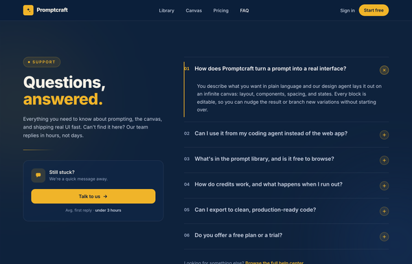
Questions, Answered - Corporate Split FAQ
A two-column split FAQ section on a full-bleed dark-navy marketing page: a sticky frosted navy nav, then a 12-column grid with a sticky left identity column (an amber 'Support' eyebrow pill, a big tight-tracked two-line 'Questions, answered.' heading with the second word in amber, a muted lead, an amber accent rule, and a 'Still stuck?' contact CTA card with a 'Talk to us' button) beside a right-hand numbered accordion (01, 02, ...) of full-width question rows split by hairline white borders, each with a circular amber plus toggle. Opening a row smoothly expands it via a grid-template-rows height animation, paints a 2px amber accent rail down the left edge, turns the question white and the number amber, and rotates the plus 45deg into an x (single-open, first open by default). Subtle dotted grain and two soft ambient glows sit behind it; closes with a dark social footer. Amber #f0b429 accent on a deep navy ramp, Inter font, inline SVG icons.

Swiss Editorial Newsprint SaaS Pricing
A brutalist Swiss-print pricing page on warm paper stock with hairline ink rules, one electric red accent, an inverted recommended tier, a monthly/yearly toggle, and a full feature-comparison matrix.

Tablecloth - Data tables you actually want to look at
A warm light-SaaS marketing page built around data-table cards: avatar cells with presence dots, pill status badges with leading dots, inline usage progress bars, and due-date chips, on cream paper with a sky-blue + coral palette and fully rounded cards in Poppins.

Tablecraft - Data Tables That Feel Engineered, Not Bolted On
A clean shadcn-style SaaS data table ('Tablecraft') on a white surface with one emerald accent and Inter: a sortable tasks table with a tri-state select-all, faceted-filter toolbar, semantic status/priority state icons, a selected-row treatment, an open row-actions menu, and an honest pagination footer.

Tablekit - The data table your team actually wants to live in
Dense light-mode admin data table (Tablekit): blurred sticky nav, dotted-grid hero, a cobalt-on-white panel with a filter bar, bulk-action bar, sticky-header scroll table with colored status/priority/type badges and avatar chips, and a full pagination footer.

Tablet - Data tables, in graphite (minimal monochrome data-table prompt page)
A minimal monochrome data-table prompt page: graphite ink on warm paper, hairline dividers, sortable headers, no zebra stripes, and a single platinum accent for the in-flight state. Inter + JetBrains Mono.

Tablr - warm comparison/pricing matrix (mobile reflow + contrast fixes)
A warm paper-toned feature comparison and pricing matrix for a data-table product: three plan columns (Starter / Studio / Scale) with the recommended Studio column rendered as a continuous dark ink panel and a terracotta 'Most popular' badge, feature rows grouped into Core grid / AI & automation / Team & governance / Support with olive check and muted dash glyphs, a Monthly/Yearly billing toggle, and a real mobile reflow into stacked per-plan cards led by the recommended plan. Cream + ink + terracotta + olive palette on Inter.

Tabular - Responsive table-to-cards (teal), legibility fixes applied
Light-mode 'Tabular' product page built around one responsive data table that is a real desktop table on wide screens and collapses each row into a labeled stacked card below 920px, in pure CSS with no JavaScript: teal accent on near-white, status pills, tabular-nums columns, a sticky blurred nav, a dark prompt-library strip, and a teal CTA band.

The Editorial Data Table
An editorial, print-inspired comparison data table for a product that typesets tables instead of rendering spreadsheets. A 'Biggest Gaps' delta table set in a rounded cream card: serif column headers underlined by one heavy 2px ink rule, hairline rules between roomy rows, Fraunces serif row labels, right-aligned tabular-nums delta values that fade by rank (leaders in burgundy), centered circular initial badges (burgundy AC vs ink MR) and right-aligned significance pills (burgundy-tinted Major vs ghost Moderate/Minor), with a genuine mobile reflow (CSS-grid rows, no <table>) so each row collapses to label + value with its badge/pill wrapping underneath. Cream + ink + a single restrained burgundy accent, set in Fraunces + Inter.
How to prompt a table that looks designed, not generated
An AI design agent has a strong default for a data table, and most of those defaults make the data harder to read: numbers left-aligned in a proportional font, a heavy boxed grid with zebra stripes, status as a raw value, every column from the database dumped in, cramped rows with no header distinction, and a wide table that overflows on mobile. A good prompt is really a list of constraints that override those defaults. Here is each default you need to override, the words that do it, and a template that bakes them all in.
Design a [light or dark] [type] data table for [who reads it] to [the task it supports, e.g. find the orders that need action].
Numbers: right-align every numeric column and set the figures in a tabular or monospace font so the digits line up by place value. Keep the format consistent down each column (currency, decimals, thousands separators).
Status: render status as a colored pill with semantic color, green for done, amber for waiting, red for trouble, never a raw value or plain text.
Rows: use hairline horizontal rules only, no vertical lines and no zebra striping, with about 16px of vertical padding so rows breathe.
Header: a quiet uppercase header row, visually distinct from the body, that stays pinned (sticky) as the table scrolls.
Columns: show only the [few columns] that drive the decision, then add sortable headers, a search or filter bar, a column toggle, and pagination for the rest.
Cells: pair related data, an avatar with a name, a progress bar with its percent, and right-align the actions menu.
Responsive: below a breakpoint, reflow each row into a labeled card, one field per line, so it never needs sideways scrolling.
Style: a neutral base with one [accent] color reserved for selection and the primary action. Header typeface [name], body [name], figures in [a mono or tabular face], not the default Inter and no purple gradient.
Align the numbers
Default: It left-aligns numeric columns in a proportional font, so the digits do not line up and you cannot compare magnitudes by glancing down the column.
Constrain it: Right-align every numeric column and set the figures in a tabular or monospace font, so digits line up by place value and the column reads in one pass.
Rows and rules
Default: It wraps the table in a full boxed grid and adds zebra striping, so the lines and fills compete with the data and the table feels heavy.
Constrain it: Ask for hairline horizontal rules only, no vertical lines and no zebra striping, with roomy row padding so the eye tracks straight across each row.
Status as a pill
Default: It prints status as a raw value or a plain word in body text, so every row looks the same and nothing flags the one that needs you.
Constrain it: Render status as a colored pill with semantic color: green for done, amber for waiting, red for trouble, so the row that needs action jumps out.
Density and the header
Default: It crams rows at the default line height and styles the header like just another row, so the whole table blurs into one undifferentiated block.
Constrain it: Set about 16px of row padding and a quiet uppercase header that is visually distinct and stays pinned as the table scrolls.
Only the columns that matter
Default: It dumps every column from the database into the table, so it spills off the screen and the few columns that drive a decision get lost in the noise.
Constrain it: Name only the columns that matter, then add sortable headers, a search or filter bar, a column toggle and pagination so the rest stay one click away.
Reflow on mobile
Default: On a narrow screen it keeps all the columns, so the table overflows and you are left dragging a tiny horizontal scrollbar to read anything.
Constrain it: Ask it to reflow each row into a labeled card below a breakpoint, one field per line, so the table stays readable with no sideways scrolling.
Color and type
Default: Left alone it reaches for a dark purple table in Inter with a rainbow of chip colors, so the look reads as generic and the color carries no meaning.
Constrain it: Name a neutral base with one accent reserved for meaning, a named display face for headers, and a mono or tabular figure font so the numbers align.
Frequently asked questions
What makes a good data table UI?
Readability and scanning speed. Right-align the numbers in a tabular figure font so digits line up, turn status into a colored pill, use hairline horizontal rules instead of a heavy boxed grid, show only the columns that drive the decision with sort and filter for the rest, and reflow into cards on mobile. The point is to find the row you need in seconds.
Should numbers be left or right aligned in a table?
Right-aligned. As Matthew Strom puts it in Design Better Data Tables, we compare numbers by reading them right to left, ones digit first, then tens, then hundreds, so right-aligning lets the place values line up. Pair that with a tabular figure font, which sizes every digit the same, and a long column of numbers becomes far easier to scan. Text stays left-aligned, and headers carry the alignment of their data.
Should a data table use zebra striping?
Usually not. Matthew Strom argues zebra striping is "really, really bad", and most design guides agree that horizontal rules only is the most common and recommended style for any data set: it cuts the visual noise of a full grid while still helping the eye keep its place. Reach for striping only when rows are very tall or the table is unusually wide, and keep the shade faint.
Why does my AI-generated table look generic?
Because a vague prompt gets the model defaults: numbers left-aligned in a proportional font, a heavy boxed grid with zebra stripes, status as a raw value, every column dumped in, cramped rows, and a dark purple card in Inter. Right-align the numbers in a tabular font, ask for hairline rules and status pills, trim the columns and add sort and filter, pick one accent on a neutral base and a non-default typeface, and it stops reaching for the average.
How do you write a prompt to generate a data table UI?
Describe the brief, not the vibe: who reads it and the task it supports, right-aligned numbers in a tabular figure font, status as a colored pill, hairline rules with roomy rows, a pinned uppercase header, only the columns that matter plus sort, filter and pagination, a mobile reflow into cards, one accent color and a named typeface. The template above walks through each part, and you can open any example here to see a full prompt that works.
Can I use my own columns and brand colors?
Yes. Generate the layout first, then describe your columns, accent color, typeface and real data in plain language and branch a variant. Every design comes back as real, editable code, so wiring in your data source and brand happens in your own repo, not a rebuild from a picture. Stuck on something? Ping us and we will sort it out together.