Design prompts for CTA sections
A call to action section has one job: give the visitor who has read this far one obvious, low-risk next step, and make it the most clickable thing on the page. The ones that convert lead with a single primary action instead of three competing buttons, label that button with the outcome ("Start designing free", not "Submit"), keep it high contrast against a calm section, pair it with a headline that names the payoff, and wrap a little trust around it (social proof, a no-card line). The prompts below are the most-copied CTA and conversion-section designs in the Superdesign library, from full-bleed color blocks to frosted-glass aurora bands and quiet monochrome cards. Open any one to see the exact prompt behind it, then tweak the copy and generate your own editable version in seconds.

Coverflow - Carousels that turn heads (dark coverflow aurora)
A dark, aurora-lit 3D coverflow carousel landing page: a sticky frosted-ink nav, then a centered hero (a 'depth-aware coverflow engine' status pill, a big 'Carousels that turn heads, not stomachs.' heading whose 'turn heads' is teal-to-magenta gradient text, and a soft lead) wrapping a real CSS 3D coverflow stage. Seven gradient cards sit on a 1600px perspective stage: the active card faces front with a teal glow ring while neighbours rotate ~42-48deg and recede in Z, scaling and fading by distance, each card carrying a top-left sheen and a bottom gradient label. Below the stage, a round glass prev button, pill dots (active = a wide teal-to-magenta gradient bar), and a next button; clicks, dots, arrows and the left/right keys re-lay the stage. Then a CTA pair, a grayscale logo strip, a 3-up glass feature grid, a 'from prompt to motion' showcase split with a faux terminal card, a gradient-thumb templates grid, a dark gradient CTA, and a social footer. Inter + Space Grotesk fonts, near-black ink #0b0f14 ground, aqua #2dd4bf + magenta #e879f9 accents, glass panels and aurora blobs, Iconify Phosphor icons; responsive geometry drops far cards on small screens and collapses the nav into a hamburger.
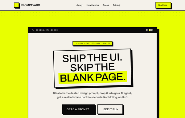
Acid Brutalist - "Skip the Blank Page" CTA Block
A loud neo-brutalist acid-yellow CTA section: a hard-bordered window-style panel with a thick offset shadow, a tilted bordered headline with an acid knockout phrase, chunky press-down buttons, a black scrolling marquee, and three tilted step cards.

Anvil - Design, generated (minimal mono graphite CTA)
Quiet monochrome graphite-on-paper SaaS landing in Inter, no color accent at all, anchored by a single centered CTA card framed by four corner registration-mark ticks, with a hairline eyebrow pill, a tight headline, one dark graphite primary pill beside a hairline ghost, and a hairline-divided trust line on a faint dotted-grain canvas.
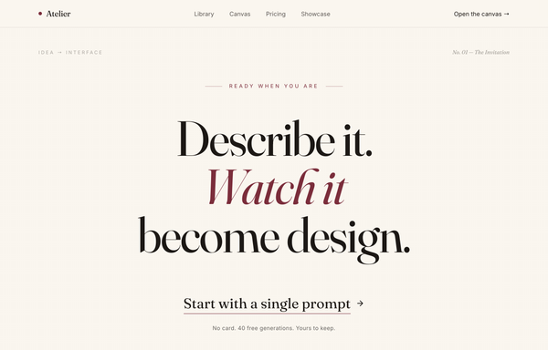
Atelier - Design, Spoken Into Being (editorial serif / burgundy)
An editorial, print-magazine CTA: an oversized Fraunces serif statement with a single burgundy italic line on warm cream paper, closed by an understated text-link call to action and a no-card trust line, framed by a sticky nav and a newsletter footer.

Carousel - Logo Marquee (teal)
A clean, light SaaS landing page built around an infinite logo-marquee carousel: a sticky frosted white nav (a teal rounded-square carousel-icon logo + a 'Carousel' wordmark, a hidden-on-mobile link row -- Customers / Product / Library / Pricing -- a ghost 'Sign in' link and a solid teal 'Start free' pill, plus a mobile hamburger), then a centered grid-textured hero (a teal 'Design system, generated in seconds' status pill, a big 'Ship interfaces the whole world already recognizes' heading whose 'recognizes' is teal with a hand-drawn SVG underline swash, a soft lead, and a primary teal 'Generate your first design' button + a ghost 'Watch the canvas' button). The anchor section is a two-row trusted-by logo marquee: 'Trusted by design & product teams at', then two edge-faded infinite-scroll rows of icon+wordmark logo chips (the top row scrolls left at 40s, the bottom row scrolls right at 28s), each row duplicated twice so the CSS translateX(-50%) loop is seamless, with a left/right transparent mask fade at the edges and a hover-to-pause + per-logo teal tint. Below it: a 4-up metric trust strip (57k+ / 2.4M / 4.9/5 / 12s) in a hairline-divided rounded card, a 3-up feature grid (Prompt to mockup / Infinite canvas / Clean export), a teal gradient CTA card with corner glow blobs, and a social footer. Inter font, teal #0f766e + #0d6660 + #115e59 accents on a slate #f8fafc ground, Iconify Phosphor icons, and a responsive reflow that collapses the nav into a hamburger.

Carousel Design - Brutalist Slider
A raw neo-brutalist slider carousel built as a complete one-screen 'Carousel/Design' landing on an off-white paper palette (#f4f1ea) with pure-black ink and a single acid-yellow accent (#e8ff00). Hard 3px black borders, blocky offset drop shadows (8px 8px 0 #000), heavy Archivo Black uppercase headlines and Space Mono labels. A sticky paper nav with a square 'C' logo sits over a grid-paper hero (a 'CAROUSELS that don't blink' headline with an acid highlight + a 2x2 brutalist stat-slab grid). The centerpiece is a no-JS radio-driven BRUTALIST SLIDER: a bordered slide panel with a hard acid+ink offset shadow, chunky square prev/next arrow buttons, an oversized blocky numeral index in an inverted ink/acid slab, and a row of 3 square index buttons; three slide layouts (acid 'Stacked panel', paper 'Split feature', inverted-ink 'Invert hero') snap with zero fade. Below: a scrolling ink marquee strip, a 6-up bordered feature 'Kit' grid, a 'prompt.txt' code slab with acid-highlighted tokens, a 3-tier brutalist pricing grid, an acid CTA band and a paper footer. Archivo / Archivo Black / Space Mono, Iconify Phosphor icons, tactile press (buttons travel on click), fully responsive.
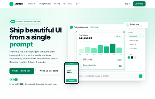
Drafted - Ship beautiful UI from a single prompt (split product, emerald)
Light split-screen SaaS hero for an AI product-design agent: white ground with a soft emerald wash and a faint dotted grid, Inter type. Left = a NEW eyebrow pill, a big two-line headline with one emerald accent word, a sub-line, a solid-emerald + white dual CTA and a 5-star social-proof row; right = a floating product-app window (top bar, tool rail, infinite canvas with a generated dashboard in an emerald selection box, Layers/Style panel, AI prompt bar) plus a floating notification chip, a phone mock and a trust logo strip.

Dual-CTA card (pastel) - contrast fixes applied
Warm pastel SaaS landing on a cream field with a sky-blue + coral two-tone gradient, all in Poppins, anchored by a centered white rounded-5xl dual-CTA card floating with a soft two-tone shadow, inner glows, bobbing decor squares, a sky-gradient primary pill beside a coral-outline secondary, and a gradient-clipped headline phrase.
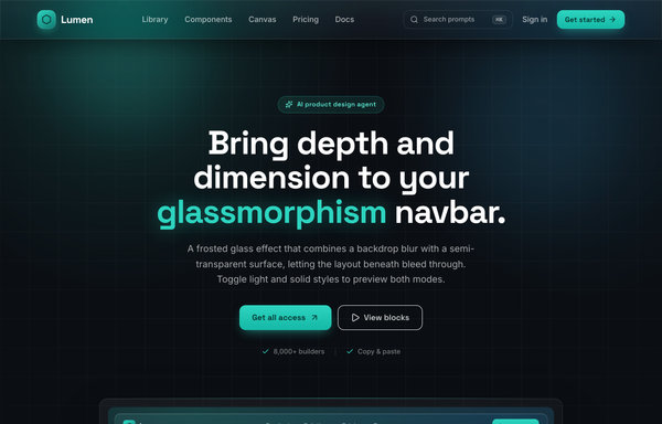
Frost & Field - A Sticky Glass Navbar in Deep Aqua
Sticky frosted-glass navbar in deep aqua: a fixed top-0 .glass bar (backdrop-blur 18px + saturate, white/8 border, inset highlight, aqua hairline on top) the page scrolls beneath. Left aqua-gradient hexagon wordmark 'Lumen' (Space Grotesk), center nav links with a grow-from-left aqua underline, right a ghost ⌘K search + 'Sign in' + one glowing aqua 'Get started' CTA. Inter body, ink-black #0b0f14 canvas, single #2dd4bf accent, collapses to a glass burger drawer. Dark page.

Glide - Carousels that feel delightful to swipe
A cheerful, friendly multi-card carousel built as a complete one-screen 'Glide' landing on a warm cream palette with a sky-blue + coral gradient accent. A sticky translucent cream nav over a centered hero (a 'Prompt library . Carousel pattern' pill eyebrow, an extrabold 'Carousels that feel delightful to swipe' headline whose 'delightful to swipe' runs a sky-to-coral gradient clip under a hand-drawn coral underline squiggle, a muted intro line, and a 'Try the carousel' / 'Copy the prompt' button pair). Then the carousel inside a big white rounded showcase panel: a 'Featured collections' meta row + a 'Draggable' pill above a draggable, scroll-snapping track of rounded cream cards (three in view on desktop, two on tablet, one peeking on mobile), each with a floating gradient icon tile, a numbered category pill, a title, a description and a swatch/feature footer, driven by rounded prev/next arrows that hover to the accent color and a dot-pagination row whose active dot stretches into a sky pill. Below: a full-bleed white 'Why Glide' feature band (a three-up card row), a 'How it works' two-column section with a floating 'prompt.txt' code-card mock, a full-bleed sky-to-coral gradient CTA panel, and a cream footer. Poppins throughout, Iconify Phosphor icons, cheerful and soft.
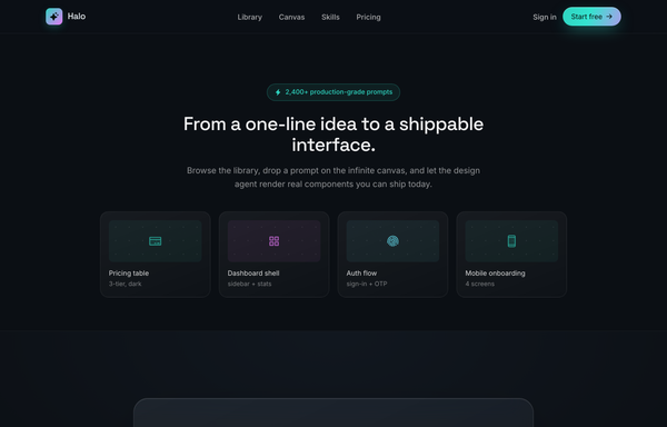
Halo - Aurora Glass CTA Band
Full-bleed dark CTA band: a frosted-glass panel floating over a luminous aurora glow that rises from the bottom, with a gradient-clipped accent headline, dual buttons and a trust row. Dark ink, aqua-to-magenta accent, Space Grotesk + Inter, sticky frosted nav + minimal footer.

Loved by builders - Promptkit testimonial wall (mono tweet wall)
A calm Twitter/X-style 'wall of praise' testimonial section on clean white with warm-grey tweet cards, monochrome initials avatars and a single muted slate-blue accent for stars and verified ticks, laid out as a responsive CSS-columns masonry under a sticky nav, with an aggregate '4.9 average' trust row and a closing 'add your post to the wall' CTA. Inter, Iconify Solar.

Loved by makers - a pastel masonry wall of designer voices
Bright pastel testimonial MASONRY WALL section for a prompt-to-UI product: a sticky frosted-cream nav, a centered header (heart 'Loved by 57,000+ makers' chip + a Poppins extrabold headline whose tail sits over a hand-drawn sky highlight swipe), and a true CSS-columns masonry wall (1/2/3 responsive) of testimonial cards, mostly plain white with two oversized HIGHLIGHTED gradient cards woven in (one sky #38bdf8, one coral #fb7185) carrying white text, a giant corner quote-mark and a glassy avatar. Coral five-star ratings, initials avatars, a sky verified seal + an X-share badge, and a footer CTA strip (overlapping +5k avatar cluster + 'Join the wall. Start designing free'). Soft pastel shadows with hover lift over a dotted-grain + ambient sky/coral glow ground. Poppins, Iconify Phosphor icons, vanilla-JS hamburger menu.
Palette - FAQ (Classic Accordion, Emerald)
A clean, classic single-column FAQ accordion on a light SaaS page: a sticky frosted-white nav, an emerald eyebrow pill with a pulsing live dot, a big tight-tracked Frequently asked questions heading, then full-width question rows split by hairline borders, each with a circular plus-to-x toggle. Opening a row smoothly expands it via a grid-template-rows height animation, washes it faint emerald, paints a 3px emerald accent rail down the left edge and turns the question emerald (single-open, first open by default), and it closes with a friendly Talk to us CTA strip. Emerald #10b981 accent on a cool-slate ink ramp, Inter font, Iconify Phosphor icons.
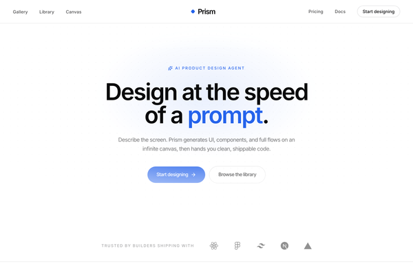
Prism - Design at the Speed of a Prompt
Minimal center-aligned marketing navbar: a true-centered wordmark flanked by symmetric link groups on a sticky white-glass header, with one low-key ghost CTA. Black-on-white (ink #0a0a0b) + a single cobalt #2563eb accent, Inter, tight tracking, a rotating diamond logo mark, clean responsive reflow to a hamburger bar.
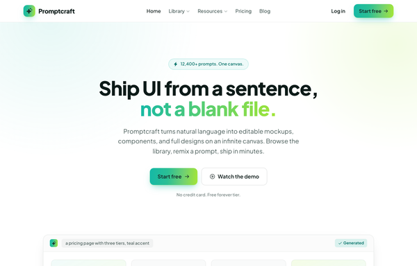
Promptcraft - Gradient CTA (teal→lime) navbar landing
A clean light-SaaS sticky navbar carried by one teal-to-lime gradient: a frosted white bar (white/85 + backdrop-blur over a hairline border) with a sparkle-tile 'Promptcraft' wordmark, five absolutely-centered nav links (Home, Library▾, Resources▾, Pricing, Blog) with a gradient underline that wipes in on hover, and a right cluster of a quiet 'Log in' link plus a gradient-filled 'Start free' CTA pill with a soft teal+lime glow shadow. Plus Jakarta Sans, Iconify Phosphor icons, gradient-text accent headline, and a hamburger reflow on mobile.
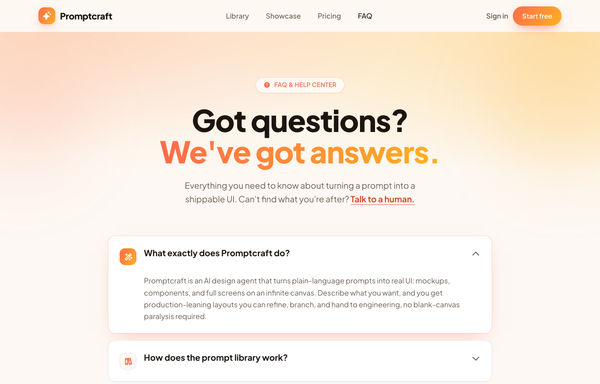
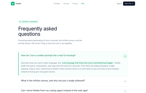
Promptcraft · Answers, sorted (gradient-CTA FAQ)
A warm, friendly FAQ / help-center page on a cream base built around one sunset gradient (coral->amber): a sticky blurred nav, a centered hero with a gradient-clipped 'We've got answers.' headline + a 'FAQ & HELP CENTER' pill over a warm radial wash with blurred blobs, a stack of soft white rounded accordion cards (one pre-opened, lifting on a coral glow with its icon tile swapping to the gradient via a grid-template-rows CSS reveal), a bold full-bleed sunset-gradient CTA card with a frosted-dark reassurance pill, and a minimal cream footer.

Promptframe - Full-Bleed Color-Block Cobalt CTA
Confident color-block SaaS landing built from full-bleed bands (white to paper gray to ONE loud cobalt to dark ink), Space Grotesk tight-tracked headlines over Inter body, anchored by a saturated cobalt CTA band with dot-grain texture, soft white and deeper-cobalt glows, and a white drop-shadow pill button.

Promptly - FAQ (card-grid-pastel)
A friendly, light-mode card-grid FAQ section on a warm cream marketing page: a sticky frosted-cream nav, then a centered header (a 'Help center' eyebrow pill, a big two-line 'Questions, answered the friendly way.' heading with a coral period, and a soft lead) over three pale blurred color blobs, then a responsive 1 / 2 / 3-column grid of rounded-4xl white FAQ cards. Each card is a native <details> disclosure with a circular toggle (sky-blue plus that flips to a coral minus when open) and a smooth grid-template-rows height reveal; open cards lift on a sky-tinted shadow and glow border. Closes with a dark-navy gradient CTA strip ('Can't find your answer?' + a white 'Chat with us' button and a ghost 'Browse the docs' button, over soft coral/sky glows) and a light social footer. Poppins font, cream #fdf9f3 ground, sky #38bdf8 + coral #fb7185 accents, ink #1f2433 text, Iconify Solar icons.
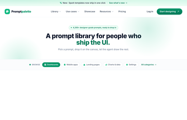
Promptpalette · classic-SaaS navbar (CTA-right) - legibility-fixed
Classic SaaS marketing navbar: left wordmark, centered links, right pill CTA on a sticky white-glass header with a gradient announcement strip; emerald-on-white, Inter, AA-legible green CTA gradient, clean responsive reflow.

PROMPTSMITH // People Who Stopped Staring at Blank Canvas
Loud neo-brutalist testimonial 'wall of proof' section for a prompt-to-UI product, on warm paper #f4f1ea with near-black ink #0a0a0a and ONE electric acid-lime accent #e8ff00. A sticky paper nav (ink + acid lightning logo, mono links, acid 'Start free' pill) over an ink->acid scrolling rating MARQUEE, then over a dotted-grain ground: a four-line Archivo-black headline ('PEOPLE / WHO STOPPED / STARING AT / BLANK CANVAS.' with the last line knocked out acid-on-ink) beside a two-cell 4.9 / 2.1k stat block, a row of filter pills, and a responsive 1/2/3-col grid of neo-brutalist testimonial cards (3px ink borders + 6px HARD offset shadows: a paper star card, an acid feature card, an inverted ink card with an acid hard-shadow, an acid pull-quote card with a giant quote glyph) with 'via X' + verified-seal trust accents and square ink/acid initials tiles. Closes on an inverted ink CTA strip ('GOT A WIN TO SHARE?' + an acid 'Leave a testimonial' pill). Archivo + JetBrains Mono, Iconify Phosphor, CSS marquee.

Proof in Navy: The Trust-Led Conversion Moment
A trust-led dark CTA on deep navy with one warm amber accent: an avatar + 5-star social-proof row, an amber payoff headline, a glowing amber primary button beside a glass demo button, a no-card check-mark trust line, a 4-up hairline stat row, and a grayscale logo trust strip.
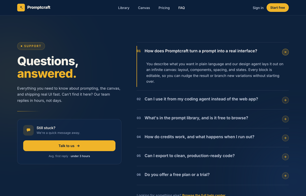
Questions, Answered - Corporate Split FAQ
A two-column split FAQ section on a full-bleed dark-navy marketing page: a sticky frosted navy nav, then a 12-column grid with a sticky left identity column (an amber 'Support' eyebrow pill, a big tight-tracked two-line 'Questions, answered.' heading with the second word in amber, a muted lead, an amber accent rule, and a 'Still stuck?' contact CTA card with a 'Talk to us' button) beside a right-hand numbered accordion (01, 02, ...) of full-width question rows split by hairline white borders, each with a circular amber plus toggle. Opening a row smoothly expands it via a grid-template-rows height animation, paints a 2px amber accent rail down the left edge, turns the question white and the number amber, and rotates the plus 45deg into an x (single-open, first open by default). Subtle dotted grain and two soft ambient glows sit behind it; closes with a dark social footer. Amber #f0b429 accent on a deep navy ramp, Inter font, inline SVG icons.
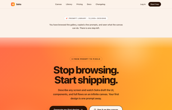
Solra - Centered Gradient Sunset CTA (legibility-fixed)
A high-conversion full-bleed end-of-page CTA band for an AI product-design tool (Solra) on a single warm coral-to-amber SUNSET gradient: a sticky frosted nav, a thin neutral context strip that names the funnel step ('Prompt library, 12,000+ designs'), then the gradient band carrying an ink eyebrow pill, a giant two-line 'Stop browsing. Start shipping.' display headline, a short subhead, a solid-ink primary + cream ghost button pair and a three-item trust line. The whole point is LEGIBILITY: contrast is bought with dark INK text + ink/cream buttons (never white-on-yellow), plus a depth-bloom + grain + seam recipe that keeps the gradient from looking flat. Plus Jakarta Sans, Phosphor icons, warm and decisive.
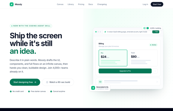
Split-image CTA - emerald (Mossly), legibility-fixed
Full-bleed split-image CTA: bold left copy with dual buttons and trust chips, a drawn product-UI mock on an emerald-washed dotted-grid right half. Light mode, emerald accent, Inter, sticky frosted nav + dark footer.

Storyframe - Stories That Tap Forward
A cinematic, full-bleed fullscreen story carousel built as a complete one-screen 'Storyframe' landing on a deep-navy palette with a single amber accent and warm cream text. A sticky translucent navy nav over a two-column hero: a 'FULLSCREEN STORY CAROUSEL . NEW PATTERN' pill eyebrow with a pulsing amber dot, a black 'Stories that tap forward.' headline (amber highlight), a cream intro and a 'Generate a story carousel' / 'See it live' button pair, beside the centerpiece: a 9/16 phone-shaped story-card mock with five segmented progress bars across the top (one animating on a 5s fillbar keyframe), a story meta row (an 'SF' avatar + 'Storyframe' + '2 of 5 . 4s'), left/right tap-to-advance zones that reveal a circular arrow on hover, and a bottom caption block (a 'Chapter 02' amber tag, a 'The Golden Hour' title, a Continue + bookmark button row), with a floating 'tap -> advance' accent card. Below: a trust strip, a 'Showcase' three-up full-bleed story-card gallery (each reusing the segmented-bars + tag + caption pattern), a full-bleed 'Prompt Library' two-column section with a 'story-carousel.prompt' code card, a 6-up bordered 'Craft' feature grid, a full-bleed gradient CTA panel and a navy footer. Inter throughout, Iconify Solar icons, immersive and cinematic.

The Dispatch - Deep-Teal Newsletter Capture CTA
A deep-teal, Inter-set newsletter capture CTA (newsletter simple left): a two-column section with a value headline on the left and an inline email field + Subscribe button, privacy line, and avatar social proof on the right, anchored by a sticky nav, an eyebrow context band, and a footer.
How to prompt a CTA section that looks designed, not generated
An AI design agent has a strong default for a call to action, and most of those defaults bury the click: a row of competing buttons of equal weight, generic labels like "Submit" or "Get Started", a low-contrast button on a busy gradient, a filler "Get Started Today" headline, no trust around the action, and the usual Inter on a purple gradient. A good prompt is really a list of constraints that override those defaults. Here is each default you need to override, the words that do it, and a template that bakes them all in.
Design a [light or dark] call to action section for [product], a [what it is] for [who it is for].
Hierarchy: ONE primary action only. If a second path is needed, make it a quiet ghost or text link, never a second solid button of equal weight.
Button label: name the outcome and finish the headline's sentence, like "Start designing free" or "Generate my first mockup", never "Submit", "Get Started" or "Learn More".
Contrast: put the primary button in one saturated accent reserved only for it, on a calm neutral section, so it clears WCAG AA (4.5:1) and is the most clickable thing on the page.
Headline: a short line that names the payoff the reader gets, not a filler "Get Started Today", with the button finishing its thought.
Trust: wrap the action in a little reassurance, a social-proof line or avatar row above it and a low-risk line under it ("No card. Free forever."), so the on-the-fence visitor has a reason to click.
Style: a neutral base with one [accent] color reserved for the primary button. Headline typeface [name], body [name], not the default Inter and no purple gradient.
One primary action
Default: It drops a row of buttons of near-equal weight, a Sign Up beside a Learn More beside a Contact Sales, so attention splits and the eye has nowhere to land. Pages with several competing links convert measurably worse than ones with a single focused action.
Constrain it: Ask for exactly one primary action. If a second path is needed, make it a quiet ghost button or a text link, never a second solid button of equal weight.
A label that names the outcome
Default: It reaches for generic verbs, a gray "Submit", a vague "Get Started" or a "Learn More" that names no outcome, so the visitor has to guess where the button leads and hesitation costs the click.
Constrain it: Make the label name the outcome and finish the headline's sentence, like "Start designing free" or "Generate my first mockup", so the visitor knows exactly what they are getting.
Contrast that makes it the click
Default: Left alone it tints the button a shade of the same busy gradient it sits on, so it reads at roughly 2:1 and blends into the section instead of standing out as the thing to press.
Constrain it: Reserve one saturated accent for the primary button on a calm neutral section, so it clears the WCAG AA 4.5:1 minimum and is unmistakably the most clickable element on the page.
A headline that names the payoff
Default: It writes a filler headline that could sit on any site, a "Get Started Today" or "Ready to dive in?" that carries no value and gives no reason to act now.
Constrain it: Ask for a short headline that names the payoff the reader gets, with the button finishing its sentence, so the pair states the value and the exact next step.
Trust around the action
Default: It leaves a bare button on a blank band with nothing to answer "is this safe, is it free, who else uses it?", so the on-the-fence visitor stalls at the moment of clicking.
Constrain it: Wrap the action in reassurance: a social-proof line or avatar row above it and a low-risk line under it, like "No card. Free forever. Cancel anytime."
Color and type
Default: Left alone it defaults to Inter, a dark theme with a purple gradient, and rainbow accents used as decoration, the house style of a vague prompt.
Constrain it: Name a headline and body typeface and one accent color on a neutral base, and reserve that color for the primary button.
Frequently asked questions
What is a call to action design?
A call to action (CTA) design is the section that asks the visitor to take one specific next step, like starting a trial or booking a demo, and the visual treatment that makes that step the most clickable thing on the page. A good CTA section pairs a short payoff headline with one high-contrast primary button whose label names the outcome, and surrounds it with just enough trust to make clicking feel safe.
Should I use one CTA or multiple CTAs on a page?
Lead with one primary action. The data is consistent that a single focused call to action converts better than several competing ones: Unbounce found landing pages with a single link convert around 13.5 percent versus about 10.5 percent for pages with five or more. If you genuinely need a second path, make it a quiet ghost button or text link, not a second solid button of equal weight, so the eye still knows where to go.
How do I write effective CTA button text?
Name the outcome and finish the sentence your headline started. Nielsen Norman Group advises against generic labels like "Submit", "Continue" or even "Get Started", because they raise an information-scent question instead of answering it. "Start designing free" or "Generate my first mockup" tell the visitor exactly what happens next, which is why specific labels reliably beat vague ones.
What colors work best for a CTA button?
The exact hue matters far less than contrast. Reserve one saturated accent color for the primary button and put it on a calm neutral section so it clears the WCAG AA minimum of 4.5:1 against its background. A button that is a shade of the same gradient it sits on is effectively invisible. Pick a color that stands out from everything around it and use it for nothing else on the section.
Why does my AI-generated CTA section look generic?
Because a vague prompt gets the model defaults: a row of competing buttons of equal weight, generic labels like "Submit" or "Get Started", a low-contrast button on a busy purple gradient, a filler "Get Started Today" headline, the Inter typeface, and no trust around the action. Constrain it to one primary action, an outcome-naming label, one high-contrast accent on a neutral base, a payoff headline, and a line of social proof, and it stops reaching for the average.
How do you write a prompt to generate a CTA section UI?
Describe the brief, not the vibe: the product and who it is for, exactly one primary action (with any second path as a ghost or text link), a button label that names the outcome, one accent color reserved for that button on a neutral base for contrast, a short payoff headline, a line of social proof and a low-risk reassurance line, and a named typeface. The template above walks through each part, and you can open any example here to see a full prompt that works.
Can I use my own brand colors and copy?
Yes. Generate the section first, then describe your accent color, typeface, headline and button label in plain language and branch a variant. Every design comes back as real, editable code, so wiring in your brand and your link happens in your own repo, not a rebuild from a picture. Stuck on something? Ping us and we will sort it out together.