Design prompts for navbars
A navbar is the first thing a visitor reads and the map they return to all day, so it has one job: tell them where they are and hand them the next step. The best ones lead with a logo that links home, three to five links named for the customer journey, a current-page state, and one clear call to action, then reflow into a labeled menu on a phone. The prompts below are the most-copied navbar and navigation designs in the Superdesign library, from sticky glass SaaS headers to mega-menus, pill navs and animated dock components. Open any one to see the exact prompt behind it, then change the links, copy and brand colors and generate your own editable version in seconds.
Magnification Dock
A premium macOS-inspired dock component with fluid magnification effects, spring physics, and tooltips. Built with Framer Motion for high-performance interactions.
Pill Nav
A premium, minimalist pill-shaped navigation component with GSAP-powered hover effects, rotating logo animation, and responsive mobile menu. Features a unique 'rising circle' background effect on hover.
Staggered Menu
A premium staggered menu with multi-layer entrance animations using GSAP. Features social links, item numbering, and smooth transitions. Source: ReactBits
Flowing Menu
A premium menu component with a flowing marquee effect on hover. Features smooth GSAP animations, directional edge detection for entry/exit transitions, and infinite scrolling image-text ribbons. Source: ReactBits

Fix Navigation Script Error
A whimsical, hand-drawn creative portfolio style with a 'sketchbook' aesthetic. Features include 'wobbly' border-radii, hard-edged black shadows, and organic handwritten typography using Kalam and Patrick Hand. The design uses a cream-colored dot-grid background (#fdfaf6) and vibrant secondary accents like orange-400, yellow-200, and blue-400. Layout elements mimic physical objects with digital tape overlays, thumbtack icons, and wavy-line decorations. Suitable for illustrators, creative developers, designers, and niche agencies looking for a high-personality, artisanal web presence.
Card Nav
A premium, expandable navigation component with card-based submenu reveals and GSAP-powered height transitions. Designed for a high-end, minimalist aesthetic.

Analytics dashboard
Professional SaaS analytics dashboard design featuring a clean, enterprise-grade aesthetic. Utilizing a refined blue brand palette (#3B82F6), high-contrast gray scales, and dual-font pairing (Inter for UI, JetBrains Mono for data logs). The layout employs a classic sidebar-and-main-content structure with bento-style metric cards, interactive grouped bar charts, and technical event streams. Ideal for fintech, developer tools, cloud infrastructure monitoring, and complex data-driven enterprise platforms.

Neumorphic Light Customization - Navigation & Theme Update
A sophisticated light-themed neumorphic (Soft UI) design system specifically optimized for SaaS admin dashboards, portfolios, and configuration panels. It utilizes a soft color palette based on #e0e5ec with high-precision shadows to create a tactile, three-dimensional physical surface. Key features include editorial typography with General Sans and Satoshi, scroll-triggered cascade animations, and complex interactive components like grid-based accordions and custom neumorphic toggles. The style is ideal for fintech, creative tools, and professional settings requiring a modern, clean, yet distinct interface.

Tidy Design System - Reusable Navigation
Replace the hardcoded <aside> sidebar element (from "<!-- Persistent Sidebar Navigation -->" to "</aside>") with the reusable Navigation component. Use this exact component tag: <sd-component componentId="1178bb72-9e1e-4bb2-bd46-db10764e0418" name="Navigation" activeItem="colors" dashboardHref="#dashboard" tasksHref="#tasks" roomsHref="#rooms" streaksHref="#streaks" scheduleHref="#schedule" settingsHref="#settings" userName="Designer" planName="System v1.0.4"></sd-component>
Bubble Menu
A playful and interactive bubble-style navigation menu with floating pill animations and staggered reveals. Uses GSAP for smooth, organic motion and hover effects.

FOB Protocol | Global Navigation & Integration
Industrial cyberpunk design system tailored for high-tech AI protocols, fintech platforms, or developer-centric SaaS. Features a high-contrast dark mode aesthetic with a 'trust layer' theme. Utilizes a deep black background (#050505) punctuated by vibrant neon accents in cyan (#00f2ff), magenta (#ff00e5), and lime (#adff00). The layout leverages a sophisticated bento grid, glassmorphism cards with 12px blur, and technical overlays like animated scanlines and grid patterns. Typography is a pairing of brutalist Cabinet Grotesk for headlines and technical Space Grotesk for mono-data, creating a futuristic, secure, and data-rich atmosphere suitable for blockchain, cyber-security, or automated economy interfaces.

Colobus Curio | Integrated Navigation
An editorial, museum-inspired design system titled 'Colobus Curio'. It features a sophisticated 'Curio Cabinet' aesthetic blending classical archival elements with modern AI curation. Key visual markers include a cream and deep-green palette, gold accents, 'Playfair Display' serif typography, and a subtle noise texture. Ideal for high-end digital archives, luxury catalogs, historical research platforms, and boutique e-commerce where heritage and craftsmanship are central themes.

Contact Page Navigation Update
A sophisticated editorial design system inspired by museum archives, curatorial records, and scholarly institutions. Featuring a palette of deep hunter green (#00604a), crimson red (#bd264a), and antique cream (#fefdef), it employs a mix of high-contrast 'Playfair Display' serif and 'Outfit' sans-serif typography. Suitable for luxury boutiques, historical archives, educational institutions, high-end portfolios, and antique dealerships. The aesthetic is defined by subtle noise textures, ornamental gold accents, and a rigid, symmetrical layout structure with intentional white space and fine-line dividers.

Role-Based Side Drawer Navigation
A context-aware side drawer that dynamically adapts navigation items based on user role, permissions, or state while maintaining a consistent structural layout. Best Suitable For Enterprise software, multi-role platforms, CRM systems, workflow tools.

Random Bot - Refined Header Navigation
A high-tech, premium dark-mode design system tailored for Discord bots, SaaS platforms, or developer tools. It features a sophisticated palette of neon accents (#f04444, #14b8a6, #fbbf24) against a deep navy background (#0f172a). The aesthetic combines glassmorphism, editorial typography with 'Cabinet Grotesk' and 'Satoshi', and scroll-triggered spring animations. Key features include animated mesh backgrounds, bento-style feature grids, and interactive simulation components like terminal logs and UI previews.

Coverflow - Carousels that turn heads (dark coverflow aurora)
A dark, aurora-lit 3D coverflow carousel landing page: a sticky frosted-ink nav, then a centered hero (a 'depth-aware coverflow engine' status pill, a big 'Carousels that turn heads, not stomachs.' heading whose 'turn heads' is teal-to-magenta gradient text, and a soft lead) wrapping a real CSS 3D coverflow stage. Seven gradient cards sit on a 1600px perspective stage: the active card faces front with a teal glow ring while neighbours rotate ~42-48deg and recede in Z, scaling and fading by distance, each card carrying a top-left sheen and a bottom gradient label. Below the stage, a round glass prev button, pill dots (active = a wide teal-to-magenta gradient bar), and a next button; clicks, dots, arrows and the left/right keys re-lay the stage. Then a CTA pair, a grayscale logo strip, a 3-up glass feature grid, a 'from prompt to motion' showcase split with a faux terminal card, a gradient-thumb templates grid, a dark gradient CTA, and a social footer. Inter + Space Grotesk fonts, near-black ink #0b0f14 ground, aqua #2dd4bf + magenta #e879f9 accents, glass panels and aurora blobs, Iconify Phosphor icons; responsive geometry drops far cards on small screens and collapses the nav into a hamburger.

Hybrid Tab +FAB Navigation
A combined system where bottom tabs handle global navigation while a floating action button provides instant access to high-frequency actions across all sections. Best Suitable For Social apps, productivity platforms, content creation tools, AI assistants.

Responsive Wireframe Mega Menu
A visual mega menu where navigation links are paired with product or collection preview blocks. Emphasizes visual recognition and quick entry into key pages. Best suited for Fashion, beauty, visually driven brands where product appearance influences navigation decisions.

Side drawer navigation
A side drawer navigation system that keeps the primary screen visually clean while housing a large number of global destinations and utilities in an off-canvas panel. Best Suitable For Enterprise apps, admin tools, B2B SaaS, internal dashboards, configuration-heavy products.

Gesture First Navigation System
A content-first navigation system that minimizes visible chrome and relies primarily on swipe gestures to move between major sections, creating an immersive and fluid experience. Best Suitable For Media apps, reading apps, gallery-style products, experimental consumer experiences.

Top Segmented Tab
A top segmented tab system used to switch between parallel views within the same context. Content changes instantly without triggering full navigation, keeping users mentally anchored. Best Suitable For Analytics views, dashboards, comparison tools, inboxes, financial breakdowns.

VOLTKIND - We Build Bold Brands Online
A bold, dark, editorial agency-studio homepage: near-black noir #0c0c0c surfaces with a single acid-lime #c4ff00 accent and off-white #f5f5f0 text. A pill-shaped floating glass nav, a massive Anton condensed-uppercase hero headline ('WE BUILD BOLD brands ONLINE.') with an italic Archivo 'brands' in lime, an infinite-scroll keyword marquee, a stat-counter studio statement, a 2-column rounded-card 'selected work' grid with hover reveals, a hover-fill numbered services list, a clients/awards logo grid, a huge centered CTA, and a 4-column footer with a newsletter input. Anton + Archivo + Inter, lime-on-noir, award-site energy.

Bottom Tab- Primary Action Navigation
A bottom tab system where the center tab is reserved for a primary action instead of navigation. The action opens a modal or creation flow while preserving the underlying page state, enabling fast task execution without losing context. Best Suitable For Creator apps, AI tools, task managers, social posting apps, productivity software.

Hierarchical Segments
A segmented tab layout that represents sub-sections under a single parent page. The parent context remains fixed while users move laterally between related sections. Best Suitable For Profile pages, settings areas, product detail views, account management screens.

Bottom Tab Navigation - Core App Shell
A stable bottom tab navigation system where each tab represents a top-level destination with its own navigation stack. The tab bar persists across primary screens, creating a predictable and scalable app shell. Best Suitable For Consumer apps, SaaS tools, marketplaces, content platforms, fintech dashboards.

One Link, No Passwords - Passwordless Magic-Link Sign-In
A passwordless 'magic-link' sign-in page on a soft off-white canvas with a single teal accent: sticky nav, a two-column hero (pitch + benefits) beside a magic-link login card AND a 'Check your inbox' success card, plus Google/SSO social, a 3-step how-it-works, and a dark security stat strip.

Robust Gesture Navigation System
A gesture-driven navigation system augmented with subtle fallback controls. Gestures remain primary, while visible affordances ensure accessibility, discoverability, and reliability. Best Suitable For Advanced consumer apps, onboarding-sensitive products, apps with broad user skill ranges.

Anvil - Design, generated (minimal mono graphite CTA)
Quiet monochrome graphite-on-paper SaaS landing in Inter, no color accent at all, anchored by a single centered CTA card framed by four corner registration-mark ticks, with a hairline eyebrow pill, a tight headline, one dark graphite primary pill beside a hairline ghost, and a hairline-divided trust line on a faint dotted-grain canvas.

ATELIER - Mono Uppercase Fashion (legibility-fixed)
A stark monochrome high-fashion editorial navbar (Toteme-style): a sticky frosted-white bar that packs three zones at once: uppercase wide-tracked text links pinned left (New / Library / Studio / About), an absolutely-centered Archivo Expanded 'ATELIER' wordmark in the dead center, and a right cluster of two more uppercase links (Search, Account) plus a Phosphor handbag icon with a '(0)' bag count. Pure black ink (#0a0a0a) on white (#ffffff) over a single hairline border, with a 1px underline that wipes in under each link on a long couture ease. Below lg the left links collapse into a hamburger drawer while the wordmark stays centered, and the legibility fix keeps the wordmark's 0.34em letter-spacing at every breakpoint.

AURELIO - Cinematic Hero (cinematic-dark-warm)
Cinematic dark-warm hero section: a full-bleed dusk cityscape photo graded toward amber, layered with a warm sepia wash, an amber atmosphere bloom and a heavy vignette, under a translucent blurred sticky nav. Space Grotesk display + Inter body on near-black #0a0a0c with an amber #f0a868 accent and cream #f5f1ea text; a huge clamp headline with an amber gradient word, a live-showreel pill, an amber gradient CTA + ghost watch button, a trust row, and a bottom showreel control bar with a scroll cue.

Aurora Glass - Sign Up at the Speed of Thought
A premium dark glassmorphism sign-up screen: a one-screen hero+signup landing on a near-black ink canvas lit by a slow-drifting teal+magenta aurora and film grain, under a translucent sticky glass nav. A two-column hero splits a marketing pitch on the left (a 'no card' trial pill, a Space Grotesk headline with a teal-to-magenta gradient 'speed of thought.' line, a teal-check benefit list and a 4.9-star social-proof cluster) from a frosted-glass auth card on the right that carries a teal-to-magenta gradient edge-light: Google + GitHub buttons above an 'or with email' divider, icon-leading full-name / email / password fields with a Show/Hide toggle and a four-segment strength meter, and a teal-to-magenta gradient 'Create account' CTA. Teal + magenta accents, Inter + Space Grotesk, plus a full-bleed glass trust strip.

Cardstack - playful bento card designs
Playful candy-pastel bento card-library landing page ('Cardstack - Beautiful cards, snapped into place') on a warm cream canvas: a sticky cream glass nav, a centered hero with a sunny highlighter headline and rotated floating sticker chips, and a colorful bento grid whose 2x2 deep-sky gradient feature card (with a nested mini-bento preview) anchors sunny stat, coral quote, white mini-stat and ink CTA cards, plus a How-it-works band, a gradient-header kit grid, and an ink-gradient pricing banner. Cream + sky + coral + sunny + ink, set in Poppins with Phosphor icons; cards wiggle and tilt on hover.

Carousel - Logo Marquee (teal)
A clean, light SaaS landing page built around an infinite logo-marquee carousel: a sticky frosted white nav (a teal rounded-square carousel-icon logo + a 'Carousel' wordmark, a hidden-on-mobile link row -- Customers / Product / Library / Pricing -- a ghost 'Sign in' link and a solid teal 'Start free' pill, plus a mobile hamburger), then a centered grid-textured hero (a teal 'Design system, generated in seconds' status pill, a big 'Ship interfaces the whole world already recognizes' heading whose 'recognizes' is teal with a hand-drawn SVG underline swash, a soft lead, and a primary teal 'Generate your first design' button + a ghost 'Watch the canvas' button). The anchor section is a two-row trusted-by logo marquee: 'Trusted by design & product teams at', then two edge-faded infinite-scroll rows of icon+wordmark logo chips (the top row scrolls left at 40s, the bottom row scrolls right at 28s), each row duplicated twice so the CSS translateX(-50%) loop is seamless, with a left/right transparent mask fade at the edges and a hover-to-pause + per-logo teal tint. Below it: a 4-up metric trust strip (57k+ / 2.4M / 4.9/5 / 12s) in a hairline-divided rounded card, a 3-up feature grid (Prompt to mockup / Infinite canvas / Clean export), a teal gradient CTA card with corner glow blobs, and a social footer. Inter font, teal #0f766e + #0d6660 + #115e59 accents on a slate #f8fafc ground, Iconify Phosphor icons, and a responsive reflow that collapses the nav into a hamburger.

Carousel Design - Brutalist Slider
A raw neo-brutalist slider carousel built as a complete one-screen 'Carousel/Design' landing on an off-white paper palette (#f4f1ea) with pure-black ink and a single acid-yellow accent (#e8ff00). Hard 3px black borders, blocky offset drop shadows (8px 8px 0 #000), heavy Archivo Black uppercase headlines and Space Mono labels. A sticky paper nav with a square 'C' logo sits over a grid-paper hero (a 'CAROUSELS that don't blink' headline with an acid highlight + a 2x2 brutalist stat-slab grid). The centerpiece is a no-JS radio-driven BRUTALIST SLIDER: a bordered slide panel with a hard acid+ink offset shadow, chunky square prev/next arrow buttons, an oversized blocky numeral index in an inverted ink/acid slab, and a row of 3 square index buttons; three slide layouts (acid 'Stacked panel', paper 'Split feature', inverted-ink 'Invert hero') snap with zero fade. Below: a scrolling ink marquee strip, a 6-up bordered feature 'Kit' grid, a 'prompt.txt' code slab with acid-highlighted tokens, a 3-tier brutalist pricing grid, an acid CTA band and a paper footer. Archivo / Archivo Black / Space Mono, Iconify Phosphor icons, tactile press (buttons travel on click), fully responsive.

Design at the Speed of Prompt - Brutalist Acid Navbar
A full-bleed neo-brutalist 'acid' sticky navbar: an electric acid-yellow band with a hard 3px ink-black border holding a boxed-monogram PROMPTS/LAB wordmark, wipe-in underline center links, and a cluster of square paper-white hard-shadowed buttons (a ⌘K search field, an 8.4k star count, an X-social icon) ending in a black-on-acid START FREE CTA, with a black Space-Mono ticker marquee scrolling beneath. Archivo Black + Space Mono, Lucide icons, chunky offset box-shadows, every control presses on hover/active, and it collapses to a burger + stacked acid drawer on mobile.

Design at the Speed of Thought - Editorial Split Sign-Up
An editorial, magazine-style sign-up screen built as a full split-screen landing: a sticky translucent cream nav over a two-pane main. The LEFT is an oversized Fraunces-serif brand panel on a textured deep-burgundy ground (film grain, faint concentric arcs, a soft bloom) with an 'Issue 06 . The Design Agent' eyebrow, a 'Design at the speed of thought.' display headline (italic 'speed'), a value paragraph and a pull-quote testimonial with an initials avatar plus a three-icon feature row. The RIGHT is a near-black ink account-creation column: a 'Start designing, free.' heading, Google + GitHub OAuth buttons above an 'or with email' divider, white burgundy-focus-ring email + password fields (an eye toggle + a four-segment strength meter) and a burgundy 'Create account' CTA. Below the split: a full-bleed cream 'Trusted in the studios shipping fastest' proof strip and a dark ink FAQ/footer accordion. Cream + burgundy + ink palette, Fraunces serif + Inter.

Design at the Speed of Thought - Lumen Pricing Tiers
Light SaaS pricing section with a teal accent: sticky glass nav, centered heading + monthly/annually toggle, and a 3-tier card row where the middle 'Pro' tier is a scaled-up, solid-teal 'Most popular' card flanked by two white ghost cards.

Design at the Speed of Thought - Sunset Centered Hero
A warm golden-hour centered hero: a soft cream-to-peach sunset gradient field, an oversized two-line headline with a coral-to-amber gradient accent line, and a single frosted glass pill that combines an envelope icon, an email field and a gradient sign-up button, over a sticky frosted nav, avatar social proof and a trusted-by logo strip.

Dual-CTA card (pastel) - contrast fixes applied
Warm pastel SaaS landing on a cream field with a sky-blue + coral two-tone gradient, all in Poppins, anchored by a centered white rounded-5xl dual-CTA card floating with a soft two-tone shadow, inner glows, bobbing decor squares, a sky-gradient primary pill beside a coral-outline secondary, and a gradient-clipped headline phrase.

Editorial Violet SaaS Pricing Matrix
A light, editorial SaaS pricing page led by a full-width grouped comparison matrix with a sticky 3-plan header, electric-violet accent, and a monthly/annual toggle.

FAB Navigation
A navigation pattern centered around a persistent floating action button that opens creation or quick-action flows without changing the current page. Navigation remains lightweight and task-oriented. Best Suitable For Note-taking apps, task apps, design tools, capture-first utilities.

Faktur - Editorial Serif Burgundy Navbar (legibility-fixed)
A sticky editorial serif navbar in cream, ink, and burgundy: a frosted translucent bar with a hairline rule, an upper/lower Fraunces wordmark, small-caps uppercase links with a grow-from-left underline, and an italic-serif burgundy 'Start designing' text CTA.

Floating Pill Coral navbar - legibility fixes applied
A sticky floating-pill navbar in a warm coral-and-cream palette: a blurred white rounded-full bar floating inset from the top, sparkle logo, a centered inner pill link group with a raised white active pill, and a solid coral Start free CTA.

Forge.Supply - The Utility Nav, Built for Real Catalogs
A sticky two-tier ecommerce utility navbar in white, ink, and a single sale-red: a black utility strip above a white main bar with a bag-icon wordmark, a search-first inline field with an 'All' dropdown and red submit, an account chip plus a cart icon with a live red count badge and a black 'Sell with us' CTA, over a hairline category rail whose links grow a red underline on hover.

Formcraft - Workspace Settings (cobalt two-column)
A two-column SaaS workspace-settings screen: sticky app nav, left section nav, grouped settings cards with toggles, a segmented control, selectable delivery cards, and a fixed save bar, in Inter on slate with one cobalt accent.

FORMHAUS - Agency Website (Brutalist Red)
A warm neo-brutalist agency homepage in a paper-cream and ink palette with one hot red signal accent: a red top accent tape over a sticky paper nav, a giant black tight-tracked Archivo wordmark hero ('Websites that refuse to blend in.' with one red word) beside a red-hard-shadowed CSS-gradient canvas block and bordered stats, a black client marquee, a 2px-bordered hard-shadow 'Selected work' grid, a 4-up stats strip, an invert-on-hover numbered services list, dark Method phase cards, a full-red 'Let's build something loud' contact section, and a black footer. Built from a universal 2px ink border language, hard offset box-shadows, JetBrains Mono uppercase labels, an SVG grain overlay, and exactly one red accent (#e5341f) on paper (#f4f1ea) + ink (#0a0a0a).

Forms in Low Light - A Graphite Image Carousel
A calm, editorial image carousel built as a complete one-screen gallery landing on a graphite + off-white 'paper' palette with a single platinum accent. A sticky translucent paper nav over a centered hero band (a 'Carousel Design' pill eyebrow, an extrabold tight-tracked 'A gallery that frames the work, not itself.' headline, a muted intro line), then the carousel: a meta row ('Editorial Set 04' / 'Forms in Low Light' + an '03 / 09' counter) above a single commanding 16:9 hero frame on a near-black graphite stage with a soft bottom vignette, quiet glass prev/next caret arrows that stay calm until hover, a bottom-left 'Frame 03 / Ridge at Dusk' caption, a bottom-right glass play/fullscreen cluster and centered dot pagination, synced to a horizontally-scrolling thumbnail strip whose active thumb wears a double-ring highlight (the rest at 55% opacity, brightening on hover, the right edge masked). Below: a hairline-gridded three-up feature row, a full-bleed dark graphite palette section with a four-swatch ramp (#1c1c1e / #2c2c2e / #c7c7cc / #fbfbfa) and an 'Open the editor' CTA, and a paper footer. Inter throughout with tight display tracking.
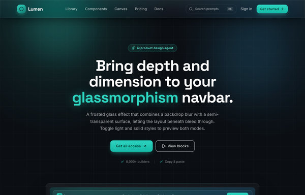
Frost & Field - A Sticky Glass Navbar in Deep Aqua
Sticky frosted-glass navbar in deep aqua: a fixed top-0 .glass bar (backdrop-blur 18px + saturate, white/8 border, inset highlight, aqua hairline on top) the page scrolls beneath. Left aqua-gradient hexagon wordmark 'Lumen' (Space Grotesk), center nav links with a grow-from-left aqua underline, right a ghost ⌘K search + 'Sign in' + one glowing aqua 'Get started' CTA. Inter body, ink-black #0b0f14 canvas, single #2dd4bf accent, collapses to a glass burger drawer. Dark page.

Glide - Carousels that feel delightful to swipe
A cheerful, friendly multi-card carousel built as a complete one-screen 'Glide' landing on a warm cream palette with a sky-blue + coral gradient accent. A sticky translucent cream nav over a centered hero (a 'Prompt library . Carousel pattern' pill eyebrow, an extrabold 'Carousels that feel delightful to swipe' headline whose 'delightful to swipe' runs a sky-to-coral gradient clip under a hand-drawn coral underline squiggle, a muted intro line, and a 'Try the carousel' / 'Copy the prompt' button pair). Then the carousel inside a big white rounded showcase panel: a 'Featured collections' meta row + a 'Draggable' pill above a draggable, scroll-snapping track of rounded cream cards (three in view on desktop, two on tablet, one peeking on mobile), each with a floating gradient icon tile, a numbered category pill, a title, a description and a swatch/feature footer, driven by rounded prev/next arrows that hover to the accent color and a dot-pagination row whose active dot stretches into a sky pill. Below: a full-bleed white 'Why Glide' feature band (a three-up card row), a 'How it works' two-column section with a floating 'prompt.txt' code-card mock, a full-bleed sky-to-coral gradient CTA panel, and a cream footer. Poppins throughout, Iconify Phosphor icons, cheerful and soft.

Graphite - Cards in monochrome
Restrained monochrome card design-system landing page ('Graphite - the quiet card, done right') with no brand color: a sticky paper glass nav, a split hero with a featured card floating over a ghost-card stack, a dark principles marquee, an annotated Anatomy + spec list, a 3-up Gallery with one inverted dark focal card, a five-swatch Tokens palette, and a dark 'copy the component' CTA, all in graphite + platinum + paper, set in Inter with Phosphor icons.

HYPERBLOK - Maximalist Vibrant Agency Website
A maximalist, neo-brutalist agency / design-studio homepage: full-saturation magenta #ff2db7 + cyan #00d4ff + yellow #ffd000 on white/ink #0a0a0a, flat color blocks with thick 3-5px black borders and hard offset pop-shadows (no blur, no gradients), a giant uppercase Archivo Black headline with color-highlighted words, Space Grotesk UI, a sticky nav, oversized bordered project tiles with abstract icon-on-color-grid art, a services card grid, two scrolling marquees, and a bold floating-shape CTA. Loud, playful, conversion-shaped.

Loomly - Sunset Spotlight Testimonial
A warm full-viewport 'sunset spotlight' testimonial section built around one big editorial pull-quote, centered on a layered coral/amber golden-hour gradient with cocoa-ink type, a gradient-ringed avatar, a coral->amber 'Start free' nav and a legibility-safe darkened-gradient highlight on the key clause. Plus Jakarta Sans, Iconify Phosphor.

Loved by builders - Promptkit testimonial wall (mono tweet wall)
A calm Twitter/X-style 'wall of praise' testimonial section on clean white with warm-grey tweet cards, monochrome initials avatars and a single muted slate-blue accent for stars and verified ticks, laid out as a responsive CSS-columns masonry under a sticky nav, with an aggregate '4.9 average' trust row and a closing 'add your post to the wall' CTA. Inter, Iconify Solar.

Loved by makers - a pastel masonry wall of designer voices
Bright pastel testimonial MASONRY WALL section for a prompt-to-UI product: a sticky frosted-cream nav, a centered header (heart 'Loved by 57,000+ makers' chip + a Poppins extrabold headline whose tail sits over a hand-drawn sky highlight swipe), and a true CSS-columns masonry wall (1/2/3 responsive) of testimonial cards, mostly plain white with two oversized HIGHLIGHTED gradient cards woven in (one sky #38bdf8, one coral #fb7185) carrying white text, a giant corner quote-mark and a glassy avatar. Coral five-star ratings, initials avatars, a sky verified seal + an X-share badge, and a footer CTA strip (overlapping +5k avatar cluster + 'Join the wall. Start designing free'). Soft pastel shadows with hover lift over a dotted-grain + ambient sky/coral glow ground. Poppins, Iconify Phosphor icons, vanilla-JS hamburger menu.

Lumen Atlas - Cinematic Websites That Feel Inevitable
A cinematic dark-mode agency / design-studio website on a deep-plum to warm-ember sunset gradient (ink #0a0a0f surfaces, plum #3b1d5e, ember #ff7a3d, cream #f4efe9 text, Space Grotesk + Inter): a glassy sticky nav, a full-bleed hero with an ember-to-violet gradient-clipped headline + showreel panel + stats strip, a big-imagery work showcase with hover-zoom gradient cards, an auto-scrolling award marquee, a capabilities card grid, a studio/process strip, a dramatic sunset contact CTA, and a 4-column footer. Layered sun-bloom glows + SVG film grain, generated gradient 'photography' (no external assets).

Mega-Menu Navy - navbar (improved per critic)
Corporate-calm mega-menu navbar: a sticky deep-navy bar (#0b1f3a) with an amber accent (#f0b429), an announcement strip above and a wide white drop-down mega-menu below: three labeled link columns (icon + title + one-liner) plus a navy gradient 'Featured' card with a prompt-to-UI micro-interaction. Inter, rounded-lg controls, one high-contrast amber CTA, and a clean responsive collapse to a navy accordion drawer. Light page, dark header.
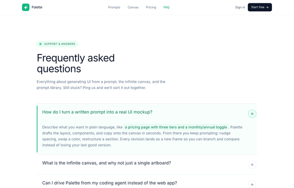
Palette - FAQ (Classic Accordion, Emerald)
A clean, classic single-column FAQ accordion on a light SaaS page: a sticky frosted-white nav, an emerald eyebrow pill with a pulsing live dot, a big tight-tracked Frequently asked questions heading, then full-width question rows split by hairline borders, each with a circular plus-to-x toggle. Opening a row smoothly expands it via a grid-template-rows height animation, washes it faint emerald, paints a 3px emerald accent rail down the left edge and turns the question emerald (single-open, first open by default), and it closes with a friendly Talk to us CTA strip. Emerald #10b981 accent on a cool-slate ink ramp, Inter font, Iconify Phosphor icons.

Palette - Social-first friendly sign-up
A warm, social-first sign-up screen on a cream canvas: a two-column hero+signup landing with a friendly product pitch on the left (hand-drawn underline, teal-check benefits, a 5-star social-proof cluster) and a white rounded card on the right that leads with three full-width stacked social-auth buttons (Google, GitHub, Apple) above an 'or sign up with email' divider and a single email field with a coral 'Create account' CTA. Coral + teal accents, Poppins, a sticky blurred nav, a logo marquee, a three-step how-it-works, and a dark gradient CTA band.
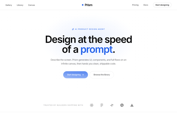
Prism - Design at the Speed of a Prompt
Minimal center-aligned marketing navbar: a true-centered wordmark flanked by symmetric link groups on a sticky white-glass header, with one low-key ghost CTA. Black-on-white (ink #0a0a0b) + a single cobalt #2563eb accent, Inter, tight tracking, a rotating diamond logo mark, clean responsive reflow to a hamburger bar.

Prism - Design at the speed of thought (Swiss big-type red hero)
Swiss / International-Typographic-Style hero section for an AI design tool: pure white ground, near-black Inter type and one hot signal red. A 12-col grid with a HUGE three-line Inter 800 headline ('Design at / the speed / of thought.') where only the last word is red, an index-rule eyebrow, a single underlined uppercase CTA and a trust row, paired with an angled clip-path 'canvas' panel of floating generated artifacts (red block, component card, swatch chip, prompt tag), a sticky blurred nav and a full-bleed use-case marquee.
How to prompt a navbar that looks designed, not generated
An AI design agent has a strong default for a navbar, and most of those defaults waste the slot: six equal ghost links, no current-page state, two competing buttons, an indigo gradient and the Inter typeface. A good prompt is really a list of constraints that override those defaults. Here is each default to override, the words that do it, and a template that bakes them all in.
Design a [dark or light] sticky navbar for [the product] that tells a visitor where they are and hands them their next step.
Logo: a wordmark on the left that links to home, the universal way back.
Links: [3 to 5] links named for the customer journey, for example Product, Pricing, Docs, Customers. Use real labels, not "Resources" or "Company".
Current state: mark the active link with weight and an accent underline so the visitor always knows where they are.
Primary action: one action-specific CTA on the right like "Start free trial", with a quiet secondary "Sign in" beside it. Not two competing buttons.
Sticky behavior: a compact bar that stays put on scroll, capped at five items with the rest in an overflow menu, and scroll-padding so anchor links are not hidden under it.
Mobile: collapse into a labeled "Menu" toggle that opens a full-screen or side drawer, with tap targets at least 48px.
Style: a neutral base with one [accent] color reserved for the active link and the CTA. Typeface [name], not the default. No indigo gradient.
Accessibility: a native nav landmark, keyboard-operable dropdowns, a visible skip link, and WCAG-level contrast on every label.
Link count and labels
Default: It drops six or more equal links with vague labels like Resources and Company, so there are too many choices and none of them is the real journey.
Constrain it: Ask for three to five links named for the customer journey, with real labels like Product, Pricing, Docs and Customers. Webflow and most navbar guides put the sweet spot at three to five.
The logo as a home anchor
Default: It places a decorative icon-plus-wordmark that links nowhere, so visitors lose the universal way back to home.
Constrain it: Ask for a left wordmark that links to home, the exit users expect on every page, anchoring the start of the bar.
One clear call to action
Default: It stacks two competing gradient buttons and a vague "Get Started", so no single next step stands out.
Constrain it: Ask for one action-specific primary CTA on the right, like "Start free trial", with a quiet secondary "Sign in" beside it so the next step is obvious.
Current-page state
Default: It makes every link look identical, so there is no current-page state and the visitor cannot tell where they are.
Constrain it: Ask for the active link to be marked with weight and an accent underline or pill, so the navbar always answers "you are here".
Mobile reflow
Default: It either crams the desktop links onto a phone or hides them behind a bare hamburger with no label.
Constrain it: Ask for a labeled "Menu" toggle that opens a full-screen or side drawer with large tap targets. Nielsen Norman Group found hidden navigation is used in only 27% of cases and is 39% slower than visible navigation.
Sticky behavior and color
Default: Left alone it builds a fixed indigo-to-purple gradient bar in Inter, packed with seven or more items, that eats the screen and breaks on zoom.
Constrain it: Ask for a compact sticky bar capped at five items with the rest in an overflow menu, one accent on a neutral base, a named typeface, and scroll-padding so anchor links are not hidden under it.
Frequently asked questions
What makes a good navbar?
It answers two questions fast: where am I, and where do I go next. Lead with a logo that links home, three to five links named for the customer journey, a clear current-page state, and one call to action. Keep it consistent on every page, reflow it into a labeled menu on mobile, and reserve one accent color for the active link and the CTA. Restraint and a clear hierarchy do more than another link ever will.
How many items should a navbar have?
Three to five primary links is the common sweet spot. That keeps the choices scannable, lowers cognitive load, and leaves room for readable labels without truncation. If you genuinely have more, group the extras into a dropdown or an overflow "More" menu rather than stretching the bar, and never push past five items in a sticky bar.
Should a navbar be sticky or fixed?
Sticky usually wins for pages where people navigate a lot, like landing pages, docs and product pages, because it keeps the links and CTA in reach without the visitor scrolling back up. Keep it compact, cap it at about five items, and add scroll-padding so anchor links are not hidden under it. Watch the accessibility traps: sticky bars can break on zoom and cover focusable elements, so test with the keyboard.
Where should the logo and CTA go in a navbar?
Put the logo on the left, because that is where people look for it, and make it link home. Put the primary CTA on the right, where the eye lands last, and keep it to one action-specific button like "Start free trial" with a quiet "Sign in" beside it. The links in the middle should map to your customer journeys, not your internal org chart.
Why does my AI-generated navbar look generic?
Because a vague prompt gets the model defaults: a floating dark bar with an indigo-to-purple gradient, the Inter typeface, six equal ghost links with no current-page state, and a vague "Get Started". Name three to five real link labels, ask for a current-page state and a labeled mobile menu, set one accent color on a neutral base, pick a named typeface, and it stops reaching for the average.
How do you write a prompt to generate a navbar?
Describe the job, not the vibe: a logo that links home, the three to five real link labels, the active-state treatment, one action-specific CTA, how it sticks and reflows on mobile, and one accent color on a neutral base with a named typeface. The template above walks through each part, and you can open any example here to see a full prompt that works. Stuck on something? Ping us and we will sort it out together.