Design prompts for startup websites
A startup website has one job: in a few seconds, tell the right person what you do, who it is for, and why it is worth a click. The best ones lead with a specific value proposition, show the real product instead of a decorative blob, build the page as a story from promise to proof to price, and keep one clear call to action. The prompts below are the most-copied startup and SaaS landing page designs in the Superdesign library, from bold editorial launches to clean developer-tool homepages and waitlist pages. Open any one to see the exact prompt behind it, then tweak the copy and generate your own editable version in seconds.

Lumina SaaS Landing Page
Lumina is a high-energy, Neo-Brutalist B2C SaaS design characterized by its bold #ffe17c yellow primary color, heavy 2px black borders, and zero-blur hard shadows. It utilizes a striking combination of 'Cabinet Grotesk' for display-heavy typography and 'Satoshi' for body copy. This style is ideal for the creator economy, modern fintech, edtech, or any startup looking to break the 'clean corporate blue' mold with a confident, high-contrast interface. The layout features bento-style grids, marquee animations, and playful asymmetric card shapes.

Softly - Digital Wellness App
A soft-aesthetic, Gen-Z oriented design system optimized for wellness, meditation, journaling, and lifestyle brands. Features a warm off-white foundation (#FDFCF8) layered with soft pastel accents (Coral #FFB7B2, Sage #E8EFE8, Lavender #EFEDF4), grain-textured overlays, and a mix of modern geometric sans-serif ('Outfit') and organic handwriting ('Reenie Beanie') typography. The layout emphasizes breathing room, gentle scroll-triggered reveals, and 'floating' organic shapes to reduce cognitive load and evoke a sense of calm.

Mosaic Grid Architecture Style
An architectural, technical-blueprint style design system featuring a minimalist mosaic grid, forest green (#1A3C2B) and light-gray paper-textured (#F7F7F5) palette. Optimized for B2B SaaS, developer tools, and high-end agency portfolios. Key features include editorial typography with Space Grotesk, JetBrains Mono labels, bento grid layouts, and 2D flat wireframe aesthetics with zero shadows.

SaaS Landing Page for Developer Tool
A bold modernist design system inspired by exhibition poster aesthetics and technical documentation. Characterized by a high-contrast 'cream and cobalt' color palette, oversized aggressive typography, and a rigid 12-column grid layout with 1px border dividers. This style is ideal for technical SaaS, developer tools, high-end design agencies, or architectural portfolios. Key elements include tight line-heights (0.85), no rounded corners, and a unique vertical labeling system in a dedicated left-hand grid column.

Futuristic SasS Landing Page
A modern, atmospheric SaaS design system featuring a high-contrast blend of dark mode hero sections and light mode content areas. Characterized by glassmorphism, sophisticated serif-sans typography pairing, and ethereal glows, it is ideal for AI startups, design tools, creative portfolios, and premium digital platforms. The style emphasizes depth through backdrop blurs, subtle borders (1px), and smooth micro-interactions like scroll-triggered navigation and hover-based transforms.

Bold Editorial Style
A high-contrast, editorial-style SaaS landing page design optimized for designers and creative tools. It features bold Anton display typography, a sophisticated palette of golden yellow (#ffe17c) and deep charcoal (#171e19), and a structured layout combining grid patterns and bento-box feature blocks. This style is characterized by aggressive visual hierarchy, oversized headlines, and a minimalist yet punchy aesthetic suitable for high-velocity startups, fintech, or creative agency portfolios.

Minimalist Beta Capture
A high-end 'Editorial Brutalist' style guide optimized for SaaS waitlists, fintech, or premium developer tools. It features a dark-mode palette (#080808), high-contrast monochromatic typography (DM Serif Display + Geist Mono), and sophisticated glassmorphism. The layout utilizes a bento-grid structure and fluid width (92vw) with oversized hero typography. Key features include scroll-triggered slide-up animations, a silver-metallic gradient system, and a persistent floating mobile navigation bar.

Neon Velocity Countdown
A high-velocity, futuristic dark-mode design system characterized by neon accents, brutalist typography, and 3D glassmorphism. Featuring a 'Laser Green' and 'Navy Black' palette, it utilizes 'Plus Jakarta Sans' for high-impact headlines and 'Geist Mono' for technical metadata. This aesthetic is ideal for high-growth tech startups, SaaS platforms, developer tools, and fintech products that want to convey speed, precision, and cutting-edge innovation. The layout uses a bento-grid structure, fluid typography, and sophisticated scroll-triggered reveal animations.

Chrome Extension Landing Page
A browser-native developer tool aesthetic characterized by a 'system interface' look rather than a marketing landing page. This style features a light-neutral base with a vibrant cyan (#06B6D4) accent, mimicking the layout of Chrome DevTools or a workspace IDE. It uses a combination of Inter for primary readability and JetBrains Mono for technical labels and commands. Suitable for SaaS, developer tools, extensions, and technical platforms requiring a high-density, utility-focused layout with scroll-triggered panel reveals and simulated interactive environments.

Superdesign Editorial Waitlist
Editorial waiting list landing page with a cinematic, high-fashion aesthetic. Features a deep matte #181818 background, warm beige #EBDCC4 typography, and a brutalist yet refined grid. Key elements include oversized edge-to-edge display type, subtle noise textures, and a layered text depth effect. Ideal for luxury tech, creative agency portfolios, high-end SaaS tools, architecture firms, and invite-only exclusivity campaigns. Layout utilizes strong typographic hierarchy and generous negative space with accent tones in coral, rust, and sage.

Disruptor Beta Launch
A high-impact Neo-Brutalist design system designed for product launches and disruptive SaaS platforms. Characterized by stark color contrasts, industrial typography, and heavy geometric borders. The aesthetic utilizes a dark mode base (#121212) punctuated by vibrant 'Volt' accents (#CCFF00) and crisp white containers. Key features include 'sticker-style' rotated elements, massive display type, solid 8px offsets (Neo-shadows), and vertical navigation elements. Ideal for high-growth tech, developer tools, fintech, and creative agencies looking for an aggressive, authoritative, and innovative brand presence.

Architectural Type System Style
A high-contrast, architectural design system rooted in Swiss Modernism and Brutalist minimalism. Characterized by a monochrome palette, massive 'Inter Tight' display typography, and a rigid grid defined by 0.5px hairlines. Features a technical 'JetBrains Mono' font for metadata and system status indicators, creating an engineering-first aesthetic. Suitable for high-end SaaS, developer tools, fintech, architecture portfolios, and design agencies. Includes a persistent noise overlay for texture and grid-based layouts that utilize viewport-relative sizing for maximalist impact.

Enterprise Admin Platform
Enterprise Admin Platform is a professional, high-trust landing page design for corporate B2B SaaS, fintech, and infrastructure tools. It features a muted corporate color palette (whites, deep slates, and technical blues), a structured grid-based layout, and a focus on operational control and security. Key elements include a high-fidelity dashboard preview, KPI count-up animations, and a glass-morphism navigation bar. Suitable for enterprise management systems, cybersecurity platforms, and developer infrastructure tools.

Gen-Z Social App
A high-energy, Gen-Z-inspired design system with a 'Neo-Brutalist' aesthetic. This style features high-saturation colors like acid green (#ccff00), vibrant purple (#7000ff), and hot pink (#ff0099), paired with heavy black borders and hard shadows. It utilizes expressive, oversized typography and intentional layout chaos through asymmetrical sections and tilted elements. Ideal for social media apps, youth-oriented fintech, creative portfolios, and lifestyle products that prioritize attitude over corporate structure.
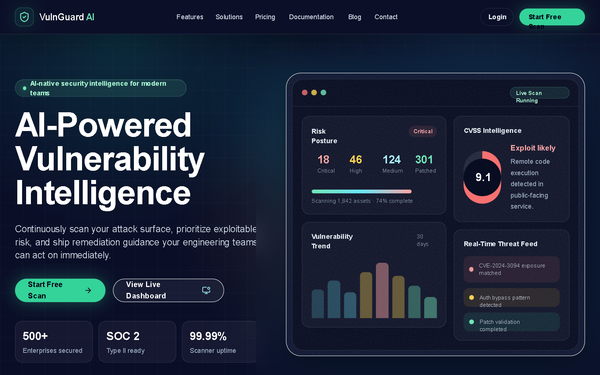
VulnGuard AI SaaS Landing Page
Premium enterprise-grade cybersecurity SaaS style guide featuring a high-contrast dark mode aesthetic. Utilizing a dark navy and charcoal foundation (#0a0e27) with technical accents of emerald, cyan, and amber. The design employs editorial typography (Clash Grotesk and Satoshi), glassmorphism effects, and a rigid grid-based layout. Optimized for high-trust industries like fintech, cybersecurity, DevSecOps, and enterprise infrastructure platforms. Key elements include scroll-triggered animations, bento-grid analytics dashboards, and glowing primary CTAs.

Aura OS - Launch Manifesto
An editorial, typography-heavy design system mimicking a high-end magazine or manifesto. Features high-contrast serif and grotesk font pairings, asymmetric layouts, and a sophisticated dark-mode palette with cream accents. Suitable for high-end product launches, boutique SaaS, architectural portfolios, and literary-focused platforms that value narrative and white space.

EPOCH | Editorial System 1.0
EPOCH is a brutalist editorial design system characterized by high-contrast typography, a monochromatic void background with 'acid' lime accents, and a technical, low-latency aesthetic. It blends luxury editorial layouts (Fraunces serif) with cyberpunk technical metadata (Inter sans). Key features include grain textures, scanline overlays, CRT-style animations, and high-friction interactions. Best suited for high-end SaaS, creative agencies, technical portfolios, fintech, and edgy lifestyle brands.
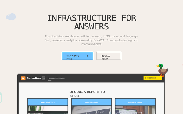
MotherDuck SaaS Landing Page
A neo-brutalist SaaS design system for data infrastructure and AI-driven platforms. Featuring a high-contrast palette of cream, charcoal, and vibrant sky blue, this style utilizes thick 2px borders, hard offset shadows, and a mix of clean sans-serif and monospaced typography. Suitable for fintech, developer tools, cloud infrastructure, and modern data-heavy dashboards that require a clear, structured, and bold visual hierarchy.
Apple-inspired Waitlist
A refined, premium waitlist page design system inspired by Apple's minimalist aesthetic. It features a sophisticated muted blue-gray accent (#4F6BA6) on a light grey background (#FAFAFA). Key elements include editorial typography with tight line heights, slow-motion scroll animations (1.5s), layered soft shadows, and subtle gradient dividers. Ideal for high-end SaaS, design tools, fintech, and professional services looking for a 'quiet luxury' digital presence.

Kinetic Pricing: High-Performance Edition
High-performance brutalist technical design with a dark mode cyberpunk aesthetic. Features kinetic typography, heavy use of neon accents (#39FF14, #00D9FF, #FF3D00), and a mix of massive display headings and tiny monospace utility text. Ideal for SaaS, fintech, AI dev tools, and high-end engineering products. Includes scroll-triggered reveals, glitch hover effects, and a custom precision crosshair cursor.

Ledgerline - fintech teal/mint startup landing page
Dark premium fintech / neobank startup landing page: deep teal canvas with a single mint accent and cream text (Inter), sticky blurred nav, a hero with a live account-dashboard mock (balance, area chart, transactions) and a tilted virtual-card chip, a bento feature grid, a hairline stat band with a pull-quote, a security & compliance badge grid, and a glowing centered CTA.

Atelier · Early Access (waitlist-minimal-graphite)
Minimal monochrome graphite-on-paper waitlist / early-access landing for an AI design tool: a warm off-white ground with near-black ink and one platinum grey (no color accent), a big tight black-weight headline, a centered single-field email + button waitlist form with overlapping social-proof avatars, scattered graphite confetti strokes, a logo trust strip, a 3-step how-it-works grid and an inverted full-bleed dark closing CTA.

Driftly: Ship a startup site your whole team is proud of
Playful illustrated 'sunny sky' startup-website landing page for an AI design agent: cream paper base with a sky-blue + coral duo-tone, rounded Poppins type, a hand-illustrated hero scene (layered SVG hills, floating clouds, sun, tiny rooftop town, founder mascots), sticky blurred nav, two-up feature cards, a numbered 3-step how-it-works band, stats row, a gallery strip, and a deep-sky rounded CTA banner.

Floating Pill Coral navbar - legibility fixes applied
A sticky floating-pill navbar in a warm coral-and-cream palette: a blurred white rounded-full bar floating inset from the top, sparkle logo, a centered inner pill link group with a raised white active pill, and a solid coral Start free CTA.
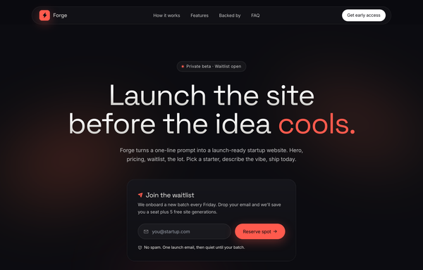
Forge - Launch Waitlist (dark, warm-ember)
Dark, warm-ember startup launch / waitlist landing page: near-black ink base with a single hot coral accent, Space Grotesk display + Inter body, blurred coral/amber ambient glows, a floating glass pill nav, a centered gradient headline, a glassmorphic email-capture waitlist card, a 'backed by' logo row, and a sticky-titled editorial 3-step feature spread.

Ledgerline - Deep-Teal + Mint Fintech Startup (Dashboard Hero)
A trustworthy deep-teal fintech-startup landing page with a mint accent and cream text: a split hero with a product dashboard mock and a floating virtual card, a bento feature grid, a stats traction band, a security certifications grid, and a glowing CTA.
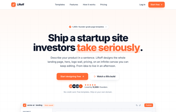
Liftoff - Ship a startup site investors take seriously
Clean YC-classic light startup landing page: white paper base with a faint slate grid, single warm orange accent, Inter extrabold tight-tracked headlines with an orange highlight swipe, a centered hero, an in-product app screenshot, backed-by logo row, feature trio, 3-step how-it-works, and a dark orange-glow CTA panel.

Loomly - Sunset Spotlight Testimonial
A warm full-viewport 'sunset spotlight' testimonial section built around one big editorial pull-quote, centered on a layered coral/amber golden-hour gradient with cocoa-ink type, a gradient-ringed avatar, a coral->amber 'Start free' nav and a legibility-safe darkened-gradient highlight on the key clause. Plus Jakarta Sans, Iconify Phosphor.

Loved by builders - Promptkit testimonial wall (mono tweet wall)
A calm Twitter/X-style 'wall of praise' testimonial section on clean white with warm-grey tweet cards, monochrome initials avatars and a single muted slate-blue accent for stars and verified ticks, laid out as a responsive CSS-columns masonry under a sticky nav, with an aggregate '4.9 average' trust row and a closing 'add your post to the wall' CTA. Inter, Iconify Solar.

Loved by makers - a pastel masonry wall of designer voices
Bright pastel testimonial MASONRY WALL section for a prompt-to-UI product: a sticky frosted-cream nav, a centered header (heart 'Loved by 57,000+ makers' chip + a Poppins extrabold headline whose tail sits over a hand-drawn sky highlight swipe), and a true CSS-columns masonry wall (1/2/3 responsive) of testimonial cards, mostly plain white with two oversized HIGHLIGHTED gradient cards woven in (one sky #38bdf8, one coral #fb7185) carrying white text, a giant corner quote-mark and a glassy avatar. Coral five-star ratings, initials avatars, a sky verified seal + an X-share badge, and a footer CTA strip (overlapping +5k avatar cluster + 'Join the wall. Start designing free'). Soft pastel shadows with hover lift over a dotted-grain + ambient sky/coral glow ground. Poppins, Iconify Phosphor icons, vanilla-JS hamburger menu.

Loved by the people who ship - quote-grid-emerald testimonial section
Trust-forward testimonial section in a fresh emerald-on-white palette: a centered heading ('It's not just us saying it.' with an emerald gradient tail), an emerald eyebrow pill, a 4.9 / 2,300+ five-star rating strip, and a responsive 1/2/3-column grid of six testimonial cards (oversized serif quote marks, emerald-ring avatars, brand logos) over a masked emerald dotted field, with one inverted emerald-700 featured card and a six-logo trust strip. Inter + Georgia quote marks, Phosphor + simple-icons via Iconify.
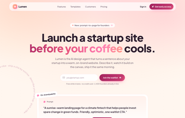
Lumen - Warm Sunrise startup-website landing page (light)
Warm sunrise light startup-website landing page: cream base with a peach-to-rose sunrise gradient, deep plum ink text, Plus Jakarta Sans, a floating pill sticky nav, gradient-clipped headline word, waitlist email CTA, an elevated prompt preview card with floating chips and a spinning copy ring, feature + template + testimonial sections, and a full-bleed sunrise CTA.
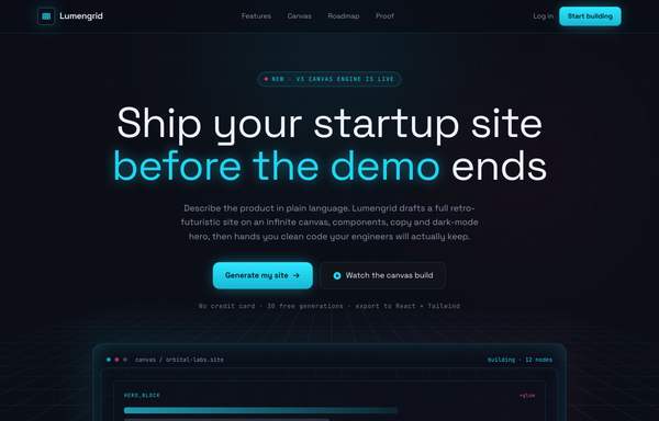
Lumengrid - Ship the Startup Site Before the Demo Ends (Neon-Grid Retro-Future)
Neon-grid retro-future startup landing page: near-black ink background lit by a cyan + magenta duotone, a synthwave perspective grid floor, scanlines and neon glow, Space Grotesk + JetBrains Mono type, a glowing wireframe canvas console hero, a 6-up feature grid, a node-stack canvas preview, a horizontal build roadmap, stat figures and a bold glowing CTA.
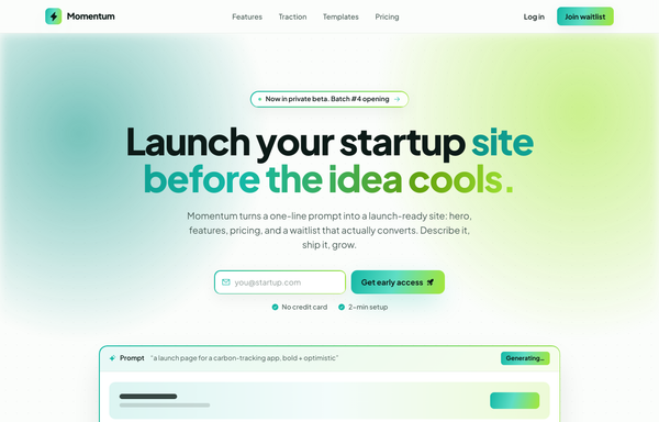
Momentum - Ship Your Startup Launch Before the Idea Cools
Bold optimistic startup launch / waitlist landing page: teal-to-lime gradient brand on warm-white paper, sticky blurred nav, gradient-aura hero with an inline email-capture form and a frameless prompt-to-page preview, feature cards, a gradient traction band, launch-template cards, a dark ink CTA, and a 4-column footer.
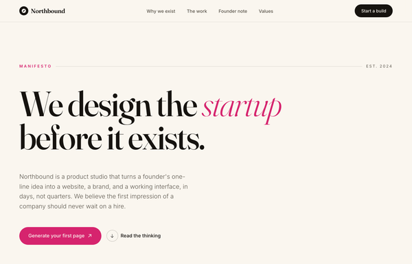
Northbound - We Design the Startup Before It Exists
Editorial 'manifesto' startup website: warm cream paper base, near-black ink, a single hot-magenta accent, huge Fraunces serif display headline with italic emphasis, hairline-divided big-number stat rows, a dark ink founder note with a handwritten signature, a 4-up numbered values grid, and a full-bleed magenta CTA band.

Petal · Soft SaaS Website Design from Prompts (pastel-friendly)
A soft pastel SaaS marketing site on a lavender page with a floating pill nav, a deep-plum hero with a live-canvas mockup, coral and mint hand-tilted italic accents, a playful stat trio, a prompt-library band, testimonials, 2-tier pricing, and a dark footer.
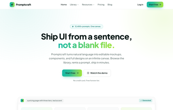
Promptcraft - Gradient CTA (teal→lime) navbar landing
A clean light-SaaS sticky navbar carried by one teal-to-lime gradient: a frosted white bar (white/85 + backdrop-blur over a hairline border) with a sparkle-tile 'Promptcraft' wordmark, five absolutely-centered nav links (Home, Library▾, Resources▾, Pricing, Blog) with a gradient underline that wipes in on hover, and a right cluster of a quiet 'Log in' link plus a gradient-filled 'Start free' CTA pill with a soft teal+lime glow shadow. Plus Jakarta Sans, Iconify Phosphor icons, gradient-text accent headline, and a hamburger reflow on mobile.

PROMPTSMITH // People Who Stopped Staring at Blank Canvas
Loud neo-brutalist testimonial 'wall of proof' section for a prompt-to-UI product, on warm paper #f4f1ea with near-black ink #0a0a0a and ONE electric acid-lime accent #e8ff00. A sticky paper nav (ink + acid lightning logo, mono links, acid 'Start free' pill) over an ink->acid scrolling rating MARQUEE, then over a dotted-grain ground: a four-line Archivo-black headline ('PEOPLE / WHO STOPPED / STARING AT / BLANK CANVAS.' with the last line knocked out acid-on-ink) beside a two-cell 4.9 / 2.1k stat block, a row of filter pills, and a responsive 1/2/3-col grid of neo-brutalist testimonial cards (3px ink borders + 6px HARD offset shadows: a paper star card, an acid feature card, an inverted ink card with an acid hard-shadow, an acid pull-quote card with a giant quote glyph) with 'via X' + verified-seal trust accents and square ink/acid initials tiles. Closes on an inverted ink CTA strip ('GOT A WIN TO SHARE?' + an acid 'Leave a testimonial' pill). Archivo + JetBrains Mono, Iconify Phosphor, CSS marquee.

Proof in Navy: The Trust-Led Conversion Moment
A trust-led dark CTA on deep navy with one warm amber accent: an avatar + 5-star social-proof row, an amber payoff headline, a glowing amber primary button beside a glass demo button, a no-card check-mark trust line, a 4-up hairline stat row, and a grayscale logo trust strip.

Proof, Stacked: Logo Wall + Metric Trust Strip + Featured Quote (Deep-Teal)
Stacked, trust-forward social-proof page in a single deep-teal-on-white palette: a centered heading with a 'Trusted in production' badge over a masked six-logo logo wall, a three-up hairline-divided metric trust strip (120k+ designs, 4.9/5 rating, 9x faster) with tabular-nums teal numbers and hover top-bars, and a featured-quote card (oversized serif quote mark, five-star 'Featured story' chip, big pull-quote, gradient monogram byline + brand lockup) over a faint teal grid and soft teal glow, closing on a 'Verified customer story' seal line. Inter + Georgia quote mark, Phosphor via Iconify.
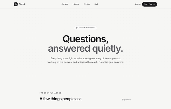
Quiet Answers - Graphite Minimal FAQ
A calm, minimal, monochrome graphite-on-paper FAQ / help-center page set in Inter: a sticky blurred paper nav, a full-bleed dot-grain hero with a huge two-line 'Questions, answered quietly.' headline (line two muted in steel grey), a hairline divider-list accordion of native <details> rows (a circular plus toggle that rotates to an x, answers indented and revealed via a grid-template-rows CSS animation, first item pre-opened, single-open behaviour), and a soft 'Didn't find your answer?' CTA card, all greyscale with one solid-black accent and zero colour.

Quiet Praise - Minimal Mono Testimonial Section
A quiet, monochrome editorial testimonial section laid out as a numbered vertical quote rail of three large light pull-quotes on warm off-white paper, with hairline dividers, per-row left accent bars that grow on hover, faded opening-quote glyphs, gradient-ink initials avatars and extreme wide-tracked micro-type. No color accent. Inter, Iconify Lucide.

Slate - Graphite Premium Monochrome (SaaS Website Design Prompt)
A graphite near-monochrome premium SaaS marketing homepage with a single platinum accent: charcoal #1c1c1e to #2c2c2e surfaces, off-white Inter text, a sticky glass nav, a restrained left-aligned hero with a platinum gradient-clipped headline and a large in-page product-canvas mock, a quiet logo row, a thin numbered feature list, a testimonial + stats split, minimal 3-tier pricing, and a 4-column footer. Linear-like restraint, in graphite.

Stepwise - Multi-step Wizard (Navy/Amber)
Dark navy multi-step form wizard landing page with one warm amber accent: hero register card with a gradient progress bar, step ticks, active focus field, Back/Continue nav and step dots, plus patterns, library and pricing.

The Dispatch - Deep-Teal Newsletter Capture CTA
A deep-teal, Inter-set newsletter capture CTA (newsletter simple left): a two-column section with a value headline on the left and an inline email field + Subscribe button, privacy line, and avatar social proof on the right, anchored by a sticky nav, an eyebrow context band, and a footer.

Validar - Forms that catch mistakes before they cost you
A teal-on-paper SaaS landing page for an inline form-validation tool: a sticky glass nav, a split hero with a live account-creation card showing all four field states (idle, active, valid, error) at once, a four-up state-model band, a dark-teal 'submit unlocks itself' section, a benefit grid, and a footer. Color + icon + plain-words validation, Inter, soft layered shadows.

Voices from the Canvas - Aurora Carousel
Dark aurora-glow testimonial CAROUSEL section for a prompt-to-UI product: a sticky glass nav, a centered header (live-dot 'Loved by 57,000+ builders' badge + a Space-Grotesk headline whose tail is painted in an aqua->sky->magenta aurora gradient), and a big glass 'stage-card' carousel holding the active testimonial (aurora-ring avatar, name/role with the company in aqua, five magenta stars, a large pull-quote, a hairline divider, animated aqua->magenta pagination pill + glass/solid-white prev/next arrows), with two rotated, floating ghost peek cards behind it and a three-up trust-stats strip (4.9/5, 120k+, 9x) below, over a grain + ambient aqua/magenta glow ground. Space Grotesk + Inter, Phosphor icons, vanilla-JS slide engine.

VOLTPRESS - Ship a startup site that screams (acid-maximalist)
Acid-maximalist startup website: near-black ink base with electric acid-lime (#d4ff00) and hot-pink (#ff2d78) accents, oversized Archivo Black display headlines (some outline/stroke), a sticky blurred nav, floating color-block blobs, an infinite scrolling marquee strip, a bento color-tile library grid, a loud hot-pink feature + stats band, and a giant CTA.
How to prompt a startup site that looks designed, not generated
An AI design agent has a strong default for every part of a startup homepage, and most of those defaults are the average of every Tailwind tutorial it trained on: a purple gradient hero, a vague headline in Inter, a decorative blob instead of the product, and a wall of equal feature cards. A good prompt is really a list of constraints that override those defaults. Here is each default you need to override, the words that do it, and a template that bakes them all in.
Design a [light or dark] [type] startup landing page for [who it is for] who want to [the outcome they are after].
Hero: a headline that names the audience and the outcome in one sentence (not a slogan), a one-line subhead, and a single primary CTA [the action, e.g. Start free].
Show the product: put a real product screenshot or a short demo in the first scroll, not an abstract gradient.
Section order: hero, the problem you remove, how it works (with the product), social proof, pricing, then one closing CTA.
Social proof: real-feeling logos, one testimonial with a name and company, and one concrete number.
Style: a neutral base with one [accent] color reserved for the CTA, and a named typeface [name], not the default Inter or a purple gradient.
Calls to action: one primary action repeated down the page; everything else is a quiet link.
Build it responsive, and include the footer with the real nav.
Hero clarity
Default: It writes a clever-sounding slogan like "Supercharge your workflow" that could belong to any product, so a stranger still does not know what you do.
Constrain it: Name the audience and the outcome in one sentence: "[product] for [who], so they [result]." Specific beats clever.
Show the product
Default: It fills the hero with a decorative gradient blob or a stock 3D shape that shows nothing about what you are actually selling.
Constrain it: Ask for a real product screenshot or a short demo in the first scroll. Showing the thing beats describing it.
Section flow
Default: It stacks interchangeable feature blocks in no particular order, so the page lists things but never builds an argument for buying.
Constrain it: Spell out the order as a story: hero promise, the problem you remove, how it works with the product, social proof, pricing, then one closing CTA.
Real social proof
Default: It leaves a hollow "Loved by teams everywhere" with grey placeholder avatars, which reads as no proof at all.
Constrain it: Give it the real material: named logos, one quote with a real person and company, and one concrete number.
Color and type
Default: Left alone it reaches for Inter, a purple gradient, and a rainbow palette: the look of every AI starter site on the internet.
Constrain it: Name one accent color on a neutral base and a non-default typeface, and reserve the accent color for the CTA.
One call to action
Default: It scatters competing buttons such as Get Started, Book a demo, and Get the app, so attention splits and none of them gets the click.
Constrain it: Name one primary action and repeat it down the page. Demote everything else to a quiet link.
Frequently asked questions
What should a startup website include?
A hero that names what you do and who it is for, a real product screenshot or demo, a short section on the problem you remove, social proof (logos, a testimonial, one number), simple pricing, and one clear call to action. An about page and a contact route round it out. Lead with the value proposition, not the feature list.
What makes a good startup landing page?
Clarity over cleverness. The visitor should know in about five seconds what you do, who it is for, and what to do next. Show the product instead of a decorative graphic, give every claim a piece of proof, keep one primary action, and let the page read as a story from promise to proof to price.
Why does my AI-generated startup website look generic?
Because a vague prompt gets the model defaults: a purple gradient hero, a centered headline in Inter, a decorative blob instead of the product, and three equal feature cards. The model is averaging every landing-page tutorial it trained on. Name the audience and outcome, ask for a real product screenshot, pick one accent color and a non-default typeface, and it stops reaching for the average.
How do you write a prompt to generate a startup website?
Describe the brief, not the vibe: who it is for, the outcome they want, the one-sentence value proposition for the hero, that you want a real product screenshot in the first scroll, the section order, the social proof, one accent color and a named typeface, and one repeated call to action. The template above walks through each part, and you can open any example here to see a full prompt that works.
Can I use my own brand colors and copy?
Yes. Generate the layout first, then describe your brand colors, typeface, headline and real copy in plain language and branch a variant. Every design comes back as real, editable code, so wiring in your content and brand happens in your own repo, not a rebuild from a picture. Stuck on something? Ping us and we will sort it out together.