Design prompts for agency websites
An agency website has one job: make a stranger believe you can make their thing look this good. So the site itself has to be the proof. The best ones lead with the work, not a stock hero, set a sharp positioning line in oversized type, keep the palette neutral so the projects supply the color, and back it with named clients and one clear ask. The prompts below are the most-copied agency, studio and portfolio styles in the Superdesign library, from bold editorial to neo-brutalist to cinematic dark. Open any one to see the exact prompt behind it, then tweak the copy and generate your own editable version in seconds.

Bold Editorial Studio Style
Bold Editorial Studio Style is a high-impact, minimalist design system characterized by massive typography, a strict monochromatic palette, and sophisticated micro-interactions. It features a signature 'editorial' look using ultra-large display fonts (up to 12vw), custom cursor logic, and fluid marquee animations. Ideal for creative agencies, high-end portfolios, fashion brands, and premium fintech products, the system leverages white space and motion to create a premium, curated feel. Key elements include mix-blend-mode navigation, staggered text reveals, and asymmetrical image containers with varied border radii.

Midnight Editorial Style
A premium, ultra-modern dark aesthetic featuring deep black backgrounds (#050505), massive 'Satoshi' typography for impact, and striking coral (#FF6B50) accents. Designed for high-end agencies and portfolios that prioritize storytelling and visual drama.

Bold Editorial Style
A high-contrast, editorial-style SaaS landing page design optimized for designers and creative tools. It features bold Anton display typography, a sophisticated palette of golden yellow (#ffe17c) and deep charcoal (#171e19), and a structured layout combining grid patterns and bento-box feature blocks. This style is characterized by aggressive visual hierarchy, oversized headlines, and a minimalist yet punchy aesthetic suitable for high-velocity startups, fintech, or creative agency portfolios.

Bold Editorial Design Style
A premium, bold editorial design system characterized by high-contrast brutalist typography and a sophisticated dark navy and sage color palette. Optimized for creative agencies, design portfolios, luxury architecture, and high-end digital studios. Features include 'Anton' display headers, a custom crosshair cursor, floating ambient gradients, asymmetric masonry layouts, and smooth scroll-triggered reveal animations. The aesthetic balances minimalist white space with massive, impactful type and subtle micro-interactions like mix-blend-mode navigation and grayscale-to-color image transitions.

Superdesign Editorial Waitlist
Editorial waiting list landing page with a cinematic, high-fashion aesthetic. Features a deep matte #181818 background, warm beige #EBDCC4 typography, and a brutalist yet refined grid. Key elements include oversized edge-to-edge display type, subtle noise textures, and a layered text depth effect. Ideal for luxury tech, creative agency portfolios, high-end SaaS tools, architecture firms, and invite-only exclusivity campaigns. Layout utilizes strong typographic hierarchy and generous negative space with accent tones in coral, rust, and sage.
Tech Editorial
A high-end 'Tech Editorial' aesthetic that merges brutalist precision with classic editorial sophistication. It features a muted, paper-like color palette (#f7f6f2), a structured grid-line system, and a unique pairing of high-contrast Serif (Playfair Display) for display headers and technical Mono (Space Mono) for functional UI. The style is characterized by scroll-triggered text reveals, glassmorphism navigation, and 'scan-line' animations that suggest a sophisticated AI-driven process. Ideal for high-tech SaaS, AI research labs, design agencies, and premium fintech platforms.

Cinematic Multi-Section Portfolio Experience
A cinematic, dark-mode portfolio design featuring high-contrast orange accents, fluid mesh gradients, and grain overlays. This design is optimized for high-end creative portfolios, fintech landing pages, and personal brand sites for executives. Key features include a scroll-less, section-based navigation system, a circular clip-path menu transition, and sophisticated GSAP-powered staggered animations. It combines bold editorial typography with technical monospace details to create a 'futuristic-industrial' aesthetic. Keywords: orange, dark mode, grain, mesh gradients, GSAP, cinematic, portfolio, fintech, executive, minimalist, maximalist typography, full-screen menu.

Terminal Portfolio
A high-density, Bloomberg Terminal-inspired dashboard design featuring a dark monochromatic palette, surgical typography, and 1px sharp border grids. Optimized for fintech, crypto trading, data analytics, and developer tools. Key features include JetBrains Mono for data points, Satoshi for UI, a zero-gradient flat aesthetic, and high information density. Suitable for professional SaaS platforms requiring a technical, brutalist, or minimalist aesthetic.

3D Journey Scroll Portfolio - Centered
A high-end 3D immersive scroll experience with a 'Museum' or 'Journey' aesthetic. Features cinematic depth transitions (Z-axis scrolling), editorial typography pairing a clean sans-serif with an elegant serif, and a luxurious dark mode palette with gold accents. Ideal for portfolios, storytelling, historical timelines, or luxury product showcases requiring a spatial, 3D hallway feel.

Hardu - Maximalist Web Agency
A vibrant, neo-brutalist and maximalist design system optimized for creative agencies, youth-focused brands, and high-energy SaaS platforms. This style combines heavy typography, 'Cabinet Grotesk' for impact, and 'Bespoke Slab' for editorial character. Key visual traits include a high-contrast palette of orange (#FF6B35), teal (#2EC4B6), and pink (#FF3366) set against a dark navy (#0F172A) and a light background (#F8FAFC). Features include hard-shadow 'neo-brutalist' components (4px solid borders, 8px offset shadows), scroll-triggered reveal animations with rotation, and continuous marquee belts. Perfect for brands wanting an 'explosive' and 'out of the box' digital presence that dominates search visibility and user attention.

Arvane Luxury Real Estate Portfolio
A luxury real estate landing page design featuring a sophisticated, minimalist aesthetic with an earth-toned palette of charcoal, cream, and gold. This style utilizes editorial typography (Cabinet Grotesk and Satoshi) and high-impact layouts like bento-style grids and floating search bars. Ideal for high-end residential agencies, interior design portfolios, or architectural firms. Key features include scroll-triggered hover effects, glassmorphism elements in the navigation, and a focus on lead generation through prominent CTA forms and property search tools.

Aura Regimen Studio
A calm, deliberately designed wellness and e-commerce landing page featuring editorial typography and a soft natural color palette. The aesthetic is focused on trust and clarity, utilizing a mix of high-contrast serif headings and clean sans-serif body text. Key features include a 'bento-grid' regimen selector, detailed supplement protocol sections with 'Supplement Facts' panels, a visual usage timeline, and high-transparency quality modules. Ideal for wellness brands, premium supplements, high-end skincare, or curated lifestyle products. Optimized for a 'shop-ready but pressure-free' user experience with subtle micro-interactions and generous whitespace.

L'AVENIR - AI Service Portfolio
L'AVENIR is an editorial luxury design system for high-end AI service portfolios, fintech, and boutique consultancies. It features a warm, sepia-toned palette (#faf8f3 background, #2a2219 text) paired with muted gold (#d4a574) and sophisticated serif typography (Boska). The aesthetic is defined by generous whitespace, 2.5rem rounded corners, 'echo-layer' text effects, and glassmorphism cards. Suitable for industries requiring a blend of technological precision and artisanal craftsmanship like medtech, luxury real-estate, or high-finance dashboards.

Hyper-Interactive 3D Developer Portfolio with Three.js
Hyper-interactive dark mode portfolio with Three.js 3D background, neon cyan-purple-pink color palette, and high-end editorial typography. Featuring glassmorphism, 3D tilt interactions, and scroll-triggered reveal animations. Optimized for developer portfolios, SaaS dashboards, and creative agencies wanting a futuristic, high-performance aesthetic.

Swapnil's Bold Portfolio
A high-impact, dark-mode design system characterized by bold editorial typography, vibrant orange-red accents, and intricate micro-interactions. Featuring a 'noise' texture overlay and a geometric grid-based layout, this style is ideal for creative developers, design agencies, or fintech landing pages. It uses a sophisticated color palette of deep blacks, slate surfaces, and warm tan highlights, paired with high-performance animations like floating SVG shapes, pulsing glows, and smooth scroll-triggered transitions.

Abhinab Jena - Portfolio
Premium minimalist dark mode portfolio and studio style guide. Features a sophisticated editorial aesthetic using a taupe (#b7ab98) and coral (#eb5939) palette on a deep charcoal (#0d0d0d) background. Suitable for high-end digital agencies, art directors, product designers, and luxury brand showcases. Employs brutalist typography with 'Clash Grotesk' and 'Satoshi', combined with sophisticated micro-interactions like magnetic buttons, custom cursor rings, and scroll-triggered revealing animations. Layout focuses on a bento-style grid, large-scale headings, and high-quality whitespace balance.

Riswan Portfolio - Anime & GSAP Enhanced
A high-end 'Anime-Tech' portfolio design featuring a dark-mode glassmorphism aesthetic, vibrant purple gradients (#A855F7), and extensive GSAP-powered animations. Suitable for software engineers, creative developers, or tech-focused agencies. Key elements include 3D-interactive cards, a custom anime mascot illustration, parallax background spheres, and a typewriter-effect hero section. Optimized for a 'Premium Professional meets Otaku' vibe.
Graphic Designer Portfolio
A sophisticated, high-end portfolio design with a dark mode aesthetic, featuring a warm taupe and deep charcoal color palette. The style utilizes 'Clash Grotesk' for bold, geometric display typography and 'Satoshi' for refined body copy. Key features include a grain/noise texture overlay, custom dual-element cursor following, scroll-triggered text reveal animations, and a spinning SVG text badge. This design is optimized for creative professionals, graphic designers, art directors, and luxury branding agencies seeking a minimalist yet high-impact digital presence.

VOIDCRAFT - Internal Tools Agency
A high-impact, 'dark stealth' tech aesthetic design system inspired by matrix-hacker culture and terminal interfaces. Features a high-contrast palette of absolute blacks (#040404) and vibrant matrix-green (#00ff41) accents. Utilizes JetBrains Mono for a professional 'code-like' typography feel and Space Grotesk for readable body copy. Suitable for cybersecurity firms, developer tools, fintech, high-end engineering agencies, and premium SaaS platforms. Key features include scanline overlays, noise textures, grid-based backgrounds, bracket-encased headers [ ], and terminal-style UI components.

Aura OS - Launch Manifesto
An editorial, typography-heavy design system mimicking a high-end magazine or manifesto. Features high-contrast serif and grotesk font pairings, asymmetric layouts, and a sophisticated dark-mode palette with cream accents. Suitable for high-end product launches, boutique SaaS, architectural portfolios, and literary-focused platforms that value narrative and white space.

Cinematic Portfolio - JS Bug Fix
A cinematic, immersive digital portfolio design system featuring brutalist typography, 3D CSS transforms, and high-contrast dark mode aesthetics. It utilizes 'General Sans' for a clean, professional look and relies on bold 'massive' text sizes to create a sense of scale. Suitable for creative agencies, high-end freelancers, luxury tech brands, and architecture studios. Key features include a rotating 3D hero cube, bento-grid case studies, glassmorphism elements, and scroll-triggered background text animations. The color palette is dominated by deep black (#050505) with high-visibility neon accents (#00FF41).

EPOCH | Editorial System 1.0
EPOCH is a brutalist editorial design system characterized by high-contrast typography, a monochromatic void background with 'acid' lime accents, and a technical, low-latency aesthetic. It blends luxury editorial layouts (Fraunces serif) with cyberpunk technical metadata (Inter sans). Key features include grain textures, scanline overlays, CRT-style animations, and high-friction interactions. Best suited for high-end SaaS, creative agencies, technical portfolios, fintech, and edgy lifestyle brands.

Abhinav Dwivedi - BI Analyst Portfolio
A sophisticated, corporate-modern data-viz aesthetic optimized for BI Analysts, FinTech, and enterprise SaaS. Featuring a deep navy #0D1B2A background, electric blue #1E90FF accents, and amber #F4A261 highlights, the style pairs Space Grotesk's geometric boldness with JetBrains Mono's precision. Key features include animated grid backgrounds, floating data nodes, scroll-triggered number counters, and interactive vertical timelines, creating a 'McKinsey meets Tableau' professional feel.

Loving MaU Portfolio
An organic, warm-toned creative portfolio design featuring a sophisticated blend of editorial typography and natural textures. Dominated by sage green, terracotta, and cream palettes, it uses fluid morphing shapes, botanical-inspired elements, and high-quality serif typography (Gambetta). Ideal for creative professionals, artisanal brands, sustainable lifestyle products, and high-end boutique services. The layout features bento-style grids, smooth scroll-triggered animations, and a distinct noise-texture overlay for a tactile, high-end feel.

Coverdash Editorial Insurtech Landing
Editorial-inspired insurtech design system featuring a high-contrast palette of Coverdash Green (#0ACF83) and Deep Navy (#202847). This style combines premium editorial aesthetics - characterized by large-scale 'Instrument Serif' typography and generous white space - with modern functional UI components using 'Plus Jakarta Sans'. Ideal for fintech, insurance, and professional services looking to balance trust with speed. Layouts utilize asymmetric bento grids, large-scale typography, and sophisticated scroll-triggered transitions using a custom cubic-bezier(0.16, 1, 0.3, 1) curve. Key visual motifs include glassmorphism navigation, 48px-64px corner radii, and ambient background blurs for depth.

TCCNY Portfolio Reveal
A high-end, dark-mode portfolio landing page featuring a tech-forward 'Digital Alchemist' aesthetic. Incorporates editorial typography with Space Grotesk and Inter fonts, a pixel-art transition intro, and modern UI elements like infinite marquees and glassmorphism. Perfect for creative agencies, fintech, luxury engineering, or independent developers seeking a brutalist yet polished Brooklyn-style aesthetic.

Riswan Kurniawan - Portfolio Modern Corporate
A modern corporate minimalist design with a futuristic monochromatic purple theme. Featuring a dark mode aesthetic with deep charcoal backgrounds (#121212), primary purple accents (#A855F7), and glassmorphism elements. The layout utilizes a bento-grid inspired structure for skills and project showcases, complemented by floating 3D-effect geometric spheres and rings. Ideal for technology portfolios, SaaS product showcases, or high-end engineering agency websites requiring a balance of professionalism and creative flair through scroll-triggered animations and typing effects.

Bauhaus Portfolio - Fixed Hover Animations
A high-energy Bauhaus-inspired portfolio design featuring neobrutalist aesthetics, primary color blocking, and a unique 3D tilted layout. It utilizes bold typography, heavy hard shadows, and geometric patterns. Ideal for creative developers, design agencies, or architectural portfolios looking for a constructivist, 'form-follows-function' visual identity with tactile interactions.

Bauhaus Constructivist Portfolio - Refined Animations
A high-impact Bauhaus-inspired design system utilizing Constructivist geometric principles. Features a primary palette of red (#D02020), blue (#1040C0), and yellow (#F0C020) against an ink-black (#121212) and off-white (#F0F0F0) background. Characterized by a 3D perspective 'tilted plane' layout that reacts to scroll, heavy 4px borders, and solid 'hard' shadows without blur. Ideal for creative portfolios, design agencies, or editorial tech products seeking a bold, structural aesthetic with experimental 3D interactions.

Mythos Story Studio
Mythos Story Studio is a sophisticated, editorial-style AI storytelling interface characterized by a dual-typography system: a modern sans-serif for UI elements and a high-contrast serif for narrative content. The design features a neutral grayscale palette (#FAFAFA, #171717, #18181B), generous whitespace, and a minimalist floating prompt interface. It is ideal for creative writing platforms, AI narrative generators, high-end blogging tools, or digital literary journals. Key structural features include a functional sidebar for history, a integrated pill-style audio player in the header, and a centered content article layout designed for maximum readability (1.8 line-height).

Blog Page - Editorial Grid Magazine
A grid-based blog layout with visual hierarchy: featured posts are larger, secondary posts arranged in a balanced grid. Emphasizes scanning and visual entry points rather than linear reading. Best suited for Lifestyle brands, design-led companies, storytelling-focused content with strong visuals.

ProdFlow | Elite Engineering Studio
A high-end, minimalist dark-mode design system for elite engineering studios, fintech, and boutique software agencies. Characterized by a deep #000000 background, vibrant #c7ff9f lime green accents, and a sophisticated pairing of sharp sans-serif and italic serif typography. Features include zero-radius sharp corners, premium whitespace, glassmorphism headers, and high-contrast section transitions. Suitable for technical brands requiring an aura of precision, performance, and institutional authority.

Graphic Comparison Report
A highly visual, typography-driven comparison report design. This style eschews traditional tables and icons for a bold, editorial layout inspired by graphic posters. Featuring a brutalist-lite aesthetic with high-contrast 'ink' and 'paper' tones, it utilizes oversized headlines, a strict 12-column grid, and structural 2px borders. Suitable for technical comparisons, whitepapers, B2B SaaS decision pages, fintech analysis, and deep-dive product evaluations where clarity and authority are paramount.

Editorial SaaS Onboarding
An editorial SaaS onboarding experience featuring a calm, sophisticated aesthetic. It uses a muted warm stone palette with terracotta accents, high-contrast serif headlines (Crimson Pro) paired with clean sans-serif UI text (Inter). The layout follows a natural document flow within a product shell, avoiding scroll-locks or overlays. Suitable for premium B2B SaaS, design tools, publishing platforms, and luxury fintech applications that prioritize a confident, professional, and non-intrusive user experience.

Editorial Feature Announcement
A high-end technical editorial design system tailored for feature announcements, changelogs, and whitepapers. It features a sophisticated 'paper and ink' color palette (#F7F5F0 background), high-contrast typography pairing (Fraunces serif and Inter sans), and an asymmetric 12-column grid layout. Suitable for developer tools, fintech, research institutions, and SaaS companies that prioritize credibility and deep readability. The style emphasizes content hierarchy through vertical reading rhythms, monospace technical markers, and minimal visual noise.

Bauhaus Tilted Portfolio - Fixed Content & Full Parallax Plane
A high-impact Bauhaus-inspired Constructivist portfolio style featuring a scroll-reactive 3D perspective plane. Characterized by bold primary colors (#D02020, #1040C0, #F0C020), rigid 4px black borders, and hard-offset shadows. The design utilizes 'Outfit' typography in heavy weights with an editorial layout. Key features include a grain-textured background, binary geometry (strictly sharp corners or perfect circles), and a unique tilted layout that shifts dynamically with user scroll. Suitable for creative portfolios, design agencies, architecture firms, and high-concept engineering showcases.

Editorial onboarding
A sophisticated, editorial-style onboarding experience for creative SaaS or workspace platforms. It features a muted earth-tone palette, a tactile noise grain texture, and high-end typographic pairing. The design utilizes huge display type, organic ambient background animations, and an intentional use of white space to create a premium, mindful user journey. Key features include a fixed 'Echo Panel' for live state updates, masonry card layouts with subtle rotations, and custom interactive dials for user input. It is optimized for creative agencies, architecture portfolios, fintech, or productivity tools aiming for an 'elevated' brand feel.

Hello World Studio Replica
A minimalist editorial and tech-nostalgia design system featuring a warm off-white background (#f4f4ed) and dark charcoal typography. This aesthetic blends sophisticated serif fonts like Cormorant Garamond with high-tech DM Mono, utilizing floating ASCII art elements to create a unique creative studio vibe. Ideal for digital agencies, high-end fashion portfolios, tech-creative hybrids, and editorial platforms. Features include bento-inspired hero cards, pill-shaped navigation, and subtle floating animations for decorative text elements.

Portfolio de Serviços
A high-end industrial and corporate portfolio style guide featuring a 'Porto de Itapoá' aesthetic. Characterized by a sophisticated forest green color palette (#007651), heavy uppercase typography, and immersive image cards. The design uses a clean white backdrop with minimalist accents, focusing on logistics, supply chain, and professional services. Key features include grayscale-to-color hover transitions, slide-up micro-interactions, and a structured bento-style grid for service presentation. Suitable for industrial, fintech, maritime, and large-scale enterprise websites.
Warm Luxury Editorial - Top Collections
Warm luxury editorial style dashboard featuring a midnight and rose gold color scheme. Utilizes high-end serif typography (Boska) paired with a clean Swiss sans-serif (Switzer). The layout is characterized by editorial spacing, 3D tilt interactions, glassmorphism panels, and layered radial glows. Suitable for premium NFT marketplaces, high-end fintech platforms, luxury brand portfolios, and sophisticated SaaS dashboards requiring a 'dark mode' aesthetic with warm, organic lighting.

Horizontal Scroll Editorial Themes
A high-energy editorial landing page style featuring bold, oversized typography, a striking pink-and-navy color palette, and fluid horizontal scroll interactions. Designed for modern digital products, SaaS, or luxury consumer brands, it utilizes a mix of 'Clash Display' for aggressive, uppercase headers and 'DM Sans' for clean legibility. Key features include snap-scrolling template carousels with gradient masks, masonry feature grids with hover-triggered 'editorial lines', and a full-screen menu overlay with sophisticated cubic-bezier transitions.

Editorial Story Product Page
Vertical storytelling layout with hero imagery, narrative sections, and a delayed purchase module. The buy action appears later, after context and meaning are established. Best suited for Premium, luxury, artisanal, sustainability-focused products where brand story matters.

Jasper Jin Portfolio Wireframe
A high-end, minimalist portfolio style guide characterized by an architectural, wireframe-inspired aesthetic. It features a refined off-white and charcoal color palette (#f0efed, #1a1a1a), editorial typography using General Sans and Switzer, and a structured 2-column grid. Suitable for creative agencies, design portfolios, architecture firms, and luxury brand showcases. The design focuses on whitespace, subtle 3D-transform animations, and elegant micro-interactions like staggered entrance effects and custom hover states.

Kinetic Pricing: High-Performance Edition
High-performance brutalist technical design with a dark mode cyberpunk aesthetic. Features kinetic typography, heavy use of neon accents (#39FF14, #00D9FF, #FF3D00), and a mix of massive display headings and tiny monospace utility text. Ideal for SaaS, fintech, AI dev tools, and high-end engineering products. Includes scroll-triggered reveals, glitch hover effects, and a custom precision crosshair cursor.

PitchPerfect Mobile Portfolio
PitchPerfect is a high-energy, dark-themed mobile UI design system specifically crafted for video creators, sports portfolios, and media-heavy entertainment apps. It features a bold, athletic aesthetic characterized by high-contrast red accents (#DC2626), deep slate backgrounds (#020617), and aggressive uppercase typography using Cabinet Grotesk and Satoshi. The layout utilizes a bento-style video grid, a featured hero card with gold gradient text (#FDE047 to #EAB308), and a unique bottom tab navigation with a floating, rotated action button. It is optimized for mobile engagement with tactile micro-interactions and a sleek, modern professional look.

Editorial Pricing Page
An editorial-style, typography-focused pricing page designed for transparency and trust. It utilizes a sophisticated pairing of geometric sans-serif and high-contrast serif fonts on a 'paper' textured background (#F5F4F1). Suitable for premium B2B SaaS, developer infrastructure, fintech, or high-end consultancies. Features include a heavy focus on long-form prose over marketing icons, large visual anchors through massive pricing typography, and a minimalist grid-based layout that prioritizes readability and rational communication.

VOLTKIND - We Build Bold Brands Online
A bold, dark, editorial agency-studio homepage: near-black noir #0c0c0c surfaces with a single acid-lime #c4ff00 accent and off-white #f5f5f0 text. A pill-shaped floating glass nav, a massive Anton condensed-uppercase hero headline ('WE BUILD BOLD brands ONLINE.') with an italic Archivo 'brands' in lime, an infinite-scroll keyword marquee, a stat-counter studio statement, a 2-column rounded-card 'selected work' grid with hover reveals, a hover-fill numbered services list, a clients/awards logo grid, a huge centered CTA, and a 4-column footer with a newsletter input. Anton + Archivo + Inter, lime-on-noir, award-site energy.

Bilal Jutt - Dark Portfolio Hero
A high-impact, high-contrast dark mode portfolio style designed for personal branding, professional mentors, and educational institutes. Characterized by 'Clash Grotesk' bold italic editorial typography and a signature red accent (#DC2626) against a deep black (#000000) backdrop. The aesthetic combines industrial brutalism with modern SaaS elegance, featuring large-scale type stacks, subtle gradient light leaks, and a structured contact information grid. Ideal for design professionals, tech influencers, and creative directors looking for a commanding digital presence.

Studio Marmalade - Make Brands People Smile About
A warm, playful pastel agency-website homepage for a friendly design studio: a cream #fdf9f3 canvas with a coral #ff7a59 / teal #2bb6a3 / sunny-yellow #ffc23c trio on near-black ink #23201d, heavy Poppins type, a sticky glassy nav, a split hero (big headline with a coral 'smile' under a hand-drawn squiggle + a floating bento stat collage), an infinite dark service marquee with outline stroke-text, a colorful 5-card work grid, a services trio, a client logo row, a big coral CTA panel, and a dark 4-column footer. Friendly-maximalist craft: chunky hard-offset ink drop-shadows that press on hover, organic floating blob shapes, and gentle floaty/spin animations.

Atmy Communications Studio
A premium Apple-inspired SaaS dashboard design characterized by its ultra-clean, minimalist aesthetic. It utilizes an Apple Mail/Weather-style interface with soft neutral backgrounds, high-contrast white cards, and a refined typographic hierarchy. The style is optimized for complex software applications requiring clarity and high professional standards, such as fintech, environmental monitoring, or marketing automation platforms. Features include 3D-effect cards with 20px border radii, glassmorphism navigation bars, and sophisticated micro-interactions for toggles and buttons. Keywords: white mode, Apple design language, minimalist SaaS, professional dashboard, environmental communications, data visualization cards, high-contrast UI, multi-channel preview.

Editorial Music Player (Now Playing)
A high-contrast editorial "Now Playing" mobile music player: a light cream top with a warm sunset gradient album art, bold track title + scrubber, dark high-contrast transport controls on cream circles, over a deep forest-green "Up Next" playlist with a coral now-playing highlight.

Electric-Blue Studio Pricing
A frameless, near-black dev-tool SaaS pricing page with one electric-blue accent, oversized outlined-type headline, and a single-plan card (monthly/annual toggle + optional power-up add-ons) instead of a tier wall.

Super Travel Premium Editorial System
Super Travel Premium Editorial System is a high-contrast luxury design language characterized by bold geometric typography and a sophisticated muted palette. Utilizing League Spartan exclusively, it blends an editorial layout with modern interactivity. Featuring a warm off-white (#fdf8f3), charcoal (#262626), and dusty rose (#e4a4bd) color scheme, the system employs heavy 15vw headlines, grayscale-to-color image transitions, and staggered portfolio grids. Ideal for high-end travel, boutique architecture, luxury concierge services, or fashion editorials, it utilizes a signature cubic-bezier(0.16, 1, 0.3, 1) easing for a 'heavy' yet fluid premium feel.
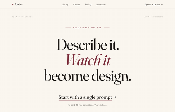
Atelier - Design, Spoken Into Being (editorial serif / burgundy)
An editorial, print-magazine CTA: an oversized Fraunces serif statement with a single burgundy italic line on warm cream paper, closed by an understated text-link call to action and a no-card trust line, framed by a sticky nav and a newsletter footer.

ATELIER - Mono Uppercase Fashion (legibility-fixed)
A stark monochrome high-fashion editorial navbar (Toteme-style): a sticky frosted-white bar that packs three zones at once: uppercase wide-tracked text links pinned left (New / Library / Studio / About), an absolutely-centered Archivo Expanded 'ATELIER' wordmark in the dead center, and a right cluster of two more uppercase links (Search, Account) plus a Phosphor handbag icon with a '(0)' bag count. Pure black ink (#0a0a0a) on white (#ffffff) over a single hairline border, with a 1px underline that wipes in under each link on a long couture ease. Below lg the left links collapse into a hamburger drawer while the wordmark stays centered, and the legibility fix keeps the wordmark's 0.34em letter-spacing at every breakpoint.

Atelier - The Brief Designs Itself (editorial serif / burgundy)
Editorial magazine-style hero for an AI design agent: warm paper-cream canvas, Fraunces serif display headline with one italic burgundy accent word, minimal underlined text CTA, asymmetric 7/5 grid with a tinted framed photo, gold hairline rule, and a sticky translucent nav.

Atelier - Welcome Back (editorial serif burgundy login)
Editorial magazine-style login: warm cream + burgundy palette, oversized Fraunces serif "Welcome back." greeting with a testimonial, split against a clean Google-SSO + email sign-in card.

Atelier · Early Access (waitlist-minimal-graphite)
Minimal monochrome graphite-on-paper waitlist / early-access landing for an AI design tool: a warm off-white ground with near-black ink and one platinum grey (no color accent), a big tight black-weight headline, a centered single-field email + button waitlist form with overlapping social-proof avatars, scattered graphite confetti strokes, a logo trust strip, a 3-step how-it-works grid and an inverted full-bleed dark closing CTA.

Atelier Vermillion - Editorial Burgundy Agency Website
An editorial, print-inspired agency studio website on a warm cream canvas: a tall Fraunces serif headline with burgundy italic accent words beside stacked case-study image cards, framed by gold hairlines, with a scrolling stat marquee, alternating asymmetric case studies, a dark pull-quote band, a burgundy contact section, and a giant clamp-scaled footer wordmark.

Atlas Studio - Charting Your Account, Step One of Three
Premium dark-navy multi-step signup / onboarding screen (step 1 of 3) for an AI design tool: a 3-step progress tracker, glassy translucent cards on a midnight-navy ground with soft amber glows, a single warm amber accent, focus-reactive fields, a password strength meter, a role selector, and a 'what you unlock' value panel with a testimonial.
How to prompt an agency site that looks designed, not generated
An AI design agent has a strong default for an agency site, and most of those defaults are wrong: a centered "we build digital experiences" hero, the Inter typeface at a timid size, a dark purple gradient, and a wall of equal service cards with no real work in sight. A good prompt is really a list of constraints that override those defaults. Here is each default you need to override, the words that do it, and a template that bakes them all in.
Design the homepage for [agency name], a [discipline, e.g. brand and product design] studio for [who you serve].
Hero: an oversized headline that states the positioning, not a slogan: "[what you do] for [who]". One line of proof under it (years, client count or a result). One primary CTA.
Work first: a grid of [4 to 6] project tiles right after the hero, each with a real cover image, the project name, and a one-line result. Make the work the hero, not a stock photo.
Services: a short list of [3 to 5] disciplines, named plainly. No equal feature-card wall.
Proof: a row of named client logos near the top and one or two short testimonials with attribution.
Type: an oversized display typeface [name it, e.g. Clash Grotesk] for the hero (80px or more on desktop), paired with a clean body face. Not the default Inter.
Color: a neutral base [light or dark] with one accent color used sparingly. Let the project thumbnails supply the color.
Motion: name the interactions you want, for example a custom cursor that scales on hover, thumbnails that reveal on scroll, smooth page transitions.
Close with a contact section: a single clear ask ("Start a project") and a real way to reach you.
Hero headline
Default: It centers a vague slogan like "We build digital experiences that drive results", which could belong to any agency on earth.
Constrain it: Make the headline state the positioning: what you do, for whom. Add one line of proof under it, like a client count or a result.
Lead with the work
Default: It opens on a generic stock hero and buries the actual projects several scrolls down, if it shows any at all.
Constrain it: Ask for a grid of real project tiles right after the hero, each a named case study with a one-line result. Make the work the first thing you see.
Typography
Default: Left alone it reaches for the Inter typeface at a safe, timid size, so the page looks like every other AI-generated site.
Constrain it: Name an oversized display typeface for the hero, 80px or more on desktop, paired with a clean body face. State both by name.
Color and restraint
Default: It defaults to a dark theme with a purple gradient and a scatter of bright accent colors used as decoration.
Constrain it: Name a neutral base, light or dark, with one accent color used sparingly. Let the project thumbnails supply the color, not the chrome.
Motion
Default: It either ships a static page or drops a generic fade-in on every block, with no intent behind the movement.
Constrain it: Name the interactions you want: a custom cursor that scales on hover, thumbnails that reveal on scroll, smooth page transitions.
Proof and the ask
Default: It ends on a bare "Contact us" with no client names, no testimonials, and nothing to make a stranger trust you.
Constrain it: Put named client logos near the top, add a short testimonial with attribution, and close with one clear ask like "Start a project".
Frequently asked questions
What makes a good agency website?
It is the proof. Lead with the work instead of a stock hero, state your positioning in one sharp line, keep the layout calm so the projects stand out, name your clients, and make the next step obvious. A site that looks this good is the strongest argument you can make.
What should an agency website include?
A hero that says what you do and for whom, a work grid of real case studies near the top, a short and plainly named list of services, named client logos and a testimonial or two for trust, an honest about or team section, and one clear contact CTA. Skip the wall of equal feature cards.
Why does my AI-generated agency website look generic?
Because a vague prompt gets the model defaults: a centered "we build digital experiences" hero, the Inter typeface at a safe size, a dark purple gradient, and equal service cards with no real work. Name your positioning line, lead with the projects, call out an oversized display typeface, keep one accent on a neutral base, and the look stops being the average.
How do you write a prompt to generate an agency website?
Describe the brief, not the vibe: the agency name and discipline, who you serve, a positioning headline with one line of proof, a work grid of named case studies, the named display typeface, a neutral base with one accent, the interactions you want, and the contact ask. The template above walks through each part, and you can open any example here to see a full prompt that works.
Can I use my own projects and brand colors?
Yes. Generate the layout first, then describe your real projects, client names and brand colors in plain language and branch a variant. Every design comes back as real, editable code, so wiring in your own case studies happens in your repo, not a rebuild from a picture. Stuck on something? Ping us and we will sort it out together.